Paint a monster from a silhouette
Concept artist Mark Molnar explains the benefits of working up a silhouette as opposed to a sketch.
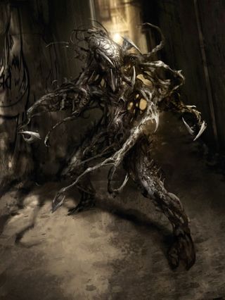
Silhouette is the most characteristic visual element in every person or animal, because our eyes see that first before moving on to the face, hands and finally to the smaller details.
The ability to recognise certain silhouettes stems from ancient times, where the survival of a species was dependent on this ability, such as recognising a shadow of a dangerous animal in the jungle.
The most successful animation or film characters also have iconic silhouettes – that's how we can instantly differentiate them from others, even in a badly lit scene or environment. Think about Mickey Mouse, Batman or even Stewie Griffin.
I start this creature design as a demo for my students, in which we have to develop a fictional pitch package for a horror film. I'm keen to create a scary, unique-looking monster, but I don't want to give it a straightforward humanoid shape. Instead, I imagine a mass of old root-like tentacles that are constantly in motion.
I'm aware that in a horror films or games there can be a lot of under-lit environments in which my creature would have to stand out. I want it to be recognisable, even if we see only parts of its limbs in a shot.
That's why I start by developing a dynamic silhouette first and then build all the details on top. As you can see in the step-by-step, I retain the original silhouette and simply refine it during the detailing process.
01. Throw some shapes
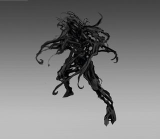
As a first step I block in the whole silhouette with a simple default Round brush. I try to focus more on the dynamism of the creature and create a really interesting shape language. I want it to resemble a humanoid shape from afar, but also give the feel of constant movement through its many tentacles.
02. Form dictates texture
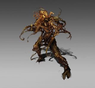
Before moving into detailing I experiment with random shapes inside the silhouette. I drop various textures on top by using Overlay and Soft Light layers to add extra noise to the creature. I use skin textures of frogs and toads and other plant photos that are a good match to the root-like body of the creature.
03. Recognisable setting
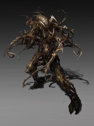
Now I fill in the gaps and make the creature more realistic-looking, and make the head and limbs the main focal point. After this step the design is pretty much finished, so to make it presentable I place the creature in an alleyway and composite everything to make it look as if it's a key frame from a film.
This article originally appeared in ImagineFX issue 114.
Like this? Read these...
- How to master the art of drawing hands
- Free Photoshop brushes every creative must have
- Great examples of doodle art

Thank you for reading 5 articles this month* Join now for unlimited access
Enjoy your first month for just £1 / $1 / €1
*Read 5 free articles per month without a subscription

Join now for unlimited access
Try first month for just £1 / $1 / €1
Get the Creative Bloq Newsletter
Daily design news, reviews, how-tos and more, as picked by the editors.
