How to paint atmospheric rooftops in ArtRage
Nick Harris looks upwards to create an atmospheric aerial scene.
There's a passage of writing early on in Titus Groan, the first part of the Gormenghast trilogy, where the author and illustrator Mervyn Peake describes the magical rooftop vista that greets kitchen menial Steerpike after he escapes through a window. It's the first thing that springs to mind when reading this question.
Rooftops offer a great alternative environment when you want a change of angle. They have an atmosphere all of their own and will vary according to their particular location: Eastern architecture versus New York skyscrapers, for example.
Setting sun
I'm depicting a European town suburb, but you should choose whatever environment suits your narrative. We want atmosphere, which can be a lot about lighting and aerial perspective, so let's go for sunset. This will result in a low, dramatic light source and give me the opportunity to draw silhouetted shapes.
Working in ArtRage, I sketch out shapes over a tinted base, before laying watercolour washes on layers set to Multiply blend mode. I build more tonal contrasts in the foreground that diminish into haze into the distance. Finally, I add highlights for extra visual interest.
01. Focal points
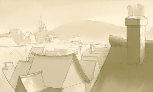
I draw roof shapes, concentrating on larger foreground elements, but indicating where focal points such as a distant church will feature. The setting sun will be on the right behind the foreground roof and chimney stack. I use the Precise variation of the ArtRage pencil on a layer over a tinted, canvas-textured background. This colour becomes the base white.
02. Textural interest
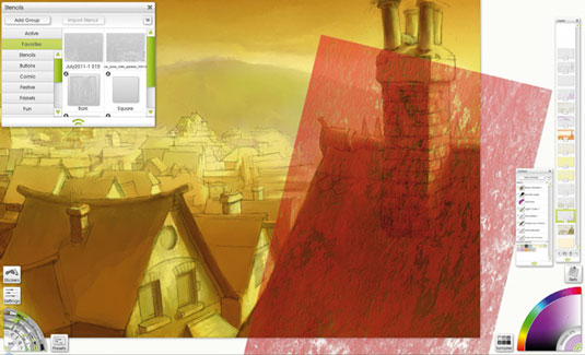
I consolidate the foreground shapes and build up tone and colour. I also introduce some textural interest using appropriate stencils. ArtRage doesn't yet support irregular transformation of stencils, so I paint through it on a separate layer and transform the result afterwards. Work into the layer to boost the effect with your chosen paint tools.
03. Highlight layer
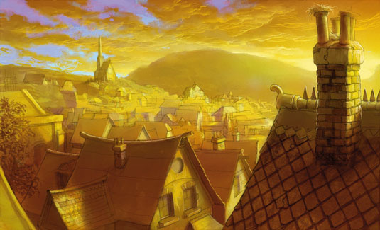
To both contrast and emphasise the strong yellow colour cast, I introduce some blue/purple in the sky. I also add a highlight layer to pick out edges where I want them. I start with adding some form to the clouds. I repeat these processes, including applying an overall colour wash for coherence near the finish. Finally, I work back into it to strengthen the effect.
This article originally appeared in ImagineFX.
Like this? Read these!
- 10 digital art events you shouldn't miss in 2015
- 50 great examples of doodle art
- You'll want to get these 5 inspiring art books

Thank you for reading 5 articles this month* Join now for unlimited access
Enjoy your first month for just £1 / $1 / €1
*Read 5 free articles per month without a subscription

Join now for unlimited access
Try first month for just £1 / $1 / €1
Get the Creative Bloq Newsletter
Daily design news, reviews, how-tos and more, as picked by the editors.
English artist Nick Harris switched to a digital canvas in 2000, after 18 years of using traditional media. Most of his work involves creating artwork for children’s books, though he has also dabbled in animation, including some background work on the hit 1988 film Who Framed Roger Rabbit?. He has supplied a wealth of advice and tutorial help for illustrators in ImagineFX magazine.
