How to design sci-fi weapons
Mass Effect concept artist Brian Sum brings out the big guns in this detailed tutorial.
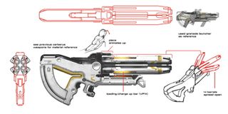
When I play shooters, there's nothing like the feeling of acquiring the perfect weapon to take down your enemy. Everyone has their own personal favourites. It could be the sniper rifle that can hit a target with pinpoint accuracy, or it could be the shotgun that rips an enemy to shreds. Its accuracy, how it sounds, the reload time... everything plays into the overall experience. Players want to feel bad-ass when using the gun, so naturally the gun should look bad-ass, too.
Cool-looking weapons can come in all shapes and sizes, but some themes remain consistent. Over the past few years I've had the opportunity to design some of the weapons for the Mass Effect franchise. I've come to realise that some basic design principles are universal and apply to weapon design as much as they do for character design and environment art.
The Rule of Thirds, composition and creating unique silhouettes are just some principles to keep in mind when trying to create a successful design. In this workshop, I'll describe some of these principles a little further, as well as offering some of my own tricks that I've picked up over the years.
01. Spec and requirements
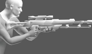
Before starting the design it's important to gather all necessary information about the gun from the game's designers, such as the type of weapon it is (assault rifle, shotgun, compact pistol and so on), where the hands need to be, or the maximum allowable size of the gun.
Are there moving parts when the gun fires? Does the gun require an ammo slot? Is there a specific alien race that this gun is designed for? What's the backstory of this gun? All these points are important to keep in mind, and serve as the boundaries to work within when concepting the weapon.
02. Research, research, research
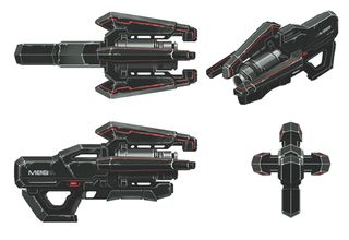
Gather as much reference material as possible, both to serve as inspiration and also to see what’s already been done before, so that you don't design something too similar to an existing weapon.
Studying real-world weapons gives you a better understanding of how guns should function. Research for made-up weapons gives you an idea of how far others have pushed their designs. In general, the goal is to be as original as possible.
Get the Creative Bloq Newsletter
Daily design news, reviews, how-tos and more, as picked by the editors.
03. Design from all angles
Think in three-dimensional space, and design from all angles. Although I've only shown the profile view in the majority of my weapon concepts, a lot of work has been done to design the weapons from every aspect.
It's important to design from all perspectives, especially from the player’s view, because this is what you would see the most in-game. Focus on creating an interesting silhouette from a range of views.
04. Start with thumbnails
I start off by doing simple thumbnails in greyscale with just a simple Round brush at 100 per cent Opacity. No shading or colour – just a light, medium and dark tone.
At this stage I'm concerned purely with the shape of the design and the relationship between the different tones. The focus is on silhouettes and the big broader shapes. By producing these thumbnails, I'm trying to capture the main essence of the design at this early point in the design process.
05. Find a theme
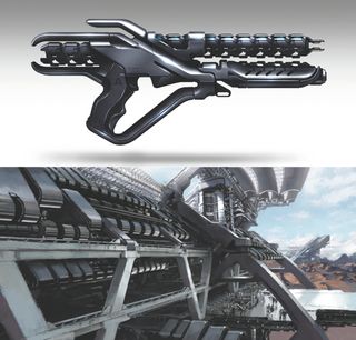
Sometime you'll find opportunities to continue an existing theme for a design. Here, the repeating chrome parts from the Quarian architecture served as a strong theme to implement in the shotgun. Each alien race has their own specific styles and it was important that we showed that in the weapons.
06. Composition is key
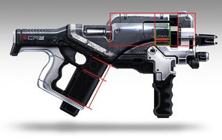
Unless the weapon's design requires a series of repeating shapes, I try not to space out details evenly across the weapon, which tends to create a boring design.
Instead, I apply the rule of thirds by placing detail elements a third of the distance from a specific part of the weapon. This works vertically, horizontally and diagonally. Leaving areas empty helps balance out all the detailed parts of the weapon.
07. Consider flow in your design
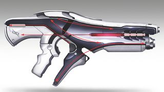
Because the Mass Effect style has more of a clean and sleek design about it, it's important to pay attention to the flow of the design elements. I try to continue lines and seams to maintain the clean, streamlined feel.
08. Flip the canvas
To do this in Photoshop choose File and then select Image>Image Rotation>Flip Canvas Horizontal. Considering assigning a hotkey for this.
09. Colour and composition

At this point it's good to start adding colour to the design and see how it affects the composition. It's interesting how a slight colour shift from a dark tone to a light tone can totally change the weapon's design and flow.
I usually like to use one dominant colour along with one or two accent colours. Adding too many colours tends to end up with them competing with each other, while adding a neutral tone complements the main colour nicely.
10. Add detail
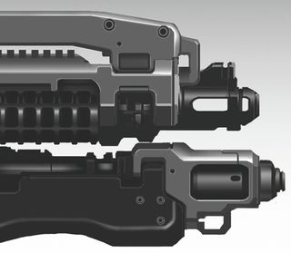
This is the fun stuff. Now that the main design is fleshed out, it's time to start adding the extra bevels, seams, nuts and bolts. This is where the weapon starts to come to life. I'll paint with an airbrush when I want to indicate soft, curved surfaces.
For sharp corners and edges I'll use a thin, simple Round brush to paint in those white highlights. I'll also use an airbrush set to Color Dodge when I want to give the surface a metallic shine. This process requires the most time and focus, but all the hard work painting those small bolts and thin seams pays off in the end.
11. Add textures
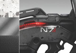
Textures give the weapon an added level of detail and help differentiate parts that may have appeared the same before. For example, the black rubber handle now looks different from the grey metallic body of the gun. Add highlights to give it that shiny quality.
You can sell what type of material it is by playing around with the level of diffuse and specularity. The more shiny the material, the more concentrated the highlight should be, and the more spread out the highlight, the more matt the finish will look. I like to add a scratch texture to give it a banged-up feel. I'll also apply a mask on the texture and paint in where the scratches should be.
12. Use a lens flare texture
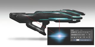
I like to use a lens flare texture set to the Color Dodge blend mode to add highlights to shiny surfaces, or the glowing lights common in the Mass Effect weapons. This adds a level of vibrancy to the weapon. The glowing stripes also make a weapon feel sci-fi.
13. Add futuristic logos and decals
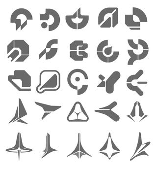
The Mass Effect style usually involves adding logos, numbers and stripes throughout the weapon. This gives it an added visual flair, and also gives the impression that these weapons were made by different manufacturers.
14. Shading for volume
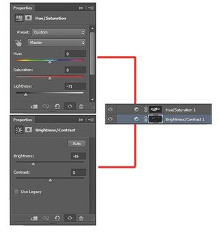
I'll usually have a Hue/ Saturation adjustment layer and a Brightness/Contrast layer placed on top of all my other layers. This is where I would paint in my shading and shadows on a layer mask with a simple airbrush. Playing around with the sliders enables me to control how dark or light I want the shading to be.
15. Blueprint for the 3D artist
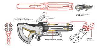
Give whoever will be modelling this as much detail as possible, so that there isn't any misunderstanding or confusion. Indicate materials, different views, pieces to be animated and whatever areas need more clarification.
Words: Brian Sum
Brian Sum is a concept artist based in Montreal, Quebec. His previous projects include Mass Effect 2 and 3, Dragon Age Origins, Sonic Chronicles and Shadowrun. This article originally appeared in ImagineFX issue 103.

Thank you for reading 5 articles this month* Join now for unlimited access
Enjoy your first month for just £1 / $1 / €1
*Read 5 free articles per month without a subscription

Join now for unlimited access
Try first month for just £1 / $1 / €1
The Creative Bloq team is made up of a group of design fans, and has changed and evolved since Creative Bloq began back in 2012. The current website team consists of eight full-time members of staff: Editor Georgia Coggan, Deputy Editor Rosie Hilder, Ecommerce Editor Beren Neale, Senior News Editor Daniel Piper, Editor, Digital Art and 3D Ian Dean, Tech Reviews Editor Erlingur Einarsson and Ecommerce Writer Beth Nicholls and Staff Writer Natalie Fear, as well as a roster of freelancers from around the world. The 3D World and ImagineFX magazine teams also pitch in, ensuring that content from 3D World and ImagineFX is represented on Creative Bloq.
