How to create an atmospheric nightmare using Photoshop
Mark Molnar uses shadows and suggestion to create an atmospheric nightmare scene.

Painting a nightmare or a horror scene is not necessarily about showing horrific things in a blatant and obvious way. If we go back to the classic horror movies or to the films of old masters like Hitchcock, we can see that what they're doing is more playing with the mind and imagination of the viewer – in lesser movies the suspense is blown as soon as you see the man in the rubber suit.
The trick is still the same today: to paint a really frightening image we should only suggest most of the horrors we would like to show.
In this case I wanted to depict a nightmare where we can't really decide whether we are sleeping or we are awake. All of us know this state, where the shadows of the moving curtains cast by the eerie moonlight could easily turn into weird monsters sneaking into our room.
01. Create your silhouette
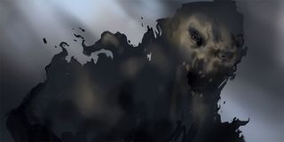
I roughly painted in the silhouette of the creature, and I knew from the very beginning that I wanted to show only part of its face. With every aspect of the image creating only one clear focal point – the amount of detail, composition, contrast, saturation – I was able to focus the eye on just a small part of the image, which could hint at the rest of the scene.
02. Focus your lens
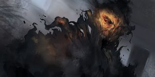
I consciously placed the 'camera' very close to the viewer, and also added some cinematic effects as the last step. This creates the feeling that we are at the very moment before the horrific action begins – or hopefully just before waking up…
03. Establish a colour scheme
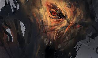
I blocked in the main silhouette of the monster first and established the overall colour scheme of the illustration. I wanted to use a slightly tilted camera angle to add more dynamism to the scene.
Although the lighting would suggest a more bluish highlight, I consciously used warmer colours for the creature's face. This helped to create a much stronger focal point with the strong colour contrast of the saturated yellows and reds, compared to the desaturated blues and greys in the background.
05. Add texture and storytelling elements
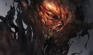
To achieve more visual noise and details in the foreground I applied photo textures to the creature. The final step was to add extra elements like the door frame at the back to support the story, then integrated the textures into the painting and added some effects to add more atmosphere to the image.
Words: Mark Molnar
Mark Molnar is a concept and visual development artist. He’s busy doing freelance work for international film, game and animation companies. This article originally appeared in ImagineFX magazine issue 101.
Like this? Read these!
- Illustrator tutorials: amazing ideas to try today!
- The designer's guide to special characters
- Free graphic design software available to you right now!

Thank you for reading 5 articles this month* Join now for unlimited access
Enjoy your first month for just £1 / $1 / €1
*Read 5 free articles per month without a subscription

Join now for unlimited access
Try first month for just £1 / $1 / €1
Get the Creative Bloq Newsletter
Daily design news, reviews, how-tos and more, as picked by the editors.
The Creative Bloq team is made up of a group of design fans, and has changed and evolved since Creative Bloq began back in 2012. The current website team consists of eight full-time members of staff: Editor Georgia Coggan, Deputy Editor Rosie Hilder, Ecommerce Editor Beren Neale, Senior News Editor Daniel Piper, Editor, Digital Art and 3D Ian Dean, Tech Reviews Editor Erlingur Einarsson and Ecommerce Writer Beth Nicholls and Staff Writer Natalie Fear, as well as a roster of freelancers from around the world. The 3D World and ImagineFX magazine teams also pitch in, ensuring that content from 3D World and ImagineFX is represented on Creative Bloq.
