How to create a dramatic composition with multiple characters
Illustrator Jose Daniel Cabrera Peña paints an image of conflict from Greek mythology.
Sign up to Creative Bloq's daily newsletter, which brings you the latest news and inspiration from the worlds of art, design and technology.
You are now subscribed
Your newsletter sign-up was successful
Want to add more newsletters?

Five times a week
CreativeBloq
Sign up to Creative Bloq's daily newsletter, which brings you the latest news and inspiration from the worlds of art, design and technology.

Once a week
By Design
Sign up to Creative Bloq's daily newsletter, which brings you the latest news and inspiration from the worlds of art, design and technology.
Once a week
State of the Art
Sign up to Creative Bloq's daily newsletter, which brings you the latest news and inspiration from the worlds of art, design and technology.

Seasonal (around events)
Brand Impact Awards
Sign up to Creative Bloq's daily newsletter, which brings you the latest news and inspiration from the worlds of art, design and technology.
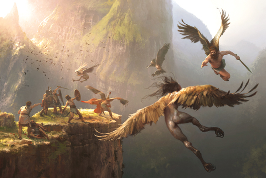
This commissioned image is for the Osprey Adventures: Myths and Legends series. The recreation of Jason and the Argonauts had to match the historical accuracy of the publisher's traditional book series, while still keeping a sense of myth and fantasy.
I go back to the Bronze Age, when the myth was born, to design armour and weapons. The strongest reference for this may be Dendra armour. I begin with a loose idea of the whole image based on singular character poses and poses in pairs and groups.
I want to add strong storytelling and movement, so the poses have to show stress and violence. I also pay attention to the dynamics of the wings. I imagine the Argonauts setting the trap to catch the harpies where Phineas the blind would be.
From there, the boreads Zetes and Calais, two winged Argonauts, would chase the harpies. So I start with a rough sketch, searching for the feeling of height. I also feel I need a strong sense of atmosphere.
01. Scale and perspective
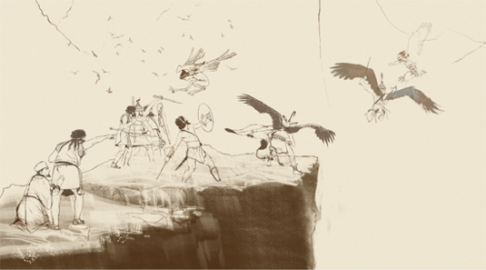
This early composition, based on my character ideas, is achieved by contrasting the shapes and introducing tension between figures. Scale and perspective are key. Then the basic palette is defined, but note that it's only a working one, which doesn't reflect the final look of the painting.
02. Adding colour to the scene
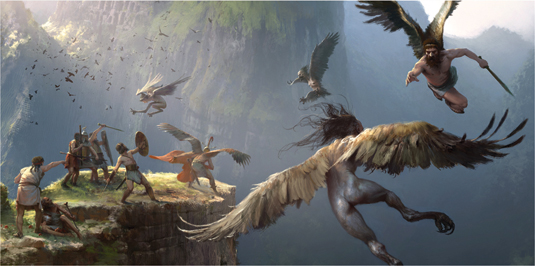
This complex composition needs the linework in place when I start the paintwork. I paint with basic colours and simple brush strokes in a layer under the line drawing.
Many may find this to be a poor method to make the paint flow, creating hard edges and a general static feeling, but I've found this is a good way to get the job done. After that, I paint over everything with refined colours.
Sign up to Creative Bloq's daily newsletter, which brings you the latest news and inspiration from the worlds of art, design and technology.
03. Complementary backlighting
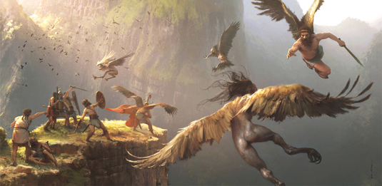
At this stage in the painting process, any general corrections are mainly about placing a dramatic backlight without killing most of the colour in the characters.
So a lateral light has to be created and warm filters used without turning the general bluish tones in the background green. Blue tones are necessary to maintain the atmosphere, and yet I think that a warmer mood looks more dramatic to my eyes.
04. Colour variations
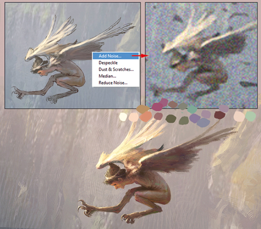
Because only basic colours have been used to fill the characters and background colour base, I use a trick to bring colour variations to the scene, although this won't work with strongly filtered palettes or those close to greyscale.
I apply 'noise' on a low-resolution copy of the image and get colour variation samples all over the image, to be used wisely.
05. Atmosphere gradient
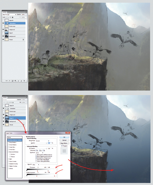
Having placed a rough background colour behind the drawing, I create an atmosphere gradient and place it in a layer between the background and the foreground and characters.
Now I can hide shadows, highlights and general background detail by using the Layer Blending sliders.
06. Adding depth
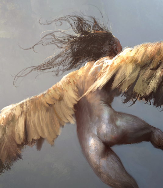
Depth here is very much about two key elements, colour contrast and detail level. So I treat this harpy with a strong colour transition, from light cool tones to light warm tones. In addition, a bizarre texture created with brush strokes adds something monstrous to the creature.
Note: Chalk brush

This custom chalk brush is used to achieve a traditional look without simulating oil brushes or canvas texture.
This article originally appeared in ImagineFX.
Like this? Read these...
- Illustrator tutorials: amazing ideas to try today!
- Free Photoshop brushes every creative must have
- Great examples of doodle art
