Design trend predictions for 2013
Leading creatives reveal what they think will be the major trends in design in 2013. Do you agree?
When some creatives hear the word 'trend' they back into a corner, refusing to acknowledge these 'trends' dictate what they do. And it's true that following trends consciously can be a bad thing to do. After all, if you're not innovating and pushing yourself, your own work will never reach its full potential.
10 web design trends that will change everything in 2015
But at the end of the day, clients want your work to be at the height of trends – so having a handle on what is going to be a popular style, or way of working over the next year will only improve your chances of getting better client work.
We've asked a number of top creative professionals, from animators to illustrators to app and editorial designers, to see what they predict for 2013. Got anything to add? Know of a trend that will be massive but is not mentioned here? Tell us in the comments below!
01. Geometric design
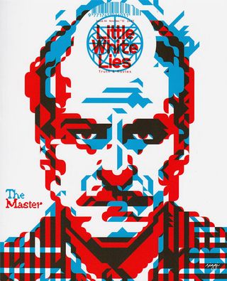
"Recently digital illustration has been fighting back to counter its hand-drawn rival," says Jonny Wan. "A combination of minimalism, simplifying and experimentation with basic shape and colour have been dominating editorial work lately. I predict this will only get stronger in 2013 with the rise in infographics and people catching on to the minimalist trend doing the rounds at the moment."
Notable illustrators working in this field to be are Siggi Eggertson and Muiz Anwar.
02. From print to digital
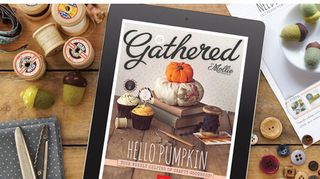
Luke O'Neill, launch art editor of Computer Arts Collection magazine, is an experienced designer, who acknowledges the traditional editorial designer's role has changed significantly in the last year, with print revenue declines and digital magazines becoming the norm.
Get the Creative Bloq Newsletter
Daily design news, reviews, how-tos and more, as picked by the editors.
"I think as both designers and consumers become more and more familiarised with the screen format, we'll (hopefully) start to see more interesting design solutions and content delivery systems," he says. "These will be created exclusively with the screen format in mind, rather than simply porting over the print magazine to a screen format, which unfortunately is often the case.
"From an aesthetic point of view I foresee design for iPad and screen formats getting back to basics and the fundamentals of graphic design, the relationship between text and image. Navigation and actual content will take prominence over whizz-bang effects that ultimately do little to enhance the experience and simply bloat the app."
03. Stripping it back

"A lot of brands redesigned their logos this year to be extremely minimal," says Lee Crutchley. "Microsoft, ebay, Starbucks, and others have done it. I think a lot of that was to make people talk about the brand, as well as being a stylistic trend."
He continues: "I think 2013 will see an extension of that trend, with more brands stripping back their logos because of the increased versatility that it brings. A simple one-colour logo can look good on anything from a solid block of colour, to a photograph, to a busy pattern. Whereas a heavily stylised logo tends to have more influence over the rest of the design."
It seems as though 2012 has kickstarted a KISS - Keep it Simple, Stupid - philosophy amongst brands, which can only be a good thing (as long as the mark is executed correctly, of course).
04. Luxury printing
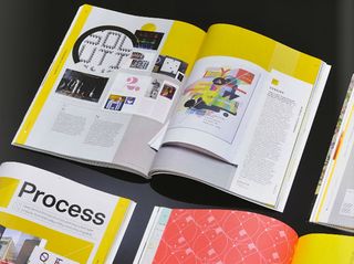
With digital magazines pushing their way to the forefront of publishers' minds, you'd think that this would be bad news for print. But it's not all going to be gloom and doom, according to Luke O'Neill.
"In 2013, I think there will be continued experimentation with print techniques and innovative finishes to really enhance the experience for the consumer who still likes to hold something in their hands," he says. Just look at some of the fashion and photography tomes appearing right now such as Hunger and indeed Luke O'Neill's own Computer Arts Collection. In 2013 we will probably see lower print runs, but we'll also see more luxury magazines that are a celebration of print.
05. Acid visuals
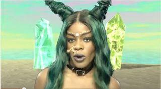
Tom Muller, a creative who specialises in graphic design, branding and art direction (and also creates some kick-ass posters) reveals his thoughts on what will be hot for 2013: "I think we'll continue to see a strong trend in combining vintage-y/found imagery with modern type for one," he says. Acid collages and images that mash up everything from 80s and 90s visuals - see the new Azelea Banks video for example - will become more mainstream. Whilst a general appreciation of vintage graphic ephemera will continue to inform a lot of design I don't think the die-hard minimal Modernist approach will fade."
06. Hand-drawn illustration
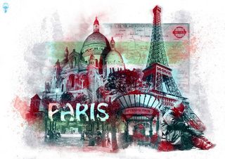
"It's always been a trend in illustration for it to swing from highly vectorised work to highly hand drawn work," says UK-based illustrator Jonny Wan. "It was always either one or the other but now we are seeing an even appreciation for both."
The illustrator, who has worked for Ford, Microsoft, Nokia, Urban Outfitters, Burton Snowboards and many more, continues: "There will always be a strong appreciation for hand drawn illustration because it's the purest form of craft. It's demonstrating with no digital alteration that you can draw, mark make and communicate visually. It's also very hard to mimic unlike digital work. In a fast evolving world where everyone is trying to be original, hand drawn work provides the fastest cheapest way of expressing yourself as an illustrator whilst claiming sole ownership."
07. The return of animated GIFs
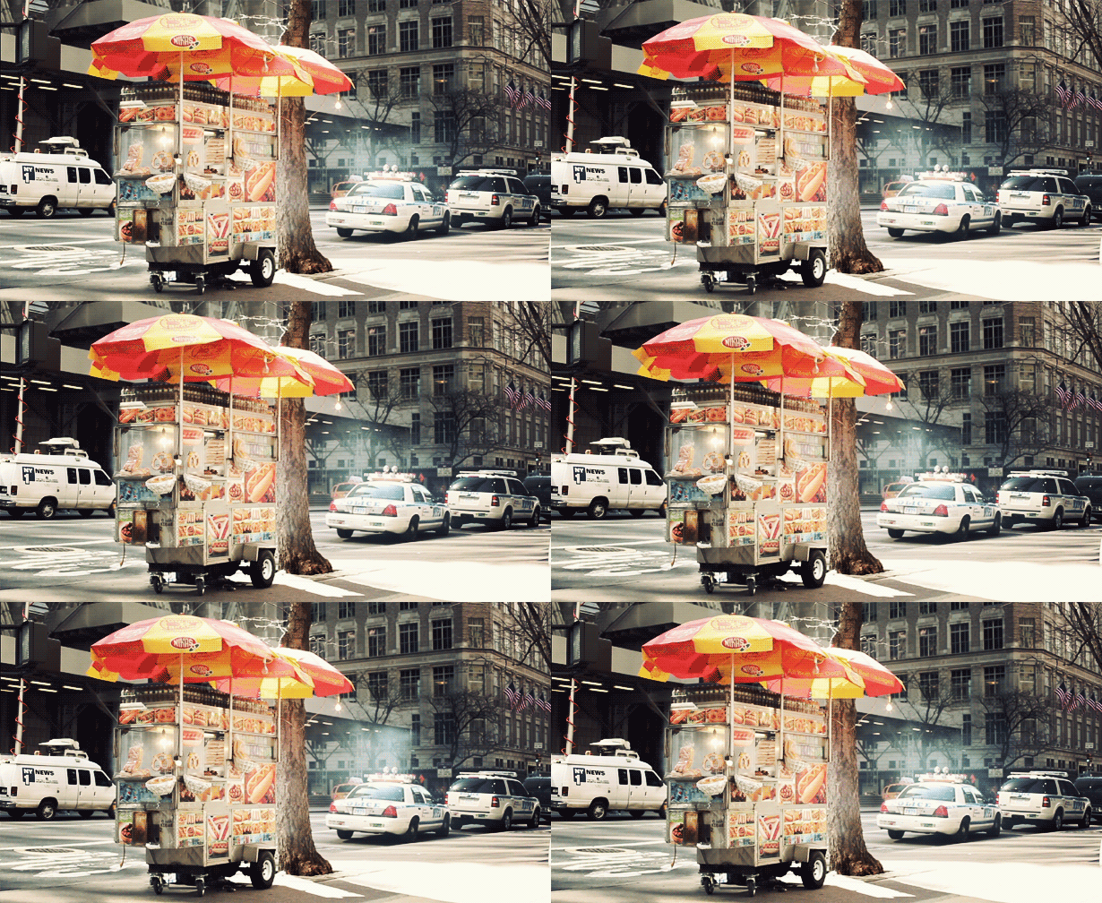
Whisper it, but Lee Crutchley - a Birmingham-based illustrator best recognised for his excellent Quoteskine book - points to a trend that re-emerged this year and will continue to thrive in 2013: animated GIFs, aka cinemagraphs.
"It's a well known fact that everyone loves animated GIFs these days," he smiles. "And more brands are beginning to notice that." He continues: "More and more campaigns are springing up using animated GIFs, and almost all so far have been terrible." He offers the GIFs Young Jerks made for MTV as a more positive example: "It will be interesting to see where designers take animated GIFs next year."
08. Multidisciplined design
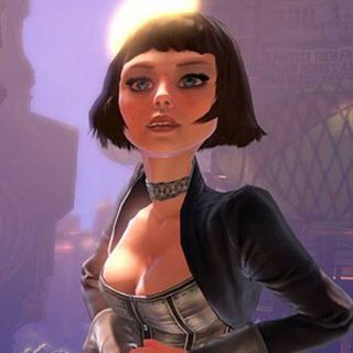
For Jonny Wan, becoming more versatile and multi-disciplined will be a huge trend in 2013, as he explains: "With illustration being so competitive and with so many people wanting to become one it's never been more crucial for illustrators to push the boundaries of their work."
"This is the most interesting trend to me personally and one I can't wait to see develop. Illustrators are becoming multidisciplinary artists fusing their digital and hand drawn work with photography and animation. In an attempt to earn another stream of income they're creating more tactile products to sell within their stores - from prints with special finishes to having their work engraved on wooden iPhones cases and mass produced as toys."
As Wan reiterates, all of these things enable the illustrator to spread their wings to forge new relationships and new clients. "Illustrators that I know are now being commissioned to produce music videos, apps and video games," he concludes.
09. Big and bold
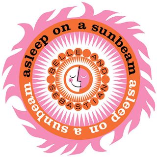
If you look at the work of Lesley Barnes, a Glasgow-based animator and illustrator whose most famous commissions include a music video for Belle and Sebastian, it's not hard to see what she sees (or rather hopes to see) as a trend for 2013. "I hope that bold bright colours are a big trend in 2013," she enthuses. "I think the whole country needs a bit of a pick-me-up and to be surrounded by bright colours would help lift the general gloom," she smiles. Let's hope clients agree.
10. Social advertising
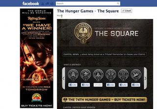
"Many big-name movies and brands have jumped onto the social advertising bandwagon this year, and I think many more will jump on in 2013," says Lee Crutchley. And you know where he's going with it: Twitter and Facebook have become massive marketing tools especially over the last year and this will continue to grow. "Brands will want to be our friends much more, interacting with us and showing us 'cool stuff' rather than selling to us," he says.
11. Making stuff look old
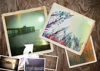
"Looking into the past to design for the present has been common practice since there was a past for designers to look into," laughs Lee Crutchley. "But in 2012 it seemed to blow up a bit more than most years. Retro type and vintage textures were everywhere. I think as well as being a nice aesthetic choice made by designers, it's also a subconscious by-product of the current economic situation.
"Everyone is looking backwards at the moment. Remember those good times? Where did it all go wrong? How did it get better the last time this happened?"
12. Remote working
"An emerging trend for us as an agency is remote working," says Christian Day of Knight Studios, which has completed client work for the likes of Intel and Adidas across motion, web, print, branding and more. "While it's not new, it is definitely now accepted by clients, which in turn opens up huge possibilities.
"Great clients truly don't care where you live and how you're set up, they care about great work, on budget and on time. The world moves so fast and there is no longer a set of rules that an agency must adhere to. This is something that we have fully harnessed and are open about with our clients and our contractors.
"As the world becomes a more open place it is something that is possible, at any level and scale. Remote working gives us access to the very best people in their field: we are no longer restricted by where we live and where we are based."
13. Fantasy moves mainstream
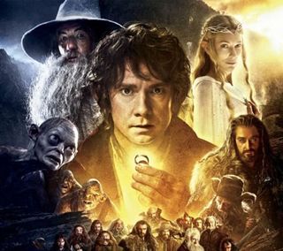
"Swords and sorcery, dungeons and dragons, orcs and ogres, unicorns and elves, knights and princesses." These are just some of the things that Manchester-based illustrator Stanley Chow thinks will make their way into client work in 2013. "Medieval and heavy metal motifs" are two more. "I just think with the Hobbit film coming out at Christmas, I can just see all those things coming into the mainstream more than before," he says.
14. Dogs and circles
"Every brand wants to appeal to the cool kids, so they throw some triangles and cats on their jumpers in the desperate hope that they'll buy them," laughs Lee Crutchley. But he has a serious point: "They don't, because that brand is not cool. But the other kids do, because they've seen that the cool kids like this stuff. Which means the cool kids are forced to look for something new because they don't want to be associated with the other kids. So I predict circles and dogs will be big in 2013."
Words: Rob Carney
Liked this? Read these!
- Top 20 graphic design trends
- 15 top logo trends
- 10 hottest trends in website design
Do you agree with our designers' predictions? Share yours in the comments below!

Thank you for reading 5 articles this month* Join now for unlimited access
Enjoy your first month for just £1 / $1 / €1
*Read 5 free articles per month without a subscription

Join now for unlimited access
Try first month for just £1 / $1 / €1
The Creative Bloq team is made up of a group of design fans, and has changed and evolved since Creative Bloq began back in 2012. The current website team consists of eight full-time members of staff: Editor Georgia Coggan, Deputy Editor Rosie Hilder, Ecommerce Editor Beren Neale, Senior News Editor Daniel Piper, Editor, Digital Art and 3D Ian Dean, Tech Reviews Editor Erlingur Einarsson and Ecommerce Writer Beth Nicholls and Staff Writer Natalie Fear, as well as a roster of freelancers from around the world. The 3D World and ImagineFX magazine teams also pitch in, ensuring that content from 3D World and ImagineFX is represented on Creative Bloq.
