Prototyping in code
Alex Morris, user experience director at Mark Boulton Design, walks us through some of the rationale, the tricks, the processes and techniques you can employ to build HTML prototyping into your workflow
First off, let’s get something out of the way. Prototyping in code is something of a misnomer within the context of what we’re about to discuss. Code sounds scary, it’s something programmers do. What we’re talking about here is far less frightening — all we’re aiming to promote is the basic concept that with some very simple HTML and a bit of CSS you can produce prototypes that communicate your ideas far better than any diagramming or wireframing tool ever could.
Neither HTML or CSS require any programming whatsoever. HTML describes the structure of a page and CSS handles layout and decoration. There’s no voodoo involved, no hidden traps or anything that can go mysteriously wrong, what you write is what you get. It’s a very instant form of gratification too.
Writing markup has somehow ended up bundled in with development tasks in a lot of agency workflow. Designers who write markup are as rare as rocking horse poo, which seems rather at odds with the direction in which the web is heading. With responsive design gaining favour and web typography finally maturing to a state where web fonts are usable, the days of producing pictures of websites are numbered. Unless designers start reacting there’s going to be a very uncomfortable period while we adjust to the new way of thinking and designing for the web.
Prototyping in code brings with it a whole swathe of benefits and very little in the way of drawbacks. This article isn’t designed to be a tutorial on HTML or CSS (there’s plenty of those around: check out Anna Debenham's crash course, for example) but more a walkthrough of some of the rationale, the tricks, the processes and techniques you can employ to build HTML prototyping into your workflow.
The benefits
Designing a user experience for websites or apps using diagramming or wireframing tools is problematic for a number of reasons. Firstly and probably most importantly, beyond anything else you’re faking the experience. No matter how fangled or interactive your tools allow you to get, the output is generally nothing like a real website. The few tools that exist that actually spit HTML out do such a poor job of rendering the HTML, you spend more time hacking your diagrams to do your bidding and the files become so unwieldy, they’re a nightmare to maintain and work with.
More importantly, by using a tool to crank out your HTML you’re not actually learning what HTML is and does, and therefore you miss the opportunity to familiarise yourself with the boundaries and nuances of the technology our ideas get built with. Jared Spool, who’s a big advocate of designers and UX practitioners knowing code, puts it nicely: “You’ll better understand the medium you’re working in” and goes on “if you know what’s easy to code and what’s difficult to code, you can get your ideas implemented faster (and more of them, since development time is a limited resource). Understanding what your medium does well and where isn’t as effective makes for more informed design decisions.”
When you look at it on those terms, it seems bonkers that anyone designing for the web wouldn’t understand that stuff. Even if you don’t end up responsible for production markup (we’ll talk more about that later) you’ll be able to have more informed discussions with those who do, and of course provide informed direction on exactly what you want built.
Get the Creative Bloq Newsletter
Daily design news, reviews, how-tos and more, as picked by the editors.
The second obvious benefit of prototyping in native HTML is the design for your website or app gets presented where it belongs: in a browser. Not in a PDF or on paper, or in a swishy Powerpoint presentation. The users you’re testing it on, or the client you’re presenting to, gets to engage with the product in its natural habitat. Interactions are real, click/touch behaviour is completely natural, text looks and reacts in a way people are familiar with, and forms work how they should. By making the prototype closer to the actual intended experience, you’ll get much more faithful feedback from both users and clients. There’s no gap in cognitive process or imagination necessary for the user to engage with the proto in a natural way. That makes your life as a designer so much easier when you’re operating in a paradigm that actually matches the intended delivery of the thing you’re designing.
Beyond the obvious benefits of being able to create actual interactions, not approximations of them, the fact you can view and test your work on other devices easily is a godsend. There’s currently no other means to effectively design a responsive site right now than in markup, so if your project requires you to cater for that need, you’ll need to embrace the technique pretty quickly or someone else will have to pick up that project.

Debunking the myths
Prototyping in code is not (for most people) a route to becoming a frontend developer, or I should probably point out, any kind of threat to a frontend developer. In purely pragmatic terms you’re just using HTML as a tool to express your ideas, albeit in the natural language of the web. And that’s where some contention occasionally arises when developers feel like their toes are being trodden on and might sneer at your efforts. As well as being hurtful and incredibly disheartening when you’re new to all this, it’s also completely pointless. There’s zero place for code snobbery in prototyping. If you make it clear the HTML and CSS you’re making is just doing a job and not intended to make it into production then people will relax. That also means you won’t be fretting about making your markup and CSS perfect. It’s there to be purely functional, and as it’s a prototype that will inevitably change beyond recognition and/or be thrown away — the quicker and sometimes dirtier, the better.
Also, I should probably mention tools briefly here. You can start prototyping HTML now without installing anything on your PC or Mac. Of course you can buy specialist software that makes editing text a bit more palatable, but text editor choice is a pretty personal thing, so try a few out and see which you like best. Most have a free trial so have a play and see which works for you.
Cheat
Which neatly leads me onto my next point. If in doubt, cheat. Most smart developers don’t ever do the same thing twice. They re-use code. It’s good practice. But beyond that, and creating your own kit of parts (more on that in a bit), look around the web.
Because you’re working in HTML and CSS you’ll pretty soon get quite adept at popping the hood (right-click, view source) on a site and helping yourself to some source code. Why reinvent the wheel? If there’s a form that’s similar to one you need, nab it. If there’s a bit of an image gallery that’s pretty much like the one you’ve designed, borrow it.
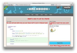
Of course there is a huge caveat here. You need to exhibit some kind of common sense and have your moral compass set to decency. It’s absolutely not cool to just wholesale-steal an entire website, or in fact roll any of that “borrowed” code into production without express permission from the author. To be honest there are plenty of helpful tutorial sites and open source pattern libraries around (for example, hackbook.hackasaurus.org/): you shouldn’t really ever need to, but you have been warned!

Beyond snagging pre-built markup from other sources there are plenty of online tools out there to help with the more laborious and bespoke requirements of a prototype. The two biggest time sinks and causes for frustration are forms and tables. Even your most hardened frontend developer will groan at having to build a complex table or form, so don’t be disheartened if you find them tedious and a bit tricky. Thankfully there are countless smart online tools that do a lot of that heavy lifting for us, auto-generating pretty decent markup from a simple GUI. A quick Google search will pull up a huge array of tools that cover off a lot of those painful tasks and give you snippets of code you can just drop into your own and adapt if need be, saving you countless hours and a load of hassle.
Two that I keep in my bookmarks folder for reference are Kotatsu, which is a neat table builder that allows you to inject classes onto cells and rows very easily, and pForm, which is a really slick drag and drop form builder that makes putting together even really complex forms an absolute breeze. No doubt you’ll find your own favourites, but rest assured if you find yourself battling against something, you can be pretty sure that someone else has experienced the same thing before you and then made a little script or widget to soothe that pain away.
960.gs
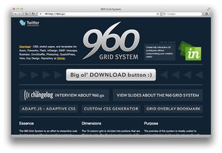
Nathan Smith is a supersmart designer and developer who put together 960.gs, a fantastic little package of tools that make prototyping (and production if you like) using a grid for layout an absolute piece of cake. Included in the package is everything you’d ever need from grid templates and guides for Fireworks and Photoshop, through to sketch sheets and most importantly the CSS library he created that does all the magic.
Using 960 is ridiculously simple. Just reference the CSS file in your HTML and you can lay out robust prototypes in a matter of minutes using very simple class names on your markup. There’s a pretty definitive tutorial over at net.tutsplus.com/tutorials/html-css-techniques/prototyping-with-the-grid-960-css-framework/, so we won’t try and cover that here but once you’ve got your head around the basics, you’ll wonder why you did it any other way.

Process
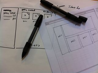
Prototyping in code certainly speeds up your working and testing process once you get your head round the basics. However, you’ll probably need to adjust your own workflow a bit to adapt to it. I’ve pretty much all but stopped wireframing for most projects. Instead of painstakingly diagramming every last detail of a design I’m working on, I work faster and looser with simple sketches. Often not of full pages, but of elements: I start prototyping against users' goals and needs, then these come together as more complete layouts.

It’s a great exercise in validating your decisions and promoting simplicity too. Instead of blithely chucking everything on the page and then shuffling them around, as it’s all too easy to do when drawing boxes in a diagramming tool, you tend to rationalise each decision. Focus on what’s really important to get what you need done and establish hierarchies, topography and flow in an actual page. When you’re dealing with a real page it’s surprising how much it changes your perspective on how an idea comes together.
We tend to work from a shared Dropbox folder for most prototypes, and give clients access to that folder. How you choose to share yours depends on your personal setup. You can go very lo-fi and work from your local machine and just send over a zip file or if you have a friendly sys admin and a staging server you could always dump the files on there. A quick note on using a web server over and above just running the prototype from your documents folder or whatever. You’ll have a lot more options for more advanced prototypes later on if you add in some server-side scripting with simple PHP or aspx. Worth considering as it really is simple to get some very useful functionality for very little effort or indeed coding ability.
Change management is obviously important. Running your prototypes in folders and just duplicating and then incrementing version numbers is a pretty simple but effective way of doing things. It’s probably overkill to start thinking about proper version management at this stage but worth considering in the future if your prototypes become complex or you have multiple people working on them.
Advanced tips
Beyond the fundamentals of learning basic HTML the more you familarise yourself with the ins and outs of the pages you’re building you’ll no doubt develop a series nifty tricks and tips that save you a lot of time and effort going forwards. Each project brings with it its own unique requirements but if I can give you two pieces of advice that will save you countless hours, then they would be:
- Build a library of stuff. It doesn’t matter how you do it. It could be a folder of snippets or something more structured such as Coda Clips (small chunks of code you can re-use by dragging onto your document). Either way, you’ll soon develop a pile of bits that you can pretty much Frankenstein together into anything.
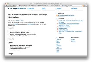
- Use includes. If there’s stuff that you use on every page that may or may not need to be changed across the whole prototype (a nav, a footer etc), then pulling out that section and dynamically including it in your document means you only need to maintain it in one place. If you change it, it gets automatically applied to every page that uses it. This used to be restricted to server-side scripting using PHP or ASP.
But thanks to the wonders of jQuery you can now achieve the same thing incredibly easily using Johann Burkard’s fantastically simple inc.js script. Whichever route you choose you’ll literally save yourself hours by using this technique.

Fidelity
Lastly, but certainly not least is the question of fidelity. The beauty of prototyping with HTML and CSS is that with one set of HTML you can apply varying degrees of styling to the same document just by switching out the CSS. So you can start very simple, black and white boxes, like a traditional wireframe, and then ramp up the fidelity for specific use cases. Users (and clients) often struggle to relate to very pared back wireframes, so for testing you can apply more UI ‘gloss’ to make the prototype feel closer to a real product. You can of course do this yourself or work with your design team to start rolling in their visual language early on, to see how it fares with users in a real world context.
So, for anyone nervous about giving prototyping in code a go, I’d say: don’t be. Start small and slow and work your way up. Ask a frontend developer for help and advice if you need it (they don’t bite). And if you’d like to get up to speed quickly, the UX Bootcamp course is very cheap and will get you started in just a couple of days.
If you like this feature, be sure to also check out Anna Debenham's crash course on building prototypes in HTML and CSS.

Thank you for reading 5 articles this month* Join now for unlimited access
Enjoy your first month for just £1 / $1 / €1
*Read 5 free articles per month without a subscription

Join now for unlimited access
Try first month for just £1 / $1 / €1
The Creative Bloq team is made up of a group of design fans, and has changed and evolved since Creative Bloq began back in 2012. The current website team consists of eight full-time members of staff: Editor Georgia Coggan, Deputy Editor Rosie Hilder, Ecommerce Editor Beren Neale, Senior News Editor Daniel Piper, Editor, Digital Art and 3D Ian Dean, Tech Reviews Editor Erlingur Einarsson and Ecommerce Writer Beth Nicholls and Staff Writer Natalie Fear, as well as a roster of freelancers from around the world. The 3D World and ImagineFX magazine teams also pitch in, ensuring that content from 3D World and ImagineFX is represented on Creative Bloq.
