How to develop a visual language
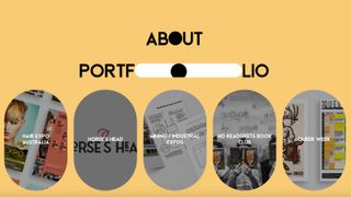
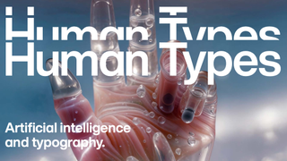
Giving your design work a consistent look and feel will give it authority and integrity. Anna Wray explains how.
However good your design and illustration skills are, it's difficult to get recognition in a competitive industry. One thing that can help you stand out is to develop your own visual language, so that your designs become easily recognisable as yours. But how do you go about it? Follow this five-step guide and you'll soon be on your way to create your own signature style...
01. Step away from the screen
It's great that we're so digitally connected these days, and it means we get to see an awful lot of our fellow creatives' work on the web. But this inevitably leads to a lot of design and illustration tending to look the same, both in terms of style and subject matter.
Don't just look at work that is being created now: look back in history and look at the real world all around us, our immediate surroundings, people, second hand book shops, found photographs, car booties, your granny's loft, anything! Resist the urge to just look online for inspiration and influence.
02. Be inventive with materials
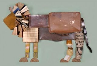
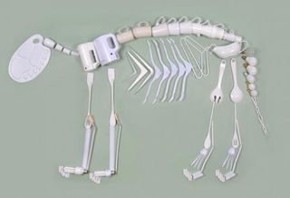
If you draw something with a pencil, then draw the same thing with a brush and ink, it will change the feel of your work entirely. So the materials you use have enormous importance.
Some materials loosen your work up and create happy accidents, others lead you to work in a cleaner, more precise way. So experiment with mixed media, printmaking and a wide range of drawing materials. Paint with a twig and see what happens. Don't be scared of working on a large scale. Be as inventive as you can be in terms of materials and mark making.
03. Use technology to your advantage
You shouldn't let the computer dictate your work - but that doesn't mean you should be a technophobe either. I wouldn't be without my Adobe Creative Suite tools, but I don't let the various tools and ways of image making dictate the way I illustrate.
To get the balance right, it's usually best to start your work with real materials away from the computer first, then scan the images in and edit, combine and compose. Be very wary of any brushes and effects that attempt to assimilate spontaneous and hand drawn mark making. It's infinitely better to scan in drawings, images textures etc and use this as the raw material. Using technology in this way will stop your work from looking generic and generated.
Get the Creative Bloq Newsletter
Daily design news, reviews, how-tos and more, as picked by the editors.
04. Find out who you are
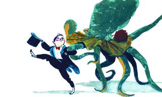
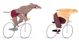
To create your own personal style, you first need to work out what kind of creative you want to be. Ask yourself: what would be your dream job? It's important to create work that genuinely interests you. As with anything in life, if you know what you want, you stick at it and work hard then you will get there in the end.
For instance, if you want to be a children's book illustrator, create a portfolio focused primary on children's book illustrations, that way publishers will believe you. There will be space for little deviations in your career but if you keep your portfolio specialised then you have a much greater chance of success.
05. Be consistent
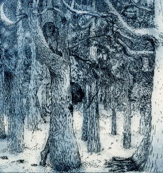
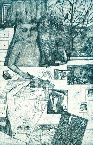
Finally and most importantly, the golden rule; be consistent (even if inconsistency is your consistent theme!).
Once you've found a way of working through months or years of experimentation, research, hard work and focus, always approach your creations with the same visual language. Too many conflicting ways of image making will make your work look indecisive and unclear.
Like any spoken language, you'll need to create rules - and stick to them - if you're going to achieve visual consistency. That may mean three specific ways you draw eyes; always combining two specific materials, or whatever. The rules will probably be both complex and appropriate to your work. If your language is clear, your work will have authority and integrity.
Words: Anna Wray
Anna Wray is an illustrator/author and a visiting lecturer on the Ba(Hons) Illustration at Cambridge School of Art. Check out her work and writing on her website.
Liked this? Read these!
- Illustrator tutorials: amazing ideas to try today!
- Great examples of doodle art
- Useful and inspiring flyer templates
Do you have any illustration tips you'd like to share? Give back to the community in the comments below!

Thank you for reading 5 articles this month* Join now for unlimited access
Enjoy your first month for just £1 / $1 / €1
*Read 5 free articles per month without a subscription

Join now for unlimited access
Try first month for just £1 / $1 / €1
The Creative Bloq team is made up of a group of design fans, and has changed and evolved since Creative Bloq began back in 2012. The current website team consists of eight full-time members of staff: Editor Georgia Coggan, Deputy Editor Rosie Hilder, Ecommerce Editor Beren Neale, Senior News Editor Daniel Piper, Editor, Digital Art and 3D Ian Dean, Tech Reviews Editor Erlingur Einarsson and Ecommerce Writer Beth Nicholls and Staff Writer Natalie Fear, as well as a roster of freelancers from around the world. The 3D World and ImagineFX magazine teams also pitch in, ensuring that content from 3D World and ImagineFX is represented on Creative Bloq.
