How to create great infographics
Great infographics can be a powerful tool for communicating complex ideas quickly and beautifully. In this tutorial Matthew Scharpnick, co-founder of Elefint Designs, puts you on the right track to create beautiful and meaningful infographics
In an internet age dominated by readers scanning short-form articles, how can we communicate something complex, nuanced, or dense in a short period of time? Queue the infographics.
If you read design-influenced publications such as GOOD, Fast Company, or Mashable, you have undoubtedly seen the flood of infographics that hit the web in recent years. Every day new infographics pop up on a wide range of topics including politics, economics, pop culture, technology, films, sports, and a whole lot more. At their best, these mixtures of design and data have the effect of drawing users in and conveying a lot of information in a small package.
Unfortunately, many of these infographics are created about trivial topics and many ignore important principals of information design. In the tutorial below, we help you separate the good from the bad, and show you how you might just get some great PR out of your creation. I use the example of Full Circle Fund (FCF), a non-profit we recently worked with to guide the discussion.
The strategy – what is the purpose? Who is the audience?
The key to any great design deliverable is to understand its purpose. Ask yourself, do you really need an infographic? Why? What is it that you are trying to communicate and to whom, and why is this the best medium to do it? Take some time to figure out the audience(s) and the message before you move into design. Some good uses for infographics include drawing attention to complex issues, providing clarity about the mission and activities of a program or organisation, visualising and beautifully displaying data, and drawing rich comparisons between competing positions, products, or ideas. Generally the more complex and rich the data, the more design is needed to simplify it. Once you are clear on the strategy, it's time to track down the right data.
Full Circle Fund (FCF)
For Full Circle Fund, the key was to explain the organisation and its activities in a simple way that engaged viewers.
Gather data and synthesise
Once you decide an infographic is a good fit for your project, you have to gather the data that will be used in the piece. To create a good infographic, you want to strip away the unimportant data, and highlight what people actually care about. The source data can take many forms depending on the type of infographic you are creating.
FCF
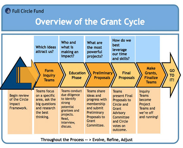
Gathering the data on this specific project meant digging through PowerPoint presentations and web pages to identify the most important pieces of information. FCF has a unique model, where it groups successful professionals into circles that lend time, money, expertise, and connections to local non-profits in a highly engaged model of philanthropy. Highlighting this unique model in a way that was fun and digestible became the focus of the piece. We then looked through all of their collateral materials to find the most important pieces of content and started figuring out how the whole thing would fit together.
Get the Creative Bloq Newsletter
Daily design news, reviews, how-tos and more, as picked by the editors.

Design
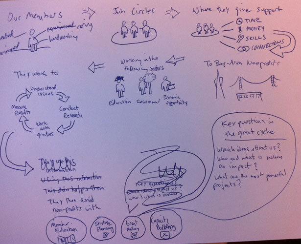
At Elefint, we always like to start out our design process with some sketching. This allows you to get all the relevant pieces down on paper, and start to figure out the best way to tie things together into a coherent theme. It’s important to figure out which pieces of content are the main focus of the piece, and which pieces are secondary. Some infographics lump everything together into a long scrolling document, and while this can sometimes be the best design, we often like to use sidebars to break things up and make the design more digestible.

Once you know where everything is going, and the design phase begins, it's really important to use the best principles of information design. By far our favourite source for these ideas is the work of the brilliant Edward Tufte. His books are incredibly valuable for anyone designing infographics.
Here are a few information design principles we always consider:
- Data Density: how much information can you work beautifully into a small space? Generally, the more points of data you can clearly show, the better. We think the best infographics compile large amounts of data into a story that gives the viewer deeper levels of understanding.
- Accuracy: Some graphics, unintentionally or otherwise, use things such as multiple scales or distorted perspectives to present data in ways that mislead viewers. Make sure your data is correct, and that the design doesn’t misrepresent the conclusions of the data.
- Ease of use: Think about the viewers. Where are they going to see this piece? Will it be displayed online or in a PowerPoint presentation? Will someone want to print it out? This not only determines the aspect ratio and size of the piece, but encourages you to do things like label graphs rather than use legends, or at least put legends in a place that viewers can very easily refer back to.
FCF
For this infographic we wanted to make a dramatic departure from Full Circle Fund’s existing charts full of a variety of shapes and paragraphs of text that made them somewhat confusing and hard to engage. We used people and icons drawn in a playful and friendly style to make this chart something a kid could understand. Combined with carefully selected content, we ended up with an infographic that was fun, simple, and full of important data.

PR
PR is a subject all of its own. However, at Elefint we have found that infographics are particularly attractive to certain media outlets and blogs. A Google search will turn up a lot of online platforms that regularly feature infographics. If you do quality work on a subject that matters and is timely, you have a good chance of getting your work featured. In addition to these, think about who might care about the content of your infographic. For example, if you are creating a piece on politics, check out political publications. Depending on the subject of your piece, there are likely a number of outlets that would love to liven up their text heavy coverage with a beautiful and illuminating infographic.
Conclusion
Infographics are getting really popular these days. In our experience the best ones are about important subjects where carefully selected content can provide new perspectives. The best infographics combine the most important principles of information design with visual design styles that make them accessible and desirable to viewers. When all these elements come together, you have a work of art that will attract attention and promote better understanding of important issues.

Thank you for reading 5 articles this month* Join now for unlimited access
Enjoy your first month for just £1 / $1 / €1
*Read 5 free articles per month without a subscription

Join now for unlimited access
Try first month for just £1 / $1 / €1

The Creative Bloq team is made up of a group of design fans, and has changed and evolved since Creative Bloq began back in 2012. The current website team consists of eight full-time members of staff: Editor Georgia Coggan, Deputy Editor Rosie Hilder, Ecommerce Editor Beren Neale, Senior News Editor Daniel Piper, Editor, Digital Art and 3D Ian Dean, Tech Reviews Editor Erlingur Einarsson, Ecommerce Writer Beth Nicholls and Staff Writer Natalie Fear, as well as a roster of freelancers from around the world. The ImagineFX magazine team also pitch in, ensuring that content from leading digital art publication ImagineFX is represented on Creative Bloq.
