Letterhead design: 16 beautiful examples
The best examples of letterhead design to spice up your stationary.
Sign up to Creative Bloq's daily newsletter, which brings you the latest news and inspiration from the worlds of art, design and technology.
You are now subscribed
Your newsletter sign-up was successful
Want to add more newsletters?
A beautiful, memorable bespoke letterhead design is a great way to enhance your brand and showcase your design skills at the same time, and can be put to use on your mail-outs, covering letters to accompany your design portfolio, invoices, and so on.
The way you design your letterhead is now about way more than simply placing your name, address and contact details aligned to the right, and not utilising this element is a wasted opportunity – especially since it is often the first thing a prospective employer or client will see.
So you want to create your own? First, you need to decide what message you want to send. From using the right font (try these free script fonts to get you started) to the perfect layout, your choices say something about your business, whether you're a freelance graphic designer, or you sell vintage designs online.
Article continues belowWhatever you do, your letterhead should creatively reflect you and your brand. Here are 14 examples of beautiful letterhead designs to inspire you. Plus, see these creative letterpress business cards to learn how to take every opportunity to convey your brand message.
01. Simon
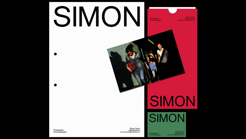
This letterhead design was part of a cohesive visual identity project for a friend of the designer. Filippos Fragkogiannis created the letterhead, business card and envelope for a photographer called, you guessed it, Simon. It's simple, bold and, most importantly, you won't miss or forget the name of the brand. The designer says: "Because it's simple, clear and adjustable, the informational structure achieves a standardised visual system. It was created using the Classic Sans font by Gert Wiescher."
02. A Panzer
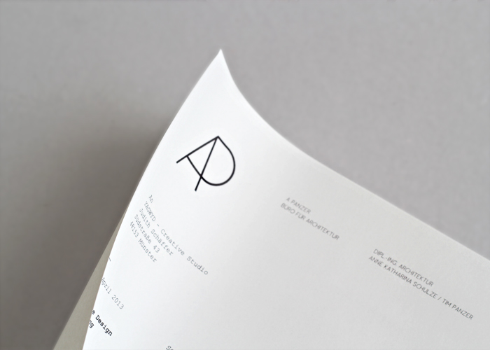
This simple yet elegant letterhead design is a beautiful example of how less can be so much more. Designed by creative studio, You Always Get What You Deserve, this minimalistic design sees the company logo, name and founders printed in the top spot, leaving readers in no doubt as to who the gorgeous correspondence is from.
03. Musto B&B
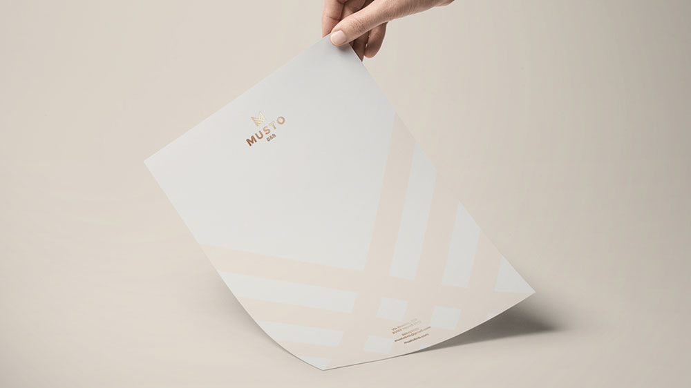
Lorenzo Rocco is the designer behind this beautiful foil blocked letterhead for Musto, a bed and breakfast in the centre of Naples, Italy. The gold runs throughout the whole logo design and brand identity, conveying elegance and understated Italian style.
Sign up to Creative Bloq's daily newsletter, which brings you the latest news and inspiration from the worlds of art, design and technology.
04. École nationale supérieure des Arts Décoratifs
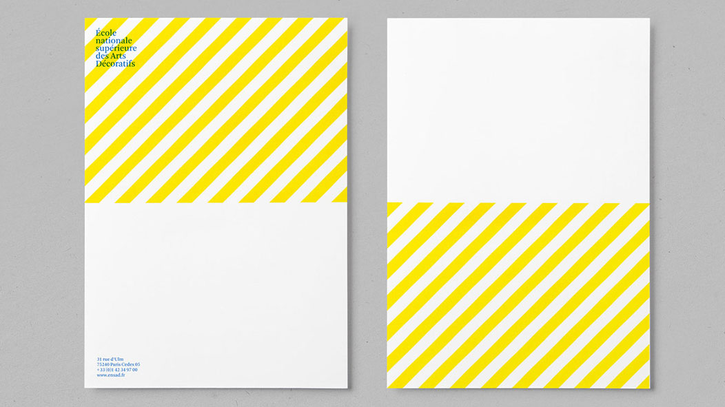
An art and design university should have well designed print materials, and we love this letterhead for the École nationale supérieure des Arts Décoratifs in Paris, France. Created by Atelier trois, the fresh yellow and blue colour scheme runs throughout the school's branding design.
05. Ted Perez & Associates
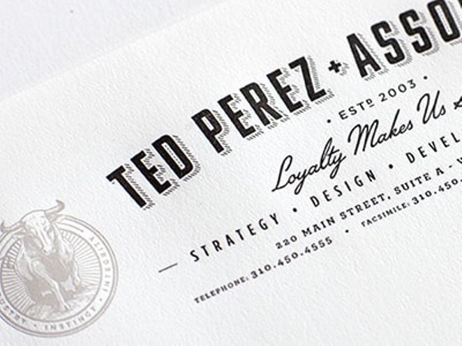
There's nothing quite like a bit of beautiful type to get some attention, which is the focus of this letterhead design for Ted Perez & Associates. Created by Alex Rinker, the design mixes a bold, shadowed sans serif with a vintage-style script font to create an eye-catching piece.
- Also read: The best free fonts for designers
06. Pixelflix
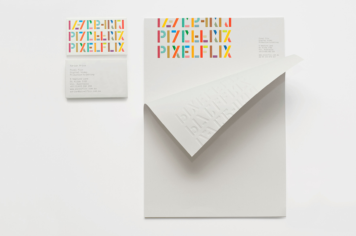
Australian agency A Friend of Mine created an identity package for Pixelflix, a digital production and editing company, including an eye-catching embossed letterhead. The idea of the branding is to reflect the nature of Pixelflix's work: taking an assortment of confusing and out-of-context scenes, and rearranging them into a coherent whole.
07. Modhouse
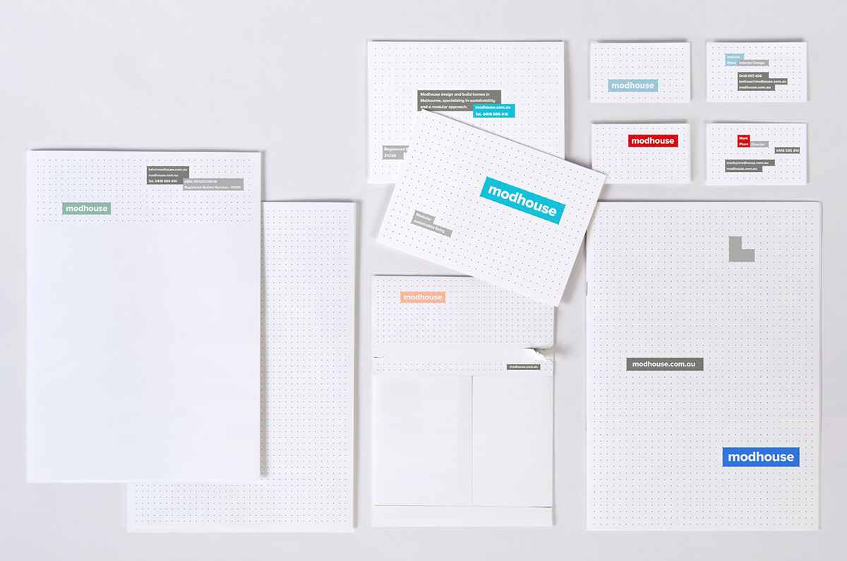
Another letterhead from A Friend of Mine – this time for Modhouse, which builds modular homes for people who want a quality, contemporary, sustainable home in a short timeframe. The grid-based identity system allows modules to be flexibly arranged in dynamic layouts to best suit the given content and context, and the bold typography and varied palette reflects the Scandinavian style of Modhouse homes.
08. Bronx Zoo
Created by designer Caroline Madigan, the concept behind this design was to capture the interactive nature of a trip to the Bronx Zoo for both children and adults. The letterhead 'speaks' to the recipient with sounds of the zoo animals printed beautifully with a selection of different fonts.
09. Bittersuite
The Bittersuite logo itself is a beautifully designed ambigram – a graphic that spells out a word not only in its original form but also in another direction or orientation. Featured prominently on the letterhead, the design also incorporates a playful concept where a simple fold in the top corner creates another illustration
10. SHE
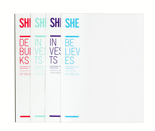
SHE (Sustainable Health Enterprises) is a New York-based organisation whose mission is to improve the quality of life for women and girls in developing countries. The team at Blok Design in Toronto, Canada, came up with these gorgeous letterhead designs, where SHE stands tall at the top of the page, emphasised by a bold underscore and varied colour palette.
11. Wine Concepts
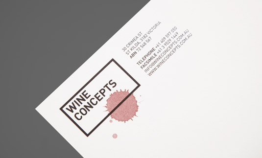
When multidisciplinary creative agency Hunt&Co was asked to develop a new identity and branding for Melbourne-based wine consultant Wine Concepts, it came up with this simple but effective design. The logo represents a stylised wine label and (our favourite bit) features overprinted wine drops to reinforce the brand and emphasise the product.
12. One Flew South
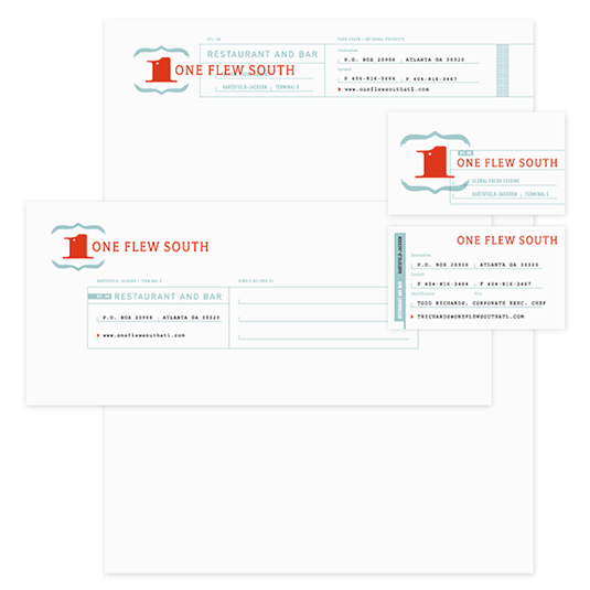
Graphic designer Alvin Diec is the man behind this cool letterhead and branding concept for restaurant and sushi bar One Flew South. Located in Atlanta's Hartsfield-Jackson airport, Diec worked with the brand's original patriotic colours, resulting in this sophisticated design.
13. Musica
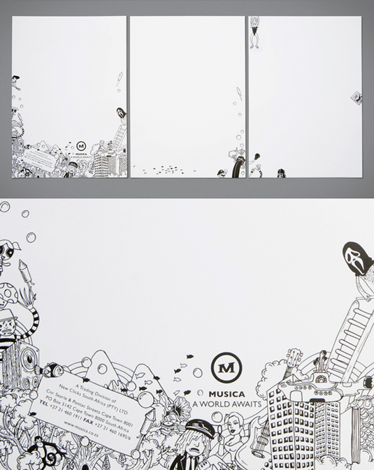
OK, so technically this is a letter-footer rather than a letterhead, we know but with such a gorgeous design we decided to ignore that technicality. Musica is the largest music retail group in South Africa. And the job of developing a rebrand fell at the feet of graphic design agency Studio Botes, which used detailed black and white illustrations to depict the world of Musica.
14. Dylan's Barbershop
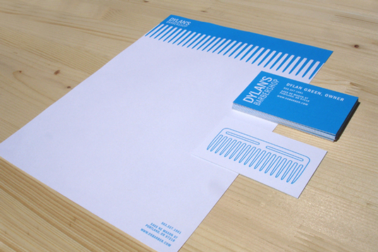
We love this obvious but brilliant comb letterhead design for a startup barbershop in Portland, Oregon. Graphic designer for Nike Sportwear, Lizzy Green, came up with the concept for this eye-catching identity.
15. Best Men's Ties
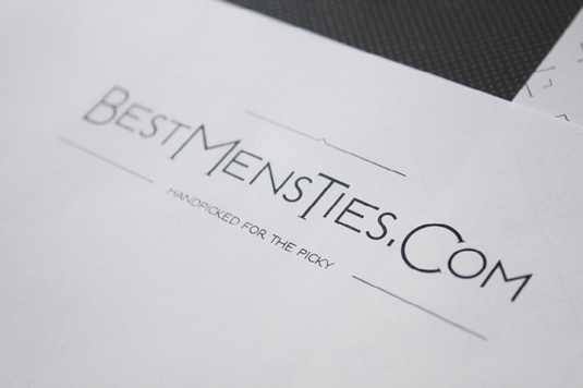
This elegant, stylish design for high quality tie retailer Best Men's Ties was created by Croatian design studio Cipmann. The brief was to create a 'visual identity that will communicate elegance and style to men who enjoy fine neckwear'. And this classy design does just that.
16. Absurd Machine
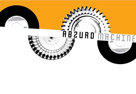
This vibrant letterhead for music and video production company Absurd Machine leaves you in no doubt as to who you're receiving a letter from. The clever concept by graphic designer Jessica Benz features vinyl records and film rolls in an eye-catching design, which surrounds the company name.
Related articles:

Kerrie Hughes is a frequent contributor to Creative Bloq, and was once its editor. One of the original CB crew, Kerrie joined the team back in 2013 after moving from her role as staff writer on 3D World. Since then she's written regularly for other creative publications such as ImagineFX, Computer Arts and Digital Camera World. After a stint working for the police, Kerrie is back reviewing creative tech for creative professionals.


