10 examples of flat design that work
2013 saw the rise and eventual domination of flat design in icons and more - take a look at 10 examples that work.
Flat design was one of the biggest design trends of 2013 - shunning all of the 3D, pseudo-realistic or skeuomorphism-based design techniques in favour of a more simplified, classically digital aesthetic. Love it or hate it, companies across the world jumped on the flat design bandwagon. Here, we take a look at some of the best examples from the past 12 months...
01. iOS 7
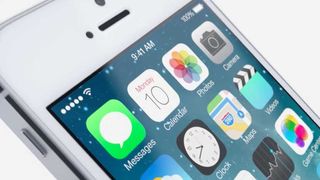
The mobile operating system that launched a million flat icons... Under Jonathan Ive, Apple went a long way down the minimalist, flat design route, although the design is not totally free of gradient or flourish. It's essentially an evolution of the look that at first glance looks fresh and modern while still recognisably iOS. The icons have been redesigned with a new palette of colours and all the elements, including the surrounding chrome, are flatter.
02. Tick
You thought you'd seen flat design on iOS 7? Really? Well, Tick would like a word. It's a to-do list app - of the type that, honestly, you probably don't need, what with the built-in Calendar and Reminders apps doing perfectly serviceable jobs and that - lent desirability by how thoroughly customisable it, and by its sheer flatness.
03. Instagram
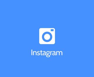
During 2013, designers were queuing up to flatten major digital brand identities. One such designer Shadman Ahmed who came up with this eye-opening concept just in case photography app Instagram should decide to follow the flat design trend. Ahmed, who specialises in UX and UI design, created the concept interface to give "a cleaner looking UI for Instagram".
04. Etch
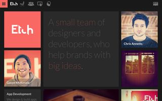
An app design studio based in Canterbury, Kent, Etch describes itself as "5 designers, 2 developers and 1 person counting the pennies". Working across iOS, Android and the web, the studio specialises in UI design, and it practises what it preaches on its own portfolio website.
The website’s look and feel has an unmistakable 'Windows 8' flavour to it, built around a sliding grid of coloured squares and clean, thin sans-serif type. A strip of flat-colour pictograms comprises the navigation bar, rounding off the flat design effect nicely.
05. Taasky
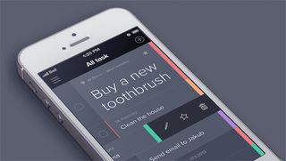
This rather crisply designed task management app is proudly minimalist, putting simplicity, speed and ease of use above of all else. Taasky is all about prioritising tasks, with the rationale that we work best when focusing on one thing at once - hence the larger 'priority' task at the top of the list.
06. Car logos

Inspired by the failure of clothing giant Gap's simplier logo, designer Philadlj decided to turn his hand to the world's favourite car logos. Simplifying the likes of BMW, Fiat and Honda, he has taken the fuss out of the original logo designs and reimagined this series of stripped-back offerings.
07. Facebook

This logo needs no introduction - but here's one anyway. Months before iOS 7 was released, social network Facebook quietly released a new flat logo and icons (so nothing like this interesting 3D icon design we discovered). Most users would've had to inspect the new icon side-by-side with its predecessor to spot any differences, but that's not the point for a brand as strong as Facebook.
08. Ford Mustang

The logo for Ford's new 50th anniversary logo design for the enduring Mustang sports car was created by designer Michael Thompson and follows an internal design competition led by chief designer J Mays. Ditching the familiar, blingy, chrome-effect 3D galloping pony for a flat silhouette, the logo feature son Mustang merchandise in the build-up to the car's 50th anniversary on April 17, 2014.
09. Wiselist
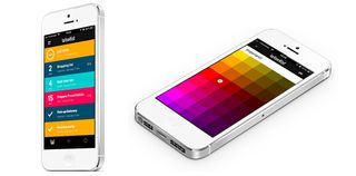
One of a slew of beautifully crafted task management apps that draw on the flat design aesthetic (such as Realmac’s Clear), Wiselist was designed by Albert Pereta and Miguel Sanchez, who describe it as "not only simple, but wise". Each of its colour-coded categories contain its own sub-checklists, notes or even relevant files to help you complete the task at hand.
10. Lorenzo Verzini
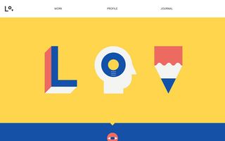
The neat little animated icons that are dotted around designer Lorenzo Verzini's site - including a blinking eye, sliding pencil, and flipping journal - are kept very graphic and simple, with a four-colour palette of red, blue, white and yellow tying the design together neatly.
Liked this? Read these!
- How to build an app
- Download the best free fonts
- The best collage maker tools - and most are free!
What do you think of the flat design trend? Will it continue for much longer? Let us know in the comments box below!

Thank you for reading 5 articles this month* Join now for unlimited access
Enjoy your first month for just £1 / $1 / €1
*Read 5 free articles per month without a subscription

Join now for unlimited access
Try first month for just £1 / $1 / €1
Get the Creative Bloq Newsletter
Daily design news, reviews, how-tos and more, as picked by the editors.
The Creative Bloq team is made up of a group of design fans, and has changed and evolved since Creative Bloq began back in 2012. The current website team consists of eight full-time members of staff: Editor Georgia Coggan, Deputy Editor Rosie Hilder, Ecommerce Editor Beren Neale, Senior News Editor Daniel Piper, Editor, Digital Art and 3D Ian Dean, Tech Reviews Editor Erlingur Einarsson and Ecommerce Writer Beth Nicholls and Staff Writer Natalie Fear, as well as a roster of freelancers from around the world. The 3D World and ImagineFX magazine teams also pitch in, ensuring that content from 3D World and ImagineFX is represented on Creative Bloq.
Related articles
-
-
-

-
