Create a website style guide
A website style guide is an ideal way to ensure brand identity, professionalism and consistency across your site. Steve Fisher explains how to go about writing one.
This article first appeared in issue 219 of .net magazine – the world's best-selling magazine for web designers and developers.
What is a style guide? Put simply, it’s the document that tells you how to tell your story. It establishes writing rules, voice, typographical treatment, visual elements and interaction decisions. Style guides originated in the print world – every newspaper has one, for example (check out The Guardian’s). And the concept has proved eminently transferable to web projects.
- Check out the latest features in Photoshop CS6
The key to both print and online is content. Making that content clear and consistent, and ensuring it sings with one voice, is the aim of the style guide. A fantastic example of a website style guide is the one for BBC Global Experience Language (GEL).

Story of a system
Done well, a style guide should read like the autobiography of your website project, enabling others to understand, interact with and extend the site. It takes all the knowledge and experience stored up about a project in one person (or a team) and lays it out in black and white. A style guide tells the story of a design system, explains the design thinking and enables other people on your team, or a future team, to take action.
Why write all this down in a formal document: shouldn’t you just instinctively know it? Well, assuming you don’t do everything yourself (business strategy, research, content strategy, UX, design, buildout, engineering, QA and launch), there’s a point where you have to hand over to others.
As interaction designers, we often do this once the user interface is done and the site is ready for implementation. And it can be a scary moment.
Does this scenario sound familiar? You have a perfectly crafted design built in Photoshop or Fireworks. Every pixel is where it belongs, line heights are perfect and colours are full of meaning. Great – but if you’re not building the website, how do you communicate every element of your design to another company that will implement it, or even to another internal department of frontend developers?
Get the Creative Bloq Newsletter
Daily design news, reviews, how-tos and more, as picked by the editors.
Think of all the important design decisions you’ve made along the way. That subtle one-pixel grey pencil line that perfectly frames the 60 per cent opacity content box. The 20-pixel padding, the 40-pixel margin, the … well, the everything.

Consistency
We put thousands of different decisions into our designs. Each obvious element and every omitted element holds meaning and affects the user experience. To document every one of these would take as long as creating the actual design. This isn’t what our clients want to pay for, nor what we really want to spend our time doing to finish the project.
A style guide enables us to square this circle. Rather than dictating the position of every pixel, it sets out the general design principles for everyone on the project to follow. This helps to ensure your design vision will survive, even if you’re no longer working on the project.
All elements of an interface should have at least one thing in common: consistency. They should live and breathe the essence of the design that’s been created and become part of a larger design system. Someone using your site, even or especially on various devices, should feel as though it all fits together.
As Nathan Borror, who wrote a great post in 2009 about interface harmony, says: “Interface consistency, if done correctly, should go unnoticed.” I’d go as far as to say that interface harmony should create delight in such a way that the user doesn’t even know why it is so delightful.
I’ve taken Borror’s concept one step further in my projects by incorporating an ‘interface harmony canvas’ into my style guide, which enables any person on the project to see all the elements of the site at a granular level. Every state of each element is exposed, along with code snippets, for quick implementation.
A side benefit that can arise from this approach is establishing a loose pattern library. Sure, the visual design of each element will need to change from project to project, but the pattern shouldn’t have to. Hurray for efficiency!
Don’t wait until you’re near the end of a project to start the style guide. It should be something that you’re working on throughout the design process, carefully adding to it as you progress. Thinking about elements as you create them and placing them in a style guide folder is a great habit to establish – items such as:
- Style tiles
- Universal grids
- Wireframes
- The interface harmony canvas, as it develops

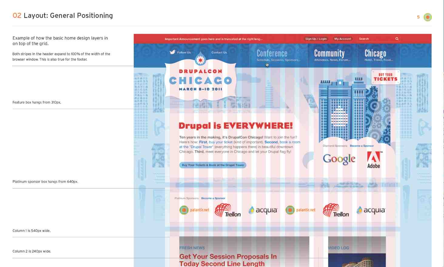
(Image courtesy of Palantir.net. Additional information about the DrupalCon Chicago project is available at http://www.palantir.net/experience/drupalcon-chicago)
All about communication
While it’s easy to get caught up in the details of a design, remember that the design itself is meant to communicate a message. It’s a response to a question, a business problem, an organisation’s issue … something macro. We need to communicate our design decisions in much the same way that we should be approaching the designs themselves – content first.
Mark Boulton says it well in his blog post titled “A Richer Canvas”: “It’s my belief that in order to embrace designing native layouts for the web – whatever the device – we need to shed the notion that we create layouts from a canvas in. We need to flip it on its head and create layouts from the content out.”
In other words, we need to start our style guide with the larger elements. If you force yourself to think about design elements on a global level before and as well as at the granular level, you’ll find that your designs become more harmonious.
So far, we’ve established that in communicating how to implement a design, a style guide should start with higher level items and flow down to the more detailed assets or sprites. Sound familiar at all? Yes, just like CSS (cascading style sheets), the key to all this is the cascade – cascading style guides, if you will.

Cascading style guides
Let’s remind ourselves how the logic of CSS works. In general, if you apply a style to something at the top of a style sheet, that style will “cascade” down and apply to everything related below it until something more specific is added.
Essentially, you start with the general, large picture items first and then add more and more details as you move along. The large picture items don’t need to be repeated because they’ve been defined. This works for CSS and it’s also enormously helpful in creating design style guides.
By following such logic, the system is established at the outset and allows those initial items to define the direction. For example, once the grid is defined you only need to talk about the elements that ‘break’ the grid.
Here, I’ll give you a basic outline for how a web design implementation style guide could flow:
01. The overview
A quick explanation of the project, your approach and your solution. Here’s your chance to communicate some of the overarching “whys” and what people should keep their eyes open for in general. It’s the perfect time to set the tone and voice of the site. This is where you can talk a bit about the content strategy for the project.
02. Layout
Your grid, general layout positioning and block placements. Where are certain global elements positioned, what’s the horizontal spacing and how are columns (if there are any) handled are all questions to answer here. This is also where your wifeframes should be included.
03. Branding
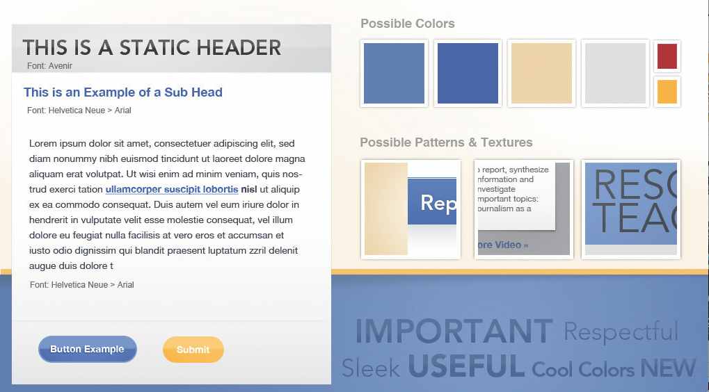
The colour palette, globally branded graphics and branding restrictions are covered in this section.
04. Typography
This isn’t where I’d cover the specific sizes of the type. I’d just explain what fonts are used and why they were chosen, and provide some examples of the implementation to offer context for the greater specificity to come.
05. Navigation
Text links, primary navigation, drop-downs, sub nav, navigational buttons, the search box … really anything that enables the user to find their way around the site should be covered here. We’re starting to arrive at a much higher level of detail. Link colours, treatments, text-decoration and more should be spelled out here. Remember, it may seem clear to you, but I operate under the assumption that it isn’t obvious. I want design decisions made by designers and I want coding decisions made by coders. It makes sense.
06. HTML elements
Headings (h1, h2, h3), lists, deck copy, button text, forms, fieldsets, tables and so on. It’s nice to have a comprehensive list that you refer back to on every project to ensure that you cover your bases. Again, having a consistent system will save you time and the headache of having to do something twice on a project.
07. Media
Unless you’re in the pre-1994 coding era (what do you mean, you don’t know about Netscape?), you’ve probably included various types of media in your design. Well, what are the image and video proportions throughout the site? Did you use a standard ratio? Are there image cache settings that you need to consider based on the CMS your client will be using? OK, that last one is a bit geeky, but it happens on most projects I work on, so I always keep it in mind.
08. Assets
This is where it really gets into the granular detail and you need to dig deep to finish. The devil is in the details. Every bit of customisation that couldn’t adequately be covered by the previous seven sections must be fleshed out here. How will different block elements be handled when in unique situations? What about those side bar adverts or the search results page after a failed search? What will comments look like when threaded or linear? How will photo galleries look and function throughout the site? Even at this stage it’s important to look for possible repeating patterns or elements. We don’t want to completely blow the budget.
09. Interface harmony canvas
Bringing it all together, this is one giant canvas or HTML page that has every element with every state displayed. If you’re able to include code snippets or have them added as the project progresses, that’s a huge bonus. The purpose of this portion of the guide is twofold: a quick reference for developers to grab elements for implementation and a place to check to see that all the elements fit together in perfect harmony.
10. UX documents
I know this is a bit of a broad title, but it’s a broad area to cover. It’s important to include the foundational deliverables that have been produced earlier in the project – items such as the sitemap, wireframes, screenshots of prototypes with links to them if they’re live, and personas. Often these earlier deliverables have helped and continue to help define the functionality, purpose and interactions of the site.

Using the style guide
Once you’ve followed these suggestions and completed your style guide, make sure that it doesn’t stay sat in a drawer, ignored! Post it to the right people using project management software or include everyone who needs to see this documentation in the relevant email thread. If you’re not sure who to include, ask the technical lead, project manager and project sponsor (owner) who they feel should have access to the style guide. It’s a foundational document for anyone working on implementation of the site, extending the design system or doing content creation. The goal is for everything to work well together, meeting or exceeding expectations. This involves a team effort.
Remember that distribution isn’t the end of the road – don’t stop talking about the importance of style guides. The more they become part of your culture and workflow, the more people will reference them. Plus this keeps them at the forefront of your mind as you work on projects, helping you to remember the need to communicate your decisions to others.
Include documentation in your PSDs through layers and assume that it isn’t obvious. No one is a mind reader – this is just a good UX mantra that should apply across our profession.
Standards and conventions aren’t there to hold you back from coming up with new solutions. They’re there to help you decide what’s a good idea and what isn’t. In his book Don’t Make Me Think, Steve Krug says all conventions start life as somebody’s bright idea. So as a rule conventions only become conventions if they work. Use them. They’re your friends.
Finally, an honest admission: I sometimes find creating web design style guides a bit tedious – and that’s perfectly okay. Don’t use that as an excuse not to create one, though, or you’ll end up repenting at your leisure. Believe me, they really are key to a successful project: worth their weight in gold and then some.
Steve Fisher yellowpencil.com/ is the creative team nerd-herder at Yellow Pencil in Canada. He leads the charge on coordinating research, business analysis, visual and interaction design, and content strategy. On the global stage he's a sought-after speaker on topics like responsive web design, UX, open source, design thinking, and web process. He also loves Twitter (maybe a little too much).

Thank you for reading 5 articles this month* Join now for unlimited access
Enjoy your first month for just £1 / $1 / €1
*Read 5 free articles per month without a subscription

Join now for unlimited access
Try first month for just £1 / $1 / €1

The Creative Bloq team is made up of a group of art and design enthusiasts, and has changed and evolved since Creative Bloq began back in 2012. The current website team consists of eight full-time members of staff: Editor Georgia Coggan, Deputy Editor Rosie Hilder, Ecommerce Editor Beren Neale, Senior News Editor Daniel Piper, Editor, Digital Art and 3D Ian Dean, Tech Reviews Editor Erlingur Einarsson, Ecommerce Writer Beth Nicholls and Staff Writer Natalie Fear, as well as a roster of freelancers from around the world. The ImagineFX magazine team also pitch in, ensuring that content from leading digital art publication ImagineFX is represented on Creative Bloq.
