How to design a favicon: The ultimate guide
All you need to know about favicon design: Golden rules, tips and a handy favicon cheatsheet.
Favicon design is more important than you might think,. Size really does matter here as a well-designed logo needs to be recognisable at whatever size it's seen at. It needs to scale from massive screens right down to an icon that can be as small as 16 x 16 pixels, known as a favicon. A great example of favicon design is the Google logo. It works perfectly for bigger screens with its big 'G' and distinctive four-colour text. And it's still as recognisable when shrunk down to the tiny four-coloured 'G' seen in a web browsers address bar.
The favicon can also be seen as a shortcut icon, a tab icon or a bookmark icon, so it needs to look the part. To see favicon designs that work, see our roundup of logo design inspiration and check out this stunning collection of iOS app icons that get it just right.
In this article, we are going to run through the process of how to design the perfect favicon. We'll include specific tips for creating a favicon for Apple devices, Android, Chrome, Opera and Safari. Plus a handy guide to the different favicon sizes and formats you need to know. Use the Quick Links (right) to jump straight to the section you want.
- Looking for a different kind of icon? See our guide to the best free icon sets
In the early days of the web, a favicon was simply a 16x16px icon file, but nowadays it's a little more complicated. There are different favicon sizes and processes for different contexts. Creating a proper favicon is a science.
So, we are going to kick-off with some top tips for what your favicon should look like, and then move on to specific advice on how to create a favicon for different contexts. We'll be using the template available on Apply Pixels to easily generate the different favicon sizes required, and the favicon from Apply Pixels as an example.
Favicon design rules
01. Make it recognisable
The first thing to consider when designing a favicon is what needs to be represented in the canvas. Remember that your favicon is only displayed to the user when they are already on your website or have bookmarked it. So there's no need to try and attract the user with your favicon.
02. Use your logo
Consider favicons as sober signposts that aid users in recognising your website when browsing their bookmarks lists and homescreens. Therefore, you want to use your logo, or whichever symbol most easily lets the user recognise your website. If you don't have a logomark that fits the quadratic canvas, use the most recognisable part of your logo.
03. Keep it clear
There are also a few things you should avoid. Don't use the favicon as a marketing tool – that means no price tags, 'new' or 'updated' banners and so on. In fact, you don't want to put text inside the favicon at all. Text doesn't scale well, and the chances are it's going to be illegible anyway. Finally, don't use a photo – it will be muddy and unrecognisable at the size it's going to appear at.
04. Create two versions
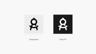
When favicons were first introduced in Internet Explorer 5, they appeared in the URL bar and in the bookmarks list. Today, favicons are displayed in a lot of other contexts, including bookmarks lists, shortcut menus and even mobile and TV homescreens. This makes it hard to predict how your favicon will be displayed to the end user.
To ensure your favicon looks good in the many different contexts it's going to appear in, ideally you should provide two favicon styles:
Logo on transparent background
This version is shown in the URL bar, bookmarks lists and other places where the favicon appears next to your website URL or name.
Logo on solid fill
This version is used in grid-like bookmarks and shortcut menus where the browser or device masks the background, to achieve a uniform look in context.
Favicon size cheatsheet
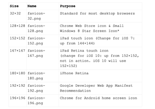
As mentioned before, different contexts require different sized favicons. Below you can see a quick guide to the different formats and dimensions you'll need to supply to cover all of the main use cases.
Previously favicons had to be provided in the ICO format. Today it's okay to provide the files in PNG format (except for the Safari Pinned Tab icon which should be provided as SVG).
If you want an easy way to design and export all favicon sizes, take a look at the favicon template over at Apply Pixels.
Now let's take a closer look at the specific requirements of different use cases.
Desktop browser favicons
How to create a desktop browser favicon
Let's start with the most straightforward favicon you'll need to create: a classic favicon for the classic desktop browsers. This type of favicon works best on transparent backgrounds, as it will often appear in the URL bar and in bookmarks lists.
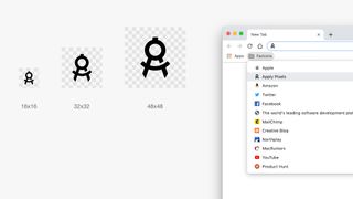
You'll need to provide this type of favicon in three sizes, all in PNG format with a transparent background.
- 16x16
- 32x32
- 48x48
Apple
How to create Apple Touch favicons
Apple's iOS uses Apple Touch Icons to represent websites that have been saved to the iOS home screen as bookmarks. This means that the Apple Touch Icon will be rounded to the squircle mask of iOS app icons.
It'll also be displayed against whichever background the user has chosen for their homescreen. With this in mind, your Apple Touch Icon should have a solid fill background style.
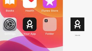
Apple favicons should be supplied in a PNG format. You can get away with providing a 180x180 Apple Touch Icon that will automatically scale for the various iPhone and iPad sizes. This will work fine in most cases.
If not, you can provide additional sizes for the different Apple devices:
- 60x60
- 76x76
- 120x120
- 152x152
- 180x180
<link rel="apple-touch-icon" sizes="60x60" href="/apple-touch-icon-60x60.png">
<link rel="apple-touch-icon" sizes="76x76" href="/apple-touch-icon-76x76.png">
<link rel="apple-touch-icon" sizes="120x120" href="/apple-touch-icon-
120x120.png">
<link rel="apple-touch-icon" sizes="152x152" href="/apple-touch-icon-
152x152.png">
<link rel="apple-touch-icon" sizes="180x180" href="/apple-touch-icon-
180x180.png">
Android, Chrome and Opera
How to create a favicon for Android, Chrome and Opera
Android, Chrome and Opera use the android-chrome-192x192.png and android-chrome-512x512.png that Google recommends.
Since the introduction of adaptive icons in Android, websites added to the Android homescreen will mask the 192x192 design, so the icon takes shape after the user's preferred masking style. This might be a squircle, ellipsis, rectangle, rounded rectangle or teardrop shape.
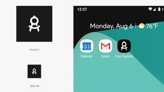
You need to create a PNG favicon with solid background, at 192x192 and 512x512.
Implement these favicons by adding a manifest.json file to your site and linking to it within the tags:
<link rel="manifest" href="/manifest.json">Here is the code for the manifest.json file:
{ "name": "", "short_name": "", "icons": [ { "src": "/android-chrome-

192x192.png", "sizes": "192x192", "type": "image/png" }, { "src": "/android-
chrome-512x512.png", "sizes": "512x512", "type": "image/png" } ], "theme_color":
"#ffffff", "background_color": "#ffffff", "display": "standalone" }
Safari
How to create a favicon for Safari's pinned tab
This is the odd one out, and it is the only favicon that needs to be provided in vector format as an SVG file. It displays as the thumbnail icon when a user pins a tab to the Safari browser window.
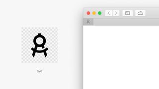
This favicon needs to be a 100% black SVG file with a transparent background. The SVG can only be one layer, and safari requires the viewBox attribute of the SVG to be set to "0 0 16 16".
<link rel="mask-icon" href="your_icon.svg">Other favicon types
There are some favicon dimensions and formats that were not included in this article eg. Google TV, Chrome Web Store and pre-iOS 7 Apple Touch Icons. Why? Because they have been deprecated or because they are rarely relevant for the average web developer.
In general, developers and designers should strive to support as broad a variety of devices and operating systems as possible, but sometimes it just does not make sense. But, if you want to see a more complete list of favicon images, make sure you take a look at this favicon cheat sheet on GitHub.
Read more:

Thank you for reading 5 articles this month* Join now for unlimited access
Enjoy your first month for just £1 / $1 / €1
*Read 5 free articles per month without a subscription

Join now for unlimited access
Try first month for just £1 / $1 / €1
Get the Creative Bloq Newsletter
Daily design news, reviews, how-tos and more, as picked by the editors.
