Create an interactive bubble chart with HTML5 canvas
Josh Marinacci, software engineer, researcher, part-time designer, and general miscreant, explains how to use HTML5 canvas to build an interactive chart that works on desktop mobile and then populate it with real data
Infographics are a way to make data understandable and entertaining. Some achieve their goal through creative graphic design, such as print infographics. Others achieve it through animation and interactivity. The best example I've recently seen is a series of talks by imaginative speaker and professor Hans Rosling. I highly recommend you watch his 20 minute whirl of a TED talk where he debunks common myths about the developing world.
The key to Professor Rosling's success is that he renders public data in a form that non-experts can understand. The core of his work is an amazing bubble chart that compares areas of the world over time. In this article I will show you how to create an attractive bubble chart using HTML Canvas populated with real data from the World Bank.
What is a bubble chart?
A bubble chart is just what it sounds like, a chart made of bubbles – or really from circles. But the power of the bubble chart is in the way it can visualise up to five dimensions of data at once. Each bubble represents some datapoint along the X and Y axes, much like any other line graph or scatter plot. However, the size and colour of each bubble can also represent two more dimensions. If we animate the chart, then we can add time as a fifth dimension.
While each of the five attributes of a bubble chart could be used to represent any kind of data; in practice we usually use the X and Y axes for typical numeric data and reserve the bubble colour to distinguish between data sets. For example: X and Y might represent child mortality and literacy rates, while the bubble colour represents the country. The bubble size should be used to represent something that is a quanity, such as the population of a country. The fifth axis of time (when animating) should be used to actually represent time, say the data points from 1960 to the present. Careful and creative use of these data dimensions is what separates a great infographic from just another chart.
Making a simple chart from mock data
Let's start by making a simple bubble chart using mock data. The data itself should represent data points over time grouped by some criteria. Let's assume we have five countries and 20 time points (1980 through 2000). Each data point will have an x, y, and size. The code to initialise this mock data looks like this:
var data = [];for(var t=0; t<20; t++) { var cdata = []; data[t] = cdata; for(var country=0; country<5; country++) { cdata.push({ x:50+Math.random()*500, y:50+Math.random()*300 , size: 3+Math.random()*20, country: country}); }}Now we need to draw the data on screen as bubbles. The code looks like this.
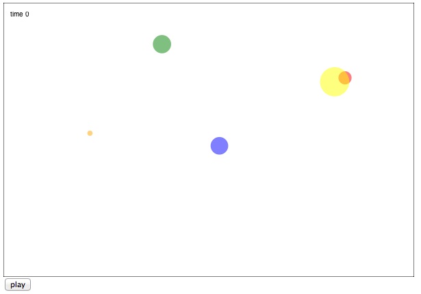
var canvas = document.getElementById('canvas');var ctx = canvas.getContext('2d');var colors = ["red","green","blue","yellow","orange"];var time = 0;function draw() { //bg and border ctx.fillStyle = "white"; ctx.fillRect(0,0, canvas.width,canvas.height); ctx.strokeStyle = "black"; ctx.strokeRect(0,0,canvas.width,canvas.height); //time indicator ctx.fillStyle = "black"; ctx.fillText("time " + time, 10,20); //draw the data for the current time slice data[time].forEach(function(d) { ctx.save(); ctx.fillStyle = colors[d.country%colors.length]; ctx.globalAlpha = 0.5; ctx.beginPath(); ctx.arc(d.x,d.y,d.size,0,Math.PI*2); ctx.fill(); ctx.restore(); }); }The code above fills the background with white and draws a background border, using the size of the canvas. Then it draws the current time indicator and finally draws the data itself. Each data point is drawn as a circle using the x, y, and size of the current point. The colour is based on the country, chosen from a preset list of colours.
Get the Creative Bloq Newsletter
Daily design news, reviews, how-tos and more, as picked by the editors.
The basic chart looks like this:

To make the chart animate over time we just need to call draw repeatedly with a different time variable.
$("#play").click(function() { var animdraw = function() { draw(); time++; if(time < data.length) { setTimeout(animdraw,100); } else { time = 0; } } animdraw();});The World Data Bank
So that's it for a basic chart. Let's update it with some real data to make it more interesting. There is a great organisation called the World Data Bank. They have amazing data sets culled from the UN and other public data sources. In addition to hosting the data bases, they have a custom report generator which lets you create data slices to download in a variety of formats.
For this article choose the 'World Development Indicators and Global Development Finance' database. Then select some countries or aggregates. I chose 'East Asia & Pacific', 'Europe and Central Asia', and 'Latin America & Caribbean'. Now choose topics to look at. These will be the X and Y variables. I chose 'Mortality Rate' and 'Population Density'. I also chose 'Population Total' so we can compare the size of countries using the size of our bubbles. Finally choose the desired years. I simply pressed the 'select all' button to choose every year available, 1960 to the present.
Now we have a report. Click the Export button to download the data as a CSV file. You can open the CSV file in Excel to have a look at what the World DataBank gave us. If you open it up in Excel, you will see that each country/region has three rows, one for each variable we chose. Some values are missing in the early years. This means that value wasn't collected for that country in those years.
Parsing CSV Data
If you open the report in Excel, it will look like just a bunch of rows. We need to parse this data into something we can use. To process the data files we need a CSV parser. This is one of those cases where there is zero value in writing your own parser from scratch. I downloaded the one from Ben Nadel here. It works very well.
To load the CSV file and parse it I'm using an AJAX call with jQuery.
$("#load").click(function() { $.ajax({ url: "data.csv", context: document.body, success: function(c) { var csvdata = CSVToArray(c); console.log("got to here " + csvdata[1]); } });}The CSV file is parsed into rows which are subdivided into columns. We can process it by looping through each column, then do each row.
data = [];//start at 9 to skip non-year columns and first few yearsfor(var t=9; t<csvdata[0].length-1; t++) { var cdata = []; //loop through rows by threes for(var i=1; i<csvdata.length-1; i+=3) { var row_mort = csvdata[i]; var row_dens = csvdata[i+1]; var row_total = csvdata[i+2]; var country = (i-1)/3; cdata.push({ x:row_dens[t] , y:row_mort[t], size: row_total[t], country: country, }); } data[t-9] = cdata;}Note that have started at column 9 to skip the metadata (country names, and so on) as well as the first few years of data points since the values are missing for some of them. When I loop through the rows I go by threes so that we handle one entire region/country per pass.
If we just draw the data as is we won't see anything. The entire canvas will be filed with a single colour. Not what we want. This is because the data isn't scaled properly. For example, the size of East Asia and Pacific is already over one billion in 1960. To draw the chart we need to scale down the values. To leave the data unmodified I have applied the scaling at drawing time. I changed the arc command like this:
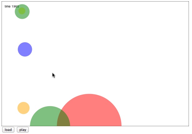
ctx.arc( d.x*6, canvas.height-d.y*2.5, d.size/(1000*1000*11), 0,Math.PI*2 );I have modifed the x, y, and size values to fit within the canvas. The size has to be divided by 11 million to have reasonable values for the bubble radius. The y value is multipled by 2.5 and then subtracted from the canvas height. The standard coordinate system in canvas starts at the upper left so subtracting from the canvas height will flip the y axis.
The values I have chosen to modify the data variables are arbitrary. I chose them specifically to make the chart look nice. The value you choose for your chart will depend on the specific data you end up drawing. In a future version of this chart you could write a routine to analyse the data and look for reasonable values, say by calculating the max and min for each variable.
The chart now looks like this:

Adding interactivity
Animating the chart is nice, but what truly makes it interactive is letting the reader tap on different bubbles to get more information. Since canvas uses pure pixels rather than shapes we need our own routine to calculate which shape was clicked on. Fortunately, since the bubbles are perfect circles, this is very easy. Just calculate the distance from the clicked point and the centre of each bubble. If the distance is less than the radius, then the shape was clicked on.
$("#canvas").mousedown(function(e) { displayInfo = false; data[time].forEach(function(d) { var x = d.x*6; var y = canvas.height-d.y*2.5; var radius = d.size/(1000*1000*11); var dis = dist(e.offsetX,e.offsetY,x,y); if(dis < radius) { displayInfo = true; displayCountry = d.country; } }); draw();});If the reader has clicked on a shape, then I set the displayInfo boolean to true, save the current country, and trigger a repaint. I also modified the draw function to add a little info panel in the upper right.
Notice in the additional paintin code that I pull the country data from the current time slice, not from the time when the user clicked on the chart. This means the country display will update even while the chart is being animated, so you can see the numbers change over time as well.
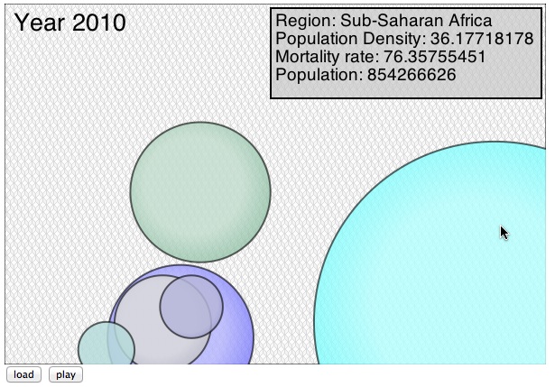
if(displayInfo) { ctx.save(); ctx.translate(canvas.width-305,5); ctx.fillStyle = "rgba(200,200,200,0.7)"; ctx.fillRect(0,0,300,100); ctx.strokeStyle = "black"; ctx.lineWidth = 2; ctx.strokeRect(0,0,300,100); ctx.fillStyle = "black"; var displayPoint = data[time][displayCountry]; ctx.fillText("Region: " + regions[displayPoint.country],5,20); ctx.fillText("Population Density: " + displayPoint.x,5,20+20*1); ctx.fillText("Mortality rate: " + displayPoint.y,5,20+20*2); ctx.fillText("Population: " + displayPoint.size,5,20+20*3); ctx.restore(); }Sprucing up the visuals
In general charts should not have so much visual flair that it detracts from the underlying data, but a nice selection of colours and patterns can make a difference. To make this chart look better I added a white overlay to the bubbles to give them a rounded effect. I also gave them a black border and choose a different set of base colours. Rather than calculating special gradients for each bubble colour I drew a base colour, then put a partially transparent radial gradient on top.
var radgrad = ctx.createRadialGradient( x-radius/10,y-radius/10,0, x-radius/10,y-radius/10,radius+30);radgrad.addColorStop(0, 'white');radgrad.addColorStop(0.5, 'white');radgrad.addColorStop(1, 'rgba(255,255,255,0.3)');ctx.globalAlpha = 0.6;ctx.fillStyle = radgrad;ctx.fill();To finish up the chart I've changed the fonts, added borders to the bubbles, and used a fun background pattern from SubtlePatterns.com. Here is the final result:

Conclusion
That's all there is to bubble charts. With the basic chart above you have a good head start on charts of your own. To improve the bubble chart you might want to scale the data automatically, let the user choose between multiple data sets, and interpolate between each time frame to make the animation smoother. You can download the full source to this project from here or from my website JoshOnDesign.com

Thank you for reading 5 articles this month* Join now for unlimited access
Enjoy your first month for just £1 / $1 / €1
*Read 5 free articles per month without a subscription

Join now for unlimited access
Try first month for just £1 / $1 / €1

The Creative Bloq team is made up of a group of design fans, and has changed and evolved since Creative Bloq began back in 2012. The current website team consists of eight full-time members of staff: Editor Georgia Coggan, Deputy Editor Rosie Hilder, Ecommerce Editor Beren Neale, Senior News Editor Daniel Piper, Editor, Digital Art and 3D Ian Dean, Tech Reviews Editor Erlingur Einarsson, Ecommerce Writer Beth Nicholls and Staff Writer Natalie Fear, as well as a roster of freelancers from around the world. The ImagineFX magazine team also pitch in, ensuring that content from leading digital art publication ImagineFX is represented on Creative Bloq.
