Ethan Marcotte's 20 favourite responsive sites
Ethan Marcotte, the father of responsive web design, has compiled a whole folder of responsive sites, each as flexible and foxy as the last. Here he rounds up 20 of his favourites.
Oh, the things I agonise over. Death. Taxes. Selecting 20 of my favourite responsive sites. All because I care, you guys.
So, a little context: I had the ridiculous honour of being interviewed by Jeffrey Zeldman, a friend and mentor, for .net magazine. But when I casually mentioned I’d been compiling a list of responsive designs I found inspiring, I quickly discovered the magazine’s editors are a sharp-eyed bunch. They pounced were kind enough to ask if I wouldn’t mind selecting a handful of sites from the list, and doing a brief write-up on each.
It needs to be said, you guys: this was impossibly hard. Don’t misunderstand me: it’s a joy to be given the opportunity to write up a few lovely sites, to gush over some of my favourite designers. But choosing just 20? My answers would probably change in a week’s time. And these lists are impossibly subjective.
But hey, who said discretion’s the better part of valour? Let’s dive in.
- How to get started in responsive web design
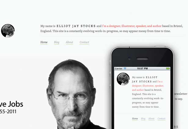
01. Elliot Jay Stocks
The ink’s not dry on this responsive redesign, as Elliot only released it to the world a couple of weeks ago after an afternoon’s work. That’s right: an afternoon.
I may hate him.
My crippling envy aside, Elliot’s new digs are so very fine. He puts Skolar through its paces here, leaving it at a fairly uniform size throughout the site, and relies on an impressively limited range of colours to frame the page.
Get the Creative Bloq Newsletter
Daily design news, reviews, how-tos and more, as picked by the editors.
02. Ampersand conference
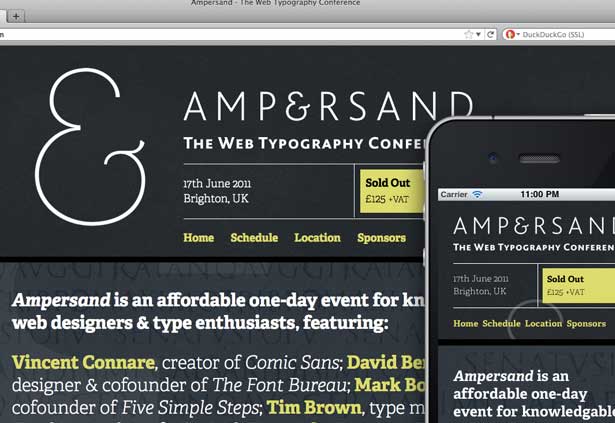
Lovingly typeset in TypeTogether Adelle, the Ampersand conference site is another favourite of mine. There’s quite a bit I love about the design: each section’s distinct hue; the subtle CSS3-enabled overlays; the type specimens appropriated as backgrounds. (And yes, I’m praising a site with Trajan on the homepage. But hey, this version is okay in my book.)
03. New Adventures in Web Design 2012
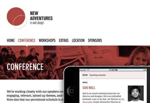
I’ve included New Adventures to round out my little trio of conference sites, but last most certainly does not imply least. I love the restraint of the site's red-heavy palette, which feels quite bold, but with enough softer hues to keep it from being outright brash. And of course, nobody makes Proxima Nova Condensed look quite as good as Simon Collison does.
Favourite geeky bit: I adore how the conference schedule table looks eminently table-like at higher resolutions, but linearises neatly at smaller ones. Adore it, I say.
04. SimpleBits
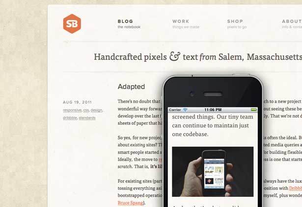
Designer. Developer. Clawhammer banjo master. Dan Cederholm truly is a quadruple threat. His site’s been responsive for a little over a year, but it’s evolved gradually over time. I love the dusty, pixellated background — feels like a throwback to the SimpleBits designs of yore.
05. Made by Hand
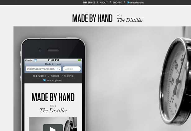
Designed by Mandy Brown and coded by Candi Ligutan, Made by Hand is a film series (and a burgeoning production house) based in Brooklyn. There's a real sense of craftsmanship about the design, which pairs neatly with the subject of Keith Ehrlich's short films. Dig those scaling videos, too.
06. CSS Tricks
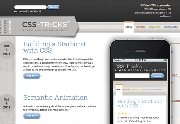
Desktop users: got a browser that understands transitions? Good. Now visit Chris Coyier's css-tricks.com with a maximised browser window, and behold the humble search field. Now make your window smaller. Watch the search field slide to its new location I'M SORRY DID I JUST BREAK YOUR MIND
Ahem. The thing is, there's plenty of Chris' wry humour to be found throughout the design. I've spent ages poring over his writing, and the new, more responsive site's a pleasure to read on any device.
07. Trent Walton
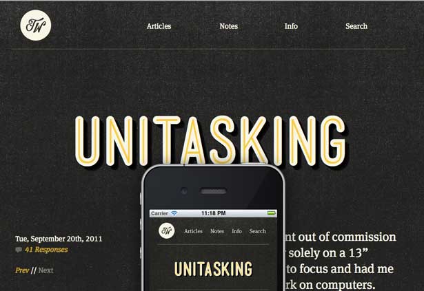
Eames once said that: "The details are not details. They make the product." And in fact, it was some of those details that initially kept Trent Walton from adopting responsive design: the lack of control over a line's length, or managing the resizing of video elements. But thankfully, he and the wizards at Paravel have built some fantastic tools to make a responsive designer's job easier: FitText, and FitVids. And Trent's own site is a beauty: as he said, "My love for responsive centres around the idea that my website will meet you wherever you are." There's something so welcoming about that sentiment, and his highly art-directed posts are inviting indeed.
08. Cognition
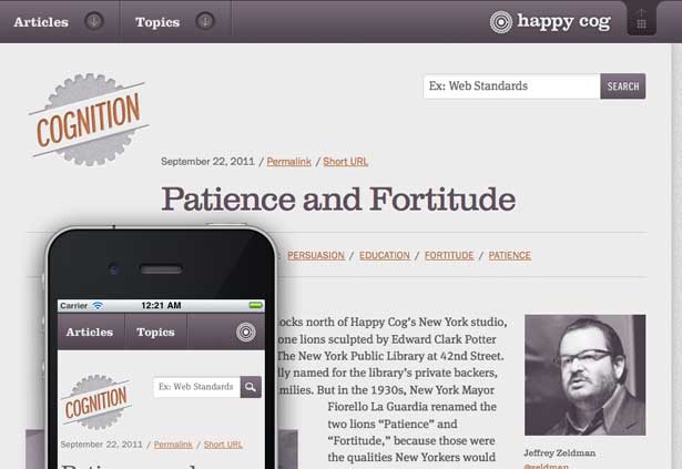
Happy Cog, my former employer, launched a new blog toward the end of last year, using it to publish a battalion of fantastic articles; some practical, some playful, some downright poetic. All are framed in a responsive design, as pretty as it is purple. I love the "Articles" and "Topics" navigation at higher resolutions, so much so I wish they were available on smaller screens. But really, the responsive design makes their archives a joy to read.
09. Paul Robert Lloyd
Paul Lloyd is a designer at Clearleft, and settled on a minimalist look for his personal site's latest design. But the spare aesthetic's a fitting frame to some truly moving writing, as well as some striking photography. I asked Paul if he had any lessons he learned from the site's design, and he shared a few with me. Here's my favourite:
"In taking on a responsive project I quickly realised that resizing the browser window doesn’t give you a true feel for how a site will perform in the real world; input methods and bandwidth availability alter the experience as much as any viewport dimension. As I developed the site I ‘field tested’ it when out and about; reading pages on the train or borrowing other people’s devices. This way I got to see how the site would appear in environments I don’t use myself."
I think that's an invaluable tip for any designer, responsive or not: letting the use of your work inform its design.
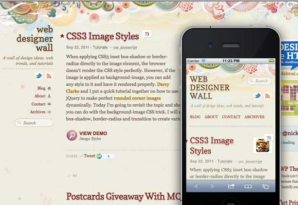
10. Web Designer Wall
Web Designer Wall is one of the web's most venerable design resources, and its recent responsive design is a beauty. I mean, that header illustration alone commands attention, but the clever bit is that the site never loses that distinctly textured feeling at any resolution. Nick La said this is was actually a major goal of adopting a responsive approach, helping him ensure a "consistent appearance of [his] site across all screen resolutions and devices." Additionally, he had this tip to share: "Creating a Photoshop mockup for each response/screen is very tedious. I find it is easier to create a HTML prototype first and then use CSS to re-align the elements."
Coding as a design tool? Love it. CSS-savvy designers, start your engines.
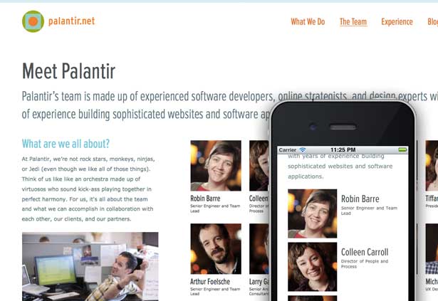
11. Palantir
Palantir is a Chicago-based design and development firm, and recently launched a responsive design. There's quite a bit I love about their site, not least of which is the diversity of layouts they're balancing. Seriously, there's much too much for me to convey in a simple site round-up: spend some time browsing through their pages, and I think you'll appreciate just how Jen Simmons, one of the site's designers, tailored their grid to the needs of their content, rather than the other way around, and implemented it in several different, equally thoughtful ways.
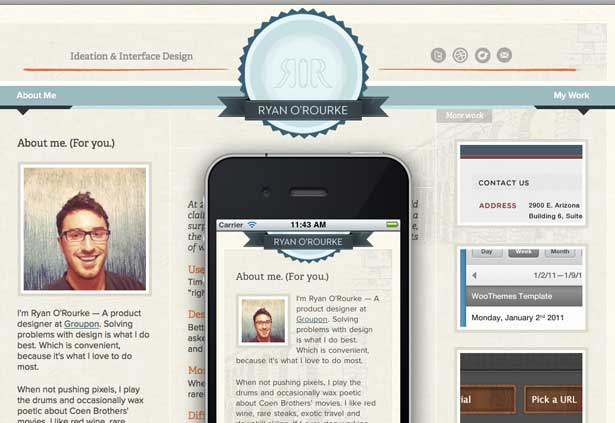
12. Ryan O'Rourke
Ryan O'Rourke is a product designer at Groupon, with a thoughtfully built responsive design. I especially love that emblematic seal at the top, and how it elegantly streamlines itself on smaller displays.
I asked Ryan if he learned any lessons during his redesign, and he suggested that the responsively minded designer first "build fluid containers, with fluid images first. Once you have your design scaling up and down properly, find the pain points where media queries can improve the experience at specific viewport sizes, then tweak." I'm a big believer in tailoring your media queries to the content you're designing, and couldn't agree more with Ryan's approach.
13. Staffanstorp
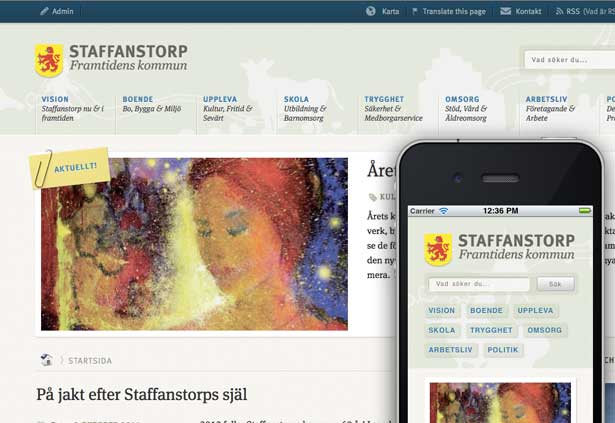
Staffanstorp is a Swedish municipality, and their official site is a responsive joy. From the understated palette to the playful line art, it's rather difficult to choose a favourite element. I do quite like how the primary navigation reveals additional contextual cues at higher resolutions, but is beautifully typeset at any resolutions. There are some small elements that could be refine (I think the events calendar is a bit overwhelming on a mobile phone), but these are the pickiest of nits. I love this design.
14. Andersson-Wise Architects
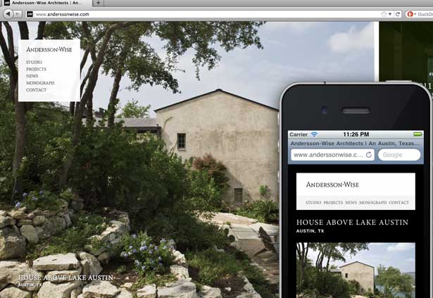
Since the term "responsive design" has its roots in "responsive architecture", there's something doubly exciting about seeing an architectural firm launch a responsive design. And a beautiful one it is, too. When I asked Chris Malven, the site's designer, why they adopted a responsive approach, he told me the diversity of their audience was key:
"There are many different situations in which someone could be looking at the Andersson-Wise website. They could be a prospective home-builder casually browsing on their iPad. Or a university president researching firms on their office computer. Possibly an architecture student browsing on their phone during their daily commute. We wanted everyone to feel like the site was designed specifically for the way they are viewing it, regardless of device, screen size, or connection speed. With a responsive approach you get one of the best qualities of print: a design perfectly suited to its format. But you also get the best of the web: content that adapts to every viewing situation."
Couldn't have said it better myself.
15. WordSkills London 2011
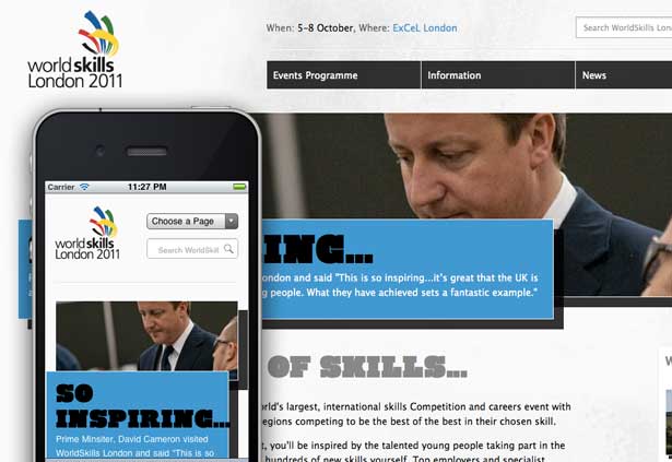
I could spend hours on this site. Actually, I have spent hours on this site. (I don't get out much.) But there's a lot to learn from Mark Boulton Design's work on the WorldSkills London 2011 site. Check out the proportional resizing of that wonderful photography: it doesn't quite scale within its container, but rather keeps the focal point of the photo in focus. And I just discovered the exhibition map, too: while the map's layout itself isn't responsive, there's been some really thoughtful work done to make it accessible to touch-based displays as well as desktops and laptops.
16. Forefathers Group
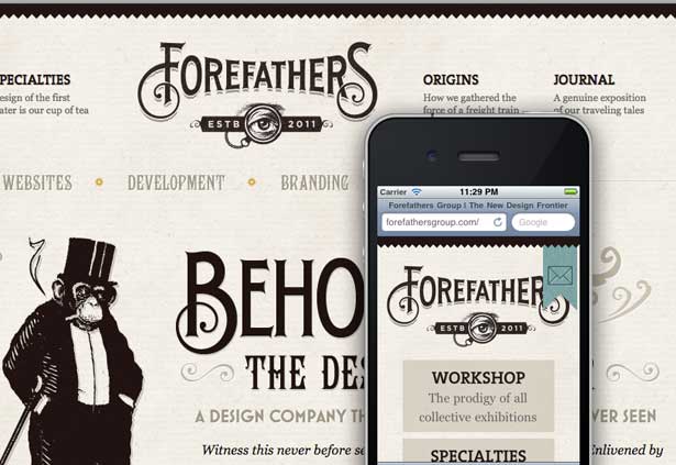
There are plenty of adjectives I could throw at this site, but let's be honest: it has a smoking monkey in a top hat. REVIEW FINISHED.
In all seriousness, what else can I say? From the stately logomark to the pages' richly layered textures, the design's infused with so much personality and playfulness. I spoke briefly with Jonden Jackson, one of Forefathers' co-founders, who said that "it was definitely not [their] first intention to make the site responsive", they're seeing "many more visitors to the site via mobile platforms." And with a design like that, it's gotta be a joy across the board.
17. Meagan Fisher
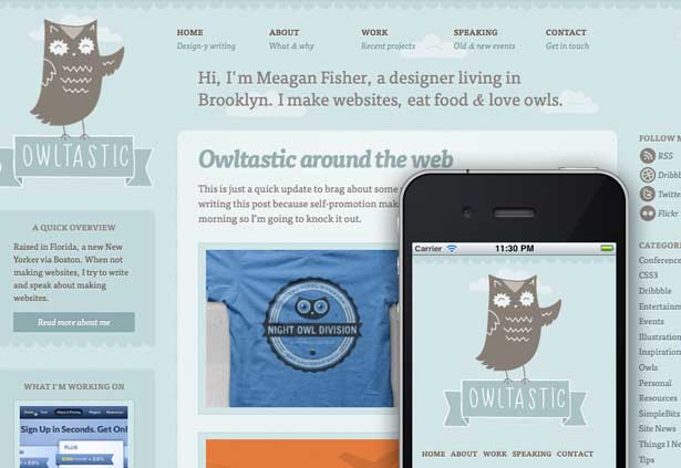
At the risk of sounding like I'm only covering sites with adorable little illustrated animals, I am in serious like with Meagan’s illustrated owl. And let’s face it, her site’s charm doesn’t end there. There’s something decidedly pleasant about Meagan’s blues and browns, and for a responsive bonus, check out those parallax-y clouds in the background.
This concludes the animal-enabled portion of our responsive tour. Moving on.
18. Design Made In Germany, Volume 5
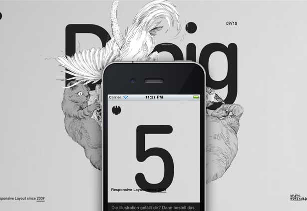
This site’s an old, old favourite of mine, but it still holds up: from the richly layered opening illustration to the ridiculously great vertical parallax effect, I still shiver when I scroll down the page. But even though I don’t speak a word of German, the content’s beautifully designed as well. And from a responsive standpoint, I quite like how each section’s chapter navigation becomes more or less complex according to the width of the viewport, but there’s a baseline level of access afforded to every user.
19. Strange Native
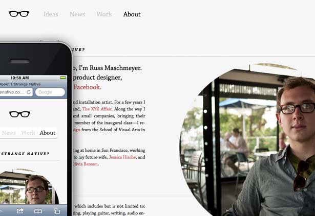
Russ Maschmeyer’s design is just impossibly inviting. The grid he's settled on is balanced, at once eminently legible but approachable. But that aside, it's hard to articulate just what a joy it is to read on any device, watching the content just fill the available space. One of my favourite little details? The lightly curved edge on the navigation that appears when you're viewing the site on a phone. It's a fantastic touch that highlights a key element of the design on a small screen, but fades away above that range. Elegant, but wonderfully understated.
20. Jessica Hische
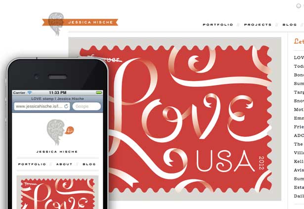
Jessica’s firmly seated in my pantheon of design superheroes: I've admired her lettering and illustration for years. So when she launched a responsive design earlier this year, you'd better believe there was serious swooning up here. Try viewing her store or her inspiring portfolio on your phone, a tablet, or, well, anything. I love how readily accessible her work is, no matter where I am.
(Also, I can't help but smile when her logo pops up a little word balloon at smaller resolutions. Not sure what that says about me.)
Well, that’s all from me. I adore these sites, but there are so many others out there. A list like this is as subjective as it is limiting: I didn’t have room to include Do Lectures, The Great Discontent, or Stephen Caver’s lovely blog. It’s damned exciting to see designers more talented than I take to flexible layouts and media queries, in ways I never could have imagined when I first wrote that article.
Ethan Marcotte is an independent designer/developer, perhaps best known for starting that whole ‘responsive web design’ thing. He’s passionate about web standards, gorgeous design, and how the two intersect.
Liked this? Read these!
- How to make an app
- Free graphic design software available to you right now!
- Create a perfect mood board with these pro tips
- The ultimate guide to logo design
- Our favourite web fonts - and they don't cost a penny

Thank you for reading 5 articles this month* Join now for unlimited access
Enjoy your first month for just £1 / $1 / €1
*Read 5 free articles per month without a subscription

Join now for unlimited access
Try first month for just £1 / $1 / €1

The Creative Bloq team is made up of a group of design fans, and has changed and evolved since Creative Bloq began back in 2012. The current website team consists of eight full-time members of staff: Editor Georgia Coggan, Deputy Editor Rosie Hilder, Ecommerce Editor Beren Neale, Senior News Editor Daniel Piper, Editor, Digital Art and 3D Ian Dean, Tech Reviews Editor Erlingur Einarsson, Ecommerce Writer Beth Nicholls and Staff Writer Natalie Fear, as well as a roster of freelancers from around the world. The ImagineFX magazine team also pitch in, ensuring that content from leading digital art publication ImagineFX is represented on Creative Bloq.
