Design sites using the Responsive Grid System
The Responsive Grid System isn't a framework or a boilerplate. But it does make creating responsive websites quick and easy. Graham Miller, its creator, explains how to use it.
- Knowledge needed: Intermediate HTML5, Intermediate CSS
- Requires: Text editor, browser, smartphone
- Project Time: One hour
The web is evolving, mobile use is accelerating and you love the idea of responsive design. Now it's ready to love you back. I'm going to go through how we created the home page for my web design agency, Edward Robertson, using my own Responsive Grid System, so you can see how easy responsive web design can be.
01. Deciding the site content
A certain Jeffrey Zeldman said: "Content precedes design. Design in the absence of content is not design, it's decoration." We kicked off the process by listing all of the elements we wanted to put on the home page, so we could build outwards from there.
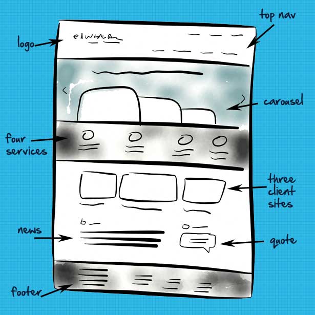
Along with the company logo and navigation we settled on a sliding carousel, four featured services, three featured projects, our latest news and a client testimonial.
02. Sketching the wireframe
We sketched out the layout for the page using the Paper iPad app by FiftyThree. It's excellent for creating quick layout sketches, and the watercolour effect is especially nice at adding colour without obscuring the details.
03. Building the site in the browser
Now we were ready for the fun part: building the site in the browser. If you're creating something responsive, it's not always feasible to produce a PSD for each view, so we jumped into the browser as soon as we could.
As the wireframe shows, the page is split into horizontal sections that fill the full width of the screen. Some of them are split into columns, but the whole site doesn't conform to one master grid. That's what makes it visually interesting.
The Responsive Grid System is great for this because:
Get the Creative Bloq Newsletter
Daily design news, reviews, how-tos and more, as picked by the editors.
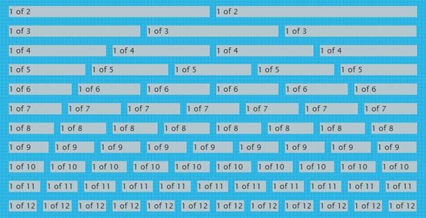
- It lets us have any number of columns. Some grids are split into twelve or sixteen, which is fine for designs with three or four equal columns, but what if you want five? It doesn't compute...
- It scales to fit any width. It uses percentages for the column widths and the gutters, and does all the maths for us.
- It includes some smart code to make the development easier and fix common bugs.
- It plugs into our existing CSS, so we don't need to change how we work.
- Media queries for mobile layouts are already baked in, although you can also cook up some of your own.
What's that noise? It's the sound of our designers, developers and site users cheering.
04. Getting into the code
The Responsive Grid System isn't a boilerplate or a framework: it's a few lines of code that fit in with how you work and can be plugged into your existing markup.
05. The HTML
To split the page into vertical columns we used the code shown below.
For three columns:
<div class="section group">
<div class="col span_1_of_3">
This is column 1
</div>
<div class="col span_1_of_3">
This is column 2
</div>
<div class="col span_1_of_3">
This is column 3
</div>
</div>
And for four columns:
<div class="section group">
<div class="col span_1_of_4">
This is column 1
</div>
<div class="col span_1_of_4">
This is column 2
</div>
<div class="col span_1_of_4">
This is column 3
</div>
<div class="col span_1_of_4">
This is column 4
</div>
</div>
The Responsive Grid System comes with code for up to twelve columns, which is more than enough for most purposes.
06. The CSS
The HTML above is styled in the CSS that comes as part of the Responsive Grid System. Here's the code:
/* GRID OF THREE */
.span_3_of_3 {
width: 100%;
}
.span_2_of_3 {
width: 66.1%;
}
.span_1_of_3 {
width: 32.2%;
}
/* GRID OF FOUR */
.span_4_of_4 {
width: 100%;
}
.span_3_of_4 {
width: 74.6%;
}
.span_2_of_4 {
width: 49.2%;
}
.span_1_of_4 {
width: 23.8%;
}
/* GROUPING */
.group:before,
.group:after {
content:"";
display:table;
}
.group:after {
clear:both;
}
07. How it all works
Let's go through what's going on here:
.section
splits up the page horizontally
.col
divides the section into columns. Each column has a left margin of 1.6% (around 20 pixels on a normal monitor) except the first one. This is removed by the .col:first-child { margin-left: 0; } code, and it has the extra benefit that you don't need to use class="last" or class="end" anywhere (woo!). It works in all browsers since IE6.
.span_1_of_3 / .span_1_of_4
specifies the width of the column. Using percentages means it's 100% fluid.
.group
solves any floating problems, by forcing the section to self-clear its children (aka the 'clearfix hack'). This works in Firefox 3.5+, Safari 4+, Chrome, Opera 9+ and IE 6+.

08. Going responsive
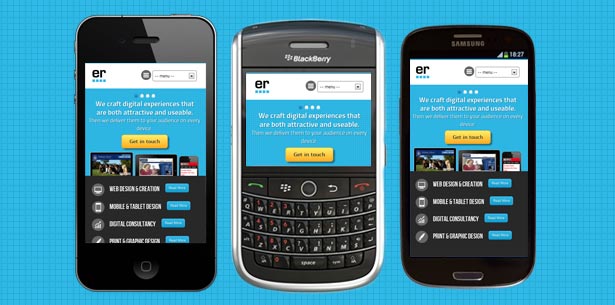
The Responsive Grid System has code baked into it to adjust the layout to suit mobile devices, so you can easily put your site in someone's pocket. It includes media queries:
/* SECTIONS */
.section {
clear: both;
padding: 0px;
margin: 0px;
}
/* COLUMN SETUP */
.col {
display: block;
float:left;
margin: 1% 0 1% 1.6%;
}
.col:first-child { margin-left: 0; }
And this is the code for the three and four column layout:
.span_3_of_3 {
width: 100%;
}
.span_2_of_3 {
width: 100%;
}
.span_1_of_3 {
width: 100%;
}
}
Which turns three columns into three rows, each filling the width of the screen. But that alone won't do the trick on a smartphone unless we put
<meta name="viewport" content="width=device-width, target-densitydpi=160dpi, initial-scale=1.0, minimum-scale=1.0, maximum-scale=1.0">
into the document head. This nifty bit of code tells viewport-aware browsers (such as those on mobile devices) not to scale down a desktop site into a mobile-sized screen, but to treat the width of the browser window as that of the device.
And now our media queries can kick in.
09. Adjusting the layout for different widths
"What about iPads and other devices with screen sizes in between?" you say. If we don't want four columns to become four rows, but we want four columns to become two rows of two, we can add this code into the CSS that is delivered to iPads:
.span_1_of_4:nth-child(2n+1) {
clear: both;
margin-left: 0;
}
The nth-child tomfoolery removes the margin and clears every second div. If you're not familiar with how nth-child works, there's a fantastic article by Chris Coyier at CSS-Tricks.
10. Test, test and test again
As satisfying as it is, it's not enough to keep shrinking and expanding your browser window. We tested the site on as many different mobile devices that we could get our hands on, and so should you.
11. And we're done (yay!)
We built a fully responsive website using the Responsive Grid System. There are more comprehensive grid systems out there, but for speed, ease of use and flexibility, it was just the job. I hope it will be for you too.
You can see the finished site at www.edwardrobertson.co.uk, where you can fiddle around with the browser window size to your heart's content.

12. Over to you
You can download all of the HTML and CSS that you need from www.responsivegridsystem.com. If you have any problems, please let me know. And I'll be thrilled to hear if you use the system on any of your own responsive websites.
iked this? Read these!
- How to build an app: try these great tutorials
- Brilliant Wordpress tutorial selection
- Our favourite web fonts - and they don't cost a penny
- Discover what's next for Augmented Reality

Thank you for reading 5 articles this month* Join now for unlimited access
Enjoy your first month for just £1 / $1 / €1
*Read 5 free articles per month without a subscription

Join now for unlimited access
Try first month for just £1 / $1 / €1

The Creative Bloq team is made up of a group of design fans, and has changed and evolved since Creative Bloq began back in 2012. The current website team consists of eight full-time members of staff: Editor Georgia Coggan, Deputy Editor Rosie Hilder, Ecommerce Editor Beren Neale, Senior News Editor Daniel Piper, Editor, Digital Art and 3D Ian Dean, Tech Reviews Editor Erlingur Einarsson, Ecommerce Writer Beth Nicholls and Staff Writer Natalie Fear, as well as a roster of freelancers from around the world. The ImagineFX magazine team also pitch in, ensuring that content from leading digital art publication ImagineFX is represented on Creative Bloq.
