4 ways to create CSS that's modular and scalable
Several methods have emerged to help designers write scalable and modular HTML and CSS. Freelance web designer Steven Bradley presents an overview of four.

Modular code is reusable code. It can be combined in a variety of ways, making it flexible and scalable, allowing you to iterate code blocks independently and leading to better performance and more maintainable sites.
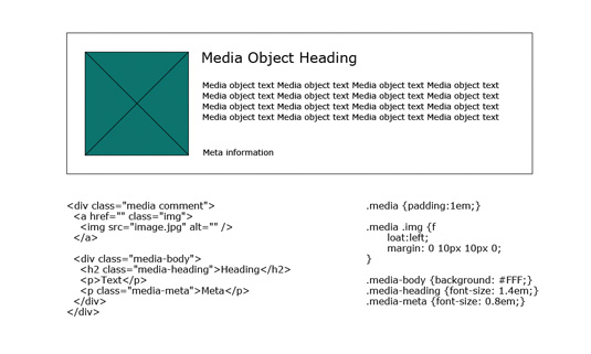
Object Oriented CSS (OOCSS), Scalable and Modular Architecture for CSS (SMACSS), Don’t Repeat Yourself CSS (DRY CSS), and Block, Element, Modifier (BEM) are four popular methods for writing modular HTML and CSS. They share common goals and concepts, though they take different approaches to how to achieve those goals.
Each should be considered as more of a general guideline than absolute rule. Understand the underlying principles behind them and take parts of them to apply to your own process. You’ll find the specifics of these methods can often be combined to work together.
01. Object Oriented CSS (OOCSS)
OOCSS isn’t object oriented in the same way programming languages are. OOCSS objects are visual design patterns that can be abstracted into blocks of HTML, CSS and sometimes JavaScript. They may also include images and other media.
The goal of OOCSS is to encourage code reuse for faster, more efficient and easier to maintain stylesheets. According to OOCSS creator Nicole Sullivan, it’s based on two main principles:
- Separate structure and skin
- Separate container and content

The first is achieved by abstracting visual patterns and coding each as a separate class. For example, your design may call for a variety of content boxes with similarly styled borders. You may write the following CSS for two of these content boxes:
#box-1 {
background-color: #eee;
border: 1px solid solid #000;
border-radius: 5px;
}
#box-2 {
background-color: #ccc;
border: 1px solid solid #000;
border-radius: 5px;
}
Get the Creative Bloq Newsletter
Daily design news, reviews, how-tos and more, as picked by the editors.
These blocks repeat the majority of their code. A better approach would be to abstract the box border into its own class:
.box-border {
border: 1px solid solid #000;
border-radius: 5px;
}
The box-border class can then be added to any box that will have the same border values. Background colours could then be moved to other classes and applied as they’re needed. Separating container and content is a matter of preventing location dependent styles. The same visual object should look the same regardless of where it’s located in a design.
#sidebar div {
background-color: #ccc;
border: 1px solid solid #000;
border-radius: 5px;
}
The code above works only for divs in the sidebar. If a similar div in the footer gets the same border and background-color, you could add another selector to the CSS block. But what happens if the footer div uses a different background-color? You would need to overwrite the background colour inside an additional selector.
A better approach is to abstract the visual patterns in separate classes and apply the necessary classes to each div.
.box-border {
border: 1px solid solid #000;
border-radius: 5px;
}
.box-background-1 { background-color: #ccc; }
.box-background-2 { background-color: #999; }
<div class="box-border box-background-1"></div>
<div class="box-border box-background-2"></div>
Ultimately, all your visual patterns would be developed inside classes like these, which then get added and combined to your HTML.
OOCSS avoids IDs and especially descendant selectors, which tightly couple HTML and CSS. It encourages classes that allow for greater reuse of code. The lack of duplication reduces the size of CSS files and, surprisingly, can do the same for HTML files. The latter comes as a result of not needing to set up any extra levels of structure to maintain a visual pattern.

02. Scalable and Modular Architecture for CSS (SMACSS)
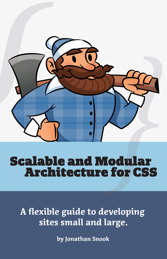
Creator Jonathan Snook, says SMACSS “is a way to examine your design process” and “an attempt to document a consistent approach to site development when using CSS”.
Like OOCSS, SMACSS encourages classes. However, it doesn’t suggest classes should be used for everything. IDs and descendant selectors can still be appropriate even if used less often. SMACSS has two core goals: to increase the semantic value of a section of HTML and content; and decrease the expectation of a specific HTML structure.
SMACSS begins by categorising the CSS we write in order to define better practices for working with observed patterns. The five categories it defines are: Base, Layout, Module, State and Theme.
Base rules are applied directly to element selectors, descendant selectors and pseudo selectors. These wouldn’t be applied to classes or IDs as they’re default CSS rules. Resets are a good example. You don’t need to change much in your existing CSS to follow the base rules of SMACSS.
Layout rules are for the major components of a site like the header, footer, sidebar, or main- content. These will often have CSS applied to an ID like #sidebar or #header. Classes can also be used.
Minor layout components are considered as modules and typically live inside the major layout components. A content box inside a sidebar is an example. Sometimes it’s hard to tell the difference between major and minor components. The more a component is repeated, the more likely it’s a module. Navigation bars and widgets are good examples of modules, too.

Most of your design components will end up being modules and should be designed to stand alone for greater flexibility. You want to be able to move them around and combine them with other elements. Here, we want to stick to classes.
To extend modules, SMACSS prefers subclassing to descendant selectors. Instead of:
box { width: 200px; }
.box ul { width: 100px; }
#sidebar .box ul { width: 200px; }
Use:
.box { width: 200px; }
.box-contstrained { width: 100px; }
The former requires overwriting styles while the latter requires an additional class be added to the HTML. This is the approach endorsed by OOCSS.
State rules apply to changes like hovering over a navigation item or collapsing and expanding an accordion menu. State rules are similar to modules, but differ in several ways. They can apply to both layout and module styles and often indicate a JavaScript dependency. More importantly, they apply to changes that occur after the page is rendered. Like modules, they should be developed to stand alone with styles being inside a single class selector.
Theme rules are typically used least on a single project and aren’t considered one of the core categories. These define things like colour and typography, and exist so user preferences can overwrite any of the above rules.
Another important concept to SMACSS is its naming convention. As Snook mentions, “a naming convention is beneficial for immediately understanding which category a particular style belongs to and its role within the overall scope of the page.”
The following convention is suggested for each of the four core categories:
- Base Nothing needed
- Layout l- or layout- prefix
- State is- prefix, as in is-active or is-hidden. Whenapplied to a module, you should include themodule name as in .is-tab-active
- Module Modules just use module name (.box)instead of trying to prefix each. However, related modules (submodules) receive a consistent prefix to help organise them (.box-border, .box-background, etc)
Since it doesn’t favour classes exclusively, SMACSS offers a way to analyse how tightly coupled a CSS selector is to the HTML it styles. It does this through a concept called depth of applicability.
Descendant selectors require specific HTML structures. The more generations of HTML that are affected by a CSS selector, the greater the depth of applicability is.
Consider the following selector:
#main-content .article div > #intro p > span { }
The above has a depth of applicability of six. It requires a very specific structure that would be hard to change. It’s better to add a class to the paragraph:
p.module span
The selector has now been reduced to a depth of applicability of two, which makes it much more flexible and modular. Much of the goal of SMACSS is to reduce this depth of applicability, which can be accomplished in two ways.
First, child selectors limit the scope of selectors. .nav > li would apply only to top level list items and not those included in the drop down. Second, class selectors are ultimately the better approach as these don’t depend on HTML structure at all.
03. Don’t Repeat Yourself CSS (DRY CSS)
DRY CSS takes a different approach. Instead of a push for more classes, it urges reorganisation of the same selectors you already use. Creator Jeremy Clarke, offers two main goals for DRY CSS:
- Keep style separate from content
- Avoid specificity by harnessing the cascade
Clarke suggests HTML should be structural. Tags, classes and IDs should refer to the content rather than how the content looks. Selectors and definitions should be as global as possible for design consistency and in order to prevent specificity collisions.

DRY CSS has several principles. Every piece of knowledge must have a single, unambiguous and authoritative representation
within a system. DRY can be difficult to implement in CSS because native CSS lacks variables and functions. Unfortunately, this can typically lead to a lot of duplication of code within a project.
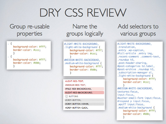
To overcome these limitations, DRY CSS takes a three step approach:
- Group reusable CSS properties and values
- Name these groups logically
- Add selectors to various groups

You start by identifying repeatable style patterns in your design and create a CSS style group with shared properties and values. For example, if some of your content boxes need to have a light background and dark text, you could set up the following box colour style group:
{
background-color: #efefef;
color: #111111;
}
With the style group defined you give it a name by adding an uppercase ID and a lowercase class. These won’t be used in your HTML, but exist to help identify the block of code and what it does.
#LIGHT-BOX-BACKGROUND,
.light-box-background {
background-color: #efefef;
color: #111111;
}
The final step is to add whatever selectors will get the style. These are added in between the ID and class name for the group:
#LIGHT-BOX-BACKGROUND,
.news-box,
.comment-box,
.light-box-background {
background-color: #efefef;
color: #111111;
}
Your CSS file would include a number of different style groups (usually with more properties than shown here). Changing a design becomes a matter of rearranging, removing and adding selectors to the different style groups. For example, if the .news-box in the above CSS needs to change to a dark background, the selector is removed from #LIGHT- BOX-BACKGROUND and added to a #DARK-BOX-BACKGROUND style group.
Ideally each property: value pair should be used only once and never repeated. Where OOCSS and SMACSS would create these style groups on a single class and apply the class to the relevant HTML, DRY CSS works with your existing HTML (including its descendant structure) and applies a selector to the style group.
DRY CSS encourages you to think in terms of CSS style patterns as opposed to mixed HTML and CSS objects. Group names should encourage rational organisation of your design. This particular method also encourages optimisation and generalisation of the selectors.

04. Block, Element, Modifier (BEM)
BEM comes to us from the developers of the Russian search engine Yandex, which has a connection to object oriented programming.
On its website, Yandex says: “In some ways, BEM is similar to OOP. It’s a way of describing reality in code, a range of patterns, and a way of thinking about program entities regardless of programming languages being used.”
Like the other methods, BEM has some core goals it tries to achieve:
- Quick development
- Team efficiency
- Scalability
- Code reuse
In BEM, a block is its own independent entity. It can be simple or complex and one block can contain others. The highest level blocks on a website are your header, footer, sidebar, or main content. Your header block may then include a search block or a navigation block and so on.
Elements are parts of blocks, which perform certain functions. A search block may have two elements: an input field and a button. Elements are context dependent because removing them breaks the block.
All blocks and elements are arranged to create layouts. So, elements are arranged inside blocks and blocks are arranged inside other blocks working all the way up to the outermost container block.
Every block and element should have a keyword (a name) that identifies it. Menu could be the keyword for a menu block. Elements inside the menu block could be assigned the keyword item so each becomes an item in a menu block. Block names need to be unique. An element name should be unique within the scope of a block, but you
can include several elements of the same name inside the block. This leads to the following three guidelines for writing CSS:
- Blocks and elements should have unique names that become classes
- HTML elements shouldn’t be used in CSS selectors as they aren’t context-free
- Descendant selectors should be avoided
Modifiers help create similar (though different) blocks, usually as an additional class that gets added to the HTML. They work much like SMACSS’s state rules.
According to the BEM website: “A modifier is a property of a block or an element that alters its look or behavior. A modifier has a name and a value. Several modifiers can be used at once.”
BEM decouples HTML and CSS and by adding modifier classes to HTML.
Underlying principles
Each of the four methods presented in this article share common goals. They aim to separate content from structure and from presentation in order to develop sites that are modular, scalable and maintainable. From OOCSS to BEM, all four methods advocate placing CSS styles in reusable modular blocks of code.
OOCSS, SMACSS and BEM suggest placing these styles in classes (and sometimes IDs) and then applying those classes as needed to your HTML. DRY CSS differs in suggesting the addition of multiple selectors to CSS instead of multiple classes to HTML.
Remember to treat these methods as guidelines rather than absolute rules. The most important parts of each method are the underlying principles. Hopefully this quick walkthrough has interested you enough to continue to research these methods in greater depth.
- Words: Steven Bradley
Steven Bradley is a freelance web designer and WordPress developer who moved from New York to Boulder, Colorado to be near the mountains. He’s an avid writer and shares what he learns about design at Vanseo Design and at www.small-business-forum.net.
- Image: James Oconnell
James Oconnell is a Manchester-based designer and illustrator who communicates thought-provoking ideas with informed aesthetics.
This article first appeared in .net magazine
Also read:
- Inspiring examples of CSS
- CSS and JavaScript tutorials to power up your skills
- Learn CSS: top video tutorials

Thank you for reading 5 articles this month* Join now for unlimited access
Enjoy your first month for just £1 / $1 / €1
*Read 5 free articles per month without a subscription

Join now for unlimited access
Try first month for just £1 / $1 / €1

The Creative Bloq team is made up of a group of design fans, and has changed and evolved since Creative Bloq began back in 2012. The current website team consists of eight full-time members of staff: Editor Georgia Coggan, Deputy Editor Rosie Hilder, Ecommerce Editor Beren Neale, Senior News Editor Daniel Piper, Editor, Digital Art and 3D Ian Dean, Tech Reviews Editor Erlingur Einarsson, Ecommerce Writer Beth Nicholls and Staff Writer Natalie Fear, as well as a roster of freelancers from around the world. The ImagineFX magazine team also pitch in, ensuring that content from leading digital art publication ImagineFX is represented on Creative Bloq.
