Create fluid layouts with HTML5 and CSS3
Ben Frain explains how to create fluid layouts by converting pixel-based grids to proportions.
When I first started making websites at the end of the 1990s, layout structures were table-based. More often than not, sectioning up screen real estate was done with percentages. For example, a left navigation column might be 20 percent whilst the main content area would be 80 percent. There weren't the vast differences in browser viewports we see today, so these layouts scaled well across the limited range of viewports.
Nobody much cared that sentences looked a little different on one screen compared to another. However, as CSS-based designs took over, it enabled web-based designs to more closely mimic print. With that transition, for many (including myself), proportionally based layouts dwindled for many years in favor of their rigid, pixel-based counterparts.
But like all things, proportional designs have come back around. The Mini, permed hair (I wish!) and flared jeans have all made their comebacks over the years. Now, it's time for proportional layouts to make a re-appearance.
Article continues below- Software: Text editor, browser
- Project time: 1-2 hours
- Skills: Learn why proportional layouts are necessary for responsive design, convert pixel-based element widths to proportional percentages, convert pixel-based typography sizes to their em-based equivalent, understand how to find the context for any element
- Support file
01. Fixed layouts aren't future-proof
As I mentioned, since the 'table layout' days, I've had little call to use proportional layouts. Typically, I've been asked to code HTML and CSS that best matches a design composite that almost always measures 950-1000 pixels wide. If the layout was ever built with a proportional width (say, 90 percent), the complaints would have arrived quickly: "It looks different on my monitor". Web pages with fixed, pixel-based dimensions were the easiest way to match the fixed, pixel-based dimensions of the composite.
Even in more recent times, when using media queries to produce a tweaked version of a layout specific to a certain popular device such as an iPad or iPhone, the dimensions could still be pixel-based, as the viewport was known. However, while developers might enjoy the possibility of re-charging a client each time they need a site tweaked for today's newest gizmo, it's not exactly a future-proof way of building web pages. As more and more varied viewports are being introduced, we need some way of provisioning for the unknown.
02. Why proportional layouts are essential for responsive designs
Whilst media queries are powerful, we are now aware of some limitations. Any fixed-width design, using only media queries to adapt for different viewports, will merely 'snap' from one set of CSS media query rules to the next with no linear progression between the two.
Instead, we want to create a design that flexes and looks good on all viewports, not just particular ones specified in a media query. I'll cut to the chase: we need to switch our fixed, pixel-based layouts to fluid, proportional ones. This will enable elements to scale relative to the viewport until one media query or another modifies the styling.
Sign up to Creative Bloq's daily newsletter, which brings you the latest news and inspiration from the worlds of art, design and technology.
03. Proportional layouts and media queries
Ethan Marcotte wrote the definitive article on Responsive Web Design at A List Apart. Whilst the tools he used (fluid layout and images, and media queries) were not new, the application and embodiment of the ideas into a single coherent methodology was. For many working in web design, his article was the genesis of new possibilities – new ways to create web pages that offered the best of both worlds: a way to have a fluid flexible design based on a proportional layout, whilst being able to limit how far elements could flex with media queries. Putting them together forms the core of a responsive design, creating something truly greater than the sum of its parts.
04. Amending a design from a fixed to a proportional layout
For the foreseeable future, any design composite you receive or create is likely to have fixed dimensions. Currently we measure (in pixels) the element sizes, margins, and so on within the graphics files from Photoshop, Fireworks, and so on. We then punch these dimensions directly into our CSS. The same goes for text sizes. We click on a text element in our image editor of choice, note the font size, and then enter the value (again, often measured in pixels) into the relevant CSS rule. So how do we convert our fixed dimensions into proportional ones?
05. A formula to remember
It's possible I'm coming off as too much of an Ethan Marcotte fanboy, but at this point it's essential that I provide another large tip of the hat (it should probably be a bow, maybe even a kneel) to him. In Dan Cederholm's excellent book, Handcrafted CSS, Mr. Marcotte contributed a chapter covering fluid grids. In it, he provided a simple and consistent formula for converting fixed width pixels into proportional percentages:
target ÷ context = result
Does that smell a bit like an equation to you? Fear not, when creating a responsive design, this formula soon becomes your new best friend. Rather than talk any more theory, let's put it to work converting the fixed-dimension design for the fictional movie website And The Winner Isn't... to a fluid percentage-based layout.
06. Embracing Fluid Layouts
At the minute, the basic markup structure of the site looks like this:
<div id="wrapper">
<!-- the header and navigation -->
<div id="header">
<div id="navigation">
<ul>
<li><a href="#">navigation1</a></li>
<li><a href="#">navigation2</a></li>
</ul>
</div>
</div>
<!-- the sidebar -->
<div id="sidebar">
<p>here is the sidebar</p>
</div>
<!-- the content -->
<div id="content">
<p>here is the content</p>
</div>
<!-- the footer -->
<div id="footer">
<p>Here is the footer</p>
</div>
</div>
What's important to note here is the CSS we are currently using to set the widths of the main structural (header, navigation, sidebar, content, and footer) elements. I've omitted many of the styling rules so we can concentrate on structure:
#wrapper {
      margin-right: auto;
      margin-left: auto;
      width: 960px;
    }
    #header {
      margin-right: 10px;
      margin-left: 10px;
      width: 940px;
    }
    #navigation {
      padding-bottom: 25px;
      margin-top: 26px;
      margin-left: -10px;
      padding-right: 10px;
      padding-left: 10px;
      width: 940px;
    }
    #navigation ul li {
      display: inline-block;
    }
    #content {
      margin-top: 58px;
      margin-right: 10px;
      float: right;
      width: 698px;
    }
    #sidebar {
      border-right-color: #e8e8e8;
      border-right-style: solid;
      border-right-width: 2px;
      margin-top: 58px;
      padding-right: 10px;
      margin-right: 10px;
      margin-left: 10px;
      float: left;
      width: 220px;
    }
    #footer {
      float: left;
      margin-top: 20px;
      margin-right: 10px;
      margin-left: 10px;
      clear: both;
      width: 940px;
    }
All the values are currently set using pixels. Let's work from the outermost element and change them to proportional percentages using the target ÷ context = result formula.
All our content currently sits within a div with an ID of #wrapper. You can see by the CSS above that it's set with automatic margin and a width of 960 px. As the outermost div, how do we define what percentage of the viewport width it should be?
07. Setting a context for proportional elements
We need something to 'hold' and become the context for all the proportional elements (content, sidebar, footer, and so on) we intend to contain within our design. We therefore need to set a proportional value for the width that the #wrapper should be in relation to the viewport size. For now, let's knock off a nought and roll with 96 percent and see what happens. Here's the amended rule for #wrapper:
#wrapper {
         margin-right: auto;
         margin-left: auto;
         width: 96%; /* Holding outermost DIV */
}
And here's how it looks in the browser window:
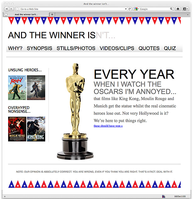
So far, so good! 96 percent actually works quite well here, although we could have opted for 100 or 90 per cent – whatever set the design within the viewport in the most aesthetically pleasing manner.
Changing from fixed to proportional gets a little more complicated as we move inwards. Let's look at the header section first. Consider the formula again: target ÷ context = result. Our #header div (the target) sits within the #wrapper div (the context). Therefore, we take our #header (the target) width of 940 pixels, divide it by the width of the context (the #wrapper), which was 960 px, and the result is .979166667. We can turn this into a percentage by moving the decimal place two digits to the right and we now have a percentage width for the header of 97.9166667. Let's add that to our CSS:
#header {
      margin-right: 10px;
      margin-left: 10px;
      width: 97.9166667%; /* 940 divided by 960 */
    }
And as both the #navigation and the #footer divs also have the same declared width, we can swap both of those pixel values to the same percentage-based rule.
Finally, before we take a peek in the browser, let's turn to the #content and #sidebar divs. As the context is still the same (960 px), we just need to divide our target size by that figure. Our #content is currently 698 px, so divide that value by 960 and the answer is .727083333. Move the decimal place and we have a result of 72.7083333 percent – that's the width of the #content div in percentage terms.
Our sidebar is currently 220 px but there's also a 2 px border to consider. I don't want the thickness of the right-hand border to expand or contract, so that will stay at 2 px. Because of that, I need to subtract its thickness from the width of the sidebar, then perform the same calculation. Divide the target (now 218 px) by the context (960 px) and the answer is .227083333. Shift the decimal and we have a result of 22.7083333 percent for the sidebar.
After amending all the pixel widths to percentages, the relevant CSS looks like this:
#wrapper {
      margin-right: auto;
      margin-left: auto;
      width: 96%; /* Holding outermost DIV */
    }
    #header {
      margin-right: 10px;
      margin-left: 10px;
      width: 97.9166667%; /* 940 divided by 960 */
    }
    #navigation {
      padding-bottom: 25px;
      margin-top: 26px;
      margin-left: -10px;
      padding-right: 10px;
      padding-left: 10px;
      width: 72.7083333%; /* 698 divided by 960 */
    }
    #navigation ul li {
      display: inline-block;
    }
    #content {
      margin-top: 58px;
      margin-right: 10px;
      float: right;
      width: 72.7083333%; /* 698 divided by 960 */
    }
    #sidebar {
      border-right-color: #e8e8e8; border-right-style: solid; border-right-width: 2px; margin-top: 58px;
      margin-right: 10px;
      margin-left: 10px;
      float: left;
      width: 22.7083333%; /* 218 divided by 960 */
    }
    #footer {
      float: left;
      margin-top: 20px;
      margin-right: 10px;
      margin-left: 10px;
      clear: both;
      width: 97.9166667%; /* 940 divided by 960 */
}
The following screenshot shows the result in Firefox with the viewport around 1000 px wide:
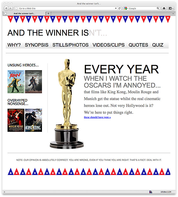
08. Can't we just round the numbers?
Let's take some time out from the layout to consider the issue of decimal precision. Some critics of responsive design techniques (for example, see this article by James Pearce) argue that entering numbers such as .550724638 em into stylesheets is daft. You may wonder yourself why they aren't simply rounded to something more sensible. The counter-argument is that unrounded values are a more accurate answer to the question being asked. Providing a browser with the most accurate answer should make it more able to display that answer in the most accurate manner.
As a related aside, if you stayed awake through more than a couple math classes, you will have heard of the Golden Ratio. The mathematical ratio, used in almost every discipline, is expressed as approximately 1:1.61803398874989 (if you want it to 10,000 decimal places, knock yourself out here). Not a neat number by any means, but quite an important one. If the Golden Ratio can suffer such precise measurements, I'm inclined to believe our web designs can too. Right, back to our fluid layout.
09. Converting the other layout elements
Now, let's go ahead and replace all the 10 px instances used for padding and margin throughout with their proportional equivalent using the same target ÷ context = result formula. As all the 10 px widths have the same 960 px context, the width in percentage terms is 1.0416667 percent (10 ÷ 960).
Everything still looks fine at the same viewport size. However, the navigation area isn't behaving. If I bring the viewport size in just a little, the links start to span two lines:
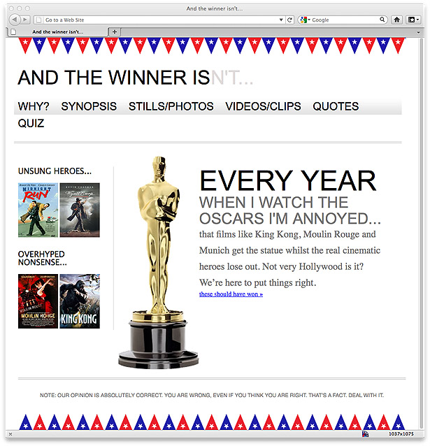
Furthermore, if I expand my viewport, the margin between the links doesn't increase proportionally. Let's take a look at the CSS associated with the navigation and try and figure out why:
#navigation {
      padding-bottom: 25px;
      margin-top: 26px;
      margin-left: -1.0416667%; /* 10 divided by 960 */
      padding-right: 1.0416667%; /* 10 divided by 960 */
      padding-left: 1.0416667%; /* 10 divided by 960 */
      width: 97.9166667%; /* 940 divided by 960 */
      background-repeat: repeat-x;
      background-image: url(../img/atwiNavBg.png);
      border-bottom-color: #bfbfbf;
      border-bottom-style: double; border-bottom-width: 4px;
    }
    #navigation ul li {
      display: inline-block;
    }
    #navigation ul li a {
      height: 42px;
      line-height: 42px;
      margin-right: 25px;
      text-decoration: none;
      text-transform: uppercase;
      font-family: Arial, "Lucida Grande", Verdana, sans-serif;
      font-size: 27px;
      color: black;
    }
Our third rule, the #navigation ul li a, still has a pixel-based margin of 25 px. Let's go ahead and fix that with our trusty formula. As the #navigation div is based on 940 px, our result should be 2.6595745 percent. So we'll amend the code as follows:
#navigation ul li a {
      height: 42px;
      line-height: 42px;
      margin-right: 2.6595745%; /* 25 divided by 940 */ text-decoration: none;
      text-transform: uppercase;
      font-family: Arial, "Lucida Grande", Verdana, sans-serif;
      font-size: 27px;
      color: black;
}
That was easy enough! Let's just check all is okay in the browser...
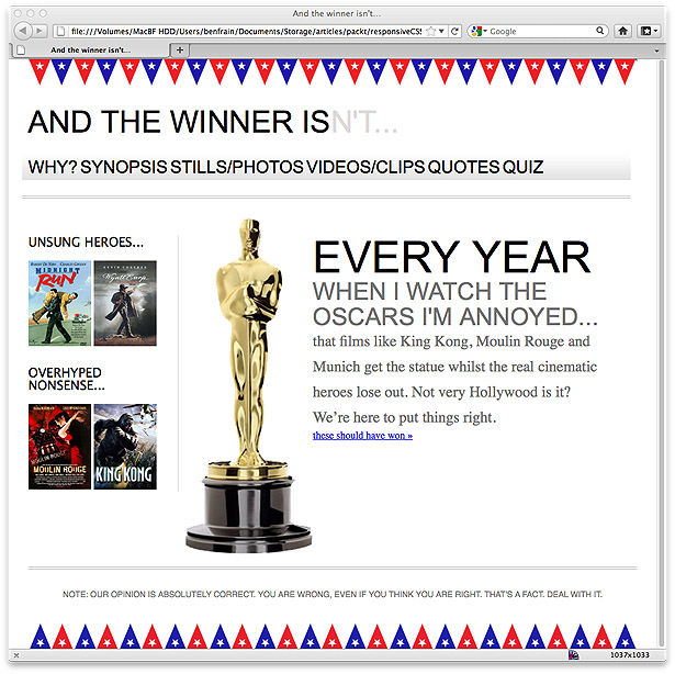
Oh wait: that isn't exactly what we were gunning for. Okay, the links aren't spanning two lines but we don't have the correct proportional margin value, clearly. The navigation links look like one big word, and not one I can find in my dictionary...
10. Always remember the context
Considering our formula again (target ÷ context = result), it's possible to understand why this issue is occurring. Our problem here is the context. Here's the relevant markup:
<div id="navigation">
      <ul>
        <li><a href="#">Why?</a></li>
        <li><a href="#">Synopsis</a></li>
        <li><a href="#">Stills/Photos</a></li>
        <li><a href="#">Videos/clips</a></li>
        <li><a href="#">Quotes</a></li>
        <li><a href="#">Quiz</a></li>
      </ul>
    </div>
As you can see, our <a href="#"> links sit within the <li> tags. They are the context for our proportional margin. Looking at the CSS for the <li> tags, we can see there are no width values set:
#navigation ul li { display: inline-block; }
As is often the case, it turns out that there are various ways of solving this problem. We could add an explicit width to the <li> tags, but that would either have to be fixed-width pixels or a percentage of the containing element (the navigation div) – neither of which allows any flexibility for the text that ultimately sits within them.
We could instead amend the CSS for the <li> tags, changing inline-block to inline:
#navigation ul li {
      display: inline;
    }
Opting for display: inline; (which stops the <li> elements behaving like block-level elements) also makes the navigation render horizontally in earlier versions of Internet Explorer (versions 6 and 7) that have problems with inline-block. However, I'm a fan of inline-block as it gives greater control over the margins and padding for modern browsers, so instead I'm going to leave the <li> tags as inline-blocks (and perhaps add an override style for IE 6 and IE 7 later) and instead move my percentage-based margin rule from the <a> tag (which has no explicit context) to the containing <li> block instead. Here's what the amended rules now look like:
#navigation ul li {
      display: inline-block;
      margin-right: 2.6595745%; /* 25 divided by 940 */
    }
    #navigation ul li a {
      height: 42px;
      line-height: 42px;
      text-decoration: none;
      text-transform: uppercase;
      font-family: Arial, "Lucida Grande", Verdana, sans-serif;
      font-size: 27px;
      color: black;
}
And here's how the result looks in the browser with a viewport 1200 px wide:
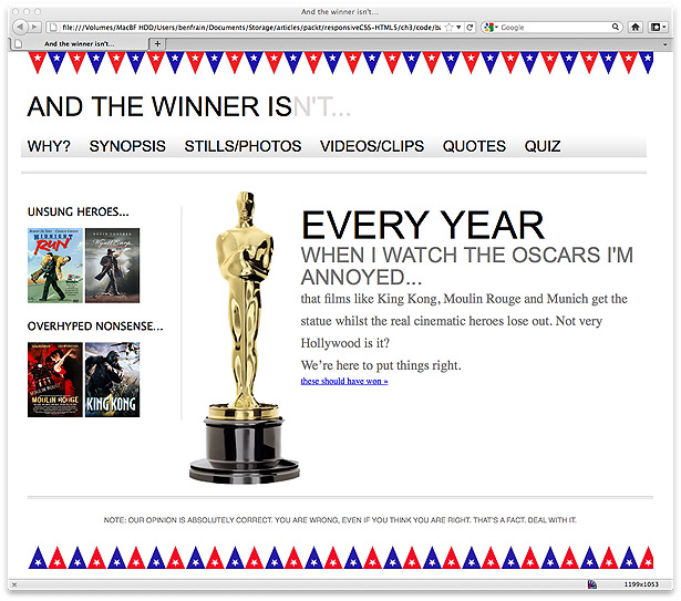
The navigation is getting there now, but I still have the problem of the navigation links spanning two lines as the viewport gets smaller, at least until I get below 768 px wide, when the media query we wrote earlier [in Chapter 2 of the book from which this article is an excerpt] overrides the current navigation styles. Before we start fixing the navigation, I'm going to switch all my typography sizes from fixed-size pixels to the proportional unit, ems.
11. Using ems rather than pixels for typography
In years gone by, web designers primarily used ems for sizing typography, rather than pixels, because earlier versions of Internet Explorer were unable to zoom text set in pixels. For some time, modern browsers have been able to zoom text on screen, even if the size values of the text were declared in pixels. So, why is using ems instead of pixels preferable?
Here are two obvious reasons: firstly anyone still using Internet Explorer 6 (yes, those two people) automatically gets the ability to zoom the text; and secondly, it makes life for you, the designer/developer, much easier.
The size of an em is determined in relation to the size of its context. If we set a font size of 100 percent to our <body> tag and style all further typography using ems, they will all be affected by that initial declaration. The upshot of this is that if, having completed all the necessary typesetting, a client asks for all our fonts to be a little bigger, we can merely change the body font size and all other typography changes in proportion.
Using our same target ÷ context = result formula, I'm going to convert every pixel-based font size to ems. It's worth knowing that all modern desktop browsers use 16 px as the default font size (unless explicitly stated otherwise). Therefore, from the outset, applying any of the following rules to the body tag will provide the same result:
font-size: 100%;
    font-size: 16px;
    font-size: 1em;
As an example, the first pixel-based font size in our stylesheet controls the site's title, And The Winner Isn't... at the top left of the screen:
#logo {
      display: block;
      padding-top: 75px;
      color: #0d0c0c;
      text-transform: uppercase;
      font-family: Arial, "Lucida Grande", Verdana, sans-serif; font-size: 48px;
    }
    #logo span {
      color: #dfdada;
    }
As 48 ÷ 16 = 3, our style changes as follows:
#logo {
      display: block;
      padding-top: 75px;
      color: #0d0c0c;
      text-transform: uppercase;
      font-family: Arial, "Lucida Grande", Verdana, sans-serif; font-size: 3em; /* 48 divided by 16 = 3*/
    }
You can apply the same logic throughout. If at any point things go haywire, it's probable the context for your target has changed. For example, consider the <h1> within the markup of our page:
<h1>Every year <span>when I watch the Oscars I'm annoyed...</span></h1>Our new em-based CSS looks like this:
#content h1 {
      font-family: Arial, Helvetica, Verdana, sans-serif; text-transform: uppercase;
      font-size: 4.3125em; } /* 69 divided by 16 */
      #content h1 span {
      display: block;
      line-height: 1.052631579em; /* 40 divided by 38 */ color: #757474;
      font-size: .550724638em; /* 38 divided by 69 */
}
You can see here that the font size (which was 38 px) of the <span> element is in relation to the parent element (which was 69 px). Furthermore, the line-height (which was 40 px) is set in relation to the font itself (which was 38 px).
But what on earth is an em?
The term 'em' is simply a way of expressing the letter M in written form and is pronounced in the same way. (Historically, the letter M was used to establish the size of a given font, since it is the widest of the letters.) Nowadays, em as a measurement defines the proportion of a given letter's width and height with respect to the point size of a given font.
Going further
By now, the structure of the website is resizing correctly when viewed in viewports of differing sizes, and we've switched our pixel-based type to ems. We still have to figure out how to scale images as the viewport resizes... but that's a topic for the book itself.
Words: Ben Frain
This article is an exclusive excerpt from Ben Frain's book Responsive Web Design with HTML5 and CSS3, published by Packt Publishing. The eBook edition currently costs £12.71, and the print edition £22.49, including the eBook. You can buy them both here.
Liked this? Read these!
- How to build an app
- The ultimate guide to designing the best logos
- The best free web fonts for designers
- Discover what's next for Augmented Reality

The Creative Bloq team is made up of a group of art and design enthusiasts, and has changed and evolved since Creative Bloq began back in 2012. The current website team consists of eight full-time members of staff: Editor Georgia Coggan, Deputy Editor Rosie Hilder, Ecommerce Editor Beren Neale, Senior News Editor Daniel Piper, Editor, Digital Art and 3D Ian Dean, Tech Reviews Editor Erlingur Einarsson, Ecommerce Writer Beth Nicholls and Staff Writer Natalie Fear, as well as a roster of freelancers from around the world. The ImagineFX magazine team also pitch in, ensuring that content from leading digital art publication ImagineFX is represented on Creative Bloq.
