Create animated infographics with CSS and jQuery
Every infographic tells a story. Val Head guides you through bringing a web-based infographic to life with CSS animations and a touch of jQuery.
Combining both CSS3 animation and transitions, we'll be using CSS to animate a timeline infographic. For the data to unfold as you scroll down the timeline, each animation is triggered via the inview jQuery plugin when it comes into view. We'll look at the components of the three main animations we apply to each year in the timeline.
Every infographic tells a story. I chose the story of how Web Design Day, the conference I run, has grown over the last four years for my infographic. This is the data we'll be using in our example project.
Code snippets in the tutorial show the unprefixed W3C syntax for all CSS3 properties for easier reading. The final CSS in the example files has all necessary prefixes thanks to autoprefixer. Also note that demo files need to be run on a web server (local via something like MAMP, or FTPed up to your web host) to execute correctly.
Before coding any of the animations, consider what's the most interesting data and the overall feel you want to achieve. For Web Design Day, the total number of attendees, plus the furthest distance any one attendee travelled to attend, were interesting points to compare. Bar charts depicting things like the number of hot dogs consumed are fun. The story is light in subject, so colours in the design are bright and playful, maintaining a consistent style throughout.
As we scroll to each year, the date pops into view to mark a point on the timeline. To get these in motion, we start by writing a set of keyframes that describe the animation we want to see. After some trial and error and playing around on CodePen, I arrived at this:
@keyframes popIn {
  0%{transform:scale(0);}
  70% {transform:scale(1.05);}
  100% {transform:scale(1);}
}
Our popIn animation starts with a transform scaling our element to a size of 0, which essentially renders it invisible to start its entrance from. Then, 70% of the way through the animation, we assign a scale of 1.05, which will display our element just a bit bigger than its assigned 110px diameter. Finally, it settles at its true assigned size, a scale of 1, at the last keyframe of our animation (100%). This keyframe declaration won't animate anything on its own. The animation needs to be assigned to an element to take effect, using the .date-anim-in class:
.date-anim-in {
  animation:popIn .4s cubic-bezier(0.6, -0.28, 0.735, 0.045) both;
}
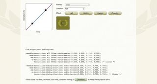
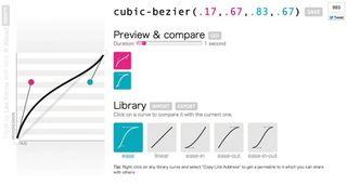
Any element we assign the .date-anim-in class to will take on the popIn animation, take 0.4 seconds to complete the animation, use the animation-timing-function property defined in our cubic-bezier function and have an animation-fill-mode of both.
Get the Creative Bloq Newsletter
Daily design news, reviews, how-tos and more, as picked by the editors.
Note that in our HTML we only assigned the class of .date to our year marker, not the .date-anim-in class that we've just created. We'll assign the .date-anim-in dynamically using jQuery to control exactly when the popIn animation executes. Without writing any additional CSS, we'll also be able to reuse it to animate the other date markers, or even other elements entirely if we wanted. Our date animation is set and ready to be used!
The bar chart animation
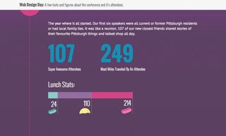
Our bar chart illustrates the number of veggie dogs, hot dogs and pierogi consumed at lunch each year. The width of each bar animates to its total length while the illustrated label for each bar fades in as the bars expand. The expanding motion is achieved with a CSS transition and some clever nesting. A CSS animation is used for the fading. There's a little bit of everything going on in this animation!
First, the HTML for each bar of our bar chart is structured like this:
<div class="veg item">
  <div class="bar"></div>
  <div class="label"><span>24</span><br/><img src="img/vegdog.svg"
  alt="veggie dogs"/></div>
</div>
Each food item contains a <div> that will represent its bar in the bar chart as well as a <div> with its label. There's an additional <span> around the total number for each item so we can easily pull that out with jQuery to assign the width to each bar later on. This helps keep the animation we're creating reusable across each year's bar chart. The CSS behind the motion of each chart is exactly the same, even though the data isn't. The <div>s with the class of .veg, .pierogi and .meaty will determine the width for each section of the chart. Each child .bar <div> is assigned the width of 100% in our CSS:
.bar {
  width:100%;
  height:2rem;}
Now, we can alter the timing of how each bar in our chart grows by assigning a transition to the parent element (.veg, .pierogi, and .meaty). For maximum effect, the bars expand in order and appear to grow on top of one another: first .veg, then .pierogi, then .meaty. This is achieved by assigning a transition property to each and staggering the associated amount of delay:
.veg {
  z-index: 100;
  width:0;
  transition: width .5s ease-in;}
.pierogi {
  z-index: 50;
  width:0;
  transition: width .75s ease-in .2s;}
.meaty {
  width:0;
transition: width 1s ease-in .2s;}
All three sections of the bar chart have an initial width of 0 to start with and a z-index set to preserve the visual layering order. For example, .veg will obscure the transition occurring on .pierogi until it transitions to a width wider than the .veg <div> layered above it. Each section also has a transition for its width with a slightly different duration (the first number in the shorthand) and delay (the second number in the shorthand) to create the staggered expanding effect. When the total width is assigned to each of these <div>s via jQuery, the transitions are triggered and the child .bar element will grow along with each.
Our nested label text and image get their motion in a similar manner. Our <div> with the class of label (containing both the text and the image) is absolutely positioned to the right side of its parent element. As the parent element expands via its transition, the label moves along with it too. That's one hard-working transition!
There's just one more thing I wanted to add to the expanding bar chart animation. It was really distracting to see the images and text of the labels awkwardly piled on top of each other near the beginning of the animation when all three bars were almost the same width. The labels overlapped and looked garbled until the bars expanded out a bit. To help minimise the visual overlap, I added an animation to fade in each label while the bars expanded.
The fadeUp animation's keyframes start with an opacity of 0 and end at an opacity of 1. We also have four different classes ready to assign this animation in various configurations. (We'll be using these classes in a similar way to the .date-anim-in class discussed previously.)
@keyframes fadeUp {
  from {opacity:0;}
  to {opacity:1;}
}
.fade-down {
  animation: fadeUp .15s ease-out reverse both;
}
.food1 .label {
  animation: fadeUp 0.5s ease-out 0.75s both;
}
.food2 .label {
  animation: fadeUp 0.5s ease-out 1s both;
}
.food3 .label {
  animation: fadeUp 0.5s ease-out 1.25s both;
}
The .fade-down class may look a little funny at first. We're assigning the animation of fadeUp but also setting the animation-direction property to reverse via the shorthand. This will execute the keyframes in the opposite order they're listed (opacity of 1 to an opacity of 0). So, we can use this one set of keyframes to fade elements in or out, depending on the animation-direction we set. That's not all! We create three additional classes to use for the fading in of our bar chart labels. We use the same fadeUp keyframes on each, but with a different animation-delay value for each.
When we assign the .food1, .food2 and .food3 classes via jQuery, the labels within each will be assigned to our fadeUp animation with staggered amounts of delay. We'll see them fade in one by one. By creating different configurations of the animation properties, you can get lots of mileage from a single keyframe declaration. This reusability is one of my favourite CSS animation features.
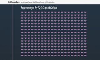
The amount of coffee drunk at the conference was begging to be displayed dramatically in this infographic. Each coffee cup image represents two cups of coffee consumed to prevent things getting too visually overwhelming. The coffee cups swing into place with a bit of spring to them and appear with staggered timing. We accomplish this with animated 3D transforms and a handful of nth-of-type rules.
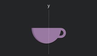
To make the coffee cups appear to rotate in 3D space, we'll rotate them around the y-axis. HTML elements lack any depth, so the cups are essentially postcards in space: they have a front and a back, but if we look at them from the side, they're essentially invisible because they're infinitesimally thin. The keyframes for our animation look like this:
@keyframes swingIn {
  0% {
  transform:rotateY(90deg);
  animation-timing-function: cubic-bezier(0.895, 0.03, 0.685, 0.22);}
5% {
  opacity: .5;
  animation-timing-function: linear;}
60% {
  transform:rotateY(-20deg);
  animation-timing-function: cubic-bezier(0.165, 0.84, 0.44, 1);}
100% {
  opacity: 1;
  transform: rotateY(0deg);}
}
We also set the perspective property on our parent element to be sure all our coffee cups are rotating using the same perspective:
ul.cups {
  perspective:800;
… }
Over the course of this animation, both the opacity and the rotation of the coffee cups are affected at different rates. It starts with a 90-degree rotation around the y-axis, which means our paper-thin image is rotated and can't be seen. It ends with a rotation of 0 degrees, which means it's flat to the screen. It rotates past its final position to create that little bit of a bounce back into place.
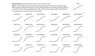
The animation-timing-function is also set differently between keyframes to maximise the 'snappiness' of the movement. You can't animate the animation-timing-function property, but you can set it to different values between keyframes as we have here. The animation-timing-function defined in our 0% keyframe will be used between the 0% and 5% keyframes and so on through our keyframes as each new animation-timing-function property is declared within a keyframe rule.
Similar to the fadeUp animation for the bar chart labels, the animation for the coffee cups is assigned to the <li>s in each list, using a number of classes. In this case, since the total number of coffee cups varies so greatly, the :nth-of-type pseudo-class selector is used to assign different animation-delay property values to the coffee cup <li>s in groups of 10. As the coffee cup list comes into view, each <li> will be assigned the class of .swing-in via jQuery. The :nth-of-type rules in our CSS will determine the animation properties assigned to each individual coffee cup <li>:
.swing-in:nth-of-type(2n+1) {
  animation: swingIn 0.9s 0.75s;
}
These classes use the .swing-in class to set an order for the elements to take on the swingIn animation. The elements also have varying values for animation-delay property (the second number in the shorthand). These override each other causing the coffee cups to animate in groups of 10, giving the animation an almost striped look as the cups all appear from assigning one class. I used a Sass loop to create these rules with incremental amounts of animation-delay. Now let's take a look at the JavaScript that's taking care of the logic and playing conductor to all our CSS animations and transitions in our infographic.
Triggering the animations
Each of our animations needs to be triggered as it comes into view based on how far down the page we've scrolled. There are a number of libraries and scripts that can give us that sort of information. I've chosen to use the inview jQuery plug-in. This plug-in can fire an event whenever a particular element is within the visible viewport area. Using that event, I assign the CSS classes containing my animation properties when the element in question is visible and then remove it when it's not. CSS animations execute when they are assigned. So, adding and removing a class with animation properties in this way essentially re-triggers an animation each time it's added. That's exactly what I want to do here. Remember our .date-anim-in class that had the animation properties we wanted our date markers to use? We can assign it to each year's marker as it comes into view, like so:
$(".date").bind('inview', function(event, visible, visiblePartX, visiblePartY) {
  if (visible) {
    $(this).addClass('date-anim-in');
  } else {
    $(this).removeClass('date-anim-in');
  }
});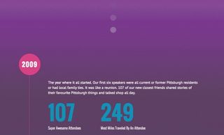
Using the inview plug-in, we look for a <div> with the class of .date and add the .date-anim-in class when it's flagged as being visible. When added, the associated animation properties are applied and our date marker animates in with the popIn animation. When it's not visible, the .date-anim-in class is removed. The .date <div> is returned to its intrinsic styles and we're ready to re-assign the .date-anim-in class when it comes back into view. Our year markers are now popping in as we scroll down the timeline. While the coffee cups are controlled in the same way, bar chart animations have more going on:
$(".nine .food").bind('inview', function(event, visible, visiblePartX, visiblePartY) {
  if (visible) {
    $(".nine .veg").removeClass('fade-down').addClass('food1').css('width', $(".nine .veg .label span").text()*2);
    $(".nine .pierogi").removeClass('fade-down').addClass('food2').css('width',
    $(".nine .pierogi .label span").text()*2);
    $(".nine .meaty").removeClass('fade-down').addClass('food3').css('width',
    $(".nine .meaty .label span").text()*2);
  } else {
    $(".nine .veg").toggleClass('fade-down food1').css('width', '0px');
    $(".nine .pierogi").toggleClass('fade-down food2').css('width', '0px');
    $(".nine .meaty").toggleClass('fade-down food3').css('width', '0px');
  }
});
In this case, as our .food section for each year becomes visible, we make three changes to each of the three food items represented in our bar chart. First, we remove the class .fade-down from it (if it's there). For example, if we were scrolling back up through our infographic, the .fade-down class would be applied to charts we'd already scrolled past. Next the .food1 (or .food2 or .food3) class is added. This was the class that was associated with our staggered delay fadeUp animations. Lastly, we assign a width to our food item based on the total number wrapped in the <span> to trigger the transition we set earlier. On the flip side, when the .food section is no longer visible, we reverse the class assignment and set the width to 0 so that it's ready to play again should it come back into view. And with that, our infographic is fully animated!
Words: Val Head
This article originally appeared in net magazine issue 246.

Thank you for reading 5 articles this month* Join now for unlimited access
Enjoy your first month for just £1 / $1 / €1
*Read 5 free articles per month without a subscription

Join now for unlimited access
Try first month for just £1 / $1 / €1
The Creative Bloq team is made up of a group of design fans, and has changed and evolved since Creative Bloq began back in 2012. The current website team consists of eight full-time members of staff: Editor Georgia Coggan, Deputy Editor Rosie Hilder, Ecommerce Editor Beren Neale, Senior News Editor Daniel Piper, Editor, Digital Art and 3D Ian Dean, Tech Reviews Editor Erlingur Einarsson and Ecommerce Writer Beth Nicholls and Staff Writer Natalie Fear, as well as a roster of freelancers from around the world. The 3D World and ImagineFX magazine teams also pitch in, ensuring that content from 3D World and ImagineFX is represented on Creative Bloq.
