Advanced RWD layout techniques
Josh Broton presents tips and tricks for creating advanced layouts for responsive web design, including the CSS Flexible Box Layout Module.
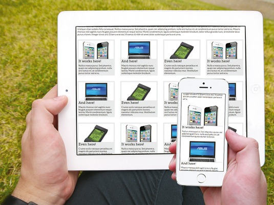
You've made the decision. You're taking the plunge. You're done with m-dot redirects, separate content for different devices and constant updates to fix broken content in new devices. It's responsive or bust. But what happens after the first bit of HTML and CSS is on the page? What if plan A doesn't work?
I launched my first responsive website in October of 2011, and have launched over 20 since. Not one of those has gone according to plan. Every one required me to know two (or even three) ways to accomplish the task at hand. It's so important to have a full tool belt, so let's take a look at what your plan B, C, and maybe D, can be for your responsive web design layout.
Watch this video to accompany the tutorial...
A solid foundation
As readers of net, I'm sure you've been told this many times, but I highly suggest picking up Ethan Marcotte's fantastic book on the subject, Responsive Web Design. He's done a better job explaining it in 70 pages than I could in 2,000. If the concept of responsive design is new or fuzzy to you, here's a quick overview. All good responsive designs are made up of the following three basic parts:
- Flexible grids
- Flexible media
- Media queries that determine layout
More than just being really cool, which it is, there is a strong case being made for responsive design being the very best way to design a site. So, how do we know?
Web usage is trending towards mobile, and quickly. Google prefers sites be responsive. Responsive redesigns lead to significant revenue and conversion ratings, and managing the content of one site is far simpler than managing two, three, or more. Ultimately, responsive design is awesome. But you know that. So let's dispense with the niceties and get on with it.
Different layout options
Depending on the situation, there are a few powerful tools that you can use to code your responsive design. Not every tool is right for every situation, so knowing when and how to use each of these methods will really improve your websites.
Floats
While I have other options, floats are still first on my list of go-to methods for laying out a responsive site. They're just too easy, and work in too many browsers, to look elsewhere first.
Get the Creative Bloq Newsletter
Daily design news, reviews, how-tos and more, as picked by the editors.
Benefits of floats
- Make line-wrapping content very easy
- Easily align left and right sides of the columns to the container
- Ability to reverse the order of the floated items with float: right or float: left
- Fully supported in all browsers
Problems with floats
- Floated elements don't honour relative height
- Requires clearfix CSS to maintain content flow
- A considerable amount of CSS is required just to adjust alignments
Overall, floats are one of the simplest responsive layouts to implement. They've been around forever, and we all know them. But there are definitely situations that require other layout methods, when: l You require multiple columns with varied content to have the same box height. l Content needs to be vertically centered when it's within a row.
We're going to look at some of the other layout methods you can use in order to solve any problems you encounter.
display: table-cell
Every once in a while, you just need to vertically align some content. There are other times when every column in a row has to be the same height. These situations are exactly why tables haven't left my layout toolbox completely. CSS gives us the ability to make a set of elements a table using display: table and display: table-cell.
.parent {
  display: table; }
.child {
  display: table-cell;
  vertical-align: middle; }
This method is awesome. I feel both dirty and nostalgic using tables to layout content, even if it's a CSS table, but it's extremely handy if you're willing to put up with the minor annoyances that come along with it.
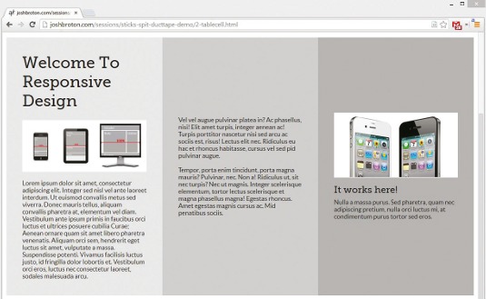
Benefits of display: table-cell
- Every column of content has an identical height
- vertical-align: middle
- Fully supported in all modern browsers
Problems with display: table-cell
- As with tables, cell widths are a suggestion (they expand to the width of the widest content)
- You can't line-wrap cells
- You may have to add extra markup (a parent div with display: table)
If used correctly, display: table-cell fixes many of the problems associated with laying out a page using floated elements. Of course, there are other situations that may require a more unique approach to layout.
text-align: justify
We've all been there: the client who wants a layout that aligns 30 identically-sized block elements in a grid. Maybe it was pictures, video, or product descriptions. They also wanted the left and right elements to align with the content above.
This is doable, but display: table-cell isn't an option because it doesn't allow wrapping, and floating elements requires a practically-unmaintainable amount of CSS as you handle the margins at each breakpoint on elements 3n+3, 4n+4, 5n+5, and so on.
This situation is tailor-made for a technique I first read about in a post written by Patrick Kunka titled Text-align: Justify and RWD, and it's become a staple of my layout toolbox: using text-align: justify on the grid. Doing so is simple, the code is supported well in all modern browsers, and the layouts it creates are solid.
.grid {
  text-align: justify; }
.grid-item {
  display: inline-block;
  width: 22.5%;
  text-align: left;
  vertical-align: top;
  margin-bottom: 3.333333333333333%; }
.grid-item::after {
  content: '';
  display: inline-block;
  width: 100%; }
.grid-item-extra {
  display: inline-block;
  border: 0;
  margin: 0; }
There are some gotchas associated with display: inlineblock. The biggest issue is the need for extra markup. Because text-align: justify will right align the last grid-item in last row, any number of elements in that row less than the maximum will leave empty space in the margins of that row. Adding extra divs that fill up that row (with a height: 0) fixes this problem. The ::after pseudo-element ensures the last row of griditems isn't the last actual row, and therefore will justify the grid-items properly.
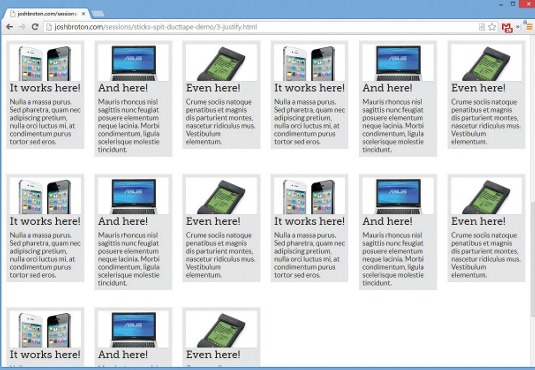
Kunka does a great job of outlining the process in his post, so I suggest checking it out when you get a chance. So, to summarise:
Benefits of text-align: justify
- No calculating margins between elements
- Easy line-wrapping in long lists of elements
- Align left, right and top sides
- Supported in IE8+ and all modern browsers
Problems with text-align: justify
- The technique requires extra markup
- Typographic "issues" arise from inline-block
I've yet to find a situation where these problems are so great that it's worth abandoning this layout technique. It's too powerful to ignore in the name of pristine markup. Simple changes to width and margin properties inside of media queries creates some amazingly flexible grid layouts:
.grid-item {
  width: 48%; }
@media only screen and (min-width:48em) {
  .grid-item {
    width: 31%; } }
@media only screen and (min-width: 64em) {
  .grid-item {
    width: 22%; } }
@media only screen and (min-width: 80em) {
  .grid-item {
    width: 12%; } }
So far, we've covered floats, display: table-cell, and text-align: justify. But as useful as they all are, there are situations where they will and won't work, and it's often difficult to determine that until you've spent three hours trying to fix broken layouts. There's a fourth layout method that's available now, compatible with most browsers, and is my personal favourite method of laying out a design.
Flexbox
Recently, Eric Meyer tweeted, "Let me put it this way: however excited you are about CSS flexboxes, I'm willing to bet you're nowhere near excited enough." I couldn't agree with him more. Every time I come across another layout problem that I'm not sure how to solve, the fix is normally a Flexbox-based solution with a "functional" fallback.
I'll touch on Flexbox here, but here's a fantastic walkthrough of Flexbox, written by Stephen Hay, so check it out if you missed it.
Benefits of Flexbox
- Once you get it, the CSS for Flexbox is easy to write
- It's very flexible. You can do almost anything
- For the first time, we have true vertical and horizontal centering with Flexbox (margin: auto)
Problems with Flexbox
- At this point, you have to write three different syntaxes, which have very different feature sets
- As of right now, it's only supported in IE10+, Chrome, and Safari (and partial support in Firefox)
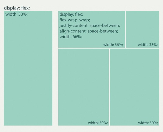
To deal with the inability of some browsers to properly render Flexbox, a fallback plan that includes Modernizr, and at least one other layout method outlined above, must be used. Keep in mind that as of this article, Modernizr in Firefox returns false on the Flexbox support test because it doesn't support flex-wrap, but the team is looking to change that.
Looking to the future: Grid Template Layouts
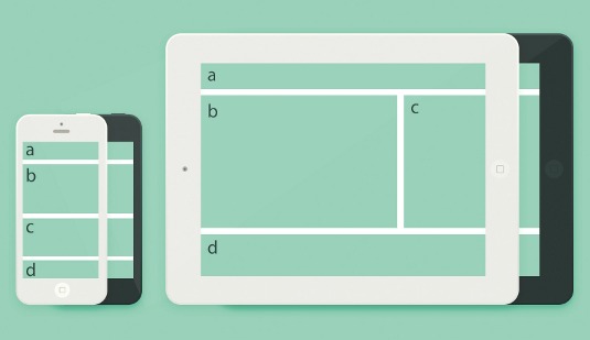
As awesome and powerful as Flexbox is, it's over-engineered for a lot of today's layout tasks. If you're looking for a basic responsive layout for your blog or a three-column homepage, having all the abilities and complexity of Flexbox at your fingertips can be too much. Enter the new CSS3 Grid Layout Template.
This fairly-unknown module working its way through the W3C now has no actual browser support. (The IE11 support is limited to the complicated and uninteresting part.) If you look at its page on caniuse.com, the overwhelming amount of unsupported browsers shown is slightly discouraging. But when it arrives, it's going to be amazingly simple, especially for designers who are more comfortable with the idea of visual layouts than ethereal code layouts.
.header { flow: 'a'; }
.main { flow: 'b'; }
.sidebar{ flow: 'c'; }
.footer { flow: 'd'; }
body {
  display: 'a'
  'b'
  'c'
  'd'; }
@media only screen and (min-width: 48em) {
  body {
    display:'aaa'
    'bbc'
    'ddd'; } }
It will soon be very easy for a novice frontend developer to quickly change the layout of a page, simply by changing the order of "bbb" to "bbc". That's true progress.
Other lessons learned
Sometimes it takes more than a good layout strategy to make a responsive design work well. I've learned a few tricks over the past few years that have really helped me. When people ask me for help, I'm always surprised by the number of people that don't know these relatively simple concepts. If you know them, great! Ignore them and hand this article to your junior dev. If you don't know them, read it and pretend you did (you can thank me later).
box-sizing: border-box
Take a look at this:
*, *::before, *::after {
  box-sizing: border-box; }
This simple rule that's supported all the way back through IE8 (with -moz- and -webkit- prefixes) tells the browser to calculate an element's width including its padding and border, rather than just the content like is the default. Width: 50% is really 50%, even with padding and border, which fixes the issues so many developers deal with when floating fluidly-sized elements with padding and border.
CSS3 calc function
Calculating values using the calc() function in CSS is one of my favourite responsive tricks. Width: 70% and width: 30% is easy, but what if you want a static width on one of the two columns?
Width: 70% and width: 200px doesn't work nearly as well. That's where the calc() function comes in. This CSS function gives you the ability to calculate a value using measurements with two different units.
For example:
.content {
  width: calc(100% - 220px); }
.sidebar {
  width: 200px; }
Media queries in JavaScript
If you're using screen width to trigger an event in JavaScript and need it to happen at the same width as your breakpoint, $(window).width() or window.outer Width are notoriously inaccurate and inconsistent across browsers. There is no way that you can comfortably rely on these widths if you're attempting to fire some JavaScript based on screen size, as they very rarely match the CSS measurements used for media queries. These inconsistencies get worse if you're using ems in your media queries.
Modern browsers, and IE10+, give us the window.matchMedia() function. It takes one parameter, a media query, and will return a boolean indicating whether or not the media query is matched. If you're using an older browser, Modernizr offers the .mq test that can be used in the same way, but doesn't cause an error in versions beyond IE9.
if (window.matchMedia("(min-width: 48em) and (max-width: 64em)".matches)) {
  /* 48em < viewport width < 64em */
} else {
  /* 48em > viewport width or viewport width > 64em */
}
if (Modernizr.mq("(min-width: 48em) and (max-width: 64em)")) {
  ...
}
Thank you for taking the time to read this article. I really hope it has expanded your responsive design toolbox, or at the very least reinforced the fact that you're doing it right.
Words: Josh Broton
This article originally appeared in net magazine issue 250.

Thank you for reading 5 articles this month* Join now for unlimited access
Enjoy your first month for just £1 / $1 / €1
*Read 5 free articles per month without a subscription

Join now for unlimited access
Try first month for just £1 / $1 / €1

The Creative Bloq team is made up of a group of design fans, and has changed and evolved since Creative Bloq began back in 2012. The current website team consists of eight full-time members of staff: Editor Georgia Coggan, Deputy Editor Rosie Hilder, Ecommerce Editor Beren Neale, Senior News Editor Daniel Piper, Editor, Digital Art and 3D Ian Dean, Tech Reviews Editor Erlingur Einarsson, Ecommerce Writer Beth Nicholls and Staff Writer Natalie Fear, as well as a roster of freelancers from around the world. The ImagineFX magazine team also pitch in, ensuring that content from leading digital art publication ImagineFX is represented on Creative Bloq.
