20 stunning examples of CSS 3D transforms
Developer Paul Hayes showcases what you can do with CSS3 3D transforms.
Rounded corners, gradients and drop shadows are well known features of CSS3, but beyond these there lie CSS transitions, transforms and animations. In combination they create effects never before achievable.
CSS 3D transforms are smooth, hardware accelerated and simple to implement, with browsers taking on what would be very difficult perspective calculations. They've been around since 2009 and are supported in Safari and Chrome, and shortly in Firefox 10 and Internet Explorer 10. They perform superbly on iOS devices, even on iPhone 3G and iPad.
Here are some fantastic examples to get you started and to illustrate CSS’s newfound power and gracefulness.
01. Understanding CSS 3D transforms
In his article Understanding CSS 3D Transforms Dirk Weber explains the steps necessary to create something with 3D transforms. With a beautifully simple butterfly animation and a sandbox for messing with transform properties, this is a good place to get started.

02. 3D cube
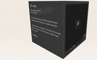
Starting with the basics, 3D transforms are often used to rearrange elements into geometric shapes. In my experiment six cube faces form a cuboid. Bonuses include click and drag and gesture support to rotate the cube.
03. Handling 3D geometry
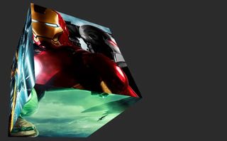
You may have noticed in the first cube that when it’s fully rotated the mouse interactions are reversed and unintuitive, the cube moves the wrong way. Joe Lambert explains how to avoid these pitfalls by using WebKitCSSMatrix to determine the correct rotation vector. Clever stuff!
04. Natural object-rotation
3D geometry is hard. Dirk’s rotation example tackles natural 3D rotation by introducing the ‘virtual trackball’, an imaginary sphere that maps mouse clicks to create smooth and intuitive rotation of a 3D object. He demonstrates with a lovely pack-shot and reflection.

05. Poster Circle and Morphin’ Power Cubes
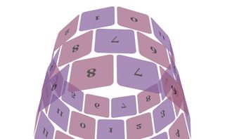
Almost as old as CSS 3D transforms themselves, these examples showcase their power and simplicity. The blog post introduces transforms with an overview of the 3D transform specification, including details of backface-visibility and transform-style.
06. 3D Sphere and Tetrahedron
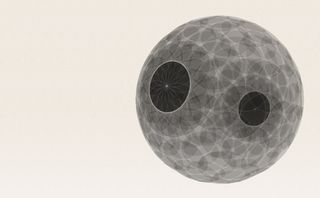
Arranging elements in 3D space can lead to a variety of shapes. A list of elements arranged in a circle around the Y-axis and a set of these arranged about the X-axis creates a sphere. CSS triangles can be built using a border-width/border-color trick, take four of these and you can build a tetrahedron.
Get the Creative Bloq Newsletter
Daily design news, reviews, how-tos and more, as picked by the editors.
07. A 3D FPS concept
In this experiment Keith Clark tests the feasibility of 3D environments using only HTML and CSS. Use the W and S keys and mouse to move around an office in this rudimentary but very cool first person shooter. It works best in Safari. Make sure to check out the source code.

08. VR
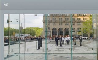
On a similar theme, Apple have their own Safari technology demo which positions a viewport inside a cube to create a virtual scene. Use the mouse to click and drag and explore the Apple store. The demo links to a number of useful Safari resources such as the excellent Visual Effects guide.
09. Web Gallery
As part of Apple’s technology showcase they created an image gallery complete with transitions and transforms, both 2D and 3D. Click next and previous on the images to rotate a 3D image carousel. There are many subtle niceties to be found here, such as images fading out and blurring when another is selected.

10. Photo Transitions
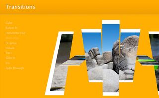
As with all the Apple demos this is best viewed in Safari. These transitions really illustrate 3D CSS’s ability to create unique but intuitive user interactions on your web page. Here images fold over, scale up and fade out in an impressive slideshow. The CSS source contains is worth studying.
11. Flux
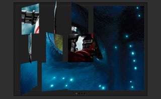
Joe Lambert has created many clever image to image transitions, with several using 3D transforms. He has very kindly bundled these into a useful WordPress plug-in named Flux. Now you can quickly drop these cool animations into your blog.
12. Snow Stack
As an example of Snow Leopard’s hardware accelerated 3D transforms, Charles Ying released this gorgeous image gallery called Snow Stack. Use the arrow keys to move along the wall and the spacebar to highlight an image. It performs beautifully and is an absolute pleasure to use. This is 3D transforms at their best.

13. CSS3 Time Machine
Joe Critchley has taken Apple’s time machine interface and reproduced it with HTML and CSS to create an image slideshow. It nicely animates the view forwards, fading out the frontmost image to reveal the one behind. Some keyboard interactions would go a long way too.

14. The Matrix Revolutions
In Dirk Weber’s 3D transform series he delves deep into the complicated world of matrix transformations (-webkit-transform: matrix3d) to create a stylish cover flow effect. As before, there’s a sandbox for playing with properties; this time matrix values and perspective. Warning, some mathematics required.
15. Wonder Webkit
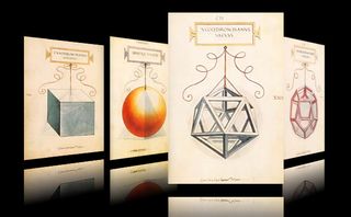
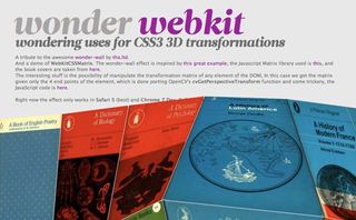
Israel Pastrana has also used complex matrix transformations, this time to create a wonder wall. As you mouse over book covers the surface responds and distorts. Clicking a book zooms into a detail view in style. The matrix libraries and JavaScript here are especially worth delving into.
16. BigText
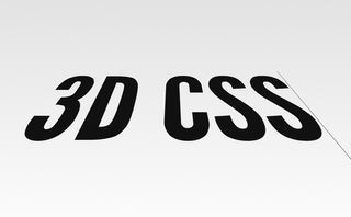
Zach Leatherman has created the excellent BigText jQuery plug-in which makes text fit a certain width for beautiful vertical alignment. It comes bundled with 3D too, so your gorgeous type can fade into the distance, just like the Star Wars preamble, if you so wish. Play with the demo’s random 3D settings to see what’s possible.
17. Reeder for Mac
Visit Reeder’s (the application giving new life to RSS feeds) site in Safari and use their navigation. You’ll see their box-like logo magically bounce and rotate to different views in a wonderfully smooth animation. A fantastic example of 3D CSS in action.

18. Panic — Transmit
Another bastion of Mac app design, Panic, have used a quick but clever card flip effect to switch between a screenshot and a list of Transmit 4 features. Here 3D transforms add that little touch of class, reproducing a native app effect on the web.

19. Beercamp 2011
Built by nclud, this Inception experience for SXSW Beercamp 2011 uses 3D transforms to travel through layers of content as you scroll or navigate. A simple translation in the z-axis put to great effect, with a clever 2D transform fallback for browsers that lack support. 3D detection uses Modernizr.

20. 3D Rotating Molecules on the iPhone/iPad
A delightfully different application, jackadam have used 3D transforms to render complicated molecular structures, which can be rotated using a mouse or gestures. The article highlights some of the advantages 3D CSS has over canvas, namely hardware acceleration on the iPad (although iOS5 has improved this).

What kind of examples of CSS 3D transforms have impressed you most? Which ones should have made our list? Let us know in the comments!
Paul Hayes designs and build websites that are a pleasure to use. He works at Last.fm and lives by the sea in Brighton. The best place to find him is on Twitter, @fofr, where he talks about UX, HTML, CSS and JavaScript, amongst other cool stuff.
Liked this? Read these!
- Brilliant Wordpress tutorial selection
- The best free web fonts for designers
- Discover what's next for Augmented Reality

Thank you for reading 5 articles this month* Join now for unlimited access
Enjoy your first month for just £1 / $1 / €1
*Read 5 free articles per month without a subscription

Join now for unlimited access
Try first month for just £1 / $1 / €1
The Creative Bloq team is made up of a group of design fans, and has changed and evolved since Creative Bloq began back in 2012. The current website team consists of eight full-time members of staff: Editor Georgia Coggan, Deputy Editor Rosie Hilder, Ecommerce Editor Beren Neale, Senior News Editor Daniel Piper, Editor, Digital Art and 3D Ian Dean, Tech Reviews Editor Erlingur Einarsson and Ecommerce Writer Beth Nicholls and Staff Writer Natalie Fear, as well as a roster of freelancers from around the world. The 3D World and ImagineFX magazine teams also pitch in, ensuring that content from 3D World and ImagineFX is represented on Creative Bloq.
Related articles
-

-

-

-

