Developers respond to Adobe Muse
Designers and developers accuse Adobe of not understanding the web and creating a tool that could damage rather than aid the industry. Craig Grannell investigates.
The response to Adobe’s new web-design app, codenamed Muse, has been, at best, divided. Adobe group product manager Danielle Beaumont claims less developer-centric communities and Muse’s forum have reacted in “overwhelmingly positive” fashion, but that’s not what we’re hearing. The majority of developers and designers we’ve talked to argue that Muse is proof Adobe has lost its way, doesn’t understand web design and web designers, and has created software that could damage the future of the web.
01. Print-centric
Beaumont tells us there are “many shades of grey between ‘designers’ and ‘developers’,” and says Adobe’s market research revealed Muse would be positively received by print-centric graphic designers. It was specifically intended to take a different approach from Dreamweaver, although the company nonetheless considered incorporating Muse’s features into InDesign, Dreamweaver and Fireworks. “But we felt we’d best address our target customer with a new product, targeted solely at their needs,” she adds.
However, those web designers and developers we spoke to have reacted in horror at Muse, not least to claims made in Adobe’s marketing videos. Due to the layout-based nature of Muse, the commentary makes a big deal about the app not requiring coding knowledge; worse, it almost seems to belittle coding, arguing web designers won’t code at all in years to come, and maintains the overlap between ‘coders’ and ‘graphic designers’ is small.

“Maybe, but it’s getting bigger,” retorts developer Matt Gemmell. He thinks that’s irrelevant anyway, because the important thing for Muse is the overlap of people who use print layout tools, want to produce for the web, yet have never used myriad existing tools for doing so. “And I don’t think that overlap is big at all.” He considers Muse a bizarre release, since graphic designers have had years to think about their web strategies: ”Muse, by virtue of its deliberate alienation of those who want or need to be able to tweak the code output, surely has a very tiny potential user-base,” he argues.
02. A code-free future
Comments within the video regarding coding becoming obsolete and people not having to “hand-edit PostScript or PDF files for print” further irked many of those we spoke to. “Unless everyone suddenly starts using the same browser, development of web standards is halted, and semantics is delegated to some kind of meta-data, optimised code will always remain important,” claims DM Logic director Darren Miller. “You can choose to not care about it, but your sites will be poorer as a result.” And Yiibu designer Bryan Rieger notes people once argued visual programming tools would enable anyone to create software, but today’s programmers nonetheless mostly write code, while many web designers increasingly use tools like Sass, Compass and Node.js.
The PostScript comment was also dismissed. Gemmell says you “don’t edit formats that aren’t designed for human hand-editing and that are rendered predictably”. Rieger adds that HTML simply isn’t conceptually analogous to PostScript: “HTML has meaning and semantics — it’s designed to work across devices, not as a technology to faithfully render a layout in one context.”

Such comments from Adobe make UX designer Aral Balkan wonder if the company “doesn’t understand the difference between designing for print and interactive mediums” or if it’s in Adobe’s interests to “feign misunderstanding so it can peddle a lowest-common-denominator tool to the masses”. He thinks print designers are “as equipped to design websites as they are to design aircraft” and says there’s no universal ‘design’ you can learn, because each medium has its own peculiarities, constraints and limitations. “With web design, you need graphic design skills, motion design skills, but most importantly an understanding of how to design interactions. No magic tool will transform you into an interaction designer if you’re a print designer. Only studying and doing interaction design will. Adobe Muse will make you a web designer as much as owning a camcorder will turn you into a filmmaker.”
03. A bad case of ‘divitis’

Unfortunately for Adobe, its code-free stance doesn’t lead to refined output. “My first reaction on hearing Adobe had released a new app aiming to solve the ‘problem’ of making websites easy for everyone — or at least print designers — was alarm bells going off in my head,” jokes graphic designer Tom Muller. “But I wanted to give Adobe the benefit of the doubt, and Muse initially looked good. On delving deeper, though, it became painfully clear. Muse will no doubt be a massive help to people who don’t code — by, ironically, producing loads of it for them.”
Developer Elliot Lewis complains that Muse’s output “ignores accessibility, load times, SEO and semantics”; and Clearleft visual designer Paul Lloyd calls Muse’s code “meaningless, unstructured and inaccessible”. He’s angry at Adobe for allowing this shortcoming: “Web designers are finally understanding the web as a medium in its own right, aspiring to be accessible and device-agnostic. Now Muse strives for print-like perfection, regardless of how many images and conditional comments that requires. This is misguided.”
Beaumont responds that Adobe isn’t blind to Muse’s shortcomings regarding code and says there are plans to improve this aspect of the application as it evolves. Examples flagged for change include duplicated HTML for IE support (“This is legacy from when we were considering IE6 compatibility — we plan to move to a cleaner approach”), overuse of divs and CSS rules (Adobe is investigating removing extra divs for floats and ‘modernising’ nine-slicing by utilising “newer CSS3 features with fallback for IE”), image-sharing, sprites, SEO-friendly tags, HTML5 semantics, and web font support. “Muse users will then be able to benefit from these improvements by republishing sites,” she adds.
And designer Steve Harris argues that Muse's potential efficiency overrides any shoddy code output: "Every extra billable second matters when you've got mouths to feed. While I do firmly believe in doing a job properly the first time and never taking shortcuts that will jeopardise the quality of the final product, I also agree that there are some battles not worth fighting. I'm not ashamed to admit that the existence of an extraneous <div> tag does not constitute a worthy battle in my books." He thinks if you have the budget for beautiful code, great, but on tight budgets and timelines, Muse "gives you "the ability to deliver visually appealing and highly functional websites in record time". Arron Bailiss adds that you needn't use Muse for a complete solution either: "I will be collaborating with designers in the future using Muse for my client's projects rather than the traditional process of receiving a Photoshop design, which is static and non-interactive. [As a developer], would you rather see a working prototype of your site or a static image?"

04. Paging print designers

Another of Adobe’s claims that’s questioned is Muse being demanded by print designers and enabling site design without technology ‘getting in the way’. NineFour managing director Nathan Pitman considers that notion ridiculous: “You need an understanding of technology to design better websites. If you asked someone to design a car without an understanding of mechanics and aerodynamics, do you think it would perform well?” Rieger agrees: “Have you seen the results of web designers who lack a print background doing print design? It isn’t pretty. Why do we think the reverse will be different?”
Gemmell argues it’s largely down to relevance — he’s all for giving people abilities they didn’t have before, but only by offering the right tools: “The print-layout UI — with its fixed-size canvas, concepts of master elements, allowing very advanced typography, with expectation of sub-pixel-precise output that’s identical in all situations — isn’t suited to the realities of web design. This means Adobe’s empowering people based on a white lie: that their existing, unrelated workflow is suitable for web development.” As a graphic designer, Muller is particularly peeved at this aspect of Adobe’s marketing. “If I would believe Adobe, Muse is ideal for me, a graphic designer who designs websites. Finally, I can create sites without coding! But I’m a designer who knows how to code, and that’s the main problem here — Adobe’s treating graphic design and code as mutually exclusive, which is wrong. And when Adobe’s Joe Shankar professes that only now with Muse can I transport proper graphic design aesthetics to the web, well, it does grind my gears a bit.”
Muller says he’s hardly alone in bridging web and graphic design, and thinks the only way forward for those not yet immersed in both is to learn coding: “Thanks to code, we can now embed proper fonts in our designs and create dynamic, adaptable layouts, but here comes Muse with image-as-text replacement and fixed-width layouts — an enormous step backwards in accessible web design.” Harris thinks otherwise, suggesting Muse being intuitive to print designers could in fact usher in myriad "stunning websites" from print designers that will challenge those in the industry to "improve, grow and adapt (or die)".

05. An app for the past
Ignoring for a moment Muse’s relevance (or lack thereof) to specific types of designer and its code shortcomings, it seems Adobe could still have released an application more suited to modern web design; those designers we spoke to who’ve experimented with the tool found it lacking in all kinds of ways. “While Muse does seek to move on from the dated world of Dreamweaver and go some way towards re-using familiar UI elements from InDesign, the general assumption that web design can be explained via trite print metaphors is a complete and utter mistake,” says Elliot Jay Stocks. “Muse’s focus is on finite dimensions, which goes against everything we’ve learned on the web in the past few years. Rather than educate through best practice and show how easy it is to learn HTML and CSS, Adobe offers nothing more than a further chance for print designers to bury their heads in the sand.” (See Stock’s article for more of his thoughts on Muse.)
Having used the tool, Miller finds further aspects of its layout design lacking: “Anything beyond a very simple block element gets rendered as an image. Adobe’s missed an opportunity to have a fluid page. There are no web fonts and there’s no decent style editor. The styling you can apply doesn’t seem to scratch the surface of what CSS3 can do.”
And developer Andrew Dean thinks there’s nothing in the app that suggests “creating rich, dynamic JavaScript-enhanced applications would be possible, never mind simplified or made more powerful”. He considers Muse source code ”a DOM nightmare” and wonders if it would even be possible to tie in any kind of commerce system. If you consider that unfair for Muse’s intended audience, Dean reminds us that the distinction between sites with and without commerce aspects has considerably blurred. “And I’m fixating on this because there is a clear need for software that allows designers to ‘hook’ into ecommerce functionality, rather like decorating a house and finding points for utilities and white goods,” he asserts. “Instead, we’re still stuck with the same process of the designer creating a beautiful room that developers will have to hack away at, cursing all the behind-the-scenes cruft that the designer’s tools created, in a vain hope to plug in some PHP or DOM scripting.”

06. Mainstream Muse
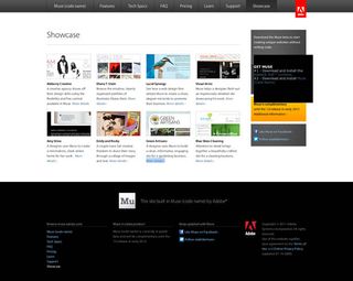
But for all Muse’s perceived shortcomings, is everyone getting hot and bothered for nothing? Won’t Muse simply slot into a niche and not bother the wider web design world? Gemmell doubts it’ll get much uptake — “A narrow userbase, coupled with an anachronistic and wilfully simplified core concept that has been done before dozens of times, doesn’t inspire optimism”. Muller says, on looking at the Muse showcase sites, it’s “clear the scope of the app is limited”. And Lewis considers it already killed, through Adobe’s subscription model. “Pros won’t touch it and non-pros can grab similar apps for $50 with no ongoing costs,” he says. (Beaumont argues the $20 per month subscription will enable the team to frequently update Muse’s feature-set and code-generation engine to “assure the most up to date cross-browser and cross-platform consistency,” something that will “likely” happen a few times a year for features and more often for bug-fixes.)
Rieger is more pessimistic; he says Muse — as it stands — “has the potential to pull us back into the dark ages of the web, with meaningless, bloated document structure [that’s] focused on a fixed-size page metaphor”. He’s worried about Muse’s disregard for the work “countless designers and developers have done in the past decade to make the web a better experience for everybody” and sees it taking hold in small business and enterprise markets. Balkan has similar concerns, suggesting Adobe’s “anyone-can-do-it attitude de-emphasises the fact there’s a body of knowledge, a craft, a discipline, a profession here”. And Lloyd is angered by the marketing pitch that dismisses code as a thing of the past: “Maybe it’s an attempt to reach an untapped market Adobe feels it can sell further subscription-based software to, but it weakens the relationship with creative professionals it was once so keen to impress.”

07. The next step
So where should Adobe head next? Balkan thinks Muse is proof “Adobe doesn’t get the web”, and he argues it never did: “That’s why Adobe bought Macromedia”. He recommends Adobe starts listening to professionals “who actually make websites” and build tools to simplify their lives. It certainly already has many relevant tools, if not the necessary focus. “Adobe has buckets of options for getting content on to the web: Dreamweaver. Contribute. Flash. Flash for HTML5. Illustrator’s HTML5 export. Edge, for HTML5 animations. And now Muse, for HTML output with a print-layout workflow,” rants Gemmell. “But every app is different, and each produces different output. Adobe needs a unified strategy for web output, because people use its applications as part of complex workflows. Adobe also has the resources to do something about the horrible, fragmented, scattered mess that is Creative Suite’s myriad web export flavours, and it would be nice if it actually simplified the problem rather than adding to it.”
Lloyd wonders if Adobe is “focused on selling more products, rather than better products” and asks whether the company will neglect Fireworks in favour of “dumbed down, everyman tools” like Muse: “If so, where are the alternatives? Who’s willing to step up and build tools for those building today’s web?” Not Adobe, thinks Pitman: “I’m beyond caring. Adobe neglects pro tools and further distances itself from the audience it built a business on. I’ve given up on Adobe ever having the sense to create the web design app we want. I’m pinning my hopes on an indie, as outlined at Project Meteor.”
Muller is a little more optimistic: “To be fair, Muse is in beta, and I hope Adobe is taking note of industry reactions.” He says he ditched Dreamweaver years ago on realising it spat out poor code, but his experience could assist Adobe today: “I needed the WYSIWYG environment to get started and understand the relationship between code and page elements. It would be nice if Muse could be a stepping-stone to a deeper understanding of web design.”
And Mark Boulton, too, doesn’t think Adobe’s entirely misstepped. “As a professional web designer, there’s plenty not to like about Muse: the code it produces is meaningless, Adobe’s marketing is misleading, and it’s treading the same ground as Dreamweaver before it and FrontPage before that. But, let’s be clear: this is not a tool for professional web designers. It’s a tool aimed at print designers who may sometimes need to quickly produce a functional website for a client. Print designers don’t understand, or care about, code,” he says. Boulton thinks if you put the problems aside and look at Muse as simply a layout tool for the web — not a website building and planning tool — it’s a more encouraging development: “I want a layout tool designed for web designers — not Photoshop nor Fireworks, and not a tool that writes code. And as the first of those things, Muse makes some positive steps in the right direction.”
Liked this? Read these!
- Hands-on review: Adobe After Effects CC
- Hands-on review: Adobe Photoshop CC
- Photoshop tips, tricks and fixes to try today
- Free Photoshop brushes every creative must have
- Free Photoshop actions to create stunning effects
- The best Photoshop plugins

Thank you for reading 5 articles this month* Join now for unlimited access
Enjoy your first month for just £1 / $1 / €1
*Read 5 free articles per month without a subscription

Join now for unlimited access
Try first month for just £1 / $1 / €1
Get the Creative Bloq Newsletter
Daily design news, reviews, how-tos and more, as picked by the editors.
The Creative Bloq team is made up of a group of design fans, and has changed and evolved since Creative Bloq began back in 2012. The current website team consists of eight full-time members of staff: Editor Georgia Coggan, Deputy Editor Rosie Hilder, Ecommerce Editor Beren Neale, Senior News Editor Daniel Piper, Editor, Digital Art and 3D Ian Dean, Tech Reviews Editor Erlingur Einarsson and Ecommerce Writer Beth Nicholls and Staff Writer Natalie Fear, as well as a roster of freelancers from around the world. The 3D World and ImagineFX magazine teams also pitch in, ensuring that content from 3D World and ImagineFX is represented on Creative Bloq.
Related articles
-

-

-

-

