Create atmospheric digicollages
BECHA on how to develop a distinct aesthetic by combining textures, photos and hand-drawn elements
Software Photoshop and Illustrator CS5
Time needed 3-5 hours
Skills
-Mix textures, photographic and illustrative elements
-Work with blending modes
-Incorporate Adjustment layers into your workflow
Creating a digital collage is faster, more efficient and involves a more advanced process than traditional collage techniques.
The advantages are that you can resize material, change colours and copy elements as many times as you wish - not to mention the possibilities available through blurring, blending and playing with the transparency. However, despite all this, your digitally created images can still end up looking a little flat.
In this tutorial we'll look at the use of texture as a means of creating depth and atmosphere, and combine hand-drawn and photographed elements to provide a richer visual aesthetic. I'll also explain some of the ways to incorporate scanned materials and typography into an image, and how to apply adjustment layers to unite the different elements when creating a digital collage.
Click here to download the support files (46.7MB)
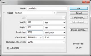
01 Open a new file in Photoshop, setting the Width to 222mm, Height to 300mm and Resolution to 300 pixels per inch. Ignore the background colour: we'll use a texture for this in the next step.
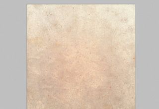
02 Open paper_texture.tiff from the support files and move it into your work document. I want a dark background so I invert the colours of the texture (Ctrl/ Cmd+I), turning it blue, with the little details that were dark becoming lighter, like a starry sky.
Get the Creative Bloq Newsletter
Daily design news, reviews, how-tos and more, as picked by the editors.
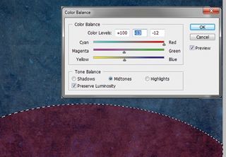
03 For the ground, select the Elliptical Marquee tool and draw a large oval shape. Go to Image>Adjustments> Color Balance and create a reddish hue to distinguish the ground from the sky. I've used these settings: +100, -13, -12.
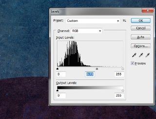
04 Now play with the Levels (Image>Adjustments>Levels) to make an even bigger contrast between the two surfaces. We want to concentrate on the middle tones, so move the middle slider to the 0.73 mark.
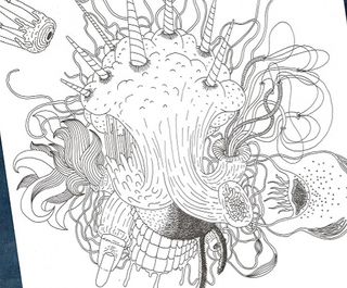
05 Adding hand-drawn elements will help create atmosphere. Here, I've drawn some strange creatures using a Rapidograph technical pen 0.2 (see Drawing_1.tif and Drawing_2.tif in teh support files), but feel free to use your own. When you're done, scan the elements in at 300 pixels per inch, position them on their own layer, and adjust their position and scale using the Free Transform tool.
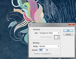
06 It's time to add colour. Create a new layer for this and drag it below your drawing layer. To simplify the colouring process, invert your drawing and change the blending mode to Screen. With the drawing layer highlighted, use the Magic Wand tool to select some shapes inside the sketch, switching back to the colouring layer to fill the selection with a colour of your choice (Shift+F5). Use different layers for each colour. Create a new layer. Apply a gradient to the central part of the drawing using the Layer Style options.
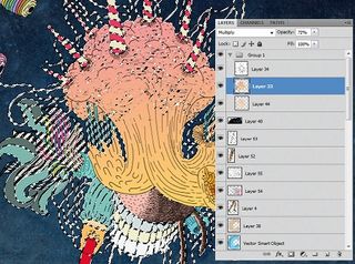
07 Now to play with the texture. Select the Move tool, hold down Ctrl/Cmd and click on the thumbnail of your painting layer. This will give you a selection of your painted shape. Choose the background layer, duplicate the shape (Ctrl/Cmd+J), and invert the texture back to its original state. It's always helpful to keep your layers organised, so drag this new layer below the painting layer. Then select the painting layer, change the blending mode to Multiply and drag the Opacity slider to 72%.
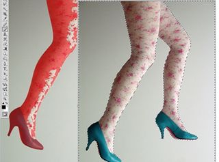
08 For the photographic elements, you can either use legs.tif from the support files or your own photos. In this case the background is clean, so first use the Magic Wand tool (Tolerance: 30) to select the background. Then fine-tune the selection by turning on Quick Mask and carefully painting the parts of the photo you want to use with a brush. Turn off Quick Mask and invert the selection.
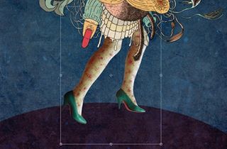
09 When you've selected the parts of the photo you want to use, drag the selection onto your working document. Position the elements using the Free Transform tool (Ctrl/ Cmd+T), and position your photo layer below the drawing layer.
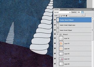
10 Open Illustrator and create some shapes to add to your image. When you're happy, drag them into Photoshop and adjust their position and size to add perspective, giving the illusion of depth. To create a sense of distance, adjust the transparency of the shapes, making those further away more transparent.
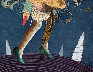
11 Using a pen and paper, sketch out some more hand-drawn elements. In this case, I drew some lines following the curvature of the ground. Again, scan your drawings and move them into your working document. Invert them and change the blending mode to Screen. You can adjust the intensity by experimenting with the levels.
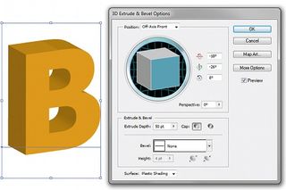
12 For the typographic elements, decide what words you'd like to add and create the first letter of each using the 3D Extrude & Bevel Options in Illustrator. I've picked Tahoma as the font and selected an orange colour. In this case, the default Extrude settings were fine for me. You don't need to write whole words, as we'll complete the lettering with a different style in Step 14. Simply drag your letters into Photoshop.
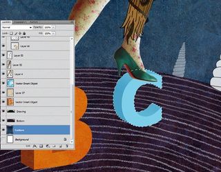
13 Arrange your letters as you wish - my creature is stepping on mine. Now repeat Step 7, duplicating the texture background layer and moving it above the letters layer. Invert (Ctrl/Cmd+I), and set the blending mode to Colour Burn.
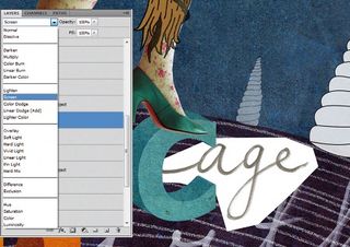
14 To add to the collage effect, complete your chosen words in a different typographic style - I've written mine in black marker pen on plain paper - and scan them in. Insert them separately into your document and position them next to the initials you made in Illustrator to complete the word. Invert the handwritten lettering and change the blending mode to Screen.
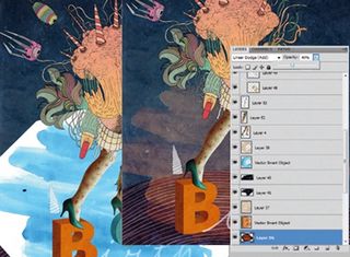
15 Another element I use to make my work richer is watercolour. With black or blue paint, or ink mixed with water, create a stain on some paper. Scan it in, position it on a new layer in between the background and main motif, and adjust the colour using the Colour Balance options. Then change the blending mode to Linear Dodge and lower the Opacity setting of the stain to 40%.
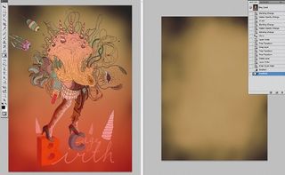
16 To add atmosphere and tie the elements together, insert a pre-made texture (you can use yellow_texture.tif, or your own). Position it on top of your background layers, then change the blending mode to Overlay. In this case, I want the texture to cover only the bottom part of the image so I create a Quick Mask, add a gradient, turn off the Quick Mask and delete the upper part of the texture using the Selection tool and Delete key.
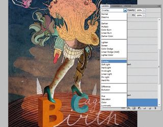
17 The texture now covers only the bottom part of the image. However, experiment to find out what works best for you. I often use whole textures to tie the different elements and colours together, and make an image more atmospheric, while different blending modes will help to create different moods.
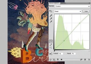
18 As a final touch we'll use an adjustment layer. Go to Layer>New Adjustment Layer>Curves, and ensure it's on top of all the layers. In this case I've chosen a green colour from the drop-down RGB list, setting Output to 61 and Input to 70. This heightens the contrast, making the colours more harmonious. Try some of the other channels or use several of them - just be sure the surfaces or textures don't lose their finer details.

BECHA .
Belgrade-based graphic designer Vesna Pesic, AKA BECHA, is an art director at animation and post-production studio Fried Pictures.
www.becha.me

Thank you for reading 5 articles this month* Join now for unlimited access
Enjoy your first month for just £1 / $1 / €1
*Read 5 free articles per month without a subscription

Join now for unlimited access
Try first month for just £1 / $1 / €1
The Creative Bloq team is made up of a group of design fans, and has changed and evolved since Creative Bloq began back in 2012. The current website team consists of eight full-time members of staff: Editor Georgia Coggan, Deputy Editor Rosie Hilder, Ecommerce Editor Beren Neale, Senior News Editor Daniel Piper, Editor, Digital Art and 3D Ian Dean, Tech Reviews Editor Erlingur Einarsson, Ecommerce Writer Beth Nicholls and Staff Writer Natalie Fear, as well as a roster of freelancers from around the world. The ImagineFX magazine team also pitch in, ensuring that content from leading digital art publication ImagineFX is represented on Creative Bloq.
