What if your favourite fonts had offspring?
If pairs of great fonts reproduced, their babies would look something like this typeface mash-up.
As a creative, you'll often have a favourite font or two that are your go-to choices when it comes to designing your latest project. Typographers often take inspiration from previous offerings and this series from Paris based designer Mr Crosmo sees fonts such as Garamond, Baskerville and Din combine into one single typeface.
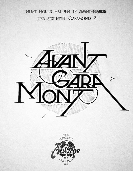
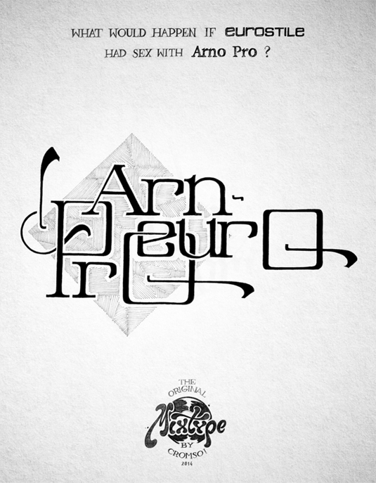
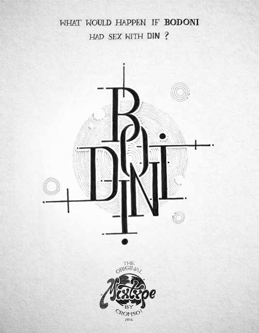
"The idea I tried to work with was, what would happen if reproduction between letters from different families was possible?" he explains. Sketching out the key aspects from each font, typefaces such as 'Bodini' and 'Avant-Garamont' were born that you'll either love or hate.
Whether these will go on to become the new favourite fonts in town remains a mystery but it's a fun little project that will enable you to see your old favourites in a whole new light. Take a look at The Original Mixtype offerings below.
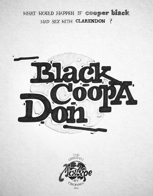
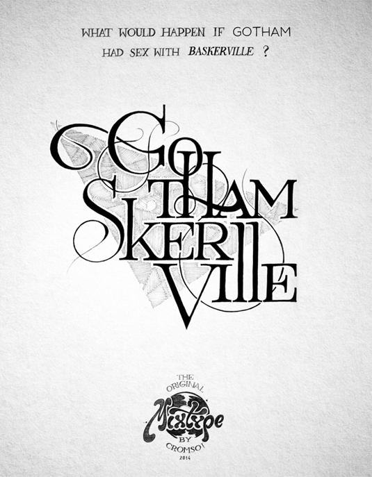
Visit The Original Mixtype Behance page to see the more images.
What do you think of the reproduced types? Let us know in the comments box below!

Thank you for reading 5 articles this month* Join now for unlimited access
Enjoy your first month for just £1 / $1 / €1
*Read 5 free articles per month without a subscription

Join now for unlimited access
Try first month for just £1 / $1 / €1
Get the Creative Bloq Newsletter
Daily design news, reviews, how-tos and more, as picked by the editors.
Sammy Maine was a founding member of the Creative Bloq team way back in the early 2010s, working as a Commissioning Editor. Her interests cover graphic design in music and film, illustration and animation. Since departing, Sammy has written for The Guardian, VICE, The Independent & Metro, and currently co-edits the quarterly music journal Gold Flake Paint.
