Mobile glossary
Scared of mobile design because of all the technical terminology? Fear not! We're back with another collection of the words you need to know.
4G
The fourth generation of mobile technology is a somewhat vague term used to describe wireless mobile radio technologies, such as WiMAX and LTE, that offer faster data rates than current 3G technologies.
Active end
No, not 'Shady Pines Retirement Village'. This is the location at which the user releases the mouse button when selecting a range of objects.
Biomimicry
The idea that nature provides us with all the design paradigms we will ever need.
Browsers
These run from Class A, which handle XHTML, HTML5, CSS3 and Ajax, down to Class F, which are mostly limited to just XHTML-MP or WML.
Centre equalisation
The placement of controls within a window so that, overall, they are visually balanced across an imaginary vertical line in the centre of that window.
Click-through
A property of some controls that enables a user to activate them in an inactive window if they so desire.

Closure
This gestalt principle of visual design states that we naturally try to close gaps and make whole shapes from incomplete visual data, providing a neat way for suggesting which part of a system is in/active.
Get the Creative Bloq Newsletter
Daily design news, reviews, how-tos and more, as picked by the editors.
Context
The situation in which a user experiences a design - for example, on the bus or in a shop. Within an application, context can also refer to the active position of the user within the 'decision tree'.
Continuation
This principle states that we have an inherent ability to complete visual patterns and arrange elements into a continuous form - in other words, the power to draw sense from animation.
Convergence
The blending of web, mobile, television, desktop and any other possible outlet for a given experience so that they represent facets of the same thing.
CSS Mobile Profile 2.0
A subset of CSS 2.0, this specification is a baseline for the implementation of CSS across mobile devices, enabling a richer web experience on the move.
Dominance
When one colour or object is emphasised more than another. This is all about using contrast rather than subtle gradations to convey information visually.
Feature phone
A mobile phone that has lightweight web features, but isn't a smartphone.
Figure to ground relationship
Another design paradigm taken from psychology. The most visually striking element at any one time will be perceived as having focus and the most relevance.
Flash Lite/AIR
Adobe's Flash platform is both resilient and flexible enough to exploit the latest generation of mobile devices.
Focus ring
A highlight around the onscreen area that is ready to accept user input.
Gesture
Any physical interaction that a device can capture and interpret. Swipe and pinch are just a couple of these movements that the iPhone has made ubiquitous.
Hierarchy
A clear visual hierarchy can be the swiftest way to ensure a user is guided efficiently through your content.
IMEI
An acronym for International Mobile Equipment Identifier, this unique 15-digit number identifies an individual phone to network operators.

Information architecture
The organisation of data within a given informational space: for example, the 'DOM tree' of a website.
Information design
The visual layout of information, or how the user will assess meaning and direction from the information presented.
Interaction design
The fine art of inducing or persuading users to interact and to continue doing so.
Interface design
The design of the visual paradigms used to create action or understanding.
J2ME: Java 2 Micro Edition
This edition of the programming language allows Java apps to run on most mobile platforms, although notably not the iPhone.
Manifest file
An XML file that applications are frequently required to define as a kind of ID card for the device OS to work from.
Native application
Mobile phone software compiled into a compatible binary format, stored in phone memory and run locally on the device.
Navigation design
The words, labels and symbols used to describe information spaces and expectations about them.
Panel
A window that floats above other windows and provides tools or controls that users can work with while documents are open. A palette of drawing tools would be considered a panel, for example.
Proximity
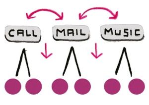
Elements that are close together are naturally perceived as being related - though on a mobile device, and particularly a touchscreen, this is limited by the idea of the 'touch target' (see next column).
Repetition
This (gestalt) design principle states that a repetition in positioning, size, colour or shape creates a kind of natural unity in the mind of the viewer.
Similarity
Another of the gestalt principles of visual design, this states that things that are similar are perceived to be related more than things that are different.

Symbian
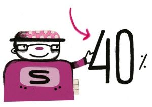
The open source operating system developed by Nokia, and running on around 40 per cent of the world's smartphones.
Task flow
The flow of actions taken to achieve a goal, such as taking a photo, finding a contact and then emailing them the photo.
Touch target
On devices with touch-sensitive screens, it's generally thought to be good practice to keep icons bigger than the pad of an index finger - which is between 10 and 14mm.
Visual flow
Gestalt design principles are frequently employed to ensure that the eyes move naturally through a task, delivering the user to the next step of their task flow.
WML
Wireless Markup Language intended for use on devices that employ the WAP protocol. Now mostly of consideration in developing nations, where many mobiles are first and second generation.
XHTML-MP
A superset of XHTML-Basic defined by the Open Mobile Alliance industry group, XHTML-MP is considered to be the implementation of WAP 2.0. It's a very popular markup language for mobile devices as well as carrier-sponsored applications and portals.

Thank you for reading 5 articles this month* Join now for unlimited access
Enjoy your first month for just £1 / $1 / €1
*Read 5 free articles per month without a subscription

Join now for unlimited access
Try first month for just £1 / $1 / €1
The Creative Bloq team is made up of a group of design fans, and has changed and evolved since Creative Bloq began back in 2012. The current website team consists of eight full-time members of staff: Editor Georgia Coggan, Deputy Editor Rosie Hilder, Ecommerce Editor Beren Neale, Senior News Editor Daniel Piper, Editor, Digital Art and 3D Ian Dean, Tech Reviews Editor Erlingur Einarsson and Ecommerce Writer Beth Nicholls and Staff Writer Natalie Fear, as well as a roster of freelancers from around the world. The 3D World and ImagineFX magazine teams also pitch in, ensuring that content from 3D World and ImagineFX is represented on Creative Bloq.
