Mastering grids in InDesign CC
Dedicated grid fanatic Jo Gulliver reveals how she creates magazine grids that bring structure to pages without hampering creativity.
Creating the perfect grid takes a bit of planning, but it's worth investing this time as it can improve your design by giving it balance. Even basic grids can help bring coherency to a multi-page document by giving your pages structure and providing guides for you to align text and other elements to. And a well-planned grid should in no way limit your creativity.
Throughout this workflow guide I'll explain the processes I use to create grids for magazines. The main thing to remember when using a grid is that it's there for reference and as a guide – sometimes the rules can be broken.
01. Magazine grid
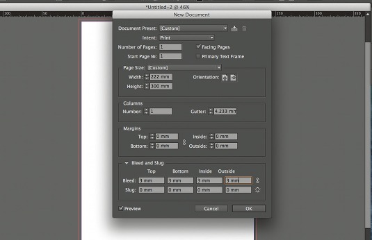
First, you need to use some basic maths to work out a document grid that fits the width of your page perfectly. Create a new document with a custom page size of 222x300mm – a standard magazine trim size. Then select Facing Pages and add 3mm bleed on all sides.
Article continues below02. Leading rules
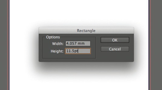
Once you've chosen your body copy style you can use this data to calculate your grid. Convert your leading from points to millimetres by drawing a rectangle and entering your point size into the height or width field in the Control bar. InDesign converts the point size to the units you set as default.
03. Grid mathematics

Now divide the width of your page by your leading measurement (in millimetres). The result will equal the amount of grid squares across the width of your page. Round to the nearest whole number, and divide this number by the width of the page. The result will be the new leading measurement.
04. A visual approach
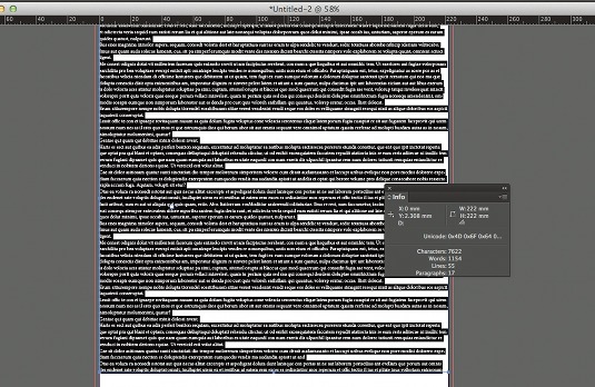
You can also do this visually. Draw a text frame that fits the width of your page and fill with styled up placeholder text. Divide the width of the page by the number of lines of text in your frame to give the new leading measurement that you'll need to apply to your document and baseline grid.
05. Rounding up (or down)
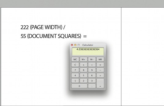
Round this up or down to the nearest whole number, and divide the width of the page by this number (222mm/55 = 4.036) to give the new leading measurement that you'll need to apply to your document and baseline grid. Remember, InDesign only recognises three digits after the decimal point.
Sign up to Creative Bloq's daily newsletter, which brings you the latest news and inspiration from the worlds of art, design and technology.
06. Applying your grid
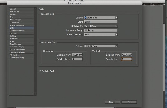
Open Preferences and select Grids. Enter the new leading value into the Increment Every field of the Baseline Grid section. InDesign will automatically convert this into points. Enter the value into the Gridline Every horizontal and vertical fields in the Document Grid section.
07. Compound grid
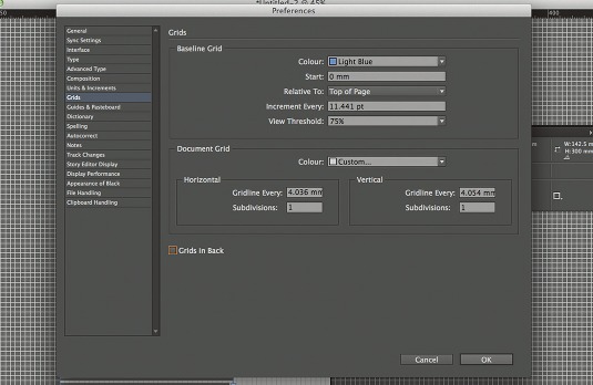
Now you've created your document and baseline grid you need to add your margins. Here, we want to create a 12-column grid, so we can have multiple grid systems working with the same document grid. With a 12-column grid, you can have six, four, three or two columns working to the same document grid.
08. More maths
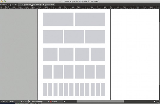
To create a 12-column grid you need to work out the width for your live text area. Do this by multiplying the number of columns by the number of document squares in the column. Then you need to add on the gutters (one document grid width), which is the number of columns, minus one.
09. Trial and error
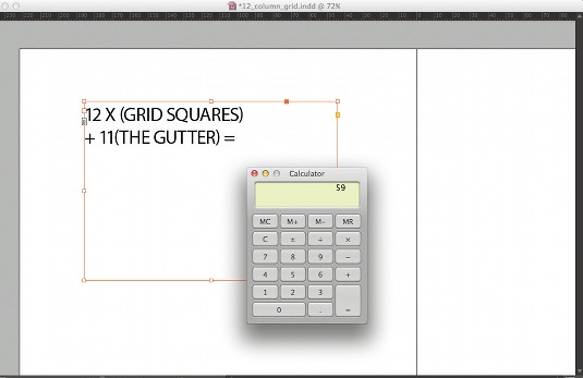
This value has to total less than the number of document grid squares across the width of the page. So the first sum to try is: 12 (grid squares) x 4 (leading) + 11 (gutter) = 59. This doesn't fit, so you will need to reduce the number of document squares that you have in each column.
10. Getting it right
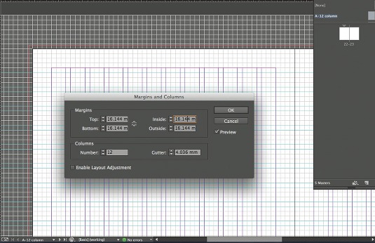
So, try 12 x 3 + 11 = 47. This leaves you with eight grid squares for your margins. You can now apply this to your master page. Generally, when creating a column grid the margin should be at least double the gutter width, and the gutter should either be the same as or double your leading.
11. Top and bottom margins

To calculate your top and bottom margins you can do a similar sum as you did for the columns, but this time working it out visually. Draw a square frame that fits the width of your column and then duplicate the box for the full height of the live text area, making sure you leave one baseline grid between each box.
12. Creating multiple master pages
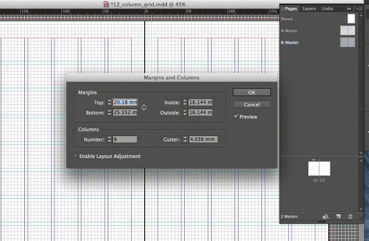
With your document set up you can start to create multiple master pages with different numbers of columns. Select both pages, Ctrl/Right-click and hit Duplicate Master Spread 'A-Master'. Then open the Margin and Columns dialog and change the number of columns.
Words: Jo Gulliver
Jo Gulliver is art editor of Computer Arts magazine. This article originally appeared in Computer Arts issue 228.

The Creative Bloq team is made up of a group of art and design enthusiasts, and has changed and evolved since Creative Bloq began back in 2012. The current website team consists of eight full-time members of staff: Editor Georgia Coggan, Deputy Editor Rosie Hilder, Ecommerce Editor Beren Neale, Senior News Editor Daniel Piper, Editor, Digital Art and 3D Ian Dean, Tech Reviews Editor Erlingur Einarsson, Ecommerce Writer Beth Nicholls and Staff Writer Natalie Fear, as well as a roster of freelancers from around the world. The ImagineFX magazine team also pitch in, ensuring that content from leading digital art publication ImagineFX is represented on Creative Bloq.
