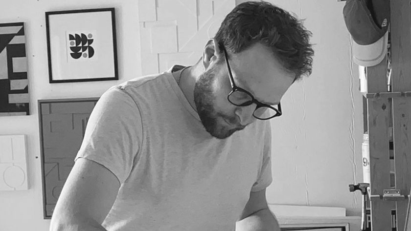
Malcolm Garrett
He would rather be that guy who works with computers than that guy who used to design record covers. The era-defining designer talks to Nick Carson about new digital worlds.
Malcolm Garrett has made a career out of swimming upstream. Having defined the aesthetic of the late '70s and early '80s with his iconic record sleeves for Buzzcocks, Duran Duran and Culture Club, Garrett has reinvented himself over the last two decades as one of the world's leading interactive designers. Computer Arts asked him to share his views on the widespread revival of the '80s aesthetic that he helped to create the first time round.
Computer Arts: Who or what were your earliest influences?
Malcolm Garrett: I've always drawn inspiration from Brian Eno, who maintains that he's not a musician, merely an explorer in the field of musical endeavour. I've often thought that I work in similar ways: graphic design is a field to be explored, with many languages to learn. I'm not disciplined enough to perfect any one technique. I've probably pursued the opposite: I don't want to be pinned down and recognised for just one thing.
As a child who constructed numerous Airfix kits, I developed a liking for military engineering and the esoteric graphic systems on planes, tanks and uniforms - how archetypal national characteristics were easily distinguishable in the weapons of warfare. Incongruously, I also liked medieval and Gothic buildings, yet modern architecture remains a fixation. It must've been the LEGO.
CA: How have these influences changed? Do your peers inspire you?
MG: Actually, I don't like to check on the work of my peers, as I'm then less likely to be influenced by them, or become jealous of their accomplishments. I've often tried deliberately to be unlike my contemporaries, and have been wilfully unfashionable in my approach to design. I like things to stand out.
Perhaps more than anything, I'm inspired by conversation and dialogue. I'm interested in thought processes and intellectual stimuli. When I am stirred to activity, I tend to be project-driven - motivated by a commitment to someone else's need. I'm not sure whether that's altruism or more of a guilt complex; I need to ensure that I do what I say I'll do.
CA: Did studying typography steer your work in a particular direction?
MG: Enrolling on a typography course straight from school was a happy accident, informed by my limited educational possibilities. But it proved to be a powerful entry point to develop the ideas that remain at the core of my work.
At school, my paintings always had words and lettering in them. I was interested in Pop Art and, just as Pop absorbed the iconography of advertising from the '50s and '60s, I felt that I should work with words and letterforms in order to remain contemporary.
My desire to be relevant to my time was to find expression sooner than I imagined, when a few lads with spiky hair and narrow-legged trousers called for cultural revolution in a way that demanded my participation. Another happy accident was that a friend of mine was a friend of some of these lads with spiky hair. And these Buzzcocks made music that focused my work in a way that made perfect sense.
CA: Your work for Buzzcocks was arguably your first big break. Is the music industry still a great incubator for design talent?
MG: It was definitely a break, although it didn't seem so big at the time. It felt natural - this was my music; these were my friends. My interests and capabilities coincided with the interests and needs of a group of musicians on a similar mission. There was a sense of collaborative purpose, and above all it was about passion and belief.
I don't think today's music inspires the same revolutionary passion, as there aren't the same barriers to creating, performing or expressing yourself. Youth culture has become contemporary culture in a way that we could never have contemplated in the mid-'70s. That's not to say that you can't find similar motivators today; I just don't think they're centred on music in quite the same way. Look to where societal issues inspire irrepressible expression, and that's where the energy associated with youthful resistance will be generated.
CA: You've said before that the original punk aesthetic was defined by its attention to detail - an overall 'image' within a wider cultural context. What parallels can you draw with modern brand development?
MG: Punk was about self-expression and doing it yourself. The aesthetic wasn't intended to be rough or amateurish, but it certainly accommodated that. It also accommodated intelligence and sophistication. The punk view was that the stage was just an extension of daily life. Visual expression had to be constant and consistent: integrity was sacrosanct. If any image were to be imposed from outside, this would not feel genuine. My task was to become a visual mouthpiece from the inside.
Parallels with commercial brand development are clear, but as they seldom concern themselves with that level of self-expression, nor demand the same kind of passion, they don't tend to resonate so much. The hopes, dreams and struggles of daily life are represented, and championed, by the musicians you identify with in your youth. Music is tribal. It's impossible to feel the same way about a bar of chocolate, a car or even the sexiest of mobile phones.
CA: What's your take on the revival of the '80s aesthetic in design?
MG: The idea of revisiting the past and reconstructing it in some slightly modified form is nothing new. It was arguably Roxy Music, with Bryan Ferry and Brian Eno at the helm, who first recognised that pop music already had a history that could be dipped into, with astonishingly innovative results.
This kind of retro aesthetic, combined with a taste for the unknown, has always appealed. I like the idea of creating a new colour from a radical mix of old colours from various palettes, rather than a simple remix of some boring beige from the same tin as before. I am not at all moved by the current fixation with the '80s, however. I may have been in the midst of it, but I think it is best left there.
CA: When did interactive media first capture your imagination?
MG: In 1990, the Design Museum commissioned me to create information graphics for Sport90, an exhibition of sports equipment. This included a Mac-based interactive guide. We were a long way from ubiquitous computing - the internet browser was still a few years away - but instinctively I already knew that this was where the action would take place.
Ben Rubinstein at Cogapp patiently introduced me to Apple's interactive media development software, HyperCard, and set me firmly on the road of interactive enquiry. Together we created the interactive gallery guide, and the lessons I learnt then are still relevant to my work today.
CA: After founding AMX Digital in 1994, interactive TV became a particular passion of yours. What role can design play in this medium nowadays?
MG: My view was that interactive media would ultimately combine the full-screen motion graphics of film and TV with the global connectivity of the internet. There were dozens of companies exploring all things internet, but not many working in the broadband space. So, of course, that's where I wanted to be.
The sophisticated 3D game environments on Xbox and PlayStation, the popularity of the BBC iPlayer, augmented reality, and the fluidity and spatial intelligence of the iPhone, are beginning to prove that a rich, interactive but totally televisual experience is an absolute must for future consumers.
CA: Bringing us to the present, part of AIG's mission statement is to "avoid being seduced by the originality of our ideas." Could you explain?
MG: There are no inherently good ideas, nor fundamentally bad ideas, nor even any original ideas. But there are always appropriate solutions. The audience's ability to understand and the context in which communication takes place are the fundamentals - all else is negotiable.
It seems that it takes a certain level of professional experience before that really sinks in. At my university interview I was asked of my portfolio, 'Would you call this graphic design?' That threw me a little, but I've been asking that same question of each piece of work since.
CA: Finally, what project on your current slate are you most excited about?
MG: I'm working with the Helen Hamlyn Trust on an online learning community for its Open Futures programme. It has four strands - growit, cookit, filmit and askit - which encourage primary school children to learn practical skills as a platform for intellectual enquiry.
Our goal is for the website to become an interactive component in a suite of learning tools. I'm interested in the ways in which interactive media can play an active part in people's day-to-day lives. Computers are becoming useful in all sorts of hitherto unexpected ways, as they throw off the constraints of the desktop.

Thank you for reading 5 articles this month* Join now for unlimited access
Enjoy your first month for just £1 / $1 / €1
*Read 5 free articles per month without a subscription

Join now for unlimited access
Try first month for just £1 / $1 / €1
Get the Creative Bloq Newsletter
Daily design news, reviews, how-tos and more, as picked by the editors.
The Creative Bloq team is made up of a group of design fans, and has changed and evolved since Creative Bloq began back in 2012. The current website team consists of eight full-time members of staff: Editor Georgia Coggan, Deputy Editor Rosie Hilder, Ecommerce Editor Beren Neale, Senior News Editor Daniel Piper, Editor, Digital Art and 3D Ian Dean, Tech Reviews Editor Erlingur Einarsson and Ecommerce Writer Beth Nicholls and Staff Writer Natalie Fear, as well as a roster of freelancers from around the world. The 3D World and ImagineFX magazine teams also pitch in, ensuring that content from 3D World and ImagineFX is represented on Creative Bloq.
