Designers choose the top logo designs of 2013
Our panel of industry experts selected 2013's best and most inspirational logo designs.
Our look at the best, most inspirational logo design of 2013 takes in the year's biggest trends, most creative branding work and biggest identity projects, as chosen by our panel of world-leading logo designers. So without further delay, on with the logos...
- Also read: Discover the 50 best logos ever
01. Mall of America
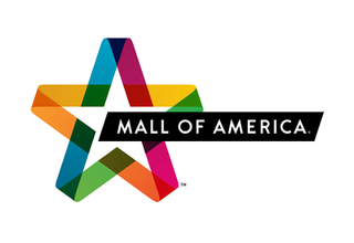
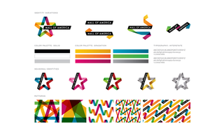
"Our design for Mall of America is a logo that evolves into so much more. It's a symbol that respects their 20-year history, while evolving into a brand language that speaks to their complex brand experience. It's always different, yet always the same." - Joe Duffy, creative director, Duffy & Partners
02. 4Seven
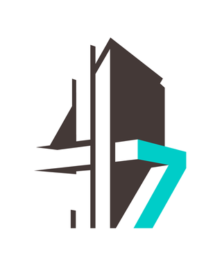
"One of my favourite logos of the year is the new logo for TV channel 4Seven by Magpie Studio. The channel identity as a whole, from 4Creative, has been doing well in the design awards this year, winning a gold at Cannes, and the marque itself is lovely: a clever twist on the classic Channel 4 logo." - Jessica Philpott, freelance designer
03. Dutch monarchy

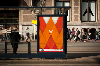
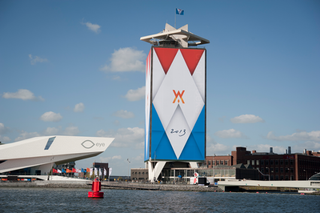
"What does a modern royal crest look like? It's an interesting and challenging brief and Koeweiden Postma nailed it with something that's modern and minimalist, yet very festive and regal. I visited Amsterdam during the run-up to the inauguration and it dressed the city beautifully." - Uri Baruchin, strategy director, the Partners, London
04. Whitney Museum
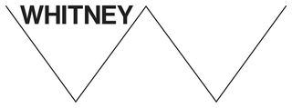
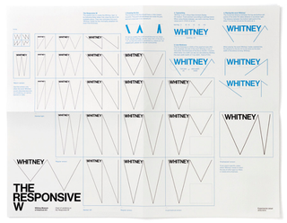
"I'd vote for the new Whitney Museum graphic identity. Interesting, engaging, unusual, controversial, flexible - all the things a good identity should be." - Michael Johnson, johnson banks
05. Monster Raving Loony Party
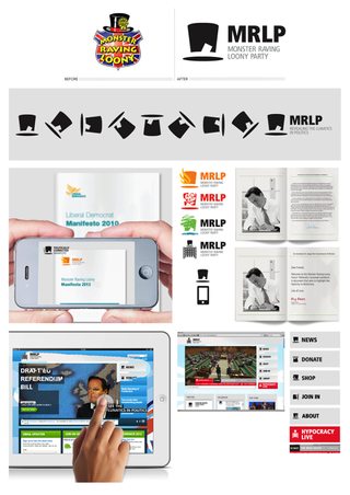
"A logo that immediately springs to mind was one I spotted through the melee at D&AD New Blood. It was for the Monster Raving Loony Party. I can describe it easily: a top hat, with a cutout where the ribbon would go round, with a small ticket shape in the same negative space.
"Essentially the Mad Hatter's hat, but so reduced that I also saw a voting ballot in the hat ticket. It intrigued me from afar, with cut-through simplicity amid so much other work vying for attention. Importantly, though, I would say that such a simple, brain-burn icon would have to be complemented by suitably bonkers behaviour and messaging elsewhere, which, credit to Ben Parish from Falmouth, seemed to be the intention." - Ben Marshall, creative director, Landor
Get the Creative Bloq Newsletter
Daily design news, reviews, how-tos and more, as picked by the editors.
06. Ippon Matsu beer
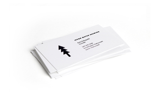
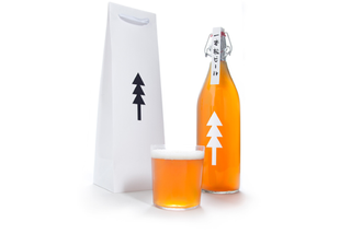
"Ippon Matsu beer, by Kota Kobayashi, is a beautiful, minimal mark and packaging program that would draw people to it, even if they didn't know its powerful meaning relative to the 2011 earthquake and tsunami in Japan." - Joe Duffy, creative director, Duffy & Partners
07. Battle of Bannockburn project
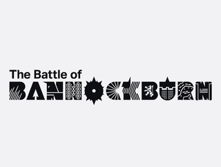
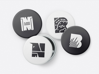
"It's been another dull year so far on the logo front ... But I did love the below, for an experience centre in Scotland by the Beautiful Meme, due to open next year, the scene of the famous defeat of the English by Robert the Bruce – remember, in Braveheart?
"Anyway, each letter effectively helps to tell the story of the battle. I saw the guidelines when I judged Design Week and the copy was bolder and more kick ass than the logo." - Greg Quinton, executive creative director, the Partners, London
08. Queen Elizabeth Award for Engineering
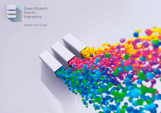
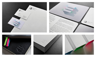
"This was actually done by Landor - but not me personally, before my narcissism starts to show. The identity for the Queen Elizabeth Award for Engineering features an abstract E. It has a depth to it: a physical construction, with an energy within.
"This sounds like 3D frippery, but is done with a degree of restraint suitable for a Royal commission. Having said that, engineering can be, literally, awe inspiring. What goes into constructing a new bridge or engine is mind-boggling to a dunce like me, so the identity also has an unleashed side that demonstrates this. I must say, it has a rather nice old school, one-colour version too, for the purist in me.
"As an appendix to that identity creation, the design of the award itself came from the same idea: tasked with making engineering more visible and engaging to a young audience, the solution was to create an online space for them to design the award itself. Again, the logo and its inner particles became the tools from which aspiring engineers could construct their creations. As such, the identity literally gets people involved." - Ben Marshall, creative director, Landor Associates
09. Oklahoma Contemporary
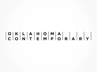
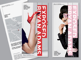
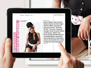
"In my opinion, this year has been a little dull in logo releases. Nothing that's ground-breaking has made an impact here in the States ( or, at least, a positive impact). My favourite for the last six months is Oklahoma Contemporary by Saffron Consultants.
"I come from middle America, a state similar to Oklahoma. So this is a surprising rebranding considering the typical approach to identity design and branding in these areas. This identity is a confident, bold step for an organisation that's connecting with its audience in a uniquely provocative way for this region. The subtle concept of connections is interesting, and it references how the museum is connecting its audience, to great art and design from around the world." - Chris Kline, design director, the Partners, New York
10. Google
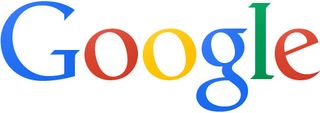
Our own pick for 2013 has to be the new-look Google logo. It was a brave move to revamp such a unibiqutous and well-known logo design and risk the kind of avalanche of criticism generated when its competitor Yahoo! did the same thing.
But somehow the search giant managed to pull off the impossible om 2013. Recasting its much-loved mark along flat design lines, it managed to create a new-look logo that was widely praised by the design community and scaled better on the smallest screens than its predecessor.
Like this? Read these!
- The best Google Doodle designs
- Free tattoo fonts for designers
- Create a perfect mood board with these pro tips
Which logo designs did we miss off our list? Let us know in the comments box below!

Thank you for reading 5 articles this month* Join now for unlimited access
Enjoy your first month for just £1 / $1 / €1
*Read 5 free articles per month without a subscription

Join now for unlimited access
Try first month for just £1 / $1 / €1
The Creative Bloq team is made up of a group of design fans, and has changed and evolved since Creative Bloq began back in 2012. The current website team consists of eight full-time members of staff: Editor Georgia Coggan, Deputy Editor Rosie Hilder, Ecommerce Editor Beren Neale, Senior News Editor Daniel Piper, Editor, Digital Art and 3D Ian Dean, Tech Reviews Editor Erlingur Einarsson and Ecommerce Writer Beth Nicholls and Staff Writer Natalie Fear, as well as a roster of freelancers from around the world. The 3D World and ImagineFX magazine teams also pitch in, ensuring that content from 3D World and ImagineFX is represented on Creative Bloq.
