Craig Ward
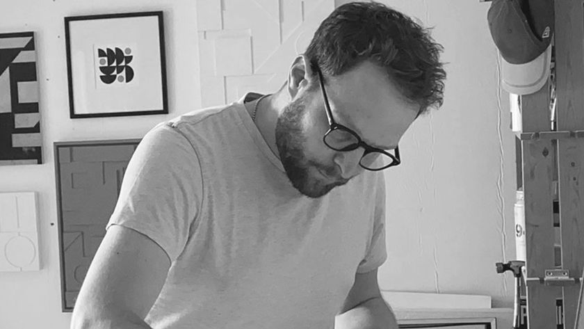
Legibility is overrated, declares London based designer and illustrator Craig Ward. Judging by the clutch of awards for his work, Julia Sagar thinks he's onto something.
Passionate about pushing type to its limits, Craig Ward straddles the boundary between illustration and typography in his work, exploring the notion of word as image. Recent projects have seen him smashing panes of glass, playing with perspective and even collecting hair off the floor, all in the name of typography.
"I'm really over legibility," he asserts. "People place too much emphasis on it. It's a client word, and is often confused with readability. Legibility and readability are two different things, and I think it's all too easy to be legible. You should make people want to read something, as opposed to just laying it out there."
A glance back through his portfolio reveals a range of projects that are as varied in style as they are experimental. Take his FontLab work: asked to create some original typefaces for a new piece of software called Photofont, Ward came up with the novel idea of forming letters from the curlicues of human hair and cherry blossom. "The software allows you to make these transparent, full-colour, really detailed bitmap typefaces for use in Photoshop," he explains. "I wanted to collide organic elements that you don't have any control over with these really cleanly designed typefaces, and see what would happen."
Faced with a completely open brief - "I could do whatever I liked, it's the best and worst kind of brief you can have" - he was having his hair cut when inspiration struck. "I was looking at the floor and a couple of clumps had fashioned themselves into the vague shape of a letter. I thought about brushing it into an existing typeface, so I went and asked for hair from the floor. I think they thought I was some kind of weirdo. Then I rubber-gloved it, bagged it up and brought it home."
Ward allowed the hair to fall into shapes on his scanner naturally, only tweaking letters slightly to achieve an "incidental look", before scanning them in at a high resolution. One clump fell into a perfect circle, inspiring him to adapt his usual process of starting an alphabet with the letters 'A', 'B' and 'C', to building it up from the letter 'O'. "It was completely accidental," he reveals. "Some shapes fell into letters very naturally - the 'K', 'G' and 'R' especially." Not all were formed so easily, however, and he admits to having to come back to some later.
Like much of his work, both Hairy Alphabet and Blossomwell were conceptual pieces, allowing Ward to concentrate on testing the boundaries of legibility and exploring the role of type. For Ward, it all comes back to storytelling: "I used Blossomwell to set the words, 'It's a beautiful decay'. The font is made from dying blossoms, but they're still very, very pretty things. It's a kind of visual code; you have to stop and look at it, and take it in."
Ward's Future Trends project provided the perfect backdrop for him to toy further with the idea of legibility, venturing into new territory to do so. In an evolution of his FontLab work, Ward took the idea of juxtaposing organic matter with a clean typeface, and went digital using a new technology called Processing.
"I'd read about this new program some 18 months earlier, but had been waiting for the right brief to try it out," he explains. "I've seen some really good work from Marian Bantjes and Build, and their collaboration; and Matt Pyke over at Universal as well. It makes you let go of your work, grow things, let it happen organically. You code the program, and it churns out all these random compositions."
Asked to create the phrase 'Future Trends' for Computer Arts Projects, Ward decided to implement the new process and, working closely with Karl Freeman, set about investigating frost patterns on windows. They analysed the different patterns and imperfections and why they formed, and Freeman wrote a script for the program to replicate the phenomenon through randomised processes.
"We had no control over it - that was the exciting part," he says. "The program would draw a line, which would randomly generate imperfections that were invisible to us, but kept affecting its development. The formations were churned out indefinitely until we told it to stop."
Some were completely unusable. Even his chosen letters were so raw, says Ward, that out of context they meant nothing until set out in a line. "Fortunately your brain is hardwired to recognise shapes like letters and faces - the whole thing kind of relies on that," he laughs.
But while the word 'Future' arrived naturally, 'Trends' didn't, and Ward was eventually forced to drop it from the piece. The challenge of finding two 't's and a different 'e' proved too much. "We could have used the 'e' again, but it would look better if we had two different ones, so it was a question of waiting until the software generated something else we could use." Was he tempted to comp some of the more challenging letters together digitally? "Absolutely," he laughs. "But we thought no - let it be as it's meant to be."
It's this experimental - and often unpredictable - element that binds Ward's different projects. Whether working with his letter press, or rendering out hundreds of random, geometric compositions, a degree of chance is often present in his personal work, and he enjoys turning over some responsibility to the process. "You aren't going to get the perfect print - as soon as you let go of that, you can really start to enjoy it. With my wood type, there's always going to be a woodworm that's had its way with the letter. If I'm in Illustrator or Photoshop, I know I'm always going to get a clean edge to my type; it's really nice to surrender to the process and not know exactly how it's going to come out."
'Words are pictures', reads the name of his website, and therein lies the fascination for Ward. "My work tells stories with type," he says. "Type is limitless. I can have as many styles as there are typefaces. There are millions of typefaces, and as many different treatments of those again. It doesn't matter who the audience is, I can put on whatever face I want - it's really exciting."
He owns countless stacks of A5 sketchbooks, where all his designs begin life. "I was taught very traditionally at university to do a spider diagram - to build out from there and see if anything materialises visually," Ward explains. "It always starts with a sketchbook and then, depending on the execution, grows out organically from there - I might fire up the old press, or sit down and do some 3D work."
Let's Go Get Lost was one such project. An experiment in Cinema 4D, inspired by lyrics from the Red Hot Chili Peppers' Road Trippin', it encouraged him to add a new skill to his arsenal and learn 3D. "I'd always had ideas about how I could play with type in three dimensions, but never been able to get my head around a 3D program," he confesses. "So I played around with Google SketchUp, and then all of a sudden Cinema 4D didn't seem quite as imposing as it had previously."
Although he had created a similar style of type many times by hand, Ward believed that Cinema 4D would bestow a certain "solidity" to the piece. "I liked the idea of 'let's go get lost', and wanted the type to be all interwoven," he adds.
Typically for Ward, the end result was surprising. "It was the first thing I'd ever rendered out in Cinema 4D," he says. "I knew I was applying depth, I knew where I'd put my light, but I didn't know how it would look until it was there rendered on the screen."
His work's won him a string of awards, but it's his Art Director's Club branding project that he's most pleased with. A previous Young Gun winner himself, he was asked to design this year's Call for Entries. "It was easily the most nerve-wracking thing I've been asked to do," he confesses. "Knowing how critical people in this industry can be, having my work sent out to 10,000 designers all around the world made me really nervous."
It was a demanding brief, with Ward tasked to include several specific elements in the logo: "They wanted 'ADC', 'Young Guns', the number seven, and a nod to their logo cube," he says. "I went through eight or nine different concepts before arriving at the final one. A lot of it was photographic, putting typography behind the cube and playing with refraction. Eventually I started cutting it up graphically." The final design is composed of a series of shapes that, when combined, form letters, numbers and small pictures, such as birds, flowers and tiny men.
Critics slated the design when he posted it on News Today asking for feedback, but the client was delighted. "I know it's not amazing," Ward reflects humbly, "but I was really proud of it. The idea behind it is solid, the typography is straight; it's good, it works. I'm happy it's going out with my name on it."
One technique that particularly intrigues Ward is anamorphic perspective theory, and he lost no time in trying his hand at it when Creative Review briefed him to create a subs page. "My original idea was to just sort of paint 'Creative Review' into a corner. But Jason Tozer thought we should do something more complicated and involve the stairwell. The lighting was tricky - because it's fluorescent it was giving off more light than it was absorbing - but it was really fun.
The legs were accidental, but the blue tights work really well and make it more fun." Given his fascination with pushing legibility, would he do non-typographical work? "It would have to be the right brief," he muses. "One that made me think, 'There's no way I can solve this typographically'. I've tried, but I always seem to come back to type."
So what does the future hold for Craig Ward? "I still fancy the whole New York thing. I thought I'd grow out of it, but I haven't," he grins. "I want to do more collaborations this year, and get my type off the screen. Whether I'm breaking glass, covering some flat in gaffer tape, arranging intestines over 3D type, or whatever, I'm very keen to get more hands on. That's the plan this year."

Thank you for reading 5 articles this month* Join now for unlimited access
Enjoy your first month for just £1 / $1 / €1
*Read 5 free articles per month without a subscription

Join now for unlimited access
Try first month for just £1 / $1 / €1
Get the Creative Bloq Newsletter
Daily design news, reviews, how-tos and more, as picked by the editors.
The Creative Bloq team is made up of a group of design fans, and has changed and evolved since Creative Bloq began back in 2012. The current website team consists of eight full-time members of staff: Editor Georgia Coggan, Deputy Editor Rosie Hilder, Ecommerce Editor Beren Neale, Senior News Editor Daniel Piper, Editor, Digital Art and 3D Ian Dean, Tech Reviews Editor Erlingur Einarsson and Ecommerce Writer Beth Nicholls and Staff Writer Natalie Fear, as well as a roster of freelancers from around the world. The 3D World and ImagineFX magazine teams also pitch in, ensuring that content from 3D World and ImagineFX is represented on Creative Bloq.
