5 classic movie posters from Anthony Goldschmidt
Movie posters icon Anthony Goldschmidt passed away on 17 June. Here we pay tribute to the founder of Intralink Film Graphic Design.
On 17 June, one of the pioneers of movie poster design sadly passed away. Anthony Goldschmidt founded Intralink Film Graphic Design in 1979 and remained the sole owner of the company since its inception. Creating imagery for motion pictures, television series' and theatrical home entertainment, his work will forever be remembered.
Here, we take a look at some of the best poster designs to ever come from Intralink under the guidance of Goldschmidt...
01. E.T.
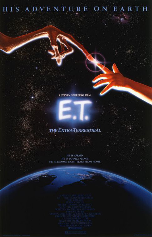
While still at college, John Alvin freelanced for Hollywood art director Anthony Goldschmidt. Little did he know that his little sideline would pave the way for a career that spanned 35 years and 135 movies. He was working as an illustrator at an animation studio when Goldschmidt recommended him to paint the poster for Mel Brook’s spoof Western Blazing Saddles. Alvin would go on to create posters for films such as Blade Runner, Beauty and the Beast, Gremlins and this stunning creation for E.T.
Spielberg himself is said to have suggested Michelangelo’s The Creation of Adam. For Alvin, who died in 2008, the design also had a personal touch: the hand of the child in the poster belongs to his daughter, Farah.
02. The Dark Knight
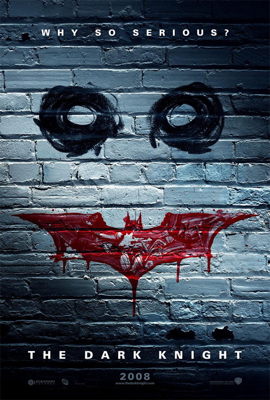
As one of the most anticipated and largest grossing superhero movies ever, the second in Christopher Nolan's Batman trilogy had to have some pretty incredible imagery; step forward Intralink Film Graphic Design. This is just one of their creations that perfectly captures the sinister tones of the Joker whilst incorporating the iconic Batman logo.
03. Dirt
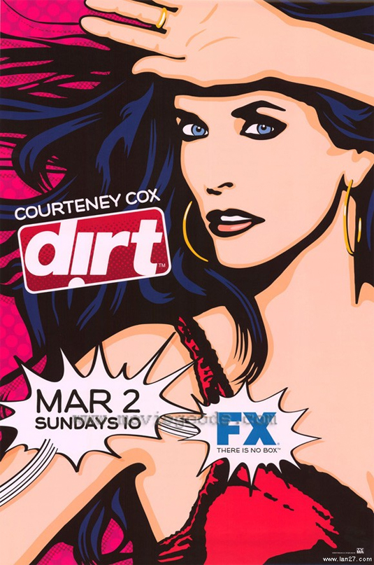
Whilst this may not be as iconic as some of Intralink Film Graphic Design's previous poster work, it's a perfect example of their constant strive for creativity and uniqueness. Harking back to some of the best comic book artists in recent memory, this poster design for cable television show Dirt is as eye-catching as it is colourful.
04. Se7en
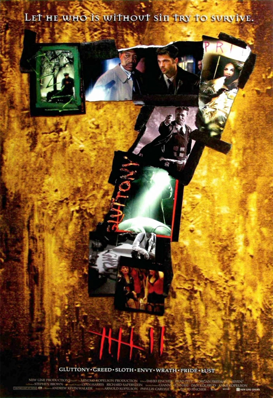
This is a movie poster design that showcases Intralink Film Graphic Design's ability to merge photography, typography and graphic design to produce an eye-catching and thought-provoking execution. Sinister and creepy, the poster perfectly captures the spirit of the film overall.
Get the Creative Bloq Newsletter
Daily design news, reviews, how-tos and more, as picked by the editors.
05. Transamerica
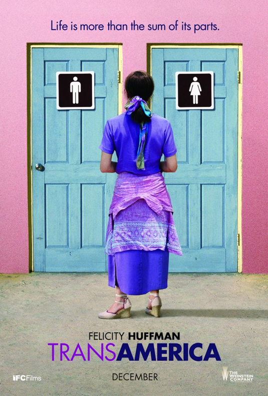
Again, whilst this might not be Intralink Film Graphic Design's best known movie poster, it almost certainly showcases their diverse range in design and execution. The tag line, teamed with the brilliantly placed character shot and packaged into one, colourful and striking poster design makes this one a winner.
Which poster is your favourite design? Let us know in the comments box below!

Thank you for reading 5 articles this month* Join now for unlimited access
Enjoy your first month for just £1 / $1 / €1
*Read 5 free articles per month without a subscription

Join now for unlimited access
Try first month for just £1 / $1 / €1

Sammy Maine was a founding member of the Creative Bloq team way back in the early 2010s, working as a Commissioning Editor. Her interests cover graphic design in music and film, illustration and animation. Since departing, Sammy has written for The Guardian, VICE, The Independent & Metro, and currently co-edits the quarterly music journal Gold Flake Paint.
