The 200 best design moments in our lifetime - part 4
It's the home stretch of our marathon trip through the greatest design things in Computer Arts' lifetime. Get set for 151-200!
Back in 1995 the first issue of Computer Arts was launched, and 17 years and 199 issues later the team compiled what they believe to be 200 of the best design moments within our lifetime.
Now to complete the 200, read on - then tell us if we've missed any in the comments!
151. Honda Grrr by Smith & Foulkes
After it comes out in 2004, no other TV advert wins more awards than Honda Grrr, created by directors Alan Smith and Adam Foulkes at Nexus Productions. It's dubbed 'the ad of the decade' and is unforgettable, with Honda's new engine floating about like a butterfly across a landscape filled with cute and highly colourful creatures. "If every single commercial was like Honda Grrr, then that would be the norm," says Smith. "It would almost be too much. You wouldn't know what it was all about. It has to sit in a world of fairly straightforward commercials to actually stand out."
The pair joke around a lot, and like many creative duos, one often completes the other's sentences in conversation. When they're in their flow, the way they collaborate is based on evolving ideas and bouncing things back and forth, rather than making hard and fast decisions. After all, they reason, when clients review their work they are bound to suggest some changes, so the Smith & Foulkes creative process takes this into account. It's almost as though the client is part of the collaboration.

"We are doing a job for somebody - not just the agency but the client, the client's dog and beyond. Everyone has an opinion, and everyone pushes it into a place that they want. We've done jobs that we thought were really good and had the client say, 'Well, it's not working hard for our market.' So we've had to change something to suit a request for something else. Everything is a compromise in every commercial job you do."
152. Life, and the Universal Everything
With a love of generative imagery and working from his garden shed, digital artist Matt Pyke founds Universal Everything, winning great acclaim for the live concert graphics the studio produces. Even better work is to come with the MTV refresh that Universal Everything contributes to in 2009.
153. The Partners' Pantone Manet
In 1882 Edouard Manet completed his impressionist painting 'Un Bar aux Folies-Bergre'. In 2008, creatives at The Partners meticulously colour-match Pantone swatches to Manet's paints and reconstruct the image within a gilded frame. They call it a 'Mantone'.
Get the Creative Bloq Newsletter
Daily design news, reviews, how-tos and more, as picked by the editors.
154. The Peter Saville show
The lanky-haired Lancastrian Peter Saville is honoured with an exhibition in 2003 at The Design Museum featuring his life's work, from his first Factory Records poster in 1978 to the 'Blue Monday' cover and his 'Colour and Form' identity, for the Museum itself.
155. Saul Bass passes away
1996: A hugely influential graphic designer - and perhaps the world's first exponent of motion graphics - Saul Bass is best known for his film title sequences with Alfred Hitchcock. But he also designed iconic logos for Bell, Kleenex, Quaker Oats and more.
156. Jasper Goodall and illustration resurgance
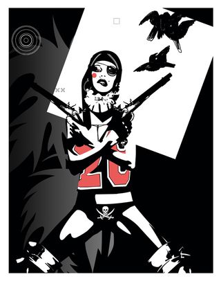
When The Face art director Graham Rounthwaite commissions Jasper Goodall for the magazine in the late 1990s, illustration is in the doldrums. Stock imagery is becoming the norm, in particular digital photography. But silhouettes, bold swathes of colour and a certain sexiness give Goodall's work an arresting edge that can turn heads far more effectively than another perfect photo.
157. Autodesk buys everything
When Adobe purchases Macromedia in 2005, it brings great technologies like Flash into its Creative Suite, but for many it reduces choice in the marketplace. The same thing seems to have happened in the 3D market with Autodesk - previously the purveyor of 3ds Max and AutoCAD - swallowing up Maya and Softimage in 2006. Luckily the company hasn't discontinued any major lines, and Cinema 4D and Lightwave 3D are still roaming out on the plains to keep things somewhat competitive.
158. Abbey Road and Robbie Williams
Abbey Road, the famous recording studio used by The Beatles in the 1960s, steps into the 21st century in 2000, broadening its scope with Abbey Road Interactive. It works with the likes of Robbie Williams to produce interactive and rich content elements for music DVDs, adding video production, animation, menus, 3D and design to its audio recording heritage.
159. Saville for England
Peter Saville has become something of a national treasure, so Umbro invites him to submit designs for the England football shirt. In September 2010 he creates a pattern made up of small, widely spaced St George's crosses in a rainbow of colours. The next thing he knows, the England team is wearing the kit against Bulgaria for the first of its European Championship qualifier matches.
160. Colour like no other
Fallon's Juan Cabral helps the agency win the YoungGun agency award with his Sony Bravia commercial in 2005. In it 50,000 coloured balls cascade down one of those hilly streets in San Francisco. It requires six takes, with 50 interns collecting up the balls after each one.
161. Raygun shot down
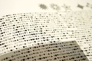
The last issue of the alternative music magazine Raygun goes on sale in 1999, ending seven years of art direction that explored type and graphic design. David Carson founded and art directed its first issues - once converting the entire text of a Bryan Ferry interview to Zapf Dingbats.
162. OFFSET Festival
In 2009, Peter O'Dwyer, Bren Byrne and Richard Seabrooke set up OFFSET - a gathering of the world's top creatives. To date, it's attracted Sagmeister, Carson, Burrill and many, many more.
163. The World Is Not Enough
The titles for the James Bond film The World Is Not Enough is just one of the projects that CG house Smoke & Mirrors tackles in 1999, when it's at the top of its game. Formed in 1995, it now bills itself as 'the original post boutique' and has studios in London, New York and Shanghai.
164. A star rises in the north
Even bigger things were to come from Brendan Dawes when in 1998 he became creative director at Subnet. An expert designer, coder and true visionary, he later becomes CD of magneticNorth, designing some of the most innovative interactive work around.
165. Alan Aldridge retrospective
Famed illustrator of the 1960s and 70s Alan Aldridge is honoured with a retrospective of his work at the Design Museum in 2009. Read our interview with Aldridge at the time of the show.
166. Graphic Thought Facility
Simple, clear and well-crafted design is the forte of London design consultancy Graphic Thought Facility. Its heart in the centre of a house drawn in one continuous line for Habitat's 2002 rebrand is an inspired piece of logo work, and other top projects include identities for the Design Museum in 2003 and the Frieze Art Fair of 2007.
167. Get down on your knees
Generative art is just one of the many playgrounds of Flash pioneer Joshua Davis and the PrayStation site he launches in 2001 is still a great example of his skills in this area. He uses code to generate imagery for everything from web apps to environmental graphics.
168. The new Coke
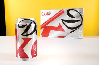
One of the main reasons for the success of Turner Duckworth's rebranding of Coca-Cola is the way the agency pares back all the detail that had developed around the drink over the years - from the decorative bubbles that appeared on cans to the use of colour and the shape of the packaging. With the simplified new look in place, in 2011 Turner Duckworth releases a new Diet Coke can that reduces things even more, cropping in on the 'D' in Diet and part of the 'oke' in Coke. It's the kind of clipped-yet-recognisable type that David Carson would be proud of.
169. All Known Questions Answered
2001: Forward-thinking San Francisco agency AKQA is founded to bring clients a new approach to media with digital at its core. Today there are offices in London, Paris, New York, Berlin and Shanghai.
170. A drop of Scotch
The typography genius Matthew Carter spends many hours in St Bride Library, London in 1997, researching Scotch Roman typefaces of the 19th century before designing the exquisite newsprint font Miller. It's been used by the Guardian, The Boston Globe and others.
171. ilovedust, and bikes
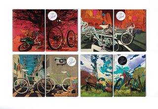
Set up in 2003, ilovedust now has studios in hectic east London and the tranquil Hampshire town of Southsea. Working in a mix of styles from cartoon, street-inspired mash-ups to clean, modern designs, the creatives are never too far away from a customised fixed-gear bike.
172. Creative Suite appears
With Adobe's individual software programs surging to the top, the company combines them into an uber-package in 2003: Creative Suite. Alongside the Mac, CS is the staple of design studios around the world.
173. The Wilderness Downtown
Music video director Chris Milk creates Arcade Fire's award-winning interactive version of The Wilderness Downtown in 2010. The viewer can enter their postcode and Street View imagery of their neighbourhood is integrated with the video thanks to some fancy HTML5 interactivity.
174. What design is really like
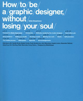
Kudos to designer and author Adrian Shaughnessy for his 2005 book How to be a Graphic Designer, Without Losing Your Soul. It's not about pretty images with little or no analysis. It's not about learning how to design, or where to find the Noise filter in Photoshop. It looks at the real issues involved in setting up a studio, finding and working with clients, plus the creative challenges you'll face along the way, such as how to cope with the long, hard hours creating a campaign with the sole purpose of getting people to purchase something.
175. Adobe Creative Suite 5.5
The latest Creative Suite launches in May 2011, with Adobe changing its two-year upgrade cycle - now there will be 0.5 version upgrades annually. The collection integrates many features that are helpful for those creating apps and using multi-touch devices, such as the iPad.
Now for the first time you can use your full copy of Photoshop Extended in conjunction with iPad creative apps such as Nav, Lava and Eazel, exchanging documents via Wi-Fi. InDesign makes publishing documents in the ePUB format smoother, and with Dreamweaver you can now author and test Android apps natively. Despite Flash not porting to iPad easily, CS5.5 is very much a mobile-orientated release.
176. TYPO London

After running in Berlin since 1995, the TYPO conference comes to London for the first time in 2011 - and Computer Arts is there. Speakers include Morag Meyerscough, Erik Spiekermann, Michael Bierut, Jonathan Barnbrook and many others. The theme is 'places' and the discussions at the centre of the show range far beyond pure typography, covering user experience design, branding and information design. And it seems to have put down roots: the show returns to London this year, and also goes to San Francisco.
177. Blur: The Best Of
Artist Julian Opie's style sums up the era when he creates the cover for Blur: The Best of in 2000, depicting each band member with simple line art, flat colours and minimal detail. Vector outlining soon becomes a popular approach to digital illustration.
178. The all-new Computer Arts site comes to a screen near you

Maybe we did let our hair grow a bit long before sorting it out, but things are knocked back into shape emphatically in 2011 with the redesign of the Computer Arts website. You could plug into articles online quickly and efficiently, and alongside a ready supply of technique tutorials, features and interviews, details of the latest inspiring projects from around the design universe regularly appeared on the blog. Our lovely visitors just kept coming back for more.
179. Silhouette dance team
Apple - its logo, in essence, the fruit in silhouette - launches its iPod in 2001 with a brilliant ad campaign overseen by Lee Clow from TBWA. The unforgettable ads feature dancers in silhouette on bright backgrounds, with telltale white earphone leads connecting to their heads.
180. Channel 4's latest referesh

TV branding is always evolving, and Rudd Studio's 2010 refresh of Channel 4 more than maintains the broadcaster's reputation for considered design. The Channel 4 logo remains the same, with its constituent forms moving together and drifting apart, constructing and deconstructing, as they have in the past.

The nod to deconstructionism this time is aided by lines bisecting many of the images, seeming to refract the numeral in interesting ways. Through the four itself you see images relating to programming and themes on the channel, so that the brand continues to adapt. Clever.
181. FWA founded
The Favourite Website Awards are conceived in May 2000 by Rob Ford, and no other website awards since has been anywhere near as successful. The website racks up 140 million hits by July 2011, and rewards a top site daily, monthly and annually. On top of being a great destination thanks to the sites it showcases, The FWA always has a none-too-shabby design itself, making it doubly inspiring to visit. So, who has won the most Site of the Day awards? Well it's B-Reel of Sweden, with 64 to date, followed by Firstborn and Big Spaceship in New York.
182. First Computer Arts Collection
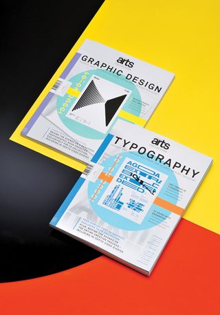
In 2011 our high-end sister magazine launches, with a bi-monthly schedule and groundbreaking design aesthetic that includes special papers, inks and finishes throughout. Issue one focuses on graphic design, and features the talents of Angus Hyland, Planning Unit and more.
183. Maya for the Mac
If one thing is missing from the Apple Mac's repertoire early on, it's a high-end 3D animation, VFX and compositing package. The best in this category is available on high-end PC workstations, but this changes when Maya arrives for the Mac in 2004, giving designers the opportunity to have Hollywood effects on their desktop.
184. Rubberduckzilla and Cactus Kid
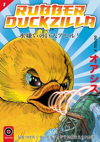
London agency Mother proves it has mastered the off-beat, viral-esque approach to advertising in 2009 with its TV work for Oasis drinks featuring the invasion of Japan by Rubberduckzilla, and the Cactus Kid saga in which a woman runs away with a man who is half-cactus.
185. Full of hot air
If an image of the world as a hot air balloon is etched into your brain, you can thank the identity agency Lambie-Nairn, which comes up with the concept for the BBC's idents featuring balloons over the British landscape, and overseas, in 1997. They run until 2002.
186. 'All is Full of Love'
Designers around the world have found inspiration in Chris Cunningham's 2000 video for Bjork's 'All is Full of Love'. Featuring a white, futuristic crash test-style mannequin that comes to life, it wins a D&AD Black Pencil for RSA/Black Dog Films in 2000.
187. Happy 50th, Helvetica
How does a typeface blow out the 50 candles on its birthday cake in 2007? With a film featuring some of the biggest names in design who've used the font, plus a poster design mash-up contributed to by every great designer with the slightest modernist tinge.
188. Computer Arts Graduate Showcase
After publishing Computer Arts for one year, we begin our initiative to promote and foster new talent in 1996 with our first annual Graduate Showcase, which looks at top creative courses around the world and the work of some of the hottest graduates.
189. Studio 8 and Elephant
With a growing reputation for clean, clear and well-crafted design work, Studio 8 works with the Dutch publisher Frame on the first issue of Elephant magazine in 2009, which looks at the creators of art and visual culture on a quarterly basis.
190. Tourette, Exocet, Moron, Bastard

These are all font titles from Virus Fonts, the foundry set up in 1997 by Jonathan Barnbrook and Marcus Leis Allion. Many of its fonts have confrontational names, since the designers want to explore how letters and words are used expressively in language.
191. The Third Place
Usually third place is a bronze medal, but Hi-Res design consultancy comes up with The Third Place in 2002 as an online branding proposition for the PlayStation 2 - the idea is that the games console is a gateway to another world. When the product launches, visitors to the site explore a 3D world. It's the ultimate design escapism - selling escapism.
192. The End of Print
Going by its title, you might expect a book about digital design. But the 1995 publication is actually a challenge to 500 years of printing, layout and legibility conventions similar to Raygun, the music magazine David Carson had previously art directed. There are essays on Carson's design philosophy, though it could be said they are there to look at rather than to be read, along with his eclectic mix of beach culture, handpainted signs and other relics of street culture, all layered together digitally using a Mac.
193. Hello TADO
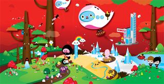
In 2004, Mike and Katie of Sheffield-based studio TADO begin cementing their positions as the king and queen of cute with their Fortune Pork Mini Plush character range of soft toys. They go on to create everything from cereal boxes to gallery exhibitions, such as The Littlest Savage, and take part in events like Pubscrawl.
194. The RenderDrive RD5000!
Raytracing is at the cutting edge of 3D design in 2000, but it requires serious processing power, such as the RenderDrive RD5000, to create imagery quickly. This kit costs £17,500. Sure, it does radiosity, HDRI, motion blur, area lights and depth of field too, but in-software rendering comes on a long way in the next 12 years.
195. My Pet Skeleton
With keen Photoshop and web design skills, Canadian creative Vincent Marcone launches FWA-winning site My Pet Skeleton in 2000. He turns haunting imagery into a living, making videos for alternative bands such as Mushroomhead, Jakalope, HourCast and more.
196. Julien De Repentigny
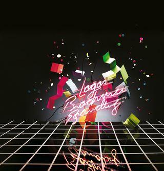
Working with Moment Factory and Cirque du Soleil, Julien De Repentigny art directs the captivating motion visuals that herald the Xbox Kinect at the huge games industry expo E3 in 2009. More than just an animation, the show is an experience for those invited. That same year, he builds a neon light sculpture for the cover of issue 181 of Computer Arts. He has also created everything from installations at art exhibitions to milk packaging. This French-Canadian designer, who now lives in London, is a man to watch.
197. Identikal Designs Angol
Nick and Adam Haynes are the dead ringers of design. Yes, they're identical twins - hence the name of their studio. Starting in London, and fascinated by typography, their typeface Angol sums up their playful approach and, indeed, each letter has a bit of an angle to it. Type is just the beginning for the duo, who move to New York in 2003. Their lettering is often part of illustration and graphic design briefs and, always hungry to explore new areas of creativity, more recently they have been exploring motion and photography.
198. Alex Trochut and Disappear Here
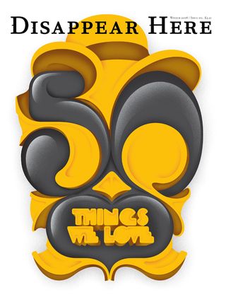
In 2008, Alex Trochut creates a deliciously decorative headline reading '10 ways to get a job' for a feature here in Computer Arts. His thick, parallel line type oozes with creativity and confidence, and he goes on to illustrate an Estrella Damm campaign that is seen nationwide, as well as create his Neo Deco typeface and work on numerous magazine front covers and book covers. Perhaps the most iconic typographic image he crafts is for the first issue of Disappear Here magazine in 2009 - it's a big gold and black statement that reads: '50 Things We Love'.
199. Five, Fiver, and Five USA
In 2008, London design studio Dixon Baxi gives Channel 5 its distinctive look and refreshes it the following year, bringing elements of the UK channel's strongest programming - The Mentalist, CSI and The Gadget Show - into the idents.
200. The Designers Republic
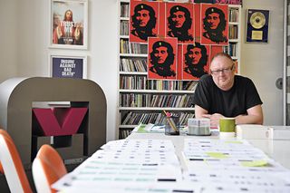
Ask a top designer like Michael Paul Young who inspired him when he started his career, and high on the list will be The Designers Republic (tDR). Founded by Ian Anderson in Sheffield during the late 1980s, the studio worked for clients more varied than people often remember - from bands including Pop Will Eat Itself, to electricity companies and Japanese brands like Sony.
After designing the graphics for the original PlayStation game Wipeout in 1995, tDR is at the forefront of Britain's young, can-do design scene, and appears regularly in Computer Arts. Sadly, it closes its doors after 23 years in January 2009.
Part 1: 1-50 | Part 2: 51-100 | Part 3: 101-150 | Part 4: 151-200

Thank you for reading 5 articles this month* Join now for unlimited access
Enjoy your first month for just £1 / $1 / €1
*Read 5 free articles per month without a subscription

Join now for unlimited access
Try first month for just £1 / $1 / €1
The Creative Bloq team is made up of a group of design fans, and has changed and evolved since Creative Bloq began back in 2012. The current website team consists of eight full-time members of staff: Editor Georgia Coggan, Deputy Editor Rosie Hilder, Ecommerce Editor Beren Neale, Senior News Editor Daniel Piper, Editor, Digital Art and 3D Ian Dean, Tech Reviews Editor Erlingur Einarsson and Ecommerce Writer Beth Nicholls and Staff Writer Natalie Fear, as well as a roster of freelancers from around the world. The 3D World and ImagineFX magazine teams also pitch in, ensuring that content from 3D World and ImagineFX is represented on Creative Bloq.
