What's so special about the Yves Saint Laurent logo?
Co-founder of Barcelona-based studio Vasava, Bruno Sellés explains why the classic YSL identity is a design apart in fashion history.

The classic Yves Saint Laurent logo design is an outstanding piece of fashion history that completely sets itself apart from the fashion clichés that are dominated by the modern serifs of Didots and Bodonis - Giorgio Armani, Vogue, Harper’s Bazaar, Calvin Klein, Ralph Lauren; and the uppercase grotesques - Chanel, D&G, Louis Vuitton, Hugo Boss and so on. It was one of the last works of Monsieur Cassandre, designed (circa 1962) before he committed suicide due to depression.
Harmonious letterforms
He blends the letterforms with exceptional harmony, mixing sans and serifs in a subtle way, while successfully mixing roman and italic forms at the same time. The challenge lies in how Cassandre dared to break the unwritten rule of not mixing - in the same word - two typeface features that are, in principle, incompatible.
This is what makes it special and inimitable. Besides this, he faced the problem of connecting all the letters - which he managed to do in a very subtle way without creating odd ligatures or distracting, superfluous strokes.
The words flow from left to right, creating a beautiful rhythm between the capitals and the small capitals. It’s a seemingly impossible combination that works perfectly and makes this an unique gem of graphic identity rarely seen even in this day in age.
Unique design
My favourite part of this masterpiece is its uniqueness. Lame copies of the lettering have never worked well. They look more like a bunch of letters dancing the conga than a proper logo (I’m thinking about the old Price Waterhouse Coopers logo).
Cassandre managed to perfectly capture the sensibility and sexual ambiguity of the fashion designer Yves Saint Laurent in this design. Years have passed but, like any good logo, it still stands strong, setting itself apart from its fellow brands.
It has become not only a synonym of the ultimate luxury brand, but also a symbol of quality. The three capital letters are turned into a charmingly elegant monogram that when left by itself still stands for most, if not all, of the values mentioned here.
Get the Creative Bloq Newsletter
Daily design news, reviews, how-tos and more, as picked by the editors.
Words: Bruno Sellés
Bruno Sellés is co-founder of Barcelona-based studio Vasava. Since 1997 it has specialised in cross-media projects - print, web, motion,
3D, animation and video - for brands such as Nike, Rocawear, Adobe, Diesel, 55DSL, Mango, Budweiser and Red Bull. This article originally appeared in Computer Arts.
Win a car in this design competition

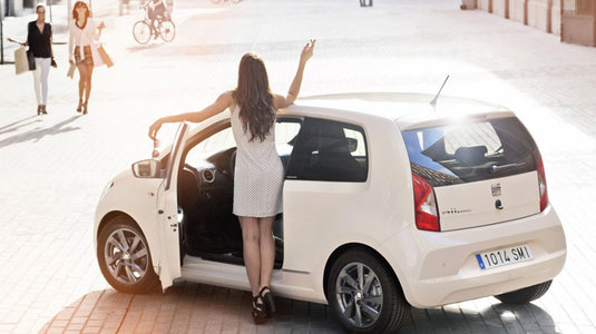
The SEAT Mii by MANGO is a city car with a special focus on design - and so it's not surprising that makers are wooing artists, illustrators and fashion designers with an enticing competition.
What do you need to do? Simply use the templates provided to create a design for a shoe bag and make-up bag inspired by the Mii and the theme 'An urban car for a city girl'.
Click here to enter the competition!

Thank you for reading 5 articles this month* Join now for unlimited access
Enjoy your first month for just £1 / $1 / €1
*Read 5 free articles per month without a subscription

Join now for unlimited access
Try first month for just £1 / $1 / €1

The Creative Bloq team is made up of a group of design fans, and has changed and evolved since Creative Bloq began back in 2012. The current website team consists of eight full-time members of staff: Editor Georgia Coggan, Deputy Editor Rosie Hilder, Ecommerce Editor Beren Neale, Senior News Editor Daniel Piper, Editor, Digital Art and 3D Ian Dean, Tech Reviews Editor Erlingur Einarsson, Ecommerce Writer Beth Nicholls and Staff Writer Natalie Fear, as well as a roster of freelancers from around the world. The ImagineFX magazine team also pitch in, ensuring that content from leading digital art publication ImagineFX is represented on Creative Bloq.
