Gumtree reveals new logo design
Online classifieds site Gumtree has rebranded for 2016 – with help from Koto design studio.

With one in four people in the UK using Gumtree at least once a month, it's important for the giant classifieds site to have a clear, simple brand image that cultivates an online community. Thanks to help from Koto, that's exactly what they've now got.
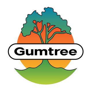
Revealed today, its new site design and branding is based on three core principles: modern, simple and digital. "I think it had been very clear the previous logo had divided a lot of opinion," explains head of Koto James Greenfield.
"They’d done a lot of consumer research and I think it’s fair to say that it wasn’t liked that much," he adds. "No one knew the reason Gumtree had started so the meaning had become quite lost.”

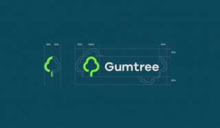
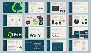
After working through various designs, a clear winner was settled upon. With a vibrant, simplified tree icon logo that pops off the screen and page, Gumtree now have a brand design they own.
Paired with a darker colour scheme, inspired by Rainbow Eucalyptus trees, James says that the rebrand keeps "all the positive natural connotations of growth, stability and diversity whilst making [Gumtree] an instantly recognisable icon."
Want to learn more? See how Gumtree and Koto worked on this distinctive rebrand in the video below.


[Via It's Nice That]
Get the Creative Bloq Newsletter
Daily design news, reviews, how-tos and more, as picked by the editors.
Liked this? Read these!

Thank you for reading 5 articles this month* Join now for unlimited access
Enjoy your first month for just £1 / $1 / €1
*Read 5 free articles per month without a subscription

Join now for unlimited access
Try first month for just £1 / $1 / €1
Dom Carter is a freelance writer who specialises in art and design. Formerly a staff writer for Creative Bloq, his work has also appeared on Creative Boom and in the pages of ImagineFX, Computer Arts, 3D World, and .net. He has been a D&AD New Blood judge, and has a particular interest in picture books.


