13 of the best style guide examples
The best branding style guides from big-name companies are super detailed.
The best style guide examples can be a pleasure to gawp at for anyone interested in branding and graphic design, and they can also be great resources to learn from. A branding style guide or style manual sets out the standards for the design of all manner of brand resources, including website pages, social media content, signage and collaterals.
Brand style guides often enforce strict rules for how logos should be applied, which colours and fonts should be used in certain situations and how other brand assets should be deployed. Their objective is to ensure a coherent consistent identity across all channels, both physical and digital, and they can often be meticulously detailed.
In the guide below, we delve into the best branding style guide examples from 12 well-known companies. You might fight inspiration if you're wondering how to create a style guide of your own. And if you haven't yet created a logo to apply rules, don't miss our piece on how to design a logo.
The best branding style guide examples
01. The Coca-Cola brand style guide
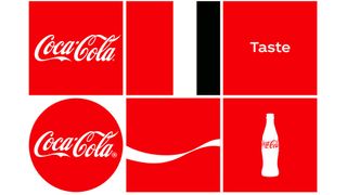
Coca-Cola is one of the most recognised brands in the world, so it's always interesting to look at how it lays out its brand rules in its style guidelines. Unsurprisingly, this is one of the biggest branding style guide examples we've seen, with rules for logo applications (in several languages) and fonts but also the design of individual products.
02. IBM style guide
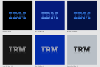
IBM's style guide is just as thorough as you'd expect for a company that's built a reputation for embracing a culture led by design thinking. The well-presented online guide covers everything from typography to app icons and how branding can be used in motion. This is a perfect modern design style guide example.
03. Apple Human Interface guidelines
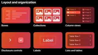
The best branding style guide examples don't only include guidelines for logo applications and collaterals. Tech companies also have human interface rules for UI design, and Apple's are nothing if not comprehensive.
Aimed at app designers who want their creations to integrate seamlessly with Apple's devices and operating systems, this online style guide covers everything you might possibly need to know – whether you're designing for macOS, iOS, watchOS or even tvOS. The Apple logo guidelines are also worth checking out.
Get the Creative Bloq Newsletter
Daily design news, reviews, how-tos and more, as picked by the editors.
04. Urban Outfitters brand style guide
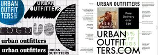
The average branch might look as though a bunch of squatters decided to hold a jumble sale in a derelict factory, but hipster bazaar Urban Outfitters takes its visual identity very seriously, as a quick flick through its brandbook will reveal. The 42-page guide covers everything from Urban Outfitters' history and philosophy through to logo usage, typography, photography methodology and guidelines on the tone of voice to be used in communications.
05. The I Love New York brand style guide
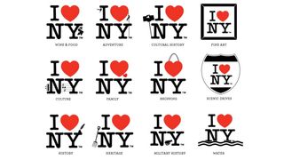
Milton Glaser's I Love New York logo is a wonderfully simple and iconic piece of design, so you might not expect there to be a 50-page set of brand guidelines attached to it. However, there's more to I Love New York than Milton Glaser's logo; that's just the most memorable aspect of a campaign launched in 1977 and refreshed in 2008.
The scrupulously detailed brand guidelines cover all the bases for a campaign that represents the whole state of New York and not just New York City. There's a mission statement and brand pyramid, consistency and typography guidelines, plus a whole load of thematic logo treatments and logo usage guidelines to follow. We're not sure what its creators would think of the new 'we love NYC' campaign.
06. NASA brand style guide
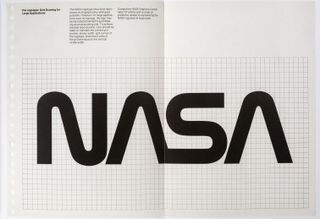
The original National Aeronautics and Space Administration's Graphics Standards Manual was created by Danne & Blackburn in 1974 when NASA changed from its original crest-based logo to the 'worm' logotype that's now so familiar (and since supplanted by the 'meatball logo' as the primary design. The manual was revived in 2015 thanks to a Kickstarter campaign to fund its reissue. Jesse Reed and Hamish Smyth's glorious 220-page version of the case-bound NASA document came with 'static shielding' packaging.
07. British Rail identity manual

The sadly now-defunct state-run British Rail had a more epic branding style guide than many multinational companies. In fact, the British Rail Corporate Identity Manual was split over four ring-bound volumes. Epic levels of obsessive behaviour abound in the guide, which dates back to 1965, and some of the pictograms are a delight. Want to own your own copy? You're in luck; after a successful Kickstarter campaign, designer Wallace Henning has created a high-specification recreation of the original manual that you can order now; find out more here.
08. Channel 4 brand style guide
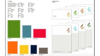
Channel 4's style guide leaves no room for confusion on how its brand is used. The guide is 46 pages long, each of which is clean and clear, stating a single guideline per page, often accompanied by a graphic for visual reference. It covers everything from poster and web banner layouts to copy design and letter templates. If that's not enough meticulous branding rules for you, there are also dedicated style guides for E4, Film4, More4 and more.
09. Skype brand style guidelines

The Skype style guide is brilliant for many reasons – its cool illustrations being one of them. The communication company hasn't filled its guide with pages of industry jargon, it simply employs easy-to-understand explanations and graphics to get its point across.
10. Barbican style guide
The Barbican theatre's identity "is not just a logo. It is a design scheme composed of several core elements that come together to create a distinctive look and feel that makes the Barbican brand instantly recognisable". Which is why a brand style guide is important. This brand style guide example is presented in a beautifully clear, minimalist way. Rules are kept to the minimum and they're expressed succinctly ("Futura is our voice. We only use one font." – love it!).
The style guide is as bold and colourful as you'd hope for from a leading arts company. it's also really easy to use since every individual page can be quickly copied to share. The Barbican allows a degree of creative flexibility for designers tasked with using its identity, and the style guide gives some clear pointers.
11. Firefox brand style guide
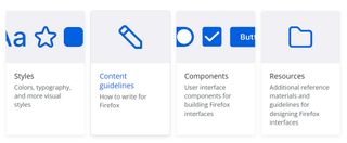
Mozilla has ditched its old style guide for Firefox and introduced a whole new public design system called Acorn to help web designers create beautiful products for Firefox users. As well as useful guidelines and principles, the online Acorn Design System guide includes reusable UI components, templates, and other resources for building consistent and recognisable products across all platforms.
12. Macmillan
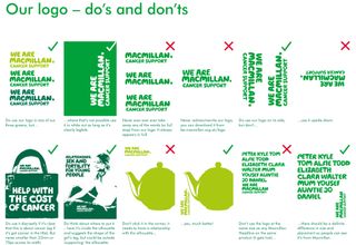
Major charities can also have great style guide examples. The Cancer charity Macmillan's identity design guide covers everything from signage to infographics, as well as tips on how to use the brand's familiar green colours and which photos are best used as the image silhouettes you'll find in the charity's marketing material. Unlike many of the style guides on this list, Macmillan offers explanations for many of its rules, to explain the thinking behind them and help fix them in readers' minds.
13. The International Olympic Committee
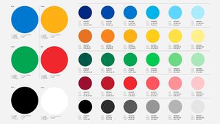
Incredibly it took 125 years for the International Olympic Committee to get around to developing a full package of brand assets, but when it finally did in 2022, it went all out. With colours, graphics, illustrations and three exclusive typefaces, the full brand style guide is as epic as the games themselves running to 129 pages. There are lots of rules, and it goes into more depth than many of the brand style guide examples we've seen above, providing guidelines for photography and even the line length of copy.
Related articles:

Thank you for reading 5 articles this month* Join now for unlimited access
Enjoy your first month for just £1 / $1 / €1
*Read 5 free articles per month without a subscription

Join now for unlimited access
Try first month for just £1 / $1 / €1
Craig Stewart is a writer, SEO strategist and content marketer, and is a former editor of Creative Bloq. Craig has written about design, typography, tech and football for publications including Creative Bloq, T3, FourFourTwo and DSG, and he has written a book on motoring for Haynes. When he's not writing, you'll usually find Craig under his old car learning about DIY repairs the hard way.


