20 outstanding uses of colour in branding
Successfully 'owning' a colour is a big deal. Here's how a succession of top brands have staked their claim.
Colour theory is a central and often overlooked area of design. On a simple level, the colours on the warm side of the spectrum – such as red and yellow – are bold, uplifting and energetic, while their cooler counterparts, blue and green, exude calmness and feel more reserved.
01: Red and orange
02: Yellow and green
03: Blue, purple and brown
04: Pink, black and white
This is particularly relevant when it comes to branding. On an emotional level, in terms of how consumers feel when they look at it; but also on a practical level, in terms of market standout.
For a company to effectively 'own' a colour in its sector can provide an enormous competitive advantage, achieving instant recognition – in some cases even without a logo, or even a mention of its name. That's the power of colour, done right.
Of course, owning an entire colour isn't easy, and it certainly goes way beyond logo design alone. Skilful planning and execution is needed across all elements of the brand and its advertising.
Depending on the popularity and market saturation of a particular colour, we could be talking as specific as an officially registered Pantone shade (Cadbury 2685C, anyone?), or as general as being the only brand in a competitive set to use that colour.
See our guide to the best branding books for inspiration. Meanwhile, read on to see how different brands around the world have staked their respective claims to 10 colours – in some cases with considerable success.
Red
This is a notoriously difficult colour to own in any sector, especially in its primary form. It's the colour of anger and danger, but also warmth and passion. And since it's also scientifically proven to increase your heart rate and raise your blood pressure, it's a bold choice to use it extensively.
Get the Creative Bloq Newsletter
Daily design news, reviews, how-tos and more, as picked by the editors.
01. Coca-Cola
Two 'red' brands in particular stand out in their sectors – although the first is perhaps the world's most instantly recognised brand in any sector. Red is linked so inextricably with Coca-Cola that popular legend tells it rebadged Santa Claus to match (sadly, this is an urban myth). Recent, more minimalist packaging and advertising has pared right back to that primary red, with the customary flourish of white.
02. Target
Meanwhile, America's chain takes on the ubiquitous blue of its rival Walmart with an ocean of red across its stores, logo, advertising and beyond. Target's shade of red is a registered trademark; communist grocery shop owners beware.
03. Vodafone
Designed in 1997 by Saatchi & Saatchi, Vodafone's previous logo featured a distinctive speech mark symbolising conversation and speech communication, while the red stands for sound, talking and passion. It was set against a silver backdrop representing sophistication and perfection.
An update to the brand in 2017 by Brand Union put more focus on the speech mark, maintaining the brand red, but dropped the silver backdrop.
Orange
Bright, fun and friendly, orange has a playful, childlike appeal and two very different brands claim ownership of it in their respective sectors.
04. The Home Depot
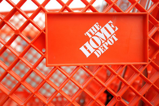
In the US comes a retail chain that's taken to blanketing its stores with a single colour: Home Depot has trademarked orange for use on advertising, lettering or any other signage in its sector, tying things up pretty neatly. In the UK, B&Q arguably does the same.
05. EasyJet group

And then, of course, there's everyone's favourite budget service provider, easyGroup – another ocean of orange, spanning everything from the original low-cost airline to car rental, finance, hotels and more.
Yellow
Positive, sunny and optimistic, yellow is energetic and eye-catching – and particularly effective for point-of-sale messaging, as it's proven to catch the eye quicker than any other colour.
06. Veuve Clicquot
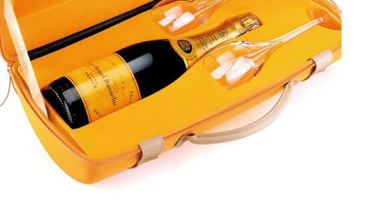
Yellow provides standout for premium champagne brand Veuve Clicquot – cutting through a sea of green, gold and cream with a punchy shot of bright yellow.
07. Caterpillar
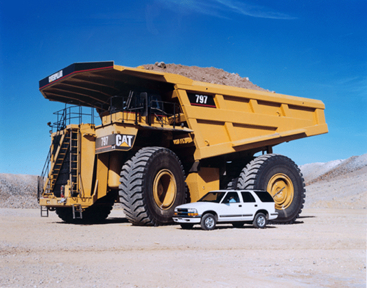
Meanwhile, in a sector that couldn't be more different, construction equipment manufacturer Caterpillar has a very distinctive, trademarked shade of yellow connected to its brand – featured in the triangle on its logo, and also on the liveries of its vehicles. Of course, in the field, the colour is invariably faded by constant weathering on construction sites, so it's rare to find a perfect match.
08. JCB

Yellow, of course, is an eye-catching colour for potentially dangerous heavy machinery, so it's no surprise that it's also used by Britain's J.C. Bamford, better known as JCB.
Green
Green is an emotionally positive colour, signifying growth and rebirth and, of course, nature. It represents stability and endurance, but it also prosperity and abundance, and taken to the extreme it can be a colour of wealth and luxury; a real mix of meanings.
09. John Deere

Joining Caterpillar and JCB in the large-scale vehicle corner is farm machinery firm John Deere, whose iconic bright green-painted tractors (with a touch of yellow) are instantly recognisable – especially when you're stuck behind one on a country lane.
10. Harrods
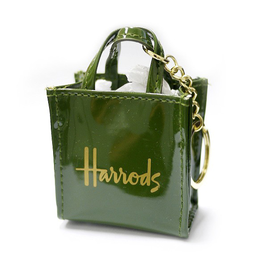
At the other end of the market, rich, dark green has associations with wealth and prestige – so it's no surprise that luxury department store Harrods has chosen it as a key part of its branding scheme. From bags and signage to all manner of own-branded products, the shade exudes class and sophistication.
11. Starbucks
Starbucks started life in 1972 with a brown logo – appropriate enough considering the coffee beans that it originally sold before introducing the wild concept of selling actual cups of coffee – then in 1987 the colour of its stylised woodcut of a siren was changed to green. The reason? It's a reference to the University of San Francisco, where all three founders were educated.
Blue
Blue is a cool, clear colour which has a trustworthy, dependable feel, and is often the colour of choice for financial institutions as a result – notably Barclays.
12. NHS
In the UK, the National Health Service uses a distinctive shade of blue that takes advantage of its cool, reassuring and secure characteristics.
13. Tiffany & Co
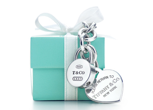
Like red, of course, blue is used so broadly in different kinds of branding that standout in a particular sector is difficult: Tiffany's solves this problem with its own iconic shade of 'robin's egg' blue, trademarked as Tiffany Blue and ubiquitous on everything from jewellery boxes to shopping bags to advertising.
14. Facebook
Originally designed by Cuban Council in 2006, the Facebook logo has been tweaked over the years, with changes made to the Messenger logos in particular. The original Facebook logo has retained its blue colour, though, which Mark Zuckerberg originally chose based on his colour blindness.
Purple
Pale lavender has a nostalgic, sentimental feel, whereas richer, darker purple has a sophisticated tone often linked with royalty.
15. Cadbury's
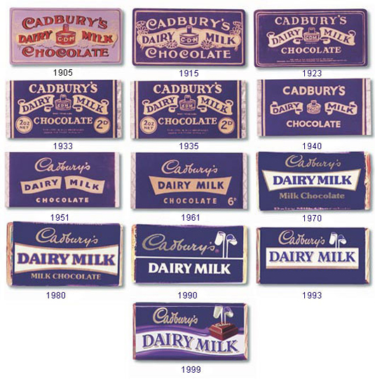
Purple's most recognisable association is with Cadbury's chocolate: Pantone 2685C is officially Cadbury Purple.
Purple and Cadbury's have been happy bedfellows since 1914, and woe betide any brand who tries to lay claim to it: Nestlé tried and failed, and Cadbury's won the right to exclusive use for chocolate bar and drink packaging. The association is so deeply ingrained that its advertising can be confident enough to remove mention of the brand altogether, as in Fallon's Black Pencil-winning Gorilla spot.
Brown
Earthy, simple and evocative of honesty and simplicity, brown (as well as green) is often used by organic companies to emphasise their links to the soil – although outside of this sector it's largely avoided in a branding context due to potential negative connotations with 'dirt', although this of course depends on the shade chosen. The fact that brown hides dirt can be twisted to a company's advantage – one reason for Pullman railway coaches to have developed their distinctive shade.
16. UPS
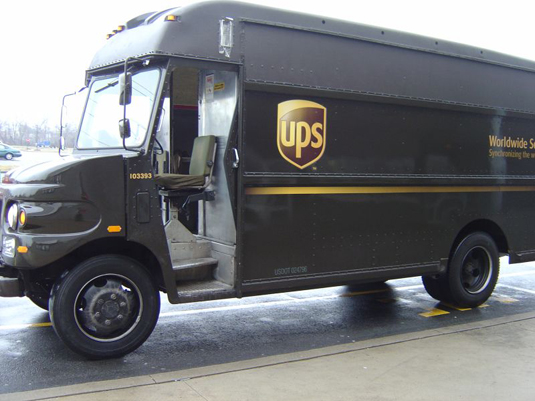
And it was Pullman Brown that the United States Postal Service plumped for in 1916, for a combination of practical reasons and the fact that the colour was perceived as the "epitome of luxury" at the time. It would become an inseparable part of UPS' branding, even becoming shorthand for the company itself, as in its former slogan: 'What can Brown do for you?'
Pink
The level of intensity with which pink is used makes a big difference to its impact. Paler shades are often have 'girly' associations, while dusty pinks have a sentimental tone – both uses are relatively clichéd and absolutely everywhere, so standout with that goal in mind is next to impossible.
17. T-Mobile
Vibrant, hot pinks have a youthful energy and sense of fun that lends itself well to trendy, inexpensive products for young women or girls – but they're also increasingly used in other sectors where a punch of bright colour is needed. T-Mobile's eye-catching magenta has been registered since 2000, and is splashed liberally across its stores and branding. Lastminute.com uses a similar punchy shade.
Black
Okay, so most brands use black in their branding some capacity – but used as the primary brand colour, it has a bold, powerful, classic effect that feels confident and sophisticated for more expensive products.
18. Hotel Chocolat
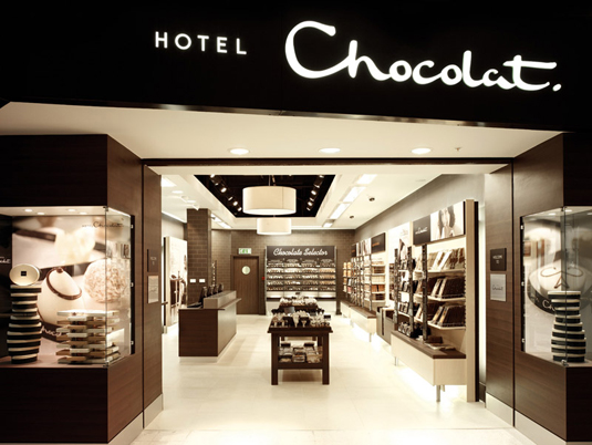
Once such example is premium British confectionery company Hotel Chocolat, which coats its stores, packaging and branding with black like the darkest of dark chocolate.
19. Guinness
Of course, when the colour of your product is one of its most distinctive characteristics it makes sense to shout about it in your branding: nowhere is this truer than The Black Stuff. The Irish icon makes liberal use of black and white in its multi-award-winning advertising, including its iconic surfer ad.
White
Simplicity and purity are the overwhelming associations with white in branding, and its brightness immediately catches the eye when used in signage. Baby and healthcare products regularly make use of it, and as a result, standout is tricky.
20. Apple

Where white is far from ubiquitous, however, is in the technology and computing sectors: here, Cupertino's finest has it all tied up. Whether it's the soothing simplicity of its packaging or the simple purity of its logo (which has long since ditched its rainbow stripes), Apple's use of white is nothing short of iconic. The adverts showcasing the white AirPods Pro say it all, and perhaps disprove claims that branding has become boring.
Related articles:
- Brand new Matrix 4 logo revealed (and it's the same but different)
- 36 perfect font pairings
- Watercolour pencils: The best you can buy

Thank you for reading 5 articles this month* Join now for unlimited access
Enjoy your first month for just £1 / $1 / €1
*Read 5 free articles per month without a subscription

Join now for unlimited access
Try first month for just £1 / $1 / €1

Nick has worked with world-class agencies including Wolff Olins, Taxi Studio and Vault49 on brand storytelling, tone of voice and verbal strategy for global brands such as Virgin, TikTok, and Bite Back 2030. Nick launched the Brand Impact Awards in 2013 while editor of Computer Arts, and remains chair of judges. He's written for Creative Bloq on design and branding matters since the site's launch.
