The 20 best fitted baseball cap designs of all time
The guys at the Strictly Fitteds blog take a look at the very best designs from the world of sport's most iconic, enduring, and far-reaching item of headgear.
The world of sports is highly passionate. You don't have to look much further than the spectators. It is highly opinionated and completely undemocratic. Bear this in mind, as we run down our top 20 list of best fitted baseball cap designs...
At the Strictly Fitteds blog - the world's number one source for fitted cap news - we were filled with excitement when the good people at Creative Bloq asked us to curate this list. But at the same time, we were under no illusions. Like the nature of any game, someone is going to go home salty. There will be a weeping and wailing and gnashing of teeth.
With all that in mind, on with the list!
Sports: the canon
Generally speaking, devotees of sports iconography acknowledge a version of a canon, and the following group of baseball cap logos have cemented their place as the gold standard. While they have stand-alone merits as brilliant designs, they also represent some of the most notable sports dynasties in history.
Coincidence? Do a search for greatest sports team logos and there's a 90 percent chance the five teams featured in this section of our list will appear. We're calling them givens...
01. Chicago Bulls 1967
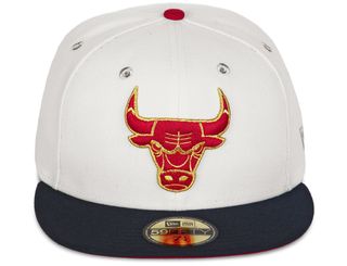
The raging bull of the cartoonist and graphic artist Theodore "Ted" W Drake mashed up a comic sensibility with an aggressive edge. Bold and bright red, the bull's angry face looks as if it's seconds from charging. The horns are tipped with (blood) red as if it just recently gouged the competition. An urban legend associated with this design is that when turned upside down, it shows a robot reading a book on a bench. What do you think?
02. Notre Dame Fighting Irish Alternate Logo (1973 - 1983)
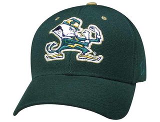
Another classic creation from the mind of Mr Theodore W Drake, who was reportedly paid $50 for this logo design. This feisty little leprechaun went on to sell multi-millions worth of team merchandise. Drake's background as a cartoonist added some humour to a violent bare-knuckle brawl. Not a comic character you'd want to play games with. Literally or figuratively.
Get the Creative Bloq Newsletter
Daily design news, reviews, how-tos and more, as picked by the editors.
03. New York Yankees (1913 - 1946)
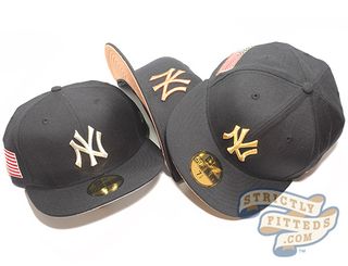
Arguably the most widely known baseball emblem in the world, the relatively simple NY lock up logo first appeared in the franchise's early incarnations, The New York Highlanders in 1909. There have been at least three variations of the 'NY', which have now come to represent the city, the empire state and in a broader sense America itself.
04. Oakland/Los Angeles Raiders (1964 - 1981)

Images of pirates have appeared throughout the history of sport. The Raiders franchise steals the spotlight with its reimagining of the notorious sea bandit. The patched and helmeted Raider, with shield, debuted in 1963. The portrait was reportedly based of the late American actor Randolph Scott. Another example of a highly illustrative piece, the logo is made up over at least seven single elements. In a city notoriously divided by colors Black and Silver united LA.
05. Dallas Cowboys
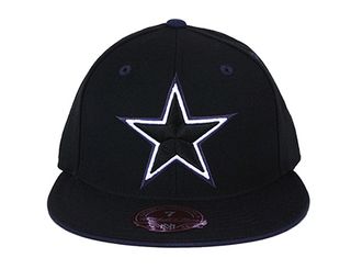
The five pointed star. It's one of mankind's, oldest and widely recognised symbols. In the case of the Dallas Cowboys it represents the Lone Star State of Texas.
However, the simple design and universal appeal is flexible and open to dozens of other interpretations. Creative retailers have created fitted baseball caps releases that emulate different countries' flags as well as capitalising on buzzworthy sneaker releases.
Professional sports
06. Montreal Expos (1969 - 1991)
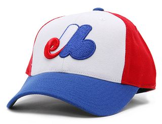
The now-defunct franchise had the distinction of being the only MLB team to incorporate the word 'baseball' in its logo. The rare three-letter-lock-up logo mashes up a heavily stylized e, m and b, representing its French name, Expos de Montréal Baseball. The result is not only memorable, but as confusing as it is mesmerising.
07. Chicago White Sox 1991 Primary
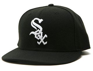
The Sox revamp of their primary logo in 1991 scores with a lewd subliminal. Intentionally or not, the unique three-letter lock-up logo gives the appearance of spelling out the word 'sex'. While American baseball prides itself on its wholesome image, this subtle adult twist could be viewed as an homage to a legacy of soulful balladeers in Chicago. Word to Etta James, Jerry Butler and Earth Wind & Fire.
08. New York Giants 1913 World Tour
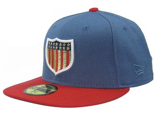
Originally marketed as baseball's "Tour to End All Tours", the 1913-14 World Tour was a series of exhibition games pitting the NY Giants against the Chicago White Sox. The 13-nation tour was eclipsed by the outbreak of World War I. The Shield is a long-standing element of heraldry. The MLB adopted a version of this image as a memorial tribute to the American Armed Forces during World War II.
09. Minnesota Wild 2000
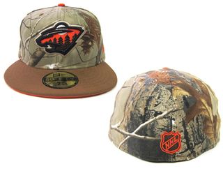
The multiple elements that make up the Wild's logo qualifies it to be called illustration. The design cleverly blends the spirit of untamed Minnesota woodlands in a complete visual package. Conservationists, hunters and the fashion-conscious all have a stake in this one. The cap is shown here in a custom colour way featuring Real Tree camouflage. Very fitting.
10. Detroit Red Wings (1934/35)
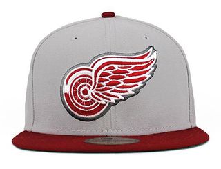
Hot wheels. Pushing the red line on four wheels is the closest sensation to flying without leaving the ground. The Motor City's Red Wings franchise's design achieves greatness visualising that sensation.
Collegiate sports
11. University of Hawaii (2000)
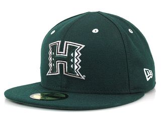
In 2000, the University of Hawaii launched a controversial rebrand of their beloved Rainbow Warriors. A dark-green block 'H' logo emerged featuring the Hawaiian kappa; the triangles symbolising body, mind and spirit. UH alumni and Kauai native Kurt Osaki was the lead designer of the logo. Granted we are mainlanders and lack the cultural perspective of the proud Hawaiian traditions, but the letter 'H' never looked better in our opinion.
12. The University of Texas Longhorns
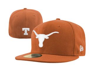
The Longhorn is an enduring symbol of the American West's spirit. The head of the hearty breed of cattle appears in a variety of forms, from skull to fully fleshed. The University of Texas version is stripped down to its most basic and recognisable elements. The silhouette's power is due to the beast's most noticeable characteristics. Mess with the bull and get the horns. Big ones.
13. UC Berkley Golden Bears
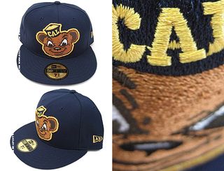
Smarter than your average. We're suckers for a good mascot; however, what works on the sidelines doesn't always translate into a cap-designated logo. No teddy bear, the Golden Bears logo counters the Chicago Bears' all-out aggressiveness with a snarky college charm.
14. University of Miami (1972 Primary)
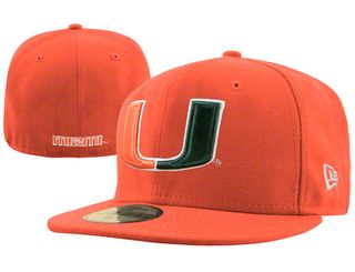
The Hurricanes literally own the "U". Their primary logo illustrates the power of minimalism when done correctly. In that spirit, we're shutting up now.
15. Georgetown Hoyas Alternate Logo
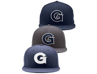
The single-letter cap designation is a long-standing tradition in sports, and the seventh letter of the alphabet has a status elevated above many of its siblings. Gentlemen, Gangster, God: the associations are many. The Georgetown Hoyas signature serif G is a stand-out character among its G-related peers. Add gusto and grand to that list.
Fashion
16. Supreme Box logo
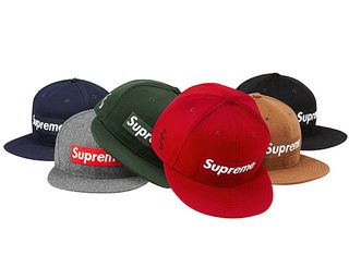
Off the backs of street skaters and on to the racks of superstar models, Supremes' infamous box logo owes much to the work of visual artist Barbara Kruger. The single line of Futura Bold Italic text, framed in a red block, attract stares; however, that single word makes it a complete braggadocios statement.
17. Crooks & Castles Chain Link C
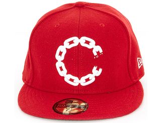
The unbroken chain has been a long-standing metaphor for strength. Powerhouse streetwear brand Crooks & Castles has proven that the opposite is true. The top selling design is has cemented itself as staple in their seasonal headwear releases since its debut. The brand flipped the iconography of the single letter cap designation and fused it with a harder conceptual edge. Can't stop (or shackle) the crooks.
18. Staple Pigeon
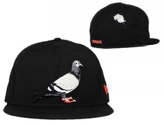
A true NYC icon finally gets its due. Designer Jeff Staple elevated the lowly urban scavenger to celebrated status. The pigeon, a staple (pun intended) of the New York City skyline and streets, isn't as majestic as the Bald Eagle or seemingly wise as the owl. It does, however, represent those living day-to-day, and crumb-to-crumb.
19. Jordan Jumpman logo
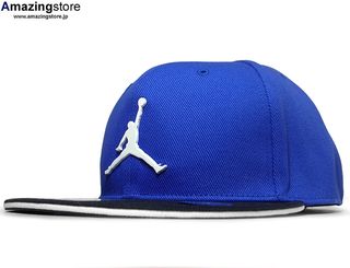
Fly by any other name, Jordan Jumpman's logo leapt off the courts and into the realm of pop culture. The icon has transcended the Jordan legacy and taken on its own brand of established cool. The silhouette of Michael Jordan catching air arguably rivals the NBA's own logo of Jerry "Mr Clutch" West.
20. Mishka Death Adders
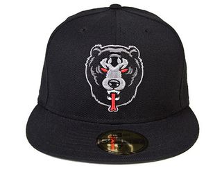
These aren't your dad's Chicago Bears. Mishka's mythical mashup, the Death Adder, is the unholy union of a Black Bear and a Cobra. In the age of clichéd 'appropriations of imagery', this manages to make its own path. In our opinion this is a logo waiting for a sports franchise. We say hockey. Any takers?
Words: Nai Morgan
Strictly Fitteds is the world's number one source of information for aficiandos of fitted baseball caps. A 24-7 online magazine, Strictly Fitteds covers the latest fitted baseball cap news, as well as interviews, previews and pin-ups.

Thank you for reading 5 articles this month* Join now for unlimited access
Enjoy your first month for just £1 / $1 / €1
*Read 5 free articles per month without a subscription

Join now for unlimited access
Try first month for just £1 / $1 / €1
The Creative Bloq team is made up of a group of design fans, and has changed and evolved since Creative Bloq began back in 2012. The current website team consists of eight full-time members of staff: Editor Georgia Coggan, Deputy Editor Rosie Hilder, Ecommerce Editor Beren Neale, Senior News Editor Daniel Piper, Editor, Digital Art and 3D Ian Dean, Tech Reviews Editor Erlingur Einarsson and Ecommerce Writer Beth Nicholls and Staff Writer Natalie Fear, as well as a roster of freelancers from around the world. The 3D World and ImagineFX magazine teams also pitch in, ensuring that content from 3D World and ImagineFX is represented on Creative Bloq.
