What is colour grading? Everything you need to know
Colour grading can dramatically transform video and still imagery. Here's how it works, and how to do it.
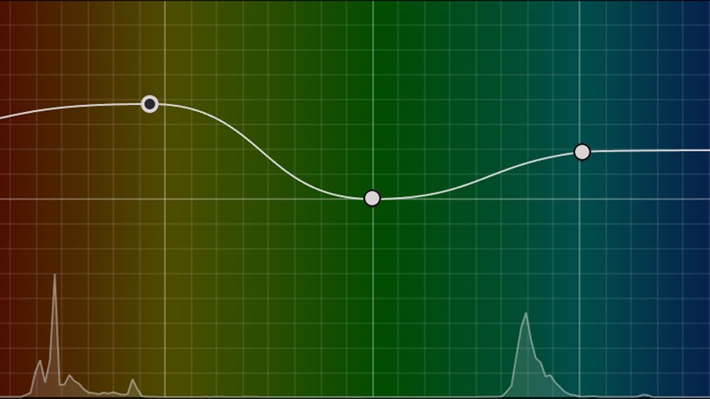
Colour grading is an important part of content creation that helps to create mood and tell engaging stories. But what is colour grading exactly? In this guide, we'll outline everything you know, from how colour grading works to how it differs from colour correction and how to colour grade video and still images in editing software to create the look you want.
Colour grading can be done in various editing programs. That includes via dedicated panels in Davinci Resolve or Lightroom or through adjustment layers in Photoshop (see our guides to the best video editing software and the best photo editing software for more options)
What is colour grading?

Colour grading is a post-production process that's used in filmmaking, video editing and photography that involves altering the colours of an image. It's often done towards the end of the editing process once the other main edits have been made.
It plays a couple of important roles, creating coherence and consistency across different scenes or shots from different angles and for presentation in difference environments (we'll look at the difference between colour grading and colour correction in a moment), and creating a particular mood or atmosphere for storytelling purposes. For example, warmer tones can feel lighter and more positive while cooler tones can feel moody and even foreboding.
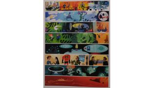
As well as mood, colour grading can be used denote character and time. Considering a colour look for a creative project before production is an essential part of any process. Pixar, one of the masters of storytelling, creates a range of colour scripts before production even commences. These indicate the colour palette that will be used for each scene, ensuring that the colour helps to tell the story rather than fight against it.
Colour grading is achieved through both global and local changes to saturation, hue and luminance at different levels of light in editing software (we'll look at some recommendations below).
While the term is most associated with video, photographers can also colour grade their images after applying general edits to levels. However, video is more complex than photography since colour graders often have to use masks and track them frame by frame to adjust the colours on specific objects or parts of a scene.
Get the Creative Bloq Newsletter
Daily design news, reviews, how-tos and more, as picked by the editors.
Colour grading vs colour correction

So what's the difference between colour grading and colour correction? They're often confused or used as synonyms, but while the tools and software used to perform them are the same, there's a conceptual difference. And if you're using software like Davinci Resolve, it's best to do the two processes on separate nodes.
Colour correction is done before colour grading, and prepares your footage for the colour grade. It involves fixing any technical issues or inconsistencies in the footage, for example to harmonise the colours in shots taken with different cameras so that they match in how they are perceived by human eye. This is often done along with corrections like removing spots and dust.
Color grading takes place after color correction and used to create a stylistic effect: a specific look or mood for artistic or storytelling purposes. For example 'crushing' the blacks of an image could make it feel contemporary. Colour grading may also involve things like taking tracking a subject and lightening their face so that they stand out.
Workflows are being developed like the ACES (Academy Color Encoding System) to ensure colour accuracy across as many different input formats as possible, which will hopefully make colour work less about correction and more about colour grading.
Software
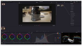
For moving image content creators there is no better piece of software than Blackmagic Design's Davinci Resolve Studio. After all, this program began life specifically as a colour grading tool, which worked with impressive hardware colour wheel desks. Blackmagic Design has since added VFX and editing features to resolve to make it a fully fledged editing program, and it works on Mac, Windows, Linux and iPad. There's even a free version: Davinci Resolve, which has a lot of the main features of the Studio version.
Davinci Resolves approach to colour grading can be a little daunting for newcomers however. Adobe is trying to make colour grading easier and more intuitive, and avoiding the need to go to deep, with its launch of a new colour management system for Premiere Pro, which is another piece of software widely used by industry pros.
For photographers, there are a wide range of tools available. Adobe Lightroom remains one of the most poplar programs among photographers. It provides a wide range of editing tools for both global and local edits, including new AI-powered features. There's also Capture One , which has a dedicated colour section.
How to colour grade video
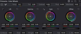
Before you start colour grading, you'll need to decide your colour management settings, including your timeline colour profile and output profile. This will depend on your software, the device you're editing an and where the video will finally be published, but Rec 709 is the most used colour profile for output (also see our guide to colour theory).
Once you've edited your footage on your timeline and you're ready to colour grade, the exact process will depend on your chosen software, but we'll take a quick look at a basic workflow in Davinci Resolve Studio.


There's no correct colour grade since it depends on what look and mood you want to achieve. For documentary-style video, you probably want to create a look that's close to the 'reality' of how the human eye would see the scene. For other uses, you may want to create a particular emotion or story.
Our biggest tip for all situations is to be organised. Colour grading can quickly become a chaotic mess if you lose track of what part of the colour grade you have on each node in your node tree. We recommend following a disciplined order and labelling every node so you remember what it does. This will also make it a lot easier to tweak things later and to copy a grade from one clip to another.
An example workflow would be to start with your input LUT (label it!) to convert your footage to the working colour space. Add a second node and call it 'balance and exposure'. This is where you'll adjust your lights and shadows either using the primaries or the HDR tab (remember that even a small tweak can be quite noticeable). Follow this with separate nodes for contrast and saturation, and parallel nodes for temperature, colour warper (which allows us to increase the saturation of very specific hues), HDR and curves.
Finish with a film look, such as Kodak 2383 if desired. Depending on your project, you might also want to add nodes for texture and other effects and for power windows if you want to apply local adjustments to specific parts of a scene, for example to an object or a person's face.
How to colour grade photos
Photography is another area where colour grading can be a big impact. Adjusting the mood of a food shot to greener hues may make a salad look tastier for an Instagram shot. Adding some blue to the shadows of a photograph will evoke a more urban look.
Colour grading photos is a lot easier than with video because they don't move, so variables don't change throughout the scene and there's not need to track elements of an image. Like with video, colour grading is often, although not always, done at the end of the editing process after applying contrast and curves adjustments.
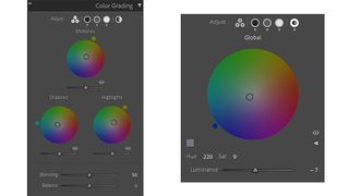
Lightroom has a dedicated tab for colour grading, where it presents four colour wheels for midtones, shadows, lights and global. The power of this split-tone approach is that you can push specific hues into particular areas of an image, for example blue into the shadows and yellow into the highlights.
You can control the relationship between the colour wheels using the Blending and Balance sliders. Use the Blending slider to create a smoother or harsher blend between the colour tones and the Balance slider to control the bias towards the colour of the highlights by pushing it right or towards the colour of the shadows by pushing it left.
FAQs
Is colour grading necessary?
Whether colour grading is necessary depends on several things, including what tools and formats you're using and what your work is going to be used for. If you're making videos for personal use or for social media and you're recording in-camera processed video directly to a format like mp4, you might feel that you don't need to do colour grading. If you do feel the colours need to be adjusted, you might be happy with making a few global adjustments to saturation, hue or warmth, particularly if the footage was all shot on the same device in similar situations.
However, if you're aiming to produce professional quality video, be it for film, TV or blogging on YouTube, colour grading is advisable to create the exact look you want. And if you record video using RAW or logarithmic footage (log) or taking photos using RAW, you will want to carry out colour grading since the image will look flat without it
What are LUTs?
Lookup Tables (LUTs) are comparable to presets or filters in photo editing. They apply a predetermined set of mathematical formulas to video footage to change the colors and achieve a desired result. Many camera makers produce their own LUTs to convert the RAW or Log footage from the camera to a specific colour space, for example from log to Rec 709, which is the standard for high-definition television. Colourists can also create their own LUTs, some of which might attempt to emulate the look of particular types of film, for example.
Input or camera LUTs are used at the beginning of the colour process to adjust the footage to the working colour space before the colour grade is applied. Conversely, look LUTs are applied at the end after colour correction since they're designed to work on specific colour spaces and assume a natural baseline colour.
What is cinematic colour grading?
In cinema, colour grading is a creative choice usually executed by a specialist colourist. The aim is to represent the story being told by the use of colour. Naturally, colour grading is heavily influenced by decisions made on set by the director of photography (DOP) and the director, but use of RAW or Log formats, means that decisions can be made on colour all the way through to the final edit, and changes can affect the mood of the entire film.
CG artists are acutely aware of the need to accommodate colour grading workflows, so use file formats such as EXRs, which store a wide range of colour data.
Colour grading in cinema (and TV) can be controversial especially as cinemas and TV look to formats such as HDR. An example of where a colour grade was potentially pushed too far was the Game of Thrones episode The Long Night. Here a beautifully graded episode in the colour suite was rendered muddy and blocky by people watching the episode on regular TVs.
What is the best software for colour grading?
We think the best software for colour grading is Davinci Resolve Studio, which is made by the camera maker Blackmagic Design. Davinci began as a specialist colour grading program before adding more tools to become editing software too. It allows a precise level of control over colour, and while it can take time to get used to using node trees, the approach allows a lot of flexibility. There's also a free version of the program called simply Davinci Resolve, which provides all of the most essential tools.
See below for the best prices on the full version of Davinci Resolve Studio and other highly rated video editing programs.

Thank you for reading 5 articles this month* Join now for unlimited access
Enjoy your first month for just £1 / $1 / €1
*Read 5 free articles per month without a subscription

Join now for unlimited access
Try first month for just £1 / $1 / €1
Mike Griggs is a veteran digital content creator and technical writer. For nearly 30 years, Mike has been creating digital artwork, animations and VR elements for multi-national companies and world-class museums. Mike has been a writer for 3D World Magazine and Creative Bloq for over 10 years, where he has shared his passion for demystifying the process of digital content creation.