How WWF's 'Race a Tiger' website was made
Want to race a tiger? This site syncs with your running app so you can do just that. We learn how it was put together.
Every day at Creative Bloq, we're bombarded with announcements of an 'exciting new running app'. The world-weary cynics that we are, few of them ever actually make us excited. But here's something that does.
Moscow creative agency Hungry Boys has teamed up with The World Wide Fund for Nature - Russia to... wait for it... race against a tiger.
By accessing the Run 4 Tiger website and connecting it to your chosen running app, you can go head to head in a time trial with an animal fitted with a GPS tracker.
Getting catty
The tiger runs an average of 20km a day. You can monitor your performance against the big cat and other contestants by following the hashtag #Run4Tiger on Twitter.
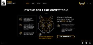
If you lose, you need to donate $5 to the WWF save the tiger campaign. Sounds like fun? We think so.
It's a smart way to raise awareness of the global decline in the wild tiger population, and we love how well it works in practice. So we sat down with Hungry Boys' creative director Vlad Sitnikov and creator Ksenia Apresyan to find out how it was all put together...
How did you approach the design of the website?
Vlad Sitnikov: We wanted the website to be completely different from most charity apps. The use of dark colors are there to represent the idea of a challenge.
We tried to convey that everyone has the power to change something for the better in the world. Combined, we can all help the tiger. That's why we created images and words using dots that came together to form a message or picture.
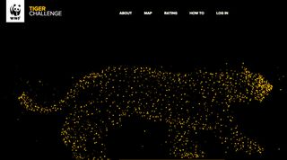
Ksenia Apresyan: We incorporated use of the tracking pad and scrolling to emphasise moving forward, to draw parallels with running and ultimately do something positive and future facing to support this endangered species – which is also a pretty nifty athlete in its own right!
We used a combination of HTML5, JavaScript and Canvas to create the animations and transitions. We also adapted the website design and layout to function across multiple platforms in order to maximise reach and ease of use on desktops, tablets and mobiles.
Next page: more on how the WWF's 'Race a Tiger' website was made

Thank you for reading 5 articles this month* Join now for unlimited access
Enjoy your first month for just £1 / $1 / €1
*Read 5 free articles per month without a subscription

Join now for unlimited access
Try first month for just £1 / $1 / €1
Get the Creative Bloq Newsletter
Daily design news, reviews, how-tos and more, as picked by the editors.
The Creative Bloq team is made up of a group of design fans, and has changed and evolved since Creative Bloq began back in 2012. The current website team consists of eight full-time members of staff: Editor Georgia Coggan, Deputy Editor Rosie Hilder, Ecommerce Editor Beren Neale, Senior News Editor Daniel Piper, Editor, Digital Art and 3D Ian Dean, Tech Reviews Editor Erlingur Einarsson and Ecommerce Writer Beth Nicholls and Staff Writer Natalie Fear, as well as a roster of freelancers from around the world. The 3D World and ImagineFX magazine teams also pitch in, ensuring that content from 3D World and ImagineFX is represented on Creative Bloq.
