How to use icon fonts in your mobile apps
Icon fonts are a perfect way of incorporating scalable graphics into any app design. Robert Brauer demonstrates how to use them for native mobile app development.
Designing for mobile can become complex quite quickly. Due to the variety of different screen sizes and pixel densities, it's almost impossible to provide pixel- perfect visuals for native apps.
When it comes to designing icons for mobile apps, we have to face two aspects of the design process. On the bright side, there is the actual design of the icons, ie pushing pixels to create attractive visuals that help people understand and be delighted by your interface. On the dark side though, there is tedious bureaucracy. Once your masterpieces are composed, you will have to slice, organise, optimise and adapt your work throughout each and every project to allow developers to apply the visuals for all the different target devices.
- Download the source files for this tutorial
As much as I love to push pixels, I recently found myself spending way too much time cleaning up folders and looking up target device specifications. Although there's a multitude of plug- ins to help you export icons and graphics in several solutions from a single source, keeping track of optimised imagery for varying resolutions and pixel densities for different operating systems is an avoidable chore. Let's have a look at vector- based icon fonts.
Friends with benefits
When designing user interfaces for production, many of us designers try to stay away from pixel -based images as long as we can and pitch for vector-based sources for a variety of reasons. For example, working in a team demands the ability to make quick changes without forfeiting quality. Maintaining manageable file sizes, as well as the ability to serve UI elements for a variety of screen sizes, are the negligible attributes that allow you get through long- term projects without bigger scratches.
With regard to responsiveness, loading times or retina displays, it's becoming common practice to go for vector- based approaches, such as CSS effects, when designing for the web in order to serve high quality UI for any type of user. Due to the recent enhancements of browsers supporting customised fonts, many designers even tend towards turning their icons into web fonts for the same reason. Being a designer for native mobile apps and spending a lot of time with slicing, organising and packaging graphics, I was curious if it's possible to use the technical advancements of web design. Hoping to be able to lose sight of resolutions, device sizes and the like during the design process and to focus more on the important aspects of my work, I came to the decision to use icon fonts to enhance the UI for iOS and Android apps.
Icon fonts are an amazing approach to scalable design. There are several advantages over bitmap images and, keeping in mind native app development, these benefits will have a significant impact on your design workflow, as well as the shipping quality of your product.
- Scalability: Font-based icons are resolution independent and can be scaled to any desired extent. Your icons will look crisp regardless of retina, HDPI, XHDPI and so on. As the rendering adjusts automatically to the target device, you will be able to cater any current, future or most arbitrary device format.
- Size: Cut into the right proportion, an icon font has an incredibly smaller file size than a set of pixel images. In this case, you won't need to cater for different target devices, your app only needs to be equipped with a single file that will be loaded only when your app starts.
- Maintainability: Since your icons are going to be packaged into a single font file, you will only need to maintain this single file throughout your project. Your icon set can be modified or extended at any time and will be naturally organised through the file structure of the font file.
- Adoption: Though the use of icon fonts may impose a new workflow to you and your colleagues, adopting their use is fairly easy. There are numerous free and professional tools that help you incorporate them in a breeze and see great results quickly on almost any mobile platform, web browser or operating system.
- Flexibility: One of the most significant benefits of using icon fonts is the ability to manipulate them. Any request to change colour, size, or appearance can be made on the fly and tested by changing only a few lines of code.
- Interactivity: Due to the flexibility and ease of manipulating fonts through code, icon fonts are unique in the way they can be manipulated at runtime. By using icon fonts, you're able to show different states, apply effects and create animations with no effort at all.
Even though icon fonts provide a lot of benefits and present some interesting design possibilities, naturally they aren't an all-purpose solution. In case your design requires complex visuals or icons with more than one colour, this approach has its limitations. However, popular and ingenious uses of icon fonts can be found all over the internet. Since the use of icon fonts is already quite popular in web design, there are a variety of services that help you create a fantastic icon font set.
Get the Creative Bloq Newsletter
Daily design news, reviews, how-tos and more, as picked by the editors.
Using icon fonts on iOS
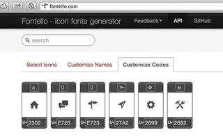
Using an icon font for iOS development is pretty straightforward. To get yourself started, you can use a service such as Fontello or IcoMoon to gather some icons and integrate them in your app right away. Alternatively, you can spend some time creating your own. In the end, this is all the creative work it takes. Now we just need to integrate the icons into our app.
All you need for this tutorial is a basic understanding of the file structure of an iOS app and your icon font file as a .ttf. To sport your new icon set in a real app, we are going to create a new Xcode project using a Single View Application for iOS. Once you've created the project, copy the font file into your application folder. Ideally, it will show directly in your Project Navigator.
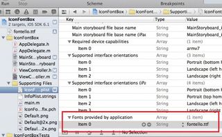
To make Xcode aware about how you'd like to use the imported file, you'll need to put a reference into the Info.plist of your application. This list can be found in the Supporting Files folder and represents a meta data table including several keys and values. For Xcode to include your font file when building the app, simply add a row (via right-click, add row) to the list and name the new key Fonts provided by application. After this, you can fill the key with your font definitions. In our case, this would be the value fontello.ttf for Item 0. Now Xcode knows what the imported file is good for and we can start using it.
Switch into the storyboard of your app and put a label into the view where you'd like to see an icon to appear. After creating the label, we need to create an outlet for the label so we can connect our icon font to the label. When you are working on your storyboard, you can easily create an outlet by selecting the Assistant Editor Mode.
It will show your interface (the View) as well as the associated header of its ViewController. Now simply hold the control (ctrl) key and drag a connection from the label into the header of the ViewController just below the @interface statement. Afterwards you can give it a name and, et voila, the outlet is created. It should look something like this:
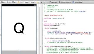
@property (weak, nonatomic) IBOutlet UILabel *iconLabelNow that you're able to manipulate the label through code, you can edit the ViewController (the .m file) and apply the icon set to the label. Go into the viewDidLoad function in the ViewController and add the following lines to set the font and to apply a text to it. Your viewDidLoad function should then look like this:
(
void)viewDidLoad{
[super viewDidLoad];
[iconLabel setFont:[UIFont fontWithName:@"fontello" size:130]];
[iconLabel setText:[NSString stringWithUTF8String:"\u2692"]];
}
The first added command defines the font used for the label and sets the size of it. In this case, it's set to 130 points. When using this command, keep an eye on the name of your font. Here, you need to reference the real name of the font, ie what is displayed when you open the font in font book or any other font editor. But, be aware that the font name may well be different to its filename.
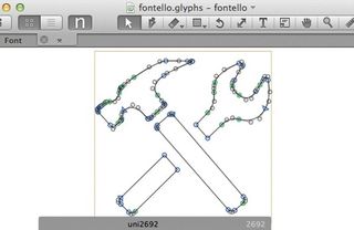
The second added row within the function references the encoded Unicode character for Hammer and Pick (2692) of our example icon as it's used by Fontello.
Though somewhat cryptic, obtaining the Unicode character of an icon in your font set is fairly easy. When you open the font with a font editor of your choice, or upload to a service such as IcoMoon, you can effortlessly reveal the Unicode hiding behind the icon.
Colours, gradients and shadows
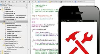
Now that the icon is referenced, you're all set. As we're going to manipulate the label through code, you'll need to run your app to see the results of your work. In the end, this is all it takes to incorporate your icon set into an app. From this point the real fun starts. All text manipulations such as colours, transparency, gradients and shadows are now in your hands. For example, you can apply commands such as the following ones to change the icon into a red colour with a black shadow around it.
iconLabel.textColor = [UIColor redColor];
iconLabel.shadowColor = [UIColor blackColor];
iconLabel.shadowOffset = CGSizeMake(1.0f, 1.0f);
There are many other effects available. Some are more complex than others but in general any type of text effect, animation or more complex manipulation you can think of is available from here.
Using icon fonts on Android
In the same way you can harness the benefits of custom icon fonts in iOS, you can use them when developing apps for Android. In terms of the application area, Android is even more interesting as there are by far more different screen resolutions and densities available for this platform. On top of that, Android doesn't support vector graphics by default, which is quite a punch for developers and designers alike, considering all the different Android devices out there.
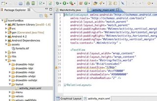
To get started with your new Android app, all you need is a basic understanding of the file structure of an Android app and, again, your icon font file as a .ttf. Using the Eclipse IDE, equipped with the Android ADT, you can start off by creating a new Android Application Project with a Blank Activity. After your application is set up, go ahead and copy the ttf file into the assets folder of your project. Once copied successfully, it will show up in the Package Explorer.
Next, you want to create a TextView in the View of your Main Activity. You can find the file located in the layout folder of your resources (res). It should be called activity_main.xml. In most cases, the Android SDK already places a TextView into your View with the label "Hello world!". We can use this TextView right away to apply our icon to it.
To manipulate the TextView, change from graphical layout to the XML of your View at the bottom of the interface builder. Now simply add an id to your TextView to create a reference that we can easily access with a command later.
Your TextView should look like this:
<TextView
android:layout_width="wrap_content"
android:layout_height="wrap_content"
android:text="@string/hello_world"
android:id="@+id/iconLabel" />
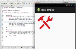
With the help of the id, we can access the TextView from anywhere in our Android app. You can now switch into the MainActivity.java file and add some code to load your icon font. Within your Main Activity, there is function called onCreate. All it takes to load the font and apply the icon are the following lines at the end of the function:
TextView iconLabel = (TextView) findViewById(R.id.iconLabel);
Typeface font = Typeface.createFromAsset(getAssets(), "fontello.ttf");
iconLabel.setTypeface(font);
iconLabel.setText("\u2692");
Similar to the iOS example, we're using a reference to our label and telling Android which custom font we'd like to apply to this TextView. In the following line we then apply the encoded Unicode character for Hammer and Pick (2692) of our example icon as it's used by Fontello, in the way it's written in Java. When you run the app from here, you'll see your icon placed on the View of your Main Activity.
After having applied the icon successfully, you can now manipulate the icon in any way you desire. UI specifications in Android are usually made in the interface builder or rather the associated XML files for your activities. To add some effects to your icon, simply go back to the XML part of your Main Activity where we added the id before and add some more commands. For example, with the following amendments, your icon will show up slightly bigger, in red with a bit of transparency and a discreet shadow around it.
android:id="@+id/iconLabel"
android:textSize="120dp"
android:textColor="#ccff0000"
android:shadowColor="#99000000"
android:shadowRadius="2" />
There are many other effects available. Similar to the iOS example, any type of text effect, animation or more complex manipulation is now in your hands. On top of that, one of the benefits of icon fonts is the wide adoption of including customised fonts throughout various operating systems. Any platform that supports custom fonts will enable you to sport a whole variety of new effects.
Wrap up
The use of icon fonts can have an incredible impact on the quality of your native app development. Considering the scalability of icon fonts, it's almost possible to forget about screen densities or resolutions when designing for any kind of mobile device. On top of that, icon fonts can be used flexibly throughout the application and be manipulated during runtime to support real-time effects and animations. Furthermore, due to the ease of adopting icon fonts into the design workflow and their overall maintainability, the use of icon fonts can impose a great improvement to your workflow by requiring less effort and delivering better results no matter what resolutions or screen density you're aiming at.
Words: Robert Brauer
This article originally appeared in net magazine issue 244
Liked this? Read these!
- The designer's guide to special characters
- Download high quality free icons
- How to build an app: try these great tutorials

Thank you for reading 5 articles this month* Join now for unlimited access
Enjoy your first month for just £1 / $1 / €1
*Read 5 free articles per month without a subscription

Join now for unlimited access
Try first month for just £1 / $1 / €1
The Creative Bloq team is made up of a group of design fans, and has changed and evolved since Creative Bloq began back in 2012. The current website team consists of eight full-time members of staff: Editor Georgia Coggan, Deputy Editor Rosie Hilder, Ecommerce Editor Beren Neale, Senior News Editor Daniel Piper, Editor, Digital Art and 3D Ian Dean, Tech Reviews Editor Erlingur Einarsson and Ecommerce Writer Beth Nicholls and Staff Writer Natalie Fear, as well as a roster of freelancers from around the world. The 3D World and ImagineFX magazine teams also pitch in, ensuring that content from 3D World and ImagineFX is represented on Creative Bloq.

