10 amazing Android development tips
Android promises many exciting opportunities. Kevin McDonagh, director of Android development consultancy Novoda, rounds up 10 essential tips that will help you make the most of your development time.
A smartphone war is raging, pitched as a neck and neck battle for market share; but I see it differently. Android is an open platform, iPhone is a lovely product, everything else is decoration. Android is most exciting in its incarnations outside of what is expected in mobile, desktop and tablets. I expect to see it in hundreds of future weird and wonderful products but in any case you’d best believe smartphone adoption isn’t going to slow down any time soon. Tinkering with Android technology today promises many exciting future opportunities.
Android makes it extremely easy to get started. The full contents of the Android source code are available online, with comprehensive documentation and an eager and friendly community. A wealth of demos and tools for IDEs will ease an otherwise steep learning curve. And here I’m going to boost your an advantage even further with 10 tips to make the most of your development time.
01. Reserve your name space
The Google Android Market uses the package name that you declare in your manifest to uniquely identify you amongst the thousands of other apps available. If you know ahead of schedule that you’ll be releasing a certain application, it’s a good idea to get in there early and make sure you can reserve your place!
02. Listen to your users
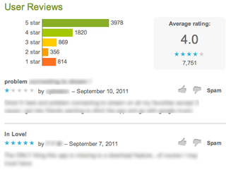
Recently we were working for a client who believed that his application needed feature X and that the omission of feature X was the reason for a lot of the woeful complaints he was seeing on the Android Market comments. Instead of implementing the wrong thing, we analysed the comments and feedback on the Android Market ourselves and compiled a list of feature requests, along with a number correlating with their requested frequency. Lone behold feature X was actually at the bottom of the list!
Your own preconceptions and preferences can blind you to what the majority of people really care about. Gather as much feedback as you can about your application and more importantly, be sure to act upon it.
03. Use Android's platform patterns
We all want our applications to be unique but there’s a saying that “To break the rules you first must know the rules”. There are a lot of apps out there and we want them to play well together, so before you start cutting out your unique niche in the Android Market, consider first trying to fit into the way people are already using Android applications. If you tie yourself into their existing habits you’ll already have an eager well educated bunch of users!
Consider how you can encourage people to share information into and out of your app. The most common way to share functionality is via platform intents. Exposing intents to your application is greatly advised and there are many intents from which your app may benefit documented in the official Google developer reference material and even more agreed upon at open intents. Probably the most popular of all is the generic Intent.ACTION_SEND option. Declare that you offer an ACTION_SEND option within your manifest and see users flock to your app through their normal message and picture sharing applications.
After you have shared functionality, consider offering the expected basics in how your application’s functionality is presented in its UI before taking any brave new directions. Dashboards, action bars, search bars, quick actions and widgets are all expected when you install an Android application and if you aren’t offering this, users are immediately forced to start learning something new before they start just using your application for what it best offers. Consider using a framework such as GreenDroid to get a headstart on the common aspects of your UI.
04. Use Hiearchy Viewer while creating views
<sdk>/tools/hierarchyviewer
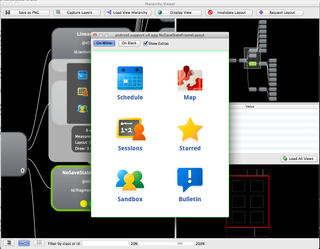
The View Hierarchy gives you a way to statically explore activity UIs and can help you visualise complicated layouts. This is my favourite Android tool but for security reasons is only available only on devices flashed with a developer version of the Android Platform. So if you want to take advantage of this tool (you do), you’ll either need a phone with an Android OS development version or the emulator.
Get the Creative Bloq Newsletter
Daily design news, reviews, how-tos and more, as picked by the editors.
Alternatively, you can include Romain Guy’s ViewServer Class into your application to enable the same views on any retail phone. When posed with a styling problem, large or small, I urge all developers to quickly turn to the Hierarchy Viewer. I’ve lost count of how many times during styling I developed further styling under erroneous assumptions. Later I’d open the Hierarchy Viewer and in light of the actual view model in memory I’d make a winning change instantly.
It has two contexts; HierarchyView and Pixel Perfect. HierarchyView is where the majority of interest lies. When revisting areas for UI polish, Pixel Perfect helps zero in on the fine placement details of images and make sure they are rendering appropriately on all densities.
The Hierarchy View will support you throughout the full development cycle of your Layouts and styling development.
First of all, you’re presented with a list of components, both system and your own activities currently sitting on the Dalvik stack. By selecting any of these you can view its associated tree view layout.
TreeView and Properties navigation
Drill into a view’s associated details through the collapsible properties area and highlighted nodes can be filtered by entering an id or class name.
Capture PNG/PSD
Various useful information can be exported to help when you’re debugging and compiling your designs. You can save a screenshot object model of the current view hierarchy tree or even export the current state as a collection of layers available to switch on and off, move around as layers in a PSD for use in Adobe Photoshop.
View Optimisation
Render times and performance indicators for each item are also available as coloured dots on each view. Each gives a high-level idea of view creation bottlenecks. Left to right, dots represent measuring, layout, and then draw time of a respective view in comparison to the rest of the nodes in the tree.
In comparison to the other items in the tree, a green dot is allocated to views 50 per cent faster, a yellow dot for items 50 per cent slower and a red dot for the overall slowest to render.
05. Optimise your XML layouts with layoutopt
<sdk>/tools/ layoutopt
Running layoutOpt against your XML layouts helps identify redundant views that could perhaps be removed. It also suggests areas where more effective platform attributes could be used in order to have fewer views rendered to the UI at run time. A common suggestion is the use of relative attributes such as android:layoutToRightOf=”id” and android:layoutToRightOf=”id”. These android attributes can be assigned to items in a relative layout instead of overly nesting views, whose only purpose is to contain other attributes.
Running the tool against a valid XML will result in a short description of the issue along with any suggested resolution and the line number of where to find it.
06. Use themes
Themes help you manage styles across an entire app. Searching for reference in how to best apply your themes to your application will not yield many results, yet this is still something I advise in managing an application of any scale. Designing your app with strict styling early on in the development of your application will make it much easier to deal with device idiosyncrasies later on when you are developing your app for the best presentation on multiple sizes and resolutions of screens.
In your Android Manifest:
<application android:icon="@drawable/icon"android:theme="@style/Theme.YourApp" android:name="com.demo.App">
Then in your res/values/styles.xml:
<?xml version="1.0" encoding="utf-8"?>
<resources>
<style name="Theme" parent="android:Theme" />
<style name="Theme.YourApp" parent="android:style/Theme.Light">
<!-- customisable theme items-->
</style>
</resources>
At the moment, the only way to really see each of the customisable attributes for a theme is in exploring the Android open source project here:
You can now override all your own themed widget items! Here is an example of overriding a button with your own declared style of ‘Widget.Button’.
...
<item name="android:buttonStyle">@style/Widget.Button</item>
...
07. Add layout defaults to your theme
Every single layout item in views is going to need a declared height and width. All together this adds up to lots and lots of extra lines in your XML layouts and styles. Instead, fallback on the sensible default of always wrapping your layouts. This way, unless you declare otherwise in your styles, you can expect your views to wrap their content and you can save space on all those redundant width/height declarations.
Simply add the following within your theme:
<style name="Theme.YourApp" parent="android:style/Theme.Light">
<item name="android:layout_width">wrap_content</item>
<item name="android:layout_height">wrap_content</item>
</style>
08. Extend sensible parents in your styles
Styles are meant to cut down on redundancy and so I like to push this as far as possible. The previous tip spoke about the redundancy of width/height combinations. In order to take this even further each time, you actually need to apply a style: why not start from one of a set of sensible defaults? Here’s a selection from some of my most-used sensible default styles:
<style name="Fill">
<item name="android:layout_width">fill_parent</item>
<item name="android:layout_height">fill_parent</item>
<item name="android:orientation">vertical</item>
</style>
<style name="Wrap">
<item name="android:layout_width">wrap_content</item>
<item name="android:layout_height">wrap_content</item>
<item name="android:orientation">vertical</item>
</style>
<style name="Fill.Height" parent="@style/Fill">
<item name="android:layout_width">wrap_content</item>
</style>
<style name="Fill.Width" parent="@style/Fill">
<item name="android:layout_height">wrap_content</item>
</style>
09. Offer translations but start simple
Google’s Android Market is a global marketplace. After all your hard work getting an app into the wild, you want as many users downloading your app as possible! Get a head start in tapping into a larger audience by simply providing a translated title and description for your app in the Android Market. Grow from this userbase to slowly offer localised text for specific regions that seem to be interested in your application. You can view the downloads pertaining to specific regions in the Android Market.
10. Standardise your naming convention
Under the res/values/directory you'll find a whole load of attributes, but try not to get carried away in creativity with your naming. Establish some sensible guidelines and then stick to them/ That way, later on down the line during an important bug fix, your development partner will be able to find items unassisted.
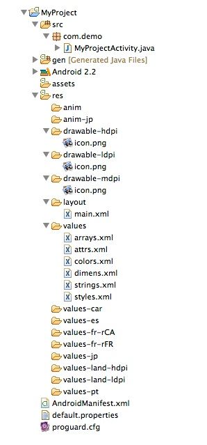
For instance, I prefix icons with ‘ic_‘ activity layouts with ‘act_’. I also prefix the ids of each layouts view items with unique identifiers so you can clearly signpost to the user where this item is being used. When styling an item, if the item is unique then I’ll also tend to use the exact same name for an item’s style, dimens color and string.
Explore the full extent of the platform online documentation on Android’s developer site: developer.android.com and access regular tips from Google’s own Android developer advocates on the very active Android developer blog: android-developers.blogspot.com.

Thank you for reading 5 articles this month* Join now for unlimited access
Enjoy your first month for just £1 / $1 / €1
*Read 5 free articles per month without a subscription

Join now for unlimited access
Try first month for just £1 / $1 / €1
The Creative Bloq team is made up of a group of design fans, and has changed and evolved since Creative Bloq began back in 2012. The current website team consists of eight full-time members of staff: Editor Georgia Coggan, Deputy Editor Rosie Hilder, Ecommerce Editor Beren Neale, Senior News Editor Daniel Piper, Editor, Digital Art and 3D Ian Dean, Tech Reviews Editor Erlingur Einarsson and Ecommerce Writer Beth Nicholls and Staff Writer Natalie Fear, as well as a roster of freelancers from around the world. The 3D World and ImagineFX magazine teams also pitch in, ensuring that content from 3D World and ImagineFX is represented on Creative Bloq.
