When to ignore 'mobile-first'
Mobile-first is a standard for a reason, but don't let a dogmatic approach sacrifice creativity.
In 2012, I learned a dangerous rule: a mobile-first approach to UX ensures users will have a consistent experience on all devices.
After four years of chanting this mantra alongside UX designers everywhere, there was a recent Sunday afternoon when I realised it like a memory. In the dogmatic spread of responsive, adaptive, cross-browser compatibility – and the design process it requires – something has been lost.
Ironically, I was meandering through my college alumni magazine, which is still quaintly printed on paper and sent in the mail. The layouts were different from web like a four-chord punk song is different from math rock. Layout itself dictated the content strategy.

Originally, mobile-first was about user experience. Now, it’s often an excuse for using a safe, traditional layout, and lately, UX has been suffering as it’s assumed that consistency is what users actually want.
Mobile-first layouts insist on simplicity and minimalism. I’m not the first to rant about the main repercussion: every website is starting to look the same.

I myself have worked with designers who basically scale up their pixel-perfect mobile comps, leaving the user with a giant desktop experience.
A consistent cross-device mobile experience has been the mantra, but it’s clear that banning the use of UI patterns, layouts and interactions that “don’t work” on mobile is becoming an outdated and irrelevant approach to some projects.
I feel equipped to pick on mobile-first because I have evangelized it for so long. In fact, for me, this article is borderline hypocrisy. I have a reputation as a ruthless champion for usability at the expense of creativity, so I know all the excuses.
Excuse #1: “Cross-device experiences help users jump between mobile and desktop”
Why it’s true: If you’re designing complex user flows that require multiple sessions, mobile-first still rules. Understanding the user’s context can dictate how likely they are to be interrupted or need to pause a task. True responsive makes it easier to pick back up where you left off.
Why it’s false: Your mobile experience should be usable enough that most tasks can be completed in one sitting, and each component should fit the most likely device for its context. For example, if research shows that a hospital website’s desktop traffic is more focused on researching services, then said content should be up front. Users visiting that website on mobile, however, might be more likely to need location information or ER times. Don’t promote “featured service lines” to a mobile user trying to find the nearest urgent care clinic. If the user’s needs are different on each device, the experience should be different.
When it shouldn’t matter: Some designers have changed the meaning of “cross-device” by creating experiences that let different screens play together.
Arcade Fire has launched “interactive films” to promote their albums. Reflektor acts as a music video for the titular track. From a computer’s web browser, the site prompts you to “Connect your smartphone or tablet.” Your computer’s webcam recognises the device’s position as you wave it, “reflecting” on the video as it plays.

In the same way, Paper Planes, built for Google I/O 2016, brought attendees together by letting them use their mobile devices to digitally throw paper planes at a 50-ft screen on stage.

Excuse #2: “People are increasingly mobile”
Why it’s true: Think about the speed, screen resolution, and browser capabilities of your current smartphone compared to five years ago. These days, it feels laborious to explicitly type the words: “mobile usage has surpassed desktop.” The stats are everywhere.
On 4 November, Google declared the switch to a “mobile-first index,” citing that “today, most people are searching on Google using a mobile device.” There’s no stronger endorsement than when Google declares you just might rank lower if your site isn’t responsive.
So, if your digital strategy still relies on SEO, don’t scrap the mobile-first approach.
Why it doesn’t matter: Remember that Google Search is meant to help people find information. Is your audience even looking for you? Maybe not. Users in 2017 expect information to come to them – to be sucked in through social referrals, clickhole vortexes, related content, and the unsung magic of contextual navigation. If you have a diverse visibility strategy that brings users in, the payoff for creative layouts and custom experiences might be worth the risk.
Shoe company Camper built a highly visual landing page for a recent campaign, heavy on motion and video, but sparse on content. Yet, the provocative site still drove to their regular ecommerce storefront.

The mobile experience is neglected. Perhaps the ROI on optimising a similar approach for mobile wouldn’t have been worth it given the short campaign window.

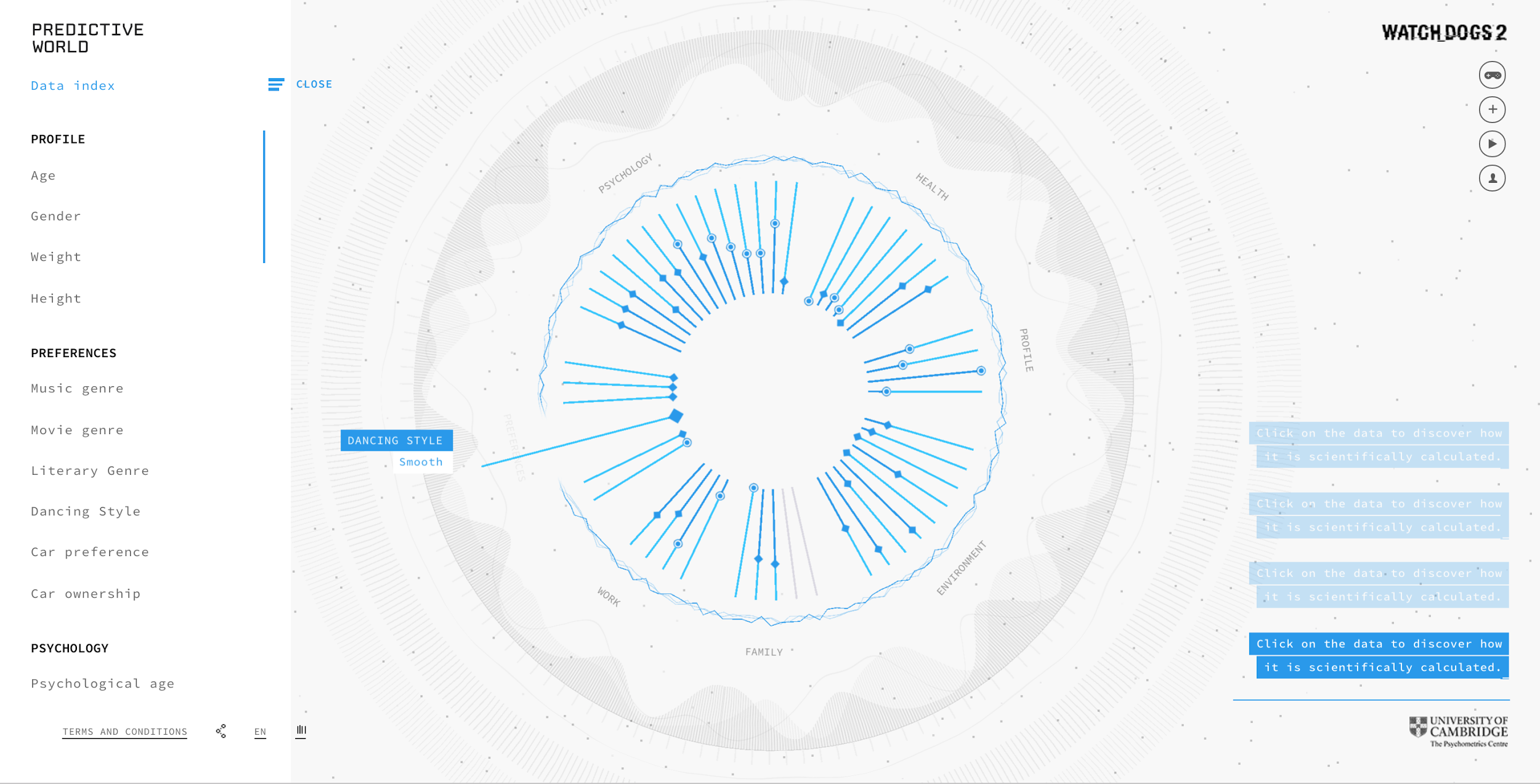
Maybe your project isn’t about findability or conversions. A PREDICTIVE_WORLD uses Facebook data “based on actual research capable of building a digital profile and predicting your future.” There isn’t exactly “content” to rank. There is no CTA. Further, not only is the layout intended for desktop, the experience is majorly enhanced by hover states, animations, and sound effects.

The team attempted a mobile version, but it’s so limited that they might as well have spent the time and budget elsewhere.

Excuse #3: “Some people only ever experience the internet from their smartphones”
Why it’s true: For billions of people, access to the internet is a luxury when it should be considered a basic human right. Low-income Americans are choosing smartphones over computers when they can only afford one or the other. Accessibility standards and best practices like mobile-first are meant to ensure equality.
If your project is meant to provide people of all contexts, locations, and demographics with information and functionality they need, you’d better be practicing mobile-first.
When you shouldn’t care: That doesn’t mean modern web technology as a medium should be forbidden as art. Some people only experience music from Spotify; we still have live concerts.
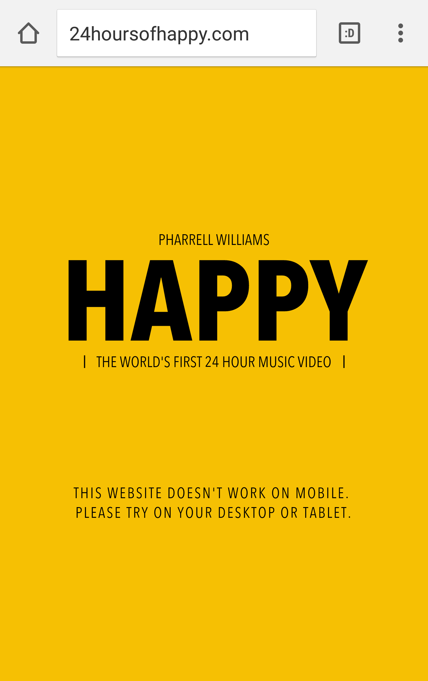
Pharrell’s 2014 web-based “24-hour music video” wouldn’t have made us “Happy” if the cross-device experience zealots had won the argument.

Web technologies are also the perfect place to pay tribute to technology itself. Canadian developer Ben Feist digitised the Apollo 17 mission within a control room-like layout. The screen is cluttered with data, visuals, text, and controls, updating “live” as the rocket is launching. It’s a little overwhelming – which is probably exactly how it felt in 1972. And who wants to experience a moon landing on a 4.7-inch screen?

Occasionally, it is better to make something you love for a few than to make something ordinary for everyone. It depends on the goal.
These sites do serve a purpose. They are emotional, not transactional. By leaving an impression rather than driving a conversion, the effect is arguably stronger than your templated content marketing site.
We’re quickly leaving the era of information-seeking. Users now expect content to appear for them contextually. Expecting them to search for, land on, and spend several minutes navigating your traditional website is no longer the right approach for every brand. Occasionally abandoning the mobile-first law can free us to embrace new ways of communicating, creative stories, and more impactful experiences.
Whatever your inspiration – maybe you have free time, maybe you have abstract KPIs, maybe there’s no one stopping you – embrace it. The internet is awesome, web technologies are insane, and you have an idea. Let the medium shine.
Related articles:

Thank you for reading 5 articles this month* Join now for unlimited access
Enjoy your first month for just £1 / $1 / €1
*Read 5 free articles per month without a subscription

Join now for unlimited access
Try first month for just £1 / $1 / €1
Get the Creative Bloq Newsletter
Daily design news, reviews, how-tos and more, as picked by the editors.
