How to know when to take the right risks in design
Interbrand's Sue Daun and Dave Wood from GBH discuss the importance of risk-taking in design.

Sometimes, with the right brand and the right client, the opportunity arises for you stick your neck out and take an audacious creative risk. Get it right and the sky's the limit, get it wrong and... well, try not to get it wrong.
To help you decide when you should attempt to when to push the creative boat out, we spoke to Brand Impact Awards judges Sue Daunt and Dave Wood.
Sue is executive creative director at Interbrand London, with over 20 years' experience working with global clients, while Dave is design director at BIA-winning agency GBH, where he's designed everything from postage stamps to space rockets for clients including Virgin Galactic, Puma and Royal Mail. Here's what they had to say.
When and why is it important to take risks?
Dave Wood: Risk taking is something we do day in, day out. We don't pick and choose when to take risks, but prefer to let the idea lead the way. Inherently we like to be over-ambitious to do the best work possible for the client, and sometimes that's in tight time frames with tight budgets – but we always find a way of doing it. There's a bit of risk involved in that, but you have to hold onto the integrity of that idea, and convince clients to believe in it too.
Sue Daun: That's a great way of describing it. For us, risk is when we push a client way outside the brief, and go in with a solution that challenges and reframes their brief massively. You need to take them on a bit of that journey, so they feel confident it's not really a risk.
As a bigger agency, often they'll listen to us if we tell them it'll be okay. But there's definitely a thrill when you go in with a risky solution. You go in with your heart pounding, and you're excited because you've got a great idea.

How does the size of your agency affect your ability to take risks?
SD: We're lucky as we're supported by a great team that encourage us to take risks. We're not a blame culture, so that's a really healthy operation to work within.
I think as a big network, with a proven track record – underpinned by measurement and analytics, as well as creativity – we're able to get clients to buy braver. Having the weight of a business like Interbrand behind us, they tend to sit back and listen, and we don't have to work that hard to push them a little bit further.
It also can play negatively. Some clients come because they want a trusted, formulaic solution. We rarely give them exactly that, but sometimes we have to take them on a longer journey.
DW: Because we're smaller, and independent, we can pick and choose when to take risks – but like I said before, we let the idea lead. It's the idea that determines whether we take risks or not.
At GBH, we work on a wide range of projects, from small – where there's more freedom – to big campaigns for clients such as Puma and Virgin Galactic. Actually it's those bigger jobs, with more of a presence, where there's an opportunity to take bigger risks.

What are the best examples of creative risks that have paid off?
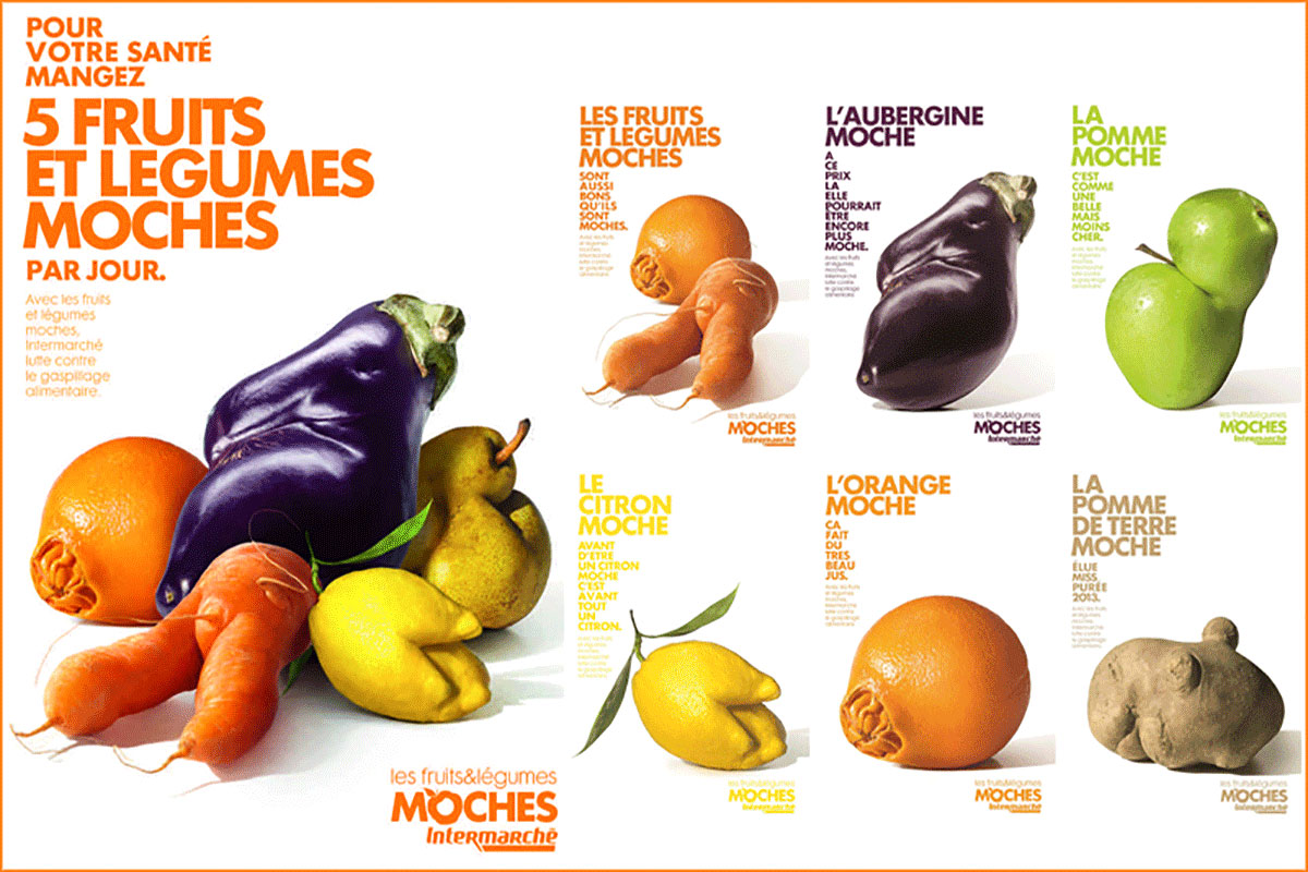
DW: Inglorious Fruit and Veg, the [Black Pencil-winning] Intermarché campaign a few years ago. They put these ugly, misshapen fruit and veg in their aisles, and encouraged people to buy them. It could easily have had the opposite effect, but there was real confidence and belief in the idea.
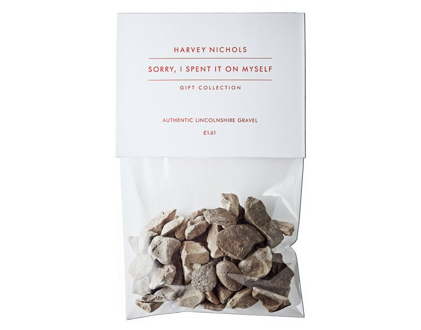
SD: Another good example is Harvey Nichols' 'Sorry, I spent it on myself' campaign. It tugged at your heart strings, but in a tongue-in-cheek way. For a luxury brand to treat design in such a brutal way was a fantastic two fingers up to the industry, and it drew people in who perhaps hadn't bought into the brand before.
This article originally appeared in Computer Arts issue 270; buy it here!
Related articles:

Thank you for reading 5 articles this month* Join now for unlimited access
Enjoy your first month for just £1 / $1 / €1
*Read 5 free articles per month without a subscription

Join now for unlimited access
Try first month for just £1 / $1 / €1
Get the Creative Bloq Newsletter
Daily design news, reviews, how-tos and more, as picked by the editors.

Nick has worked with world-class agencies including Wolff Olins, Taxi Studio and Vault49 on brand storytelling, tone of voice and verbal strategy for global brands such as Virgin, TikTok, and Bite Back 2030. Nick launched the Brand Impact Awards in 2013 while editor of Computer Arts, and remains chair of judges. He's written for Creative Bloq on design and branding matters since the site's launch.

