43 of the best print ads ever
Some of the most memorable, funny, clever and impactful print ads of all time
Sign up to Creative Bloq's daily newsletter, which brings you the latest news and inspiration from the worlds of art, design and technology.
You are now subscribed
Your newsletter sign-up was successful
Want to add more newsletters?
Five times a week
CreativeBloq
Sign up to Creative Bloq's daily newsletter, which brings you the latest news and inspiration from the worlds of art, design and technology.
Once a week
By Design
Sign up to Creative Bloq's daily newsletter, which brings you the latest news and inspiration from the worlds of art, design and technology.
Once a week
State of the Art
Sign up to Creative Bloq's daily newsletter, which brings you the latest news and inspiration from the worlds of art, design and technology.
Seasonal (around events)
Brand Impact Awards
Sign up to Creative Bloq's daily newsletter, which brings you the latest news and inspiration from the worlds of art, design and technology.
In today's digital age, many of us may muse over the foreboding statement "print is dead", but we beg to differ. While the genre may not be as kicking as it used to be, brands continue to make an impact on paper, and there's still plenty to be learned from the best print ads of the past.
Through clever copy and captivating static visuals, some of the best print ads are still referenced today, proving their lasting impact on the branding sphere. While the best billboard ads and best adverts of all time might be more relevant, today we'll be looking back at the most iconic print ads that shaped the advertising scene as we know it. We'll start with some of the classics, then take a journey into brand wars, minimalist ads, illusions and more.
Classic ads
01. Toyota
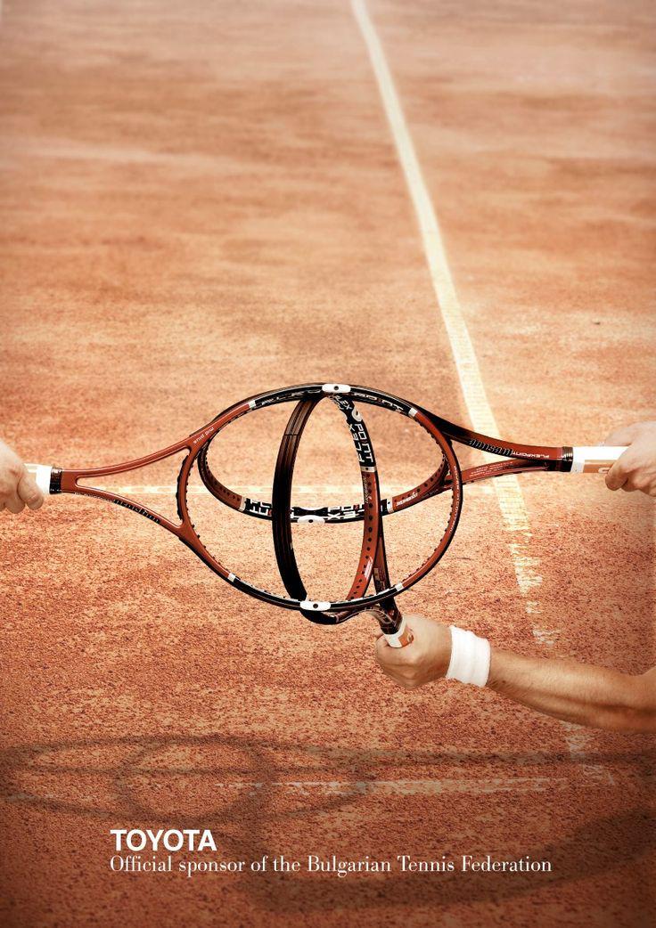
In 2008, Toyota announced it was sponsoring the Bulgarian Tennis Federation, and it did so via this delightfully simple print ad. In it, tennis rackets are positioned to look like the Toyota logo.
The ad was created by Bulgaria's New Moment New Ideas agency and it recently caught the attention of Reddit users on the r/DesignPorn channel, with one person calling it a "incredible" and another saying: "It's executed so well that it makes me feel Toyota sponsored the event only to make this happen."
02. Stabilo
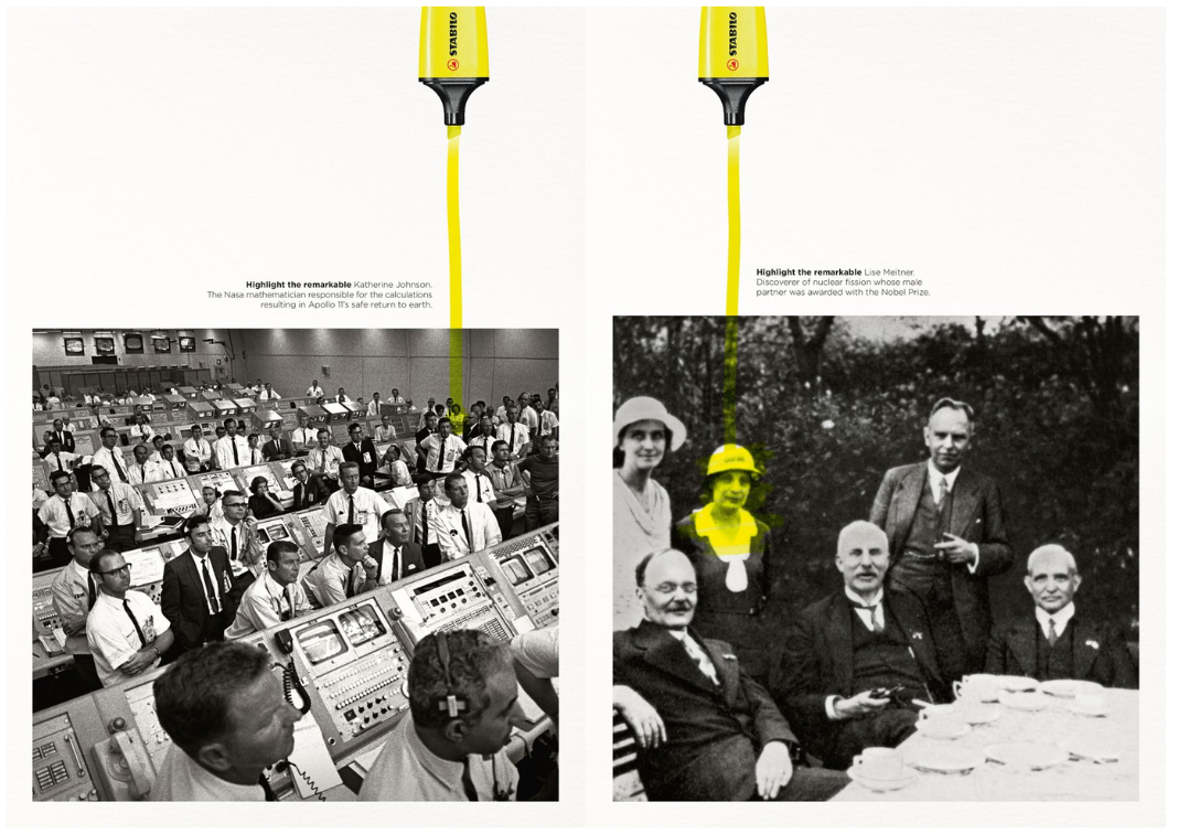
Stationery brand Stabilo turned a promo for a highlighter pen into a push for female empowerment in 2018. It plays on the analogue technique to literally highlight and create a focal point for the ad, conveying a significant message the composition.
“A great strapline – ‘highlighting the remarkable’,” says designer Mike Roberts. “This ad series highlights influential women in the background with great storytelling, while showing the product in action.”
03. La Ligue Alzheimer
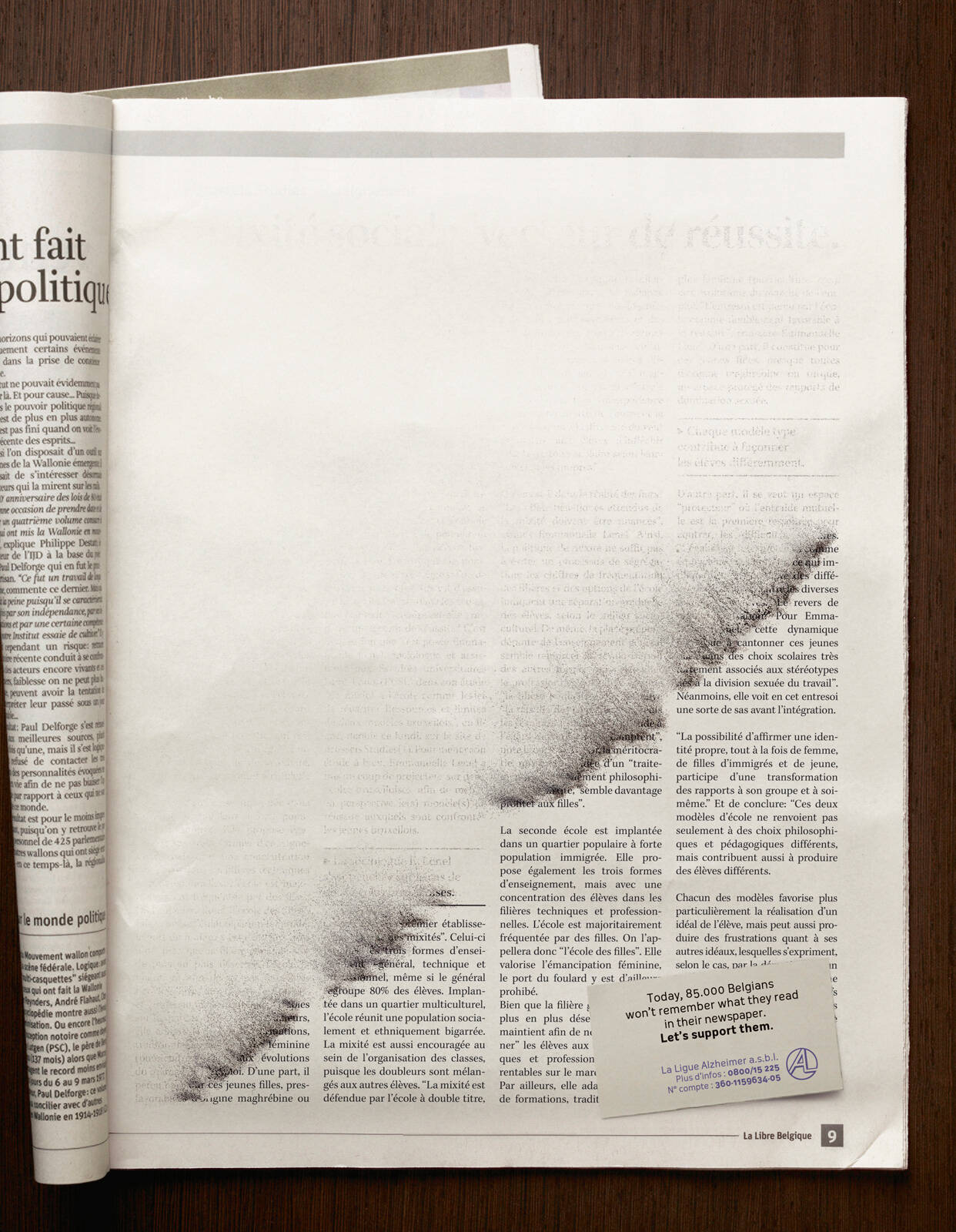
With words on the page appearing to disappear off the page in front of your eyes, Publicis created this ad for Brussel's based non-profit La Ligue Nationale Alzheimer to bring attention to the number of people who experience the sudden and dramatic loss of memory and inability to retain information.
"This ad is very powerful. I like the colour palette and sepia tones and how they help reinforce the theme of fading memories," says London-based designer Laura Foley. "The design avoids clutter allowing the emotional impact to take prominence. The fading effect is subtle and well balanced. I also like the choice of font and how it mimics a traditional newspaper. It adds to the seriousness of the campaign."
04. Nescafé
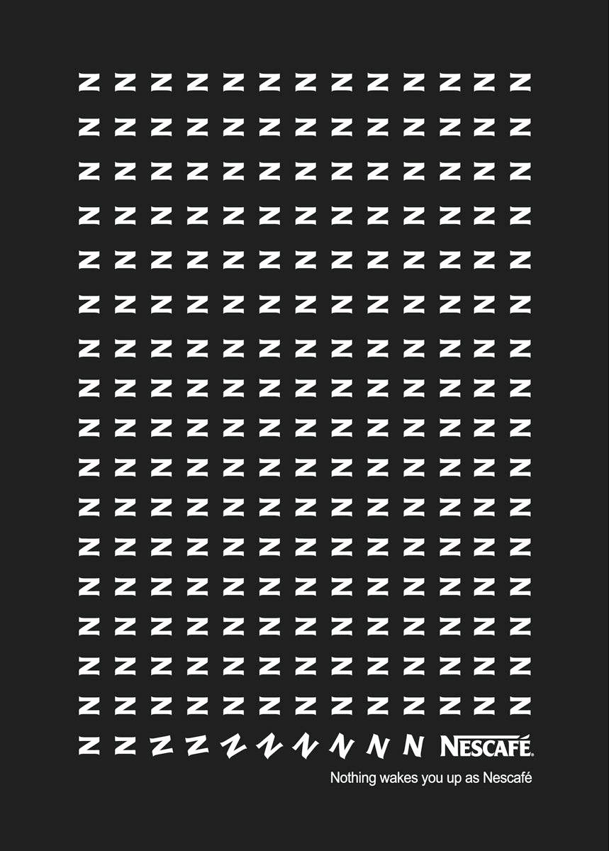
Instant coffee brand Nescafé uses Zs and flips them to become Ns to emphasise the feeling a cup of their coffee can make you feel in this print ad, accompanied by the tagline, "Nothing wakes you up as Nescafé".
Sign up to Creative Bloq's daily newsletter, which brings you the latest news and inspiration from the worlds of art, design and technology.
"The tagline is super easy to remember and nails the point. I also love how simple and clean the design is – you don’t have to squint to get it," says Laura. "The sans serif font feels fresh and fits the brand identity well. The flipping of the 'n' into a 'z' is super clever too and acts as a good visual metaphor in the storytelling."
05. Ikea
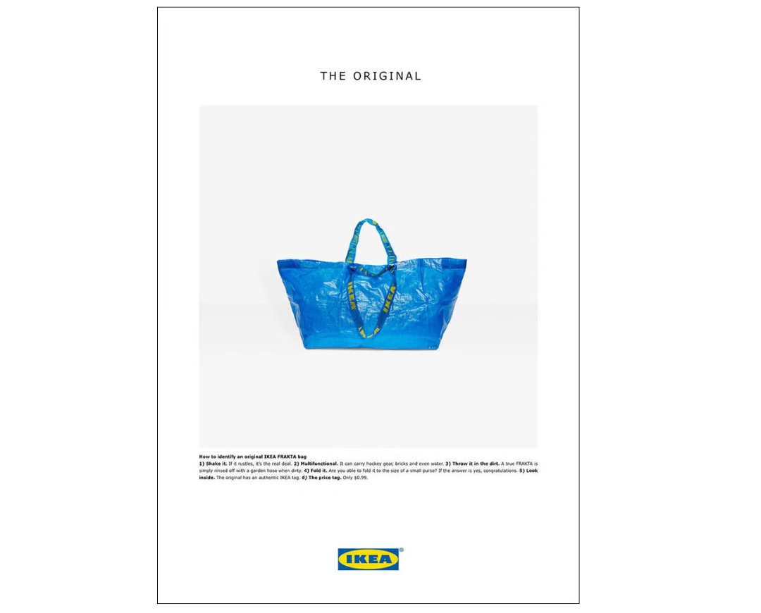
Playing on the impossible-to-ignore likeness with a Balenciaga bag, Swedish homewares store Ikea decided to launch an ad to point out the designer label's version was different to the "original". "If it rustles, it’s real”, Ikea says in the tongue-in-cheek ad, which presented both versions of the big blue bag together.
“In a world that moves at the speed of social, even print ads need to be timely and topical to catch people’s attention,” says Mike Perry, founder and creative director of New York-based creative agency Tavern. Back in 2017, an Ikea ad, parodying Balenciaga did just that. Balenciaga had just released a $2,145 blue bag that looked suspiciously similar to Ikea’s iconic Frakta shopping bag.”
06. Adidas
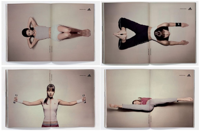
Sports brand Adidas embraced the fold with this next ad, which created a dynamic exercise workout with static images across double page spreads and the action of turning a page. Mimicking motion in print, the TBWA Hong Kong campaign is a great example of how to use the medium of print effectively.
"I really like how the fold brings the exercises more to life. The split across the page creates a dynamic effect that makes the models movements feel more real. There’s also a nice amount of negative space around the model which keeps them in focus," Laura says. "The placement of the logo in the right-hand corner works well too – it’s noticeable but doesn’t distract from the image too much. The type on the fold also feels well placed."
07. Absolut
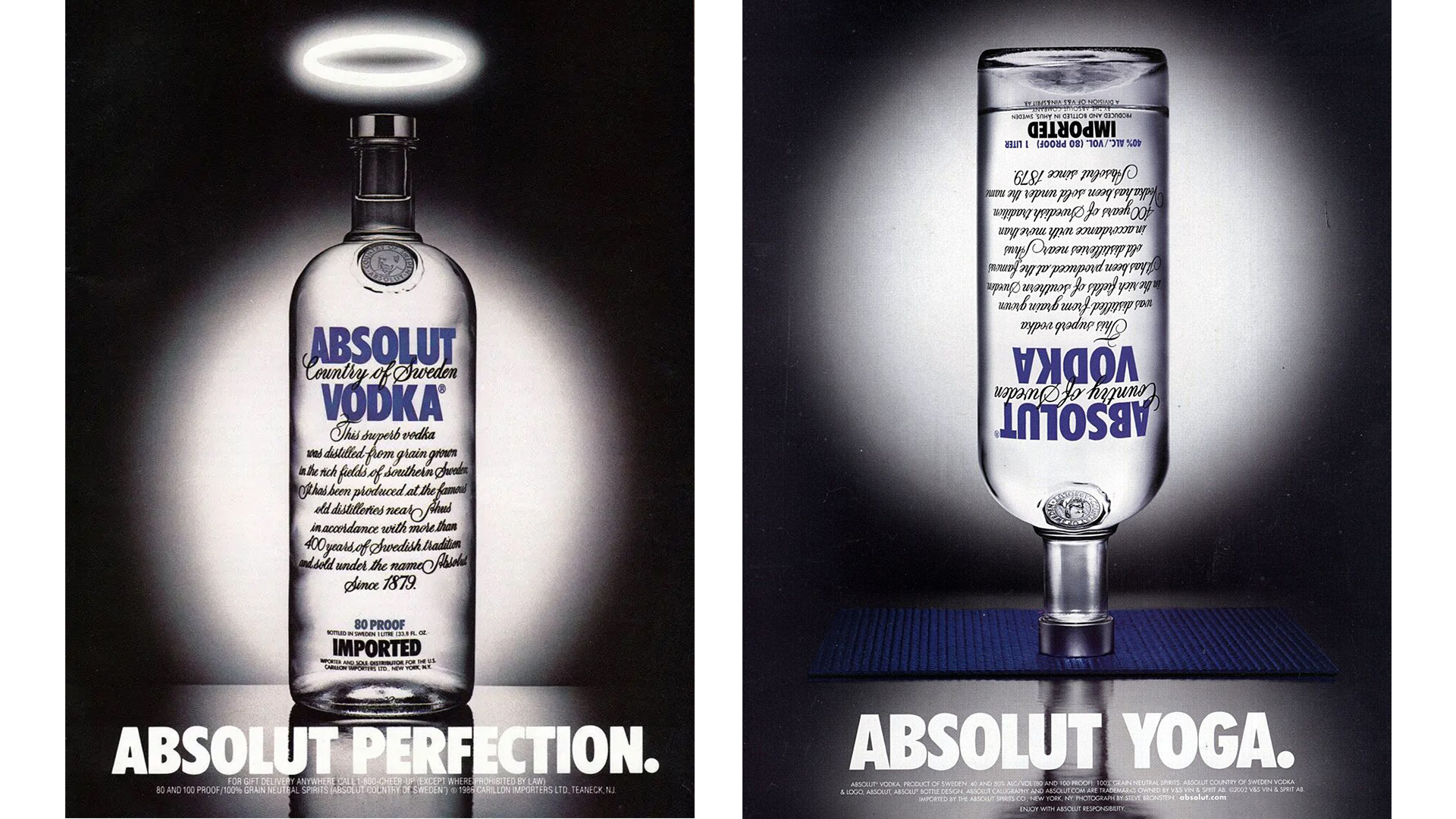
Absolute's simple bottle-based ads represent one of the longest-running print ad campaigns ever. The vodka brand has produced over 1,500 variations of the ad featuring the iconic bottle since the original 'Absolut Perfection' version was released in 1980. It's bold and simple, and it makes the most of the brand's most defining asset – its iconic bottle design. Over at the Absolut website, you can view every version of the ad ever made.
Find out more about Absolut's iconic print ad.
08. Volkswagen
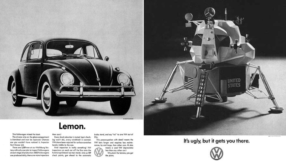
Created by ad agency Doyle Dane Bernbach (DDB), VW’s series of print ads from the 1960s are the ads that helped change advertising. They were concept-driven and charged with comedic value – from connecting with their target audience of everyday people by addressing relatable problems, to playing on the fact the vehicles were small, cheap and, well, less glamorous other cars at the time. Simple visuals were combined with compelling copy – sometimes as brief as 'Think Small' or 'Lemon' (used to describe 'foreign', defective cars).
09. Apple

The power of Apple ads often lies in their simplicity and wry humour. This ad, from the company's first marketing brochure in 1977 announcing the Apple II computer, features no product, and instead a stripped-down aesthetic and minimal copy. "Simplicity is the ultimate sophistication" is a quote often attributed to Leonardo Da Vinci but here acts as a company ethos, along with its claim that this will be "the" personal computer.
10. Penguin Books
Penguin Books used another brilliant print ad to promote its audiobooks. The campaign features illustrations of three famous authors – William Shakespeare, Mark Twain and Oscar Wilde – shaped into headphones so they could whisper directly into the ears of their listeners. Developed by team at McCann India, the campaign won a Gold Press Lion at Cannes International Festival of Creativity.
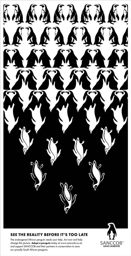
11. SANCCOB
Ad agency McMillan encouraged animation lovers to rediscover the child inside with this print ad campaign promoting the Ottawa International Animation Festival (OIAF). Each of the five print ads features a gorgeous illustration and the tagline 'Get in touch with your inner child'. Some of the drawings contain mature content (see the full set here) but the cartoon-style characters and graphics maintain a fun, tongue-in-cheek vibe.
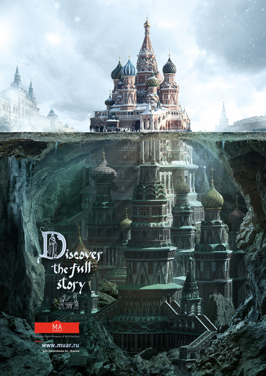
12. Schusev State Museum of Architecture
This beautiful illustration of St Basil's church in Moscow was created by ad agency Saatchi & Saatchi to promote the information available at the Schusev State Museum of Architecture. The campaign features a series of photographs of famous Russian landmarks, all of which are continued beneath ground (or water) level, and feature the tagline 'Discover the full story'. The stunning imagery is the thing that really sells this campaign.
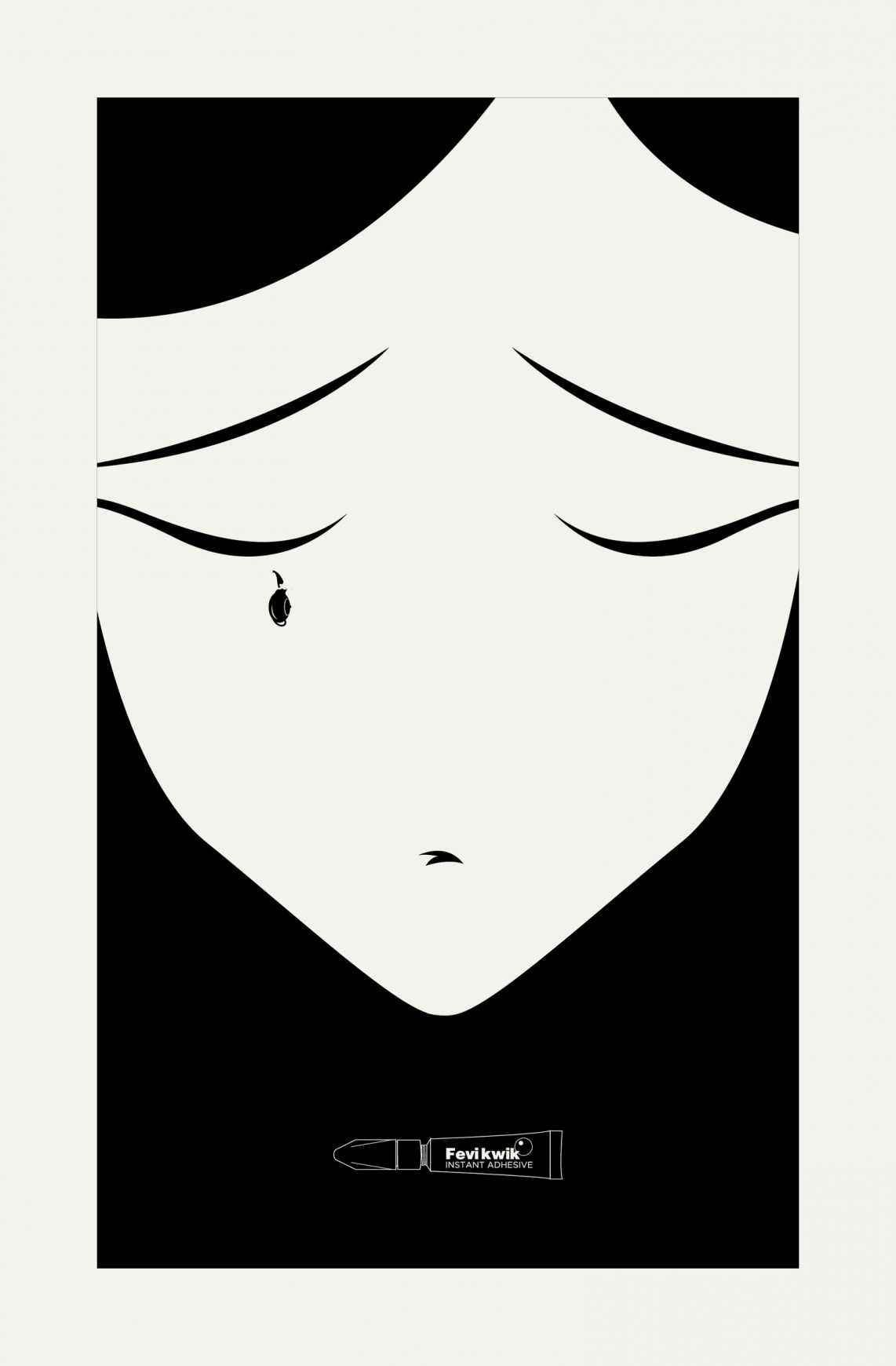
13. Sticky ad
Ogilvy is known for creating some of the best print advertisements around the world. This is just another example of its brilliant work. Created for Fevikwik Instant Adhesive, it's one of a three-part print advertisement series that uses clever illustration and a monochrome colour scheme to its fullest potential.
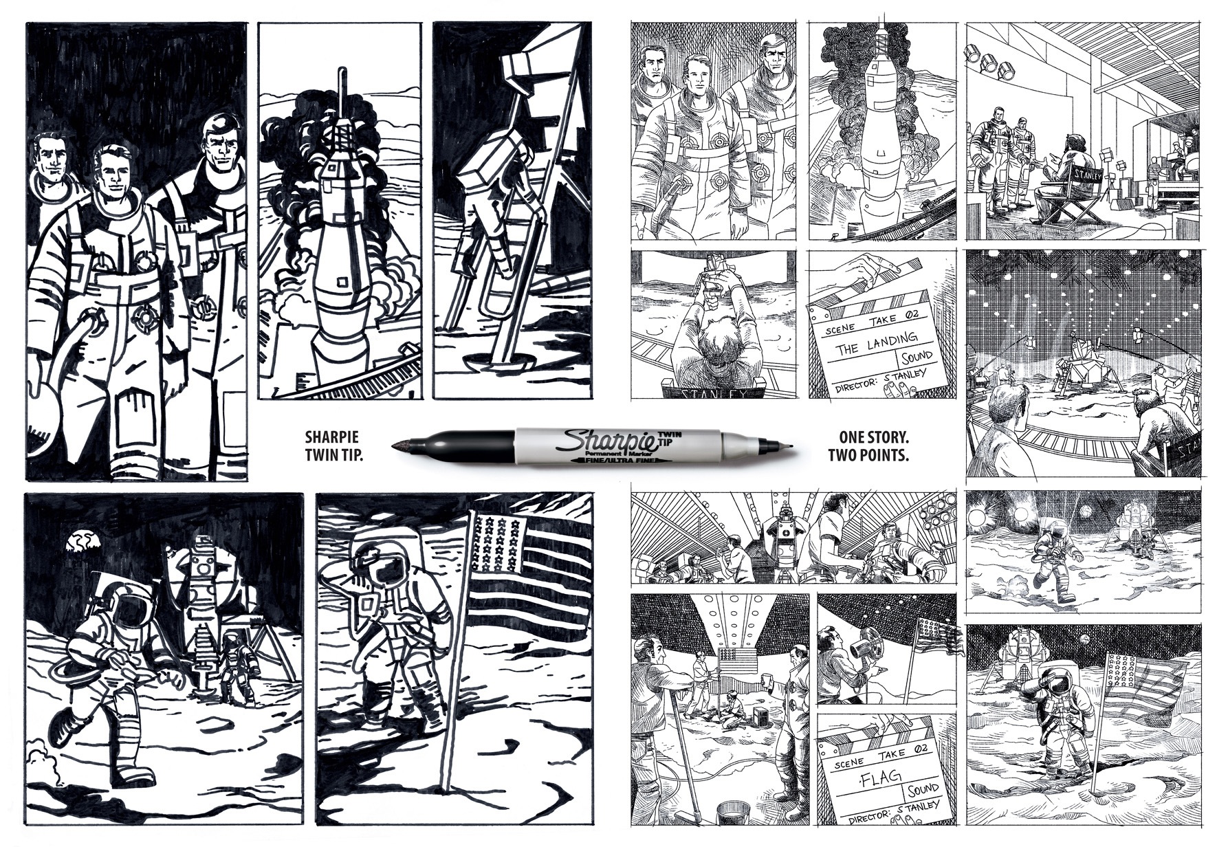
14. Sharpie advert
Pen giant Sharpie has produced some marvellous print ads over the years and kept up with design trends galore. Brazilian agency FCB created these clever print ads with the tagline 'One story. Two Points' to promote a new pen with – you guessed it – two points. In turn, the comic art style story captures a major news story from two points of view. We love the comic book execution. Which side will you believe?
Fast food ads
15. Burger King's meaty trick
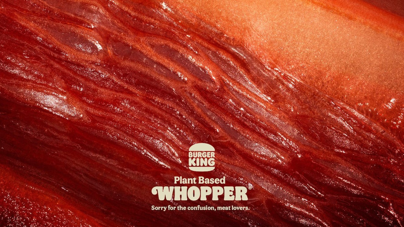
At first glance at Burger King's 2022 ad, you'd be forgiven for thinking you're staring at a macro close-up of some red meat. But no, those are peppers, beetroot and radicchio. This one is designed to make you double-take.
"Sorry for the confusion, meat lovers," reads the tagline – and indeed, you wouldn't know that's veg you're looking at. From the deep red colour to those thin fibres, the whole thing looks disconcertingly, well, meaty. This one was nominated for a CB at 10 Award as the best print ad of the decade.
16. McDonald's brings new meaning to fast food
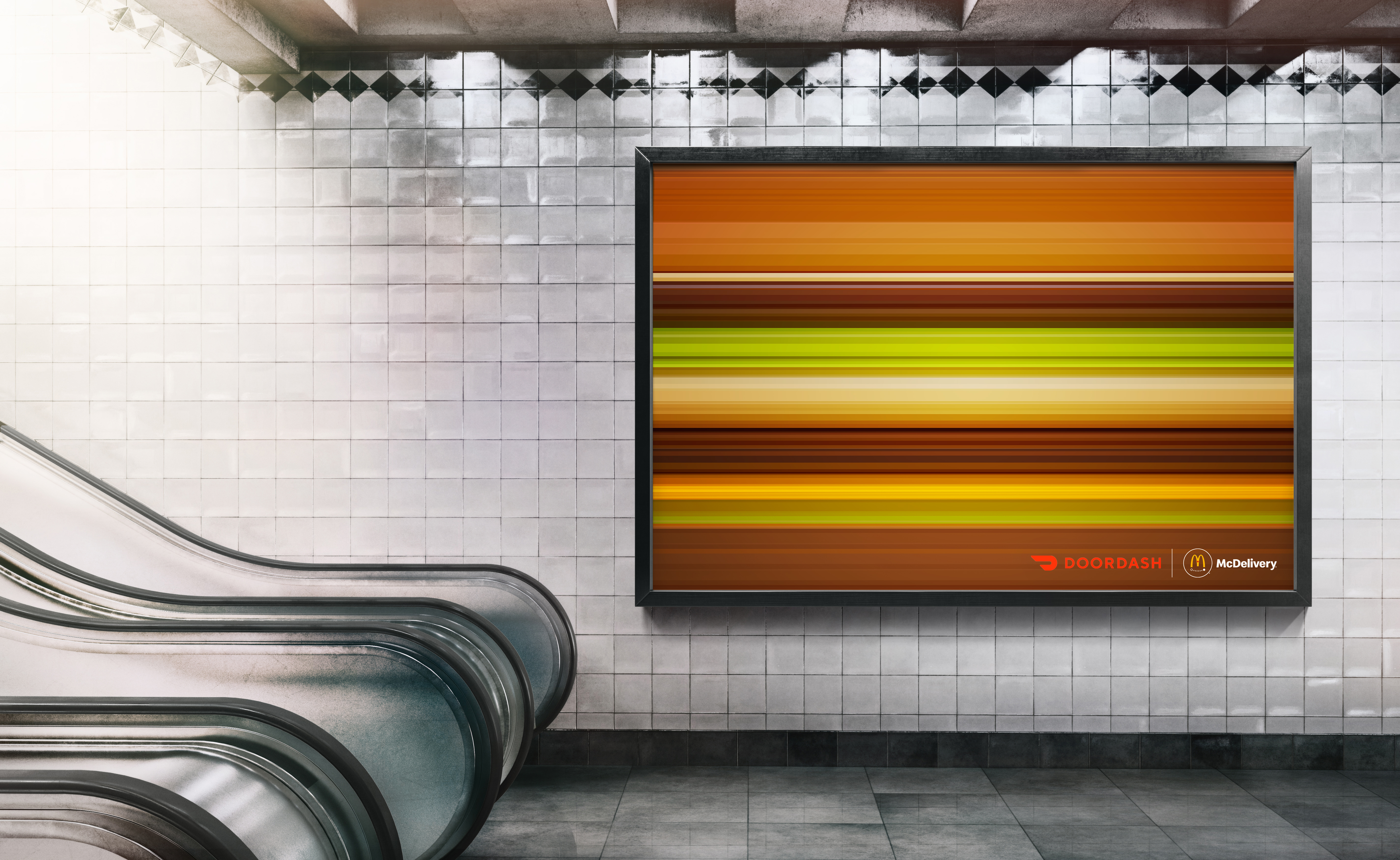
Famed for its iconic print ads, McDonald's is certainly a strong contender for the champion of advertising. This print ad features an array of the fast food chain's iconic burgers rendered at high speed, and despite the design being as simplistic as a set of horizontal lines, the products remain distinguishable. Designed by the creative agency No Fixed Address, this ingenious ad showcases the power of iconic imagery, offering a clever twist on familiar motifs.
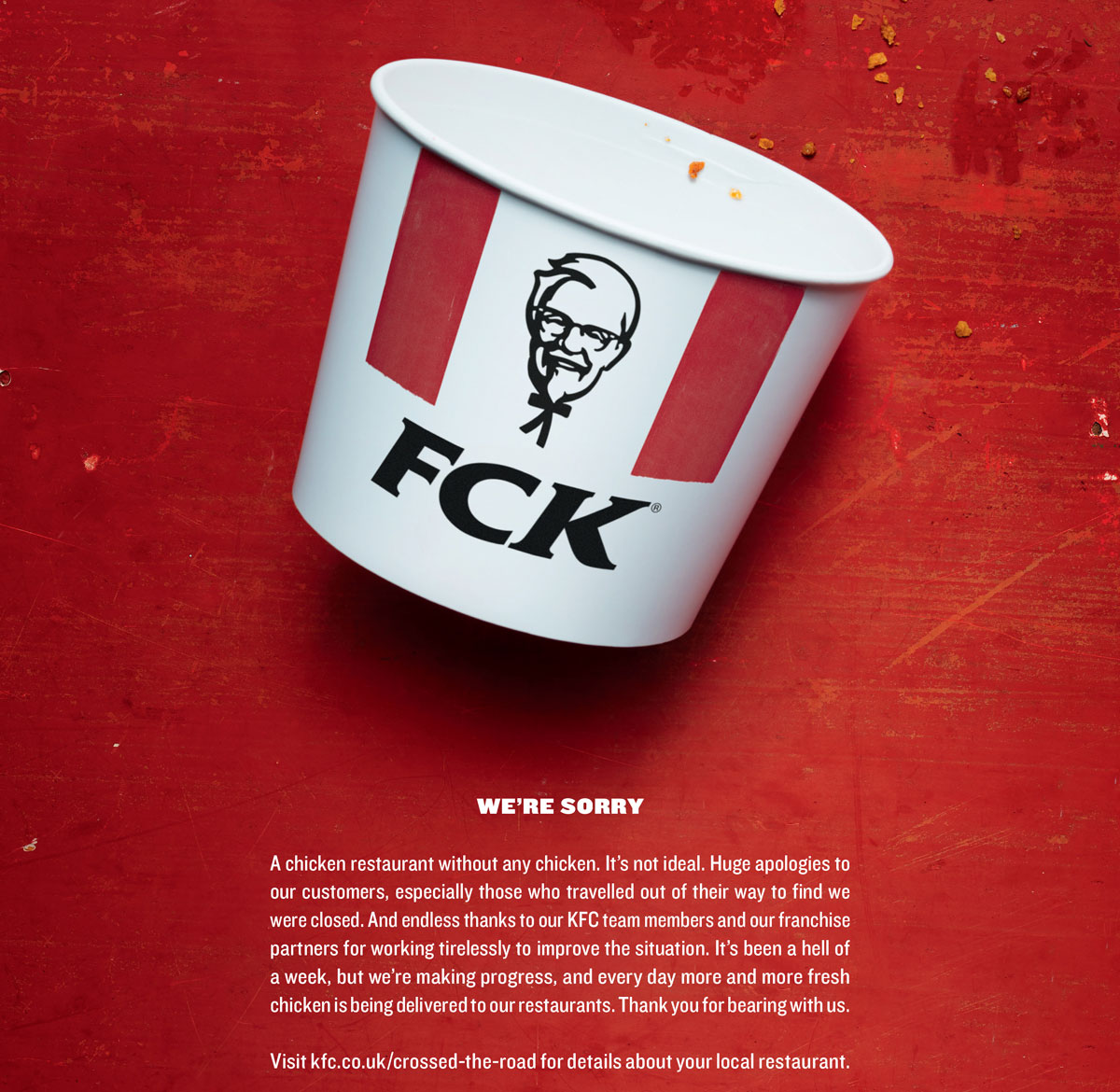
17. FCK
In spring 2018, the unthinkable happened. KFC ran out of chicken. Thanks to problems with a new distributors, the Colonel ended up temporarily closing most of its 900 UK restaurants. KFC handled it like a true pro, putting its hands up and accepting responsibility, and bringing in Mother London to create a print ad apology that instantly went viral. It even picked up a Wood D&AD Pencil in writing for advertising. Check out more companies that have mastered the art of saying sorry (or not) in our roundup of the good, the bad, and the WTF of brand apologies.
Brand war ads
18. KFC (or is that Ikea?)
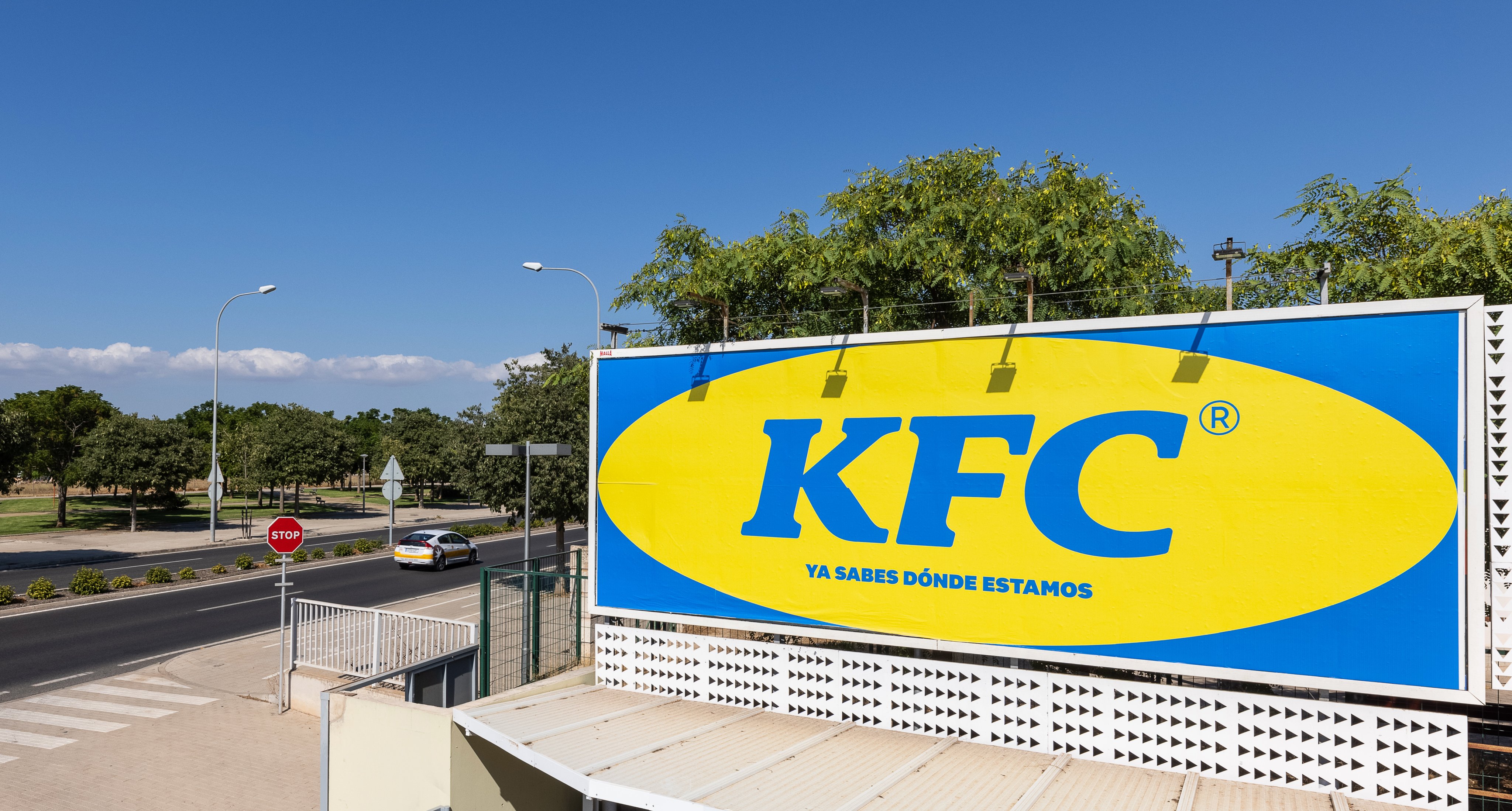
When KFC opened a new restaurant in an area of Majorca known locally as "where Ikea is"), the fast food chain decided to lean in to the association. Madrid agency PS21 mimicked Ikea's colour scheme and typography for the ad, leading to some good old brand banter between the unlikely rivals.
19. Ikea iDealisk
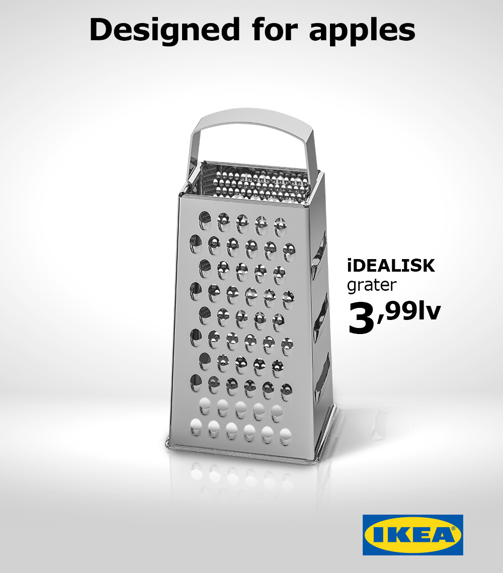
The previous model may have been likened to a trash can, but the when Apple unveiled its new Mac Pro in June 2019, the design drew unkind comparisons of its own: there was something decidedly cheese grater-ish about it. IKEA Bulgaria jumped into the discussion immediately, and within a few days it had released this killer ad. Created by advertising studio The Smarts, the design takes a bite out of Apple with its cheeky tagline and clever lower-case 'i' on the product name.
20. Pepsi trolls Coca-Cola
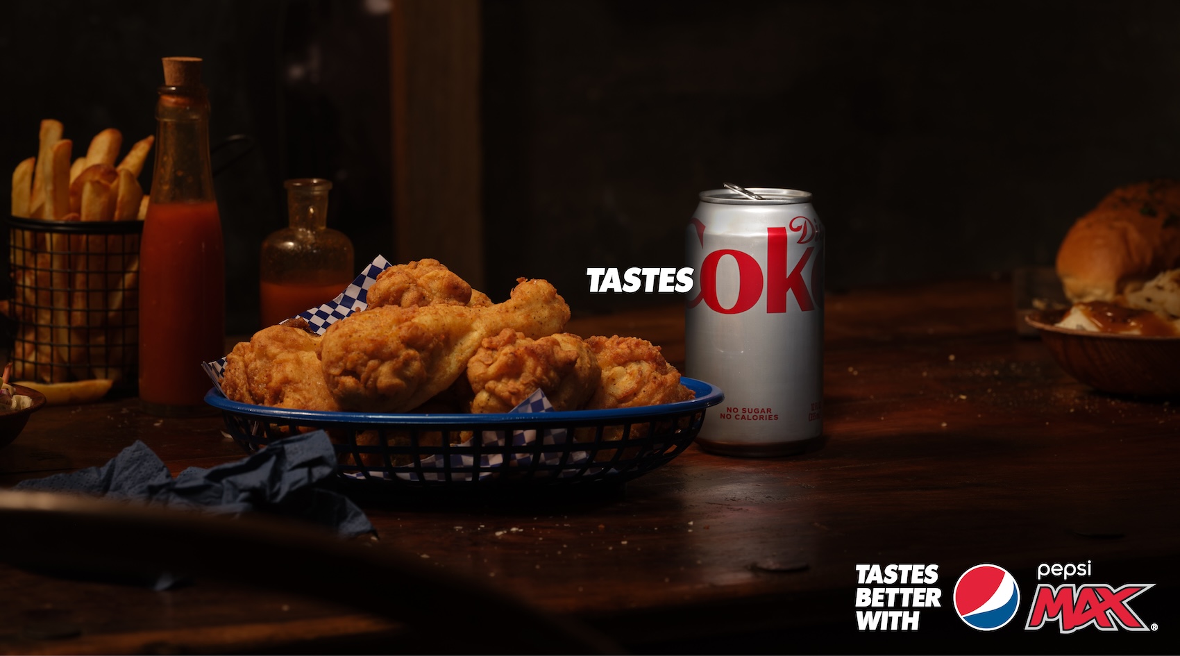
Pepsi and Coca-Cola have had a playful rivalry for some time now, but this creative ad is a prime example of effortlessly clever marketing. Known for its iconic 'Tastes better' tagline, Pepsi switched the narrative for this Australian campaign, suggesting that in comparison, the rival brand is just "ok".
Pepsi's 'Tastes ok' campaign lets Coca-Cola's design flaw do all the work, using the product's packaging to suggest its inferiority. It's a clever but risky strategy to base your marketing around your competitors, but when a genius marketing opportunity is hidden in plain sight, it's a golden opportunity to one-up the competition.
Illusion ads
21. McDonald's optical illusion hits the road
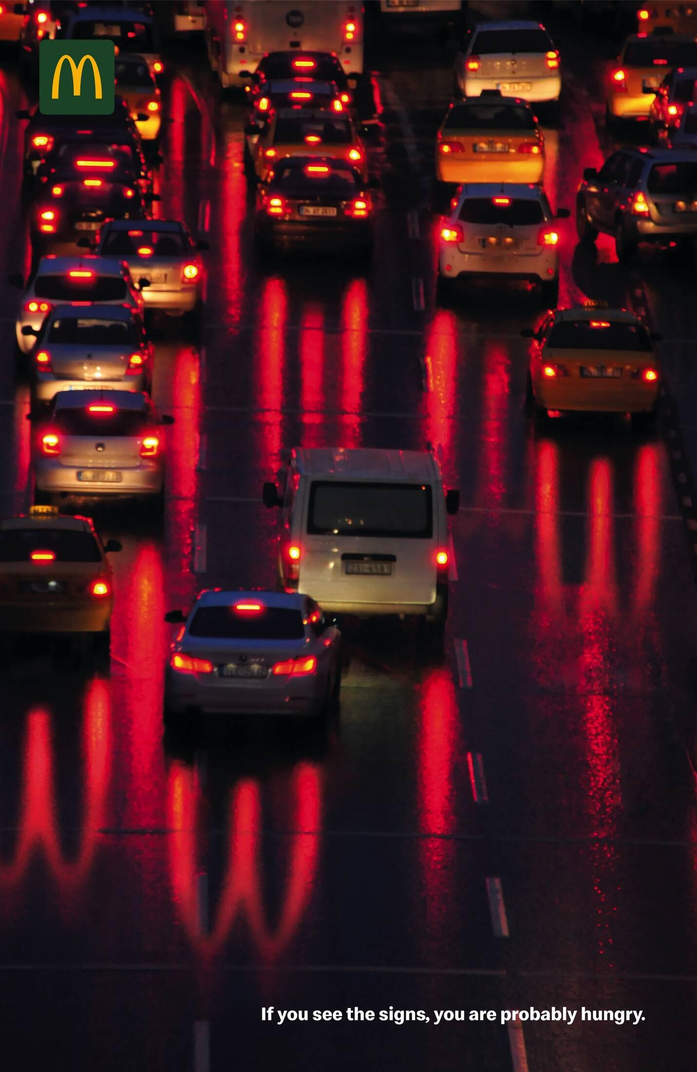
The clever ad features a group of cars piled up on a highway, their red lights beaming in the darkness. While upon first inspection, the reflection of the lights appears normal, a closer look reveals a subtle optical illusion effect, casting spectral Golden (or in this case, red) Arches on the road behind them. Text in the bottom right corner reads "If you see the signs, you are probably hungry" – a playful subliminal message from the McDonald's Gods.
22. Staedtler pencil buildings
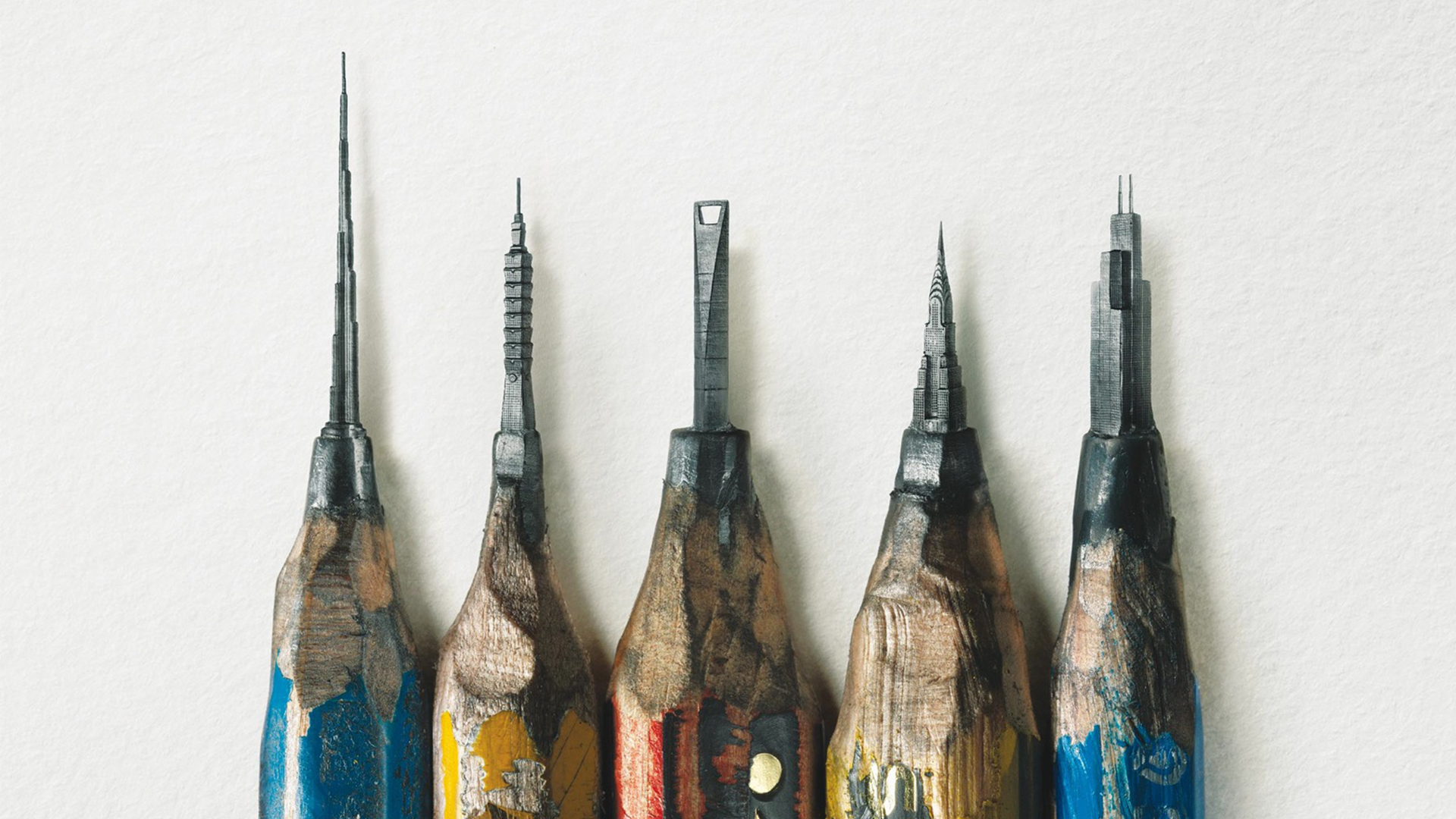
This campaign from a German pencil brand (by Leo Burnett Hong Kong) might just have left the sharpest impression yet. The poster for Staedtler pencils shows what looks, at first glance, like a bunch of bizarrely sharpened pencils. But look a little closer, and it becomes clear that you're looking at a series of impossibly intricate buildings carved into the lead. Find out more here.
23. Hiper Centro Corona's optical illusion print advert
We love a good optical illusion here at Creative Bloq, and we've seen them come in all forms, from still images that appear to move to images that appear to change colour but don't. They're great for insights into how our brains work, but sometimes an optical illusion can make a great print ad too.
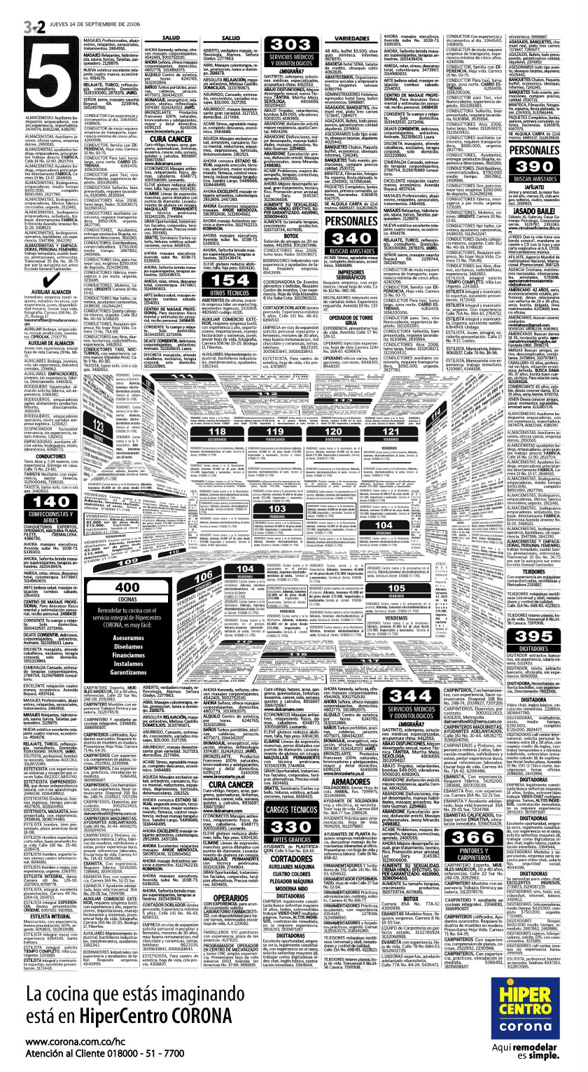
The designer Felipe Salazar created this ad to advertise the kitchen offerings of Colombia's Hiper Centro Corona chain. At first glance it looks like a page of classified ads, but it's been designed in such a way as to form the shape of a kitchen, complete with extractor fan and kitchen tops.
24. See what you want to see
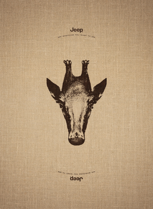
This print ad campaign was created by Leo Burnett France, and plays on the idea that with Jeep, you can go wherever you like and 'see what you want to see'. Each ad features an image of an animal, which, when turned upside down, turns into another creature from the other side of the world: the giraffe becomes a penguin, the elephant a swan and the doe a sea-lion.
25. Flipped
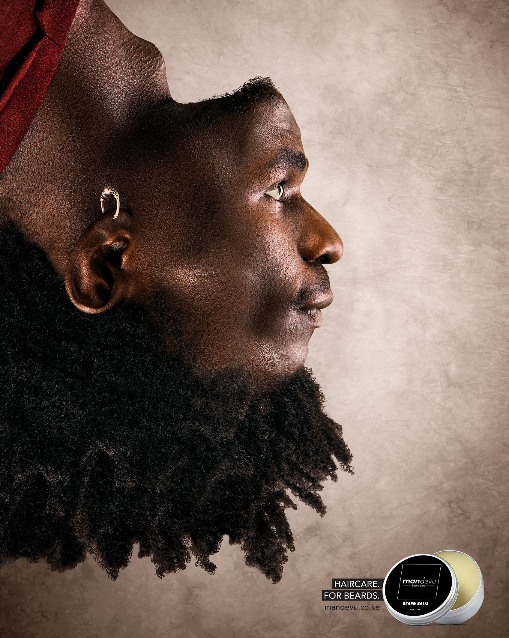
Beard hair just doesn't get the same kind of attention as head hair. Mandevu aims to change all that with its range of 'haircare for beards'. Ad agency Creative Y&R put together a series of adverts that flip the model's facial features, putting his beard on his head while his head hair becomes his beard. The unusualness of the image instantly captures the viewer's attention.
Clever copy ads
26. Breakfast means breakfast
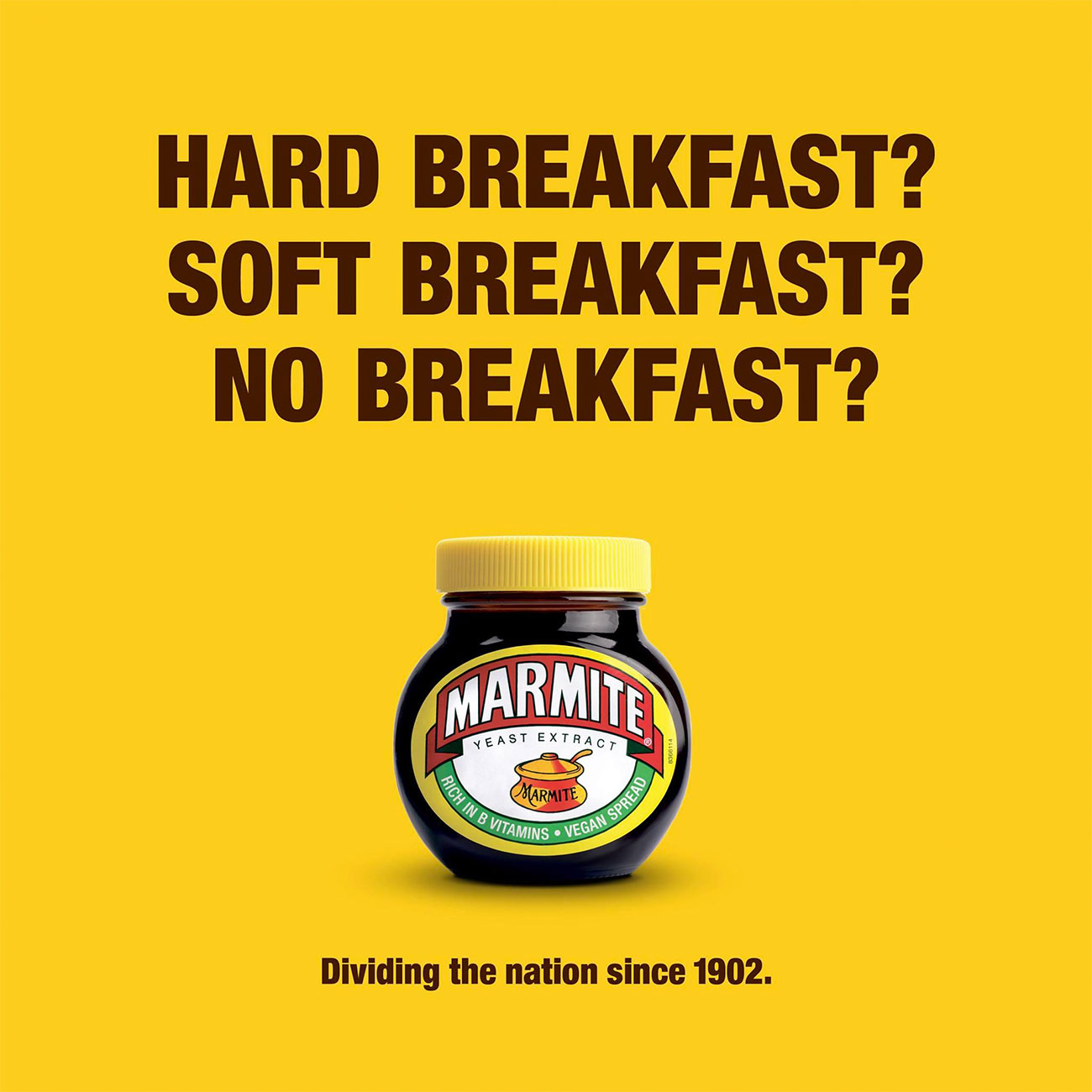
Popular yeasty spreadable, Marmite, has carved out an admirable little niche for itself as shorthand for anything that polarises opinion. And around 2016 there was nothing quite so Marmitey in the UK as the result of a certain Brexit referendum, so this ad, created by Oliver's in-house team at Unilever, felt kind of inevitable. Well played, Marmite.
27. Copywriter needed
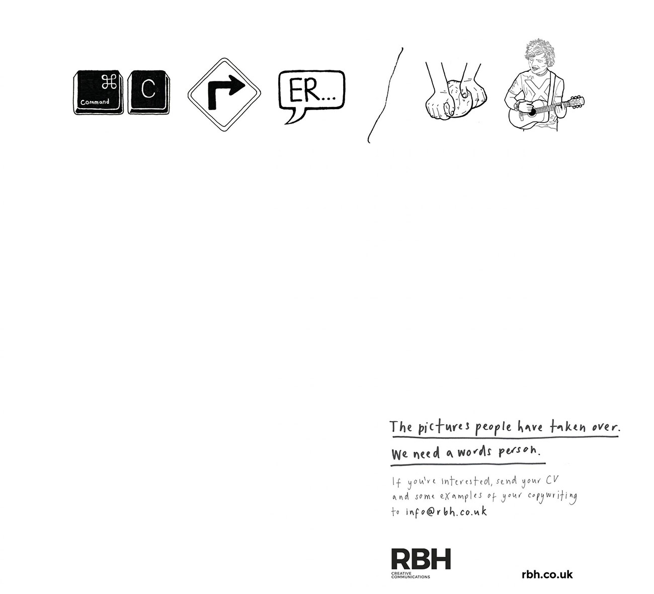
There's nothing particularly new about using pictograms to spell out a message in an advert, but we love the twist behind this one. It's a recruitment ad for a copywriter put out by RBH, and the illustrated pictograms spell out 'Copywriter needed', with the ad going on to state that, 'The pictures people have taken over. We need a words person.'
28. SMS mistype
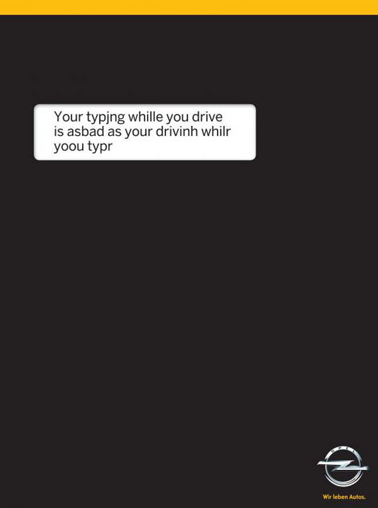
We all know the dangers of using a mobile phone while driving. But we really like the simple but clever way ad agency Gitam BBDO points out the facts in this road safety message from car manufacturer Opel. The cool print has a black background, replicating a phone while at the same time making the white box of text all the more prominent. It's a simple but really effective concept.
29. Reading Means Resisting
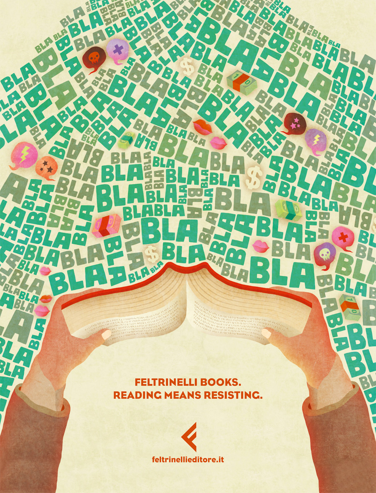
This illustrated print advertisement is designed to promote Feltrinelli books. This tackles head-on the problem people often have with reading: there are just too many distractions around. This sweet illustration goes back to the roots of why reading is great, acknowledging the surrounding distractions but showing how immersing yourself in a book can help shut these out. This campaign was created by Italian advertising agency Tita.
30. Hungry Copywriter
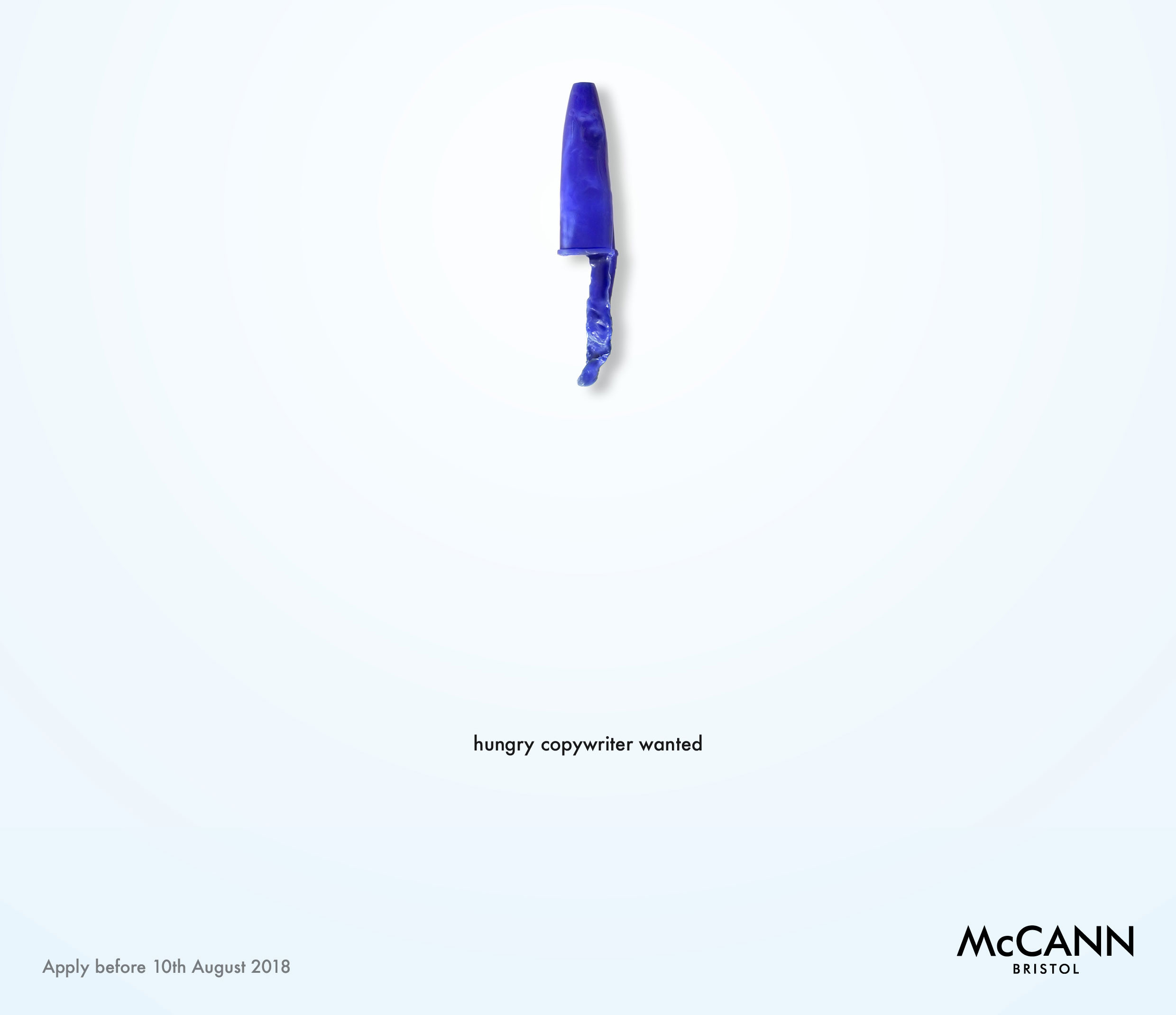
When advertising agency McCann Bristol needed a new copywriter, it did what it does best: advertise for one, and it created one of the best print adverts we've seen in the process. It's no standard job ad.
The agency created a striking print ad that included a clever pun, eye-catching layout, and all the information you needed to apply, all in an absolute minimum number of design elements. Incidentally, it also serves as a great lesson in editing for a prospective copywriter.
Thought provoking ads
31. Kiss with Pride
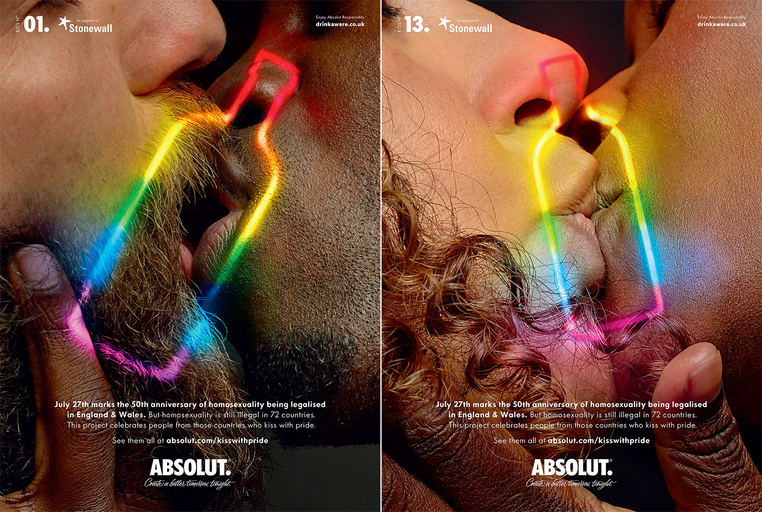
It's been over 50 years since homosexuality was decriminalised in England and Wales, but today it's still illegal in 72 countries around the world – and punishable by death in eight. To highlight this, Absolut, in collaboration with LGBTQ charity Stonewall and BBH London, created this series featuring close-up shots of same-sex kisses, with many of the subjects coming from the countries where these kisses could land them in prison, or worse.
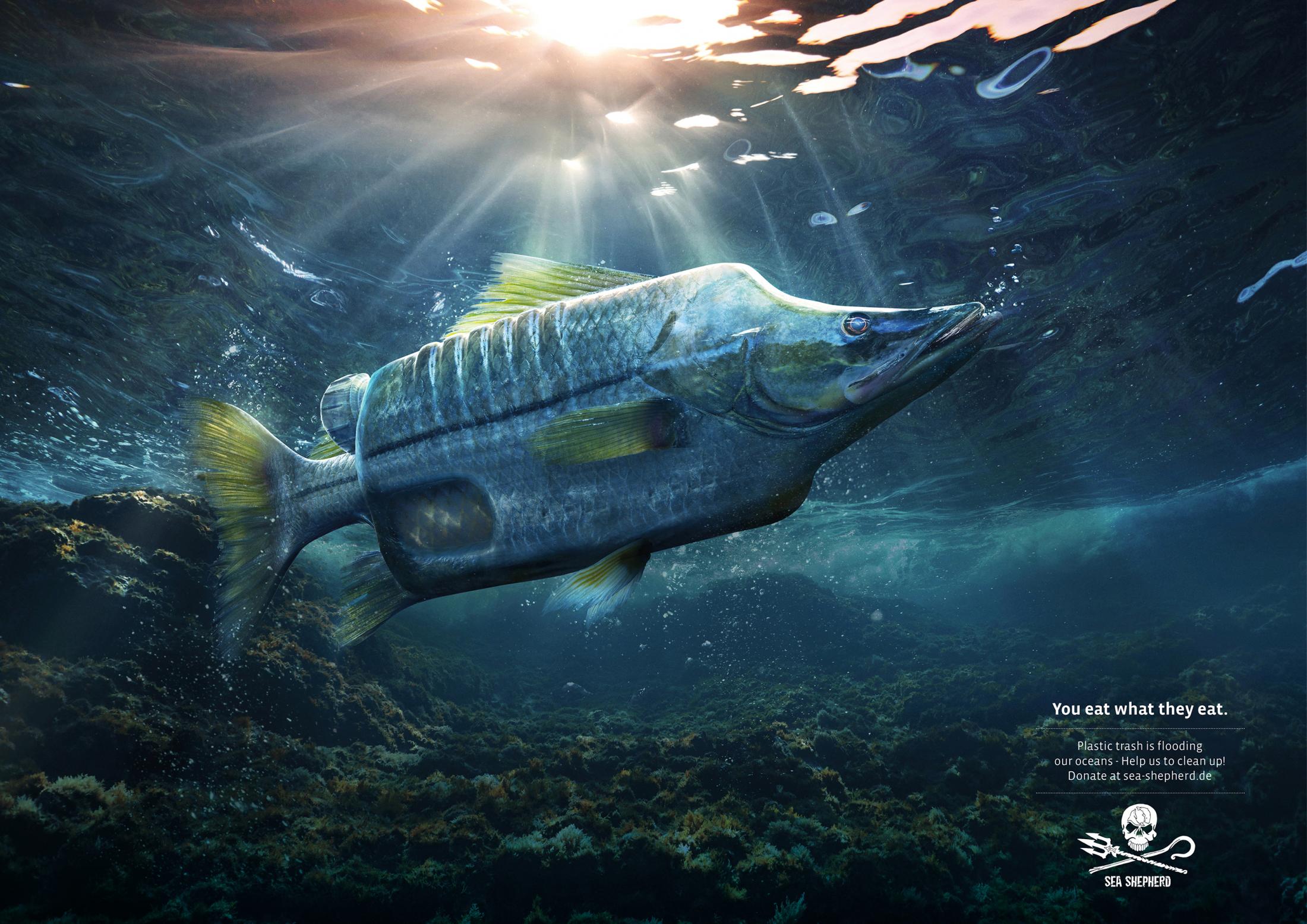
32. You eat what they eat
The amount of plastic being dumped in the ocean is so far beyond what we can comprehend that it doesn't bear thinking about. But that doesn't mean we shouldn't, as the team at German advertising company Ogilvy highlight with this campaign for Sea Shepherd Conservation Society (SSCS), an international non-profit, marine wildlife conservation organisation.
The print ad campaign depicts a number of different fish, misshapen by various plastic objects, with the tagline 'You eat what they eat'. The ad goes on to encourage viewers to help clean up our oceans by donating to Sea Shepherd.
33. A Better Job is Waiting
Created by Joe Public United, this print campaign for a job portal aims to motivate people to stop slogging it out in a job they don’t like. Deftly retouched photos show bored workers at their desks, sat still for so long mould has started to grow on their bodies, or spiders have set up their webs on them.
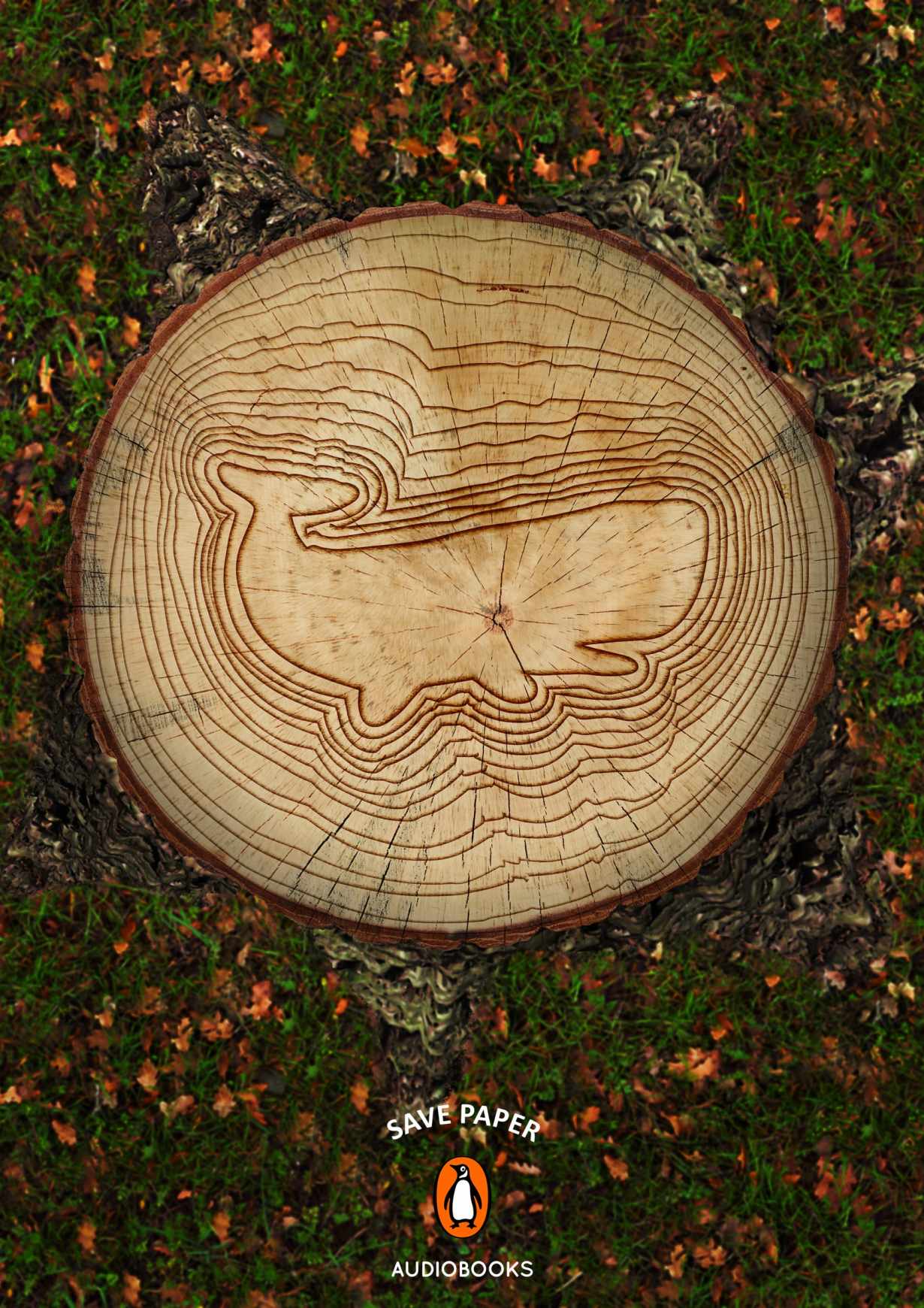
34. Save paper
It's a bold move for a company that has built itself on selling paper books. When Penguin needed to push its audiobook offering, Miami Ad School decided to tackle the eco issues of paper production head-on. The intricate illustration in the bark is a lovely touch.
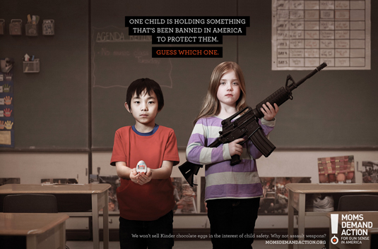
35. Choose One
Grey Canada created this print ad campaign for Moms Demand Action, a collective of mothers calling for gun law reform. While the conversation has moved on somewhat since these print adverts were released in 2013, the campaign still hits hard.
Focusing on gun violence in schools, the Choose One concept features a child carrying a weapon, alongside a classmates holding either a Kinder Surprise egg, the book Little Red Riding Hood or a ball from the schoolyard game Dodgeball. One child is holding something that's been banned in America to protect them, with the audience asked to guess which one.
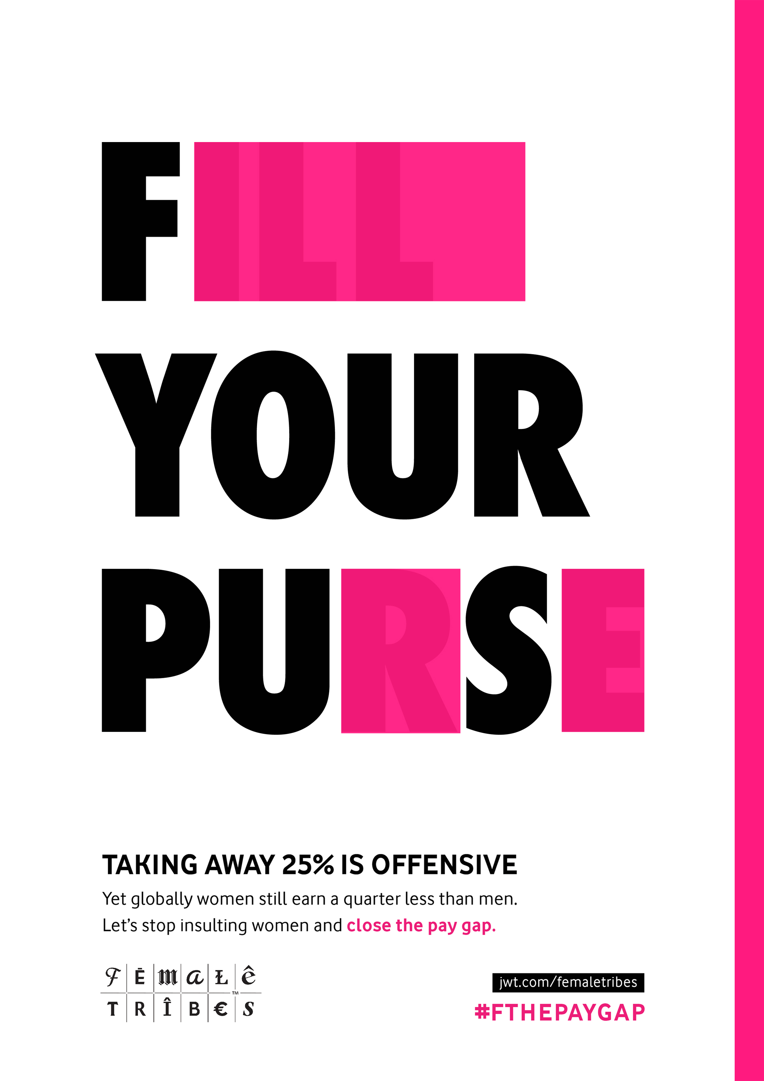
36. #FTHEPAYGAP
This clever print advert campaign by J. Walter Thompson addresses the pay gap between women and men. The series takes campaign messages and blocks out certain letters to suggest alternate, aggressive phrases – the message being that choosing to pay female members of your workforce significantly less than their male counterparts is just as offensive as other, more obviously sexist behaviours. The ads form part of JWT's Female Tribes campaign to change the cultural narrative around women.
37. Holes
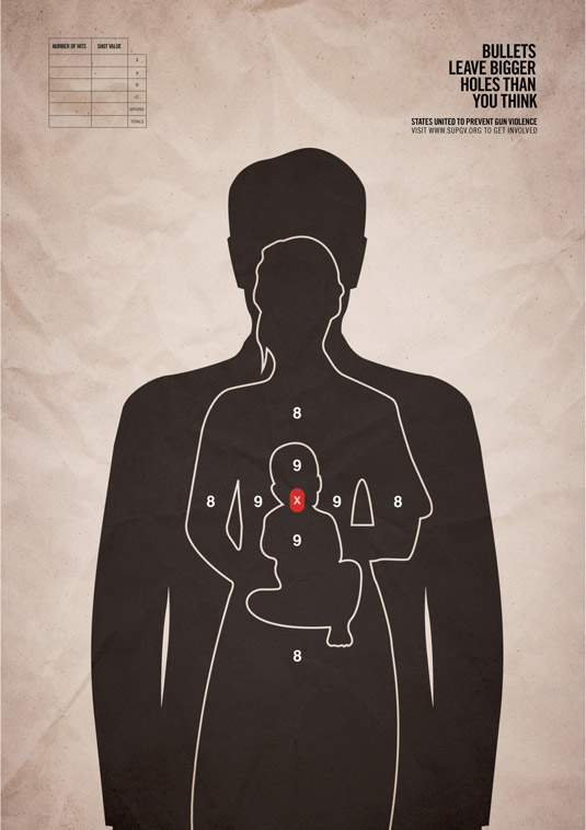
This hard-hitting print ad campaigning against gun violence comes from advertising and marketing agency Grey New York. The ads feature a single bullet target affecting three humans (including a small baby), and call for an update to the USA's antiquated gun laws. The ad, commissioned by non-profit organisation States United to Prevent Gun Violence, features the tagline 'Bullets leave bigger holes than you think'.
Minimalist ads
38. FedEx
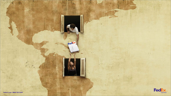
FedEx has run plenty of great campaigns, and we had to include this one in our pick of the best print adverts. It makes the FedEx package the centre of attention without being too in-your-face, and successfully gives a human, friendly face to postal logistics. The campaign was created by DDB.
39. Pantone: Rain Edition
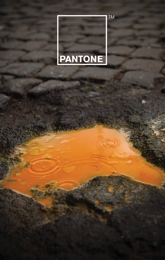
A collaborative effort between Italian creatives Giuliano Lo Re and Matteo Gallinelli, this inspiring campaign for Pantone puts colour front and centre, as you'd expect for the king of special inks. But rather than play the well-worn rainbow card, the duo opted to explore the relationship between colour and water – particularly rainwater.
40. The Kit-Kat lockdown ad
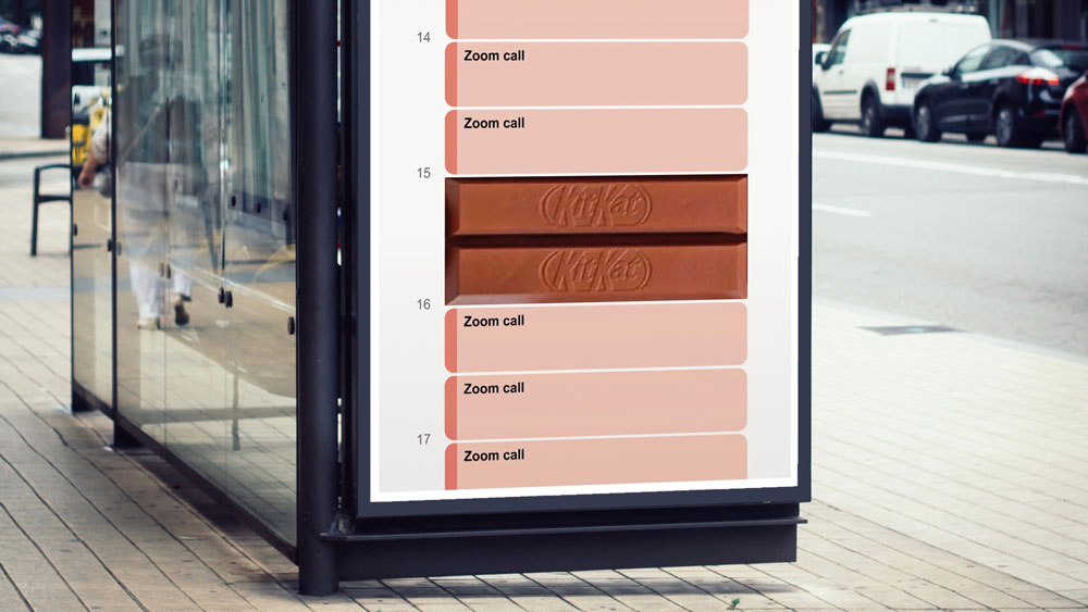
Every now and again a concept ad comes along that's so brilliantly done, it fools people into thinking it's an official design. Sam Hennig recently created this Kit-Kat ad, which plays on lockdown life so cleverly it's gained massive amounts of attention across the internet.
Made for the One Minute Briefs Twitter account, the advert shows a daily schedule, totally consumed by Zoom meetings, with a Kit-Kat duo blocking out two slots in the middle, at 3pm. It's simple, relevant and completely on-brand. In fact, it's so clever, many are praising Kit-Kat itself for the genius, before realising it actually has nothing to do with the brand, officially (though KitKat and Zoom have responded to it via Twitter). Read more about it here.
41. Norwegian Airlines
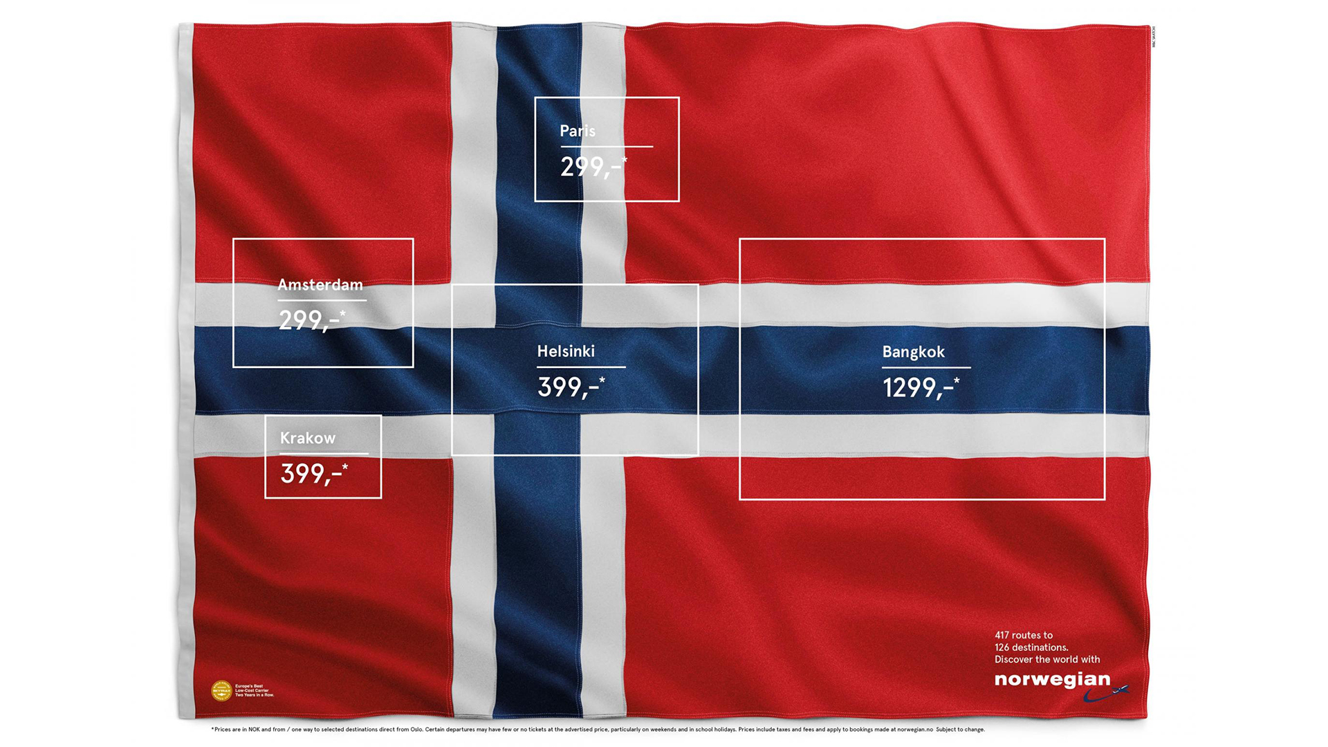
This ad keeps resurfacing on the internet, with folk going wild for the genius concept, so we thought it worth including in this roundup. Originally created in 2015 by Stockholm-based agency M&C Saatchi, the ad, titled Flag of Flags, highlights five hidden flags inside Norway's (including France, the Netherlands and Finland). The destinations (and, of course, prices) are listed inside the rectangles in a pleasingly clean sans-serif typeface.
42. Sharper than you think
There's nothing worse than trying to cut, well, anything with a blunt knife. And so Hamburg-based design agency KNSK have nailed this print advert for the WMF Grand Gourmet knife. We're not sure why you'd ever need a knife that sharp, but this eye-catching ad leaves us in no doubt that this is one kitchen utensil you shouldn't mess about with.
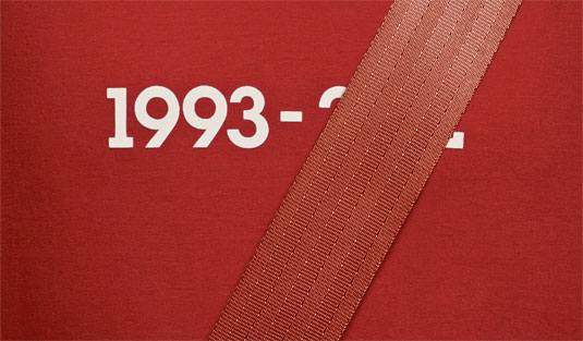
43. Buckle Up, Stay Alive
Addressing driving safety is a daunting task for any creative agency. Any ad needs to provoke a strong and lasting impression with an important message whilst still being creatively sound. This campaign from Lg2 for the Quebec Automobile Insurance Society ticks all these boxes and more. This campaign tackles the enduring issue of how to get people to wear a seatbelt. The simple image shows the driver's life dates printed on a car seat, with the latter year of death covered up by the seatbelt. It's a simple but very effective concept.

Daniel John is Design Editor at Creative Bloq. He reports on the worlds of design, branding and lifestyle tech, and has covered several industry events including Milan Design Week, OFFF Barcelona and Adobe Max in Los Angeles. He has interviewed leaders and designers at brands including Apple, Microsoft and Adobe. Daniel's debut book of short stories and poems was published in 2018, and his comedy newsletter is a Substack Bestseller.
- Antonia WilsonFreelance writer and editor
- Georgia CogganEditor
You must confirm your public display name before commenting
Please logout and then login again, you will then be prompted to enter your display name.

