Create digital magazines with Adobe Digital Publishing Suite
T3 art editor Luke O'Neill runs through some of the basics of using Adobe DPS, helping you to make the transition from print to screen.
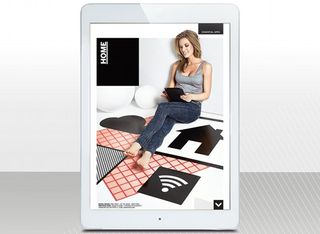
If you're a print designer, the transition over to digital can seem like a daunting one. The very word 'digital' throws up visions of having to learn reams and reams of code – something that print designers often raise an eyebrow to. And years of ingrained print design processes and techniques are hard to let go.
But with a little help from Adobe Digital Publishing Suite, adapting your print workflow to create fully interactive digital editions is a breeze. What's more, you don't have to go near a code editor.
If you're used to working with InDesign, then working on a project using DPS is essentially no different – apart from the page dimensions and a few additional panels to add interactivity, that is. In this workshop, we'll run through the basic concepts of designing for screen. Our focus is on iPad, but these techniques can be easily adapted for different devices.
We'll begin by showing you how to set up digital folios and articles, and then look at adding some basic interactivity. So let's get started…
01. Dimensions and setting up a document
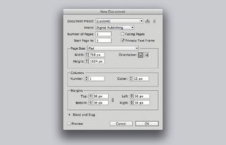
Go to New>Document and select Digital Publishing from the intent menu. Choose iPad for the page size, Portrait as the orientation, and select a resolution (either 1024x768 or 2048x1536). To add alternate layouts, go to the flyout menu in the Pages panel and select Create Alternate Layout.
02. Folios and articles
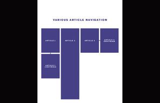
Your folio is the entire publication, and within that are as many articles, or separate InDesign files, as you want. Depending on the article, you can choose to have multiple pages that you swipe through horizontally or vertically, single static pages with interactivity or one long, smooth scrolling page.
03. Long scrolling pages
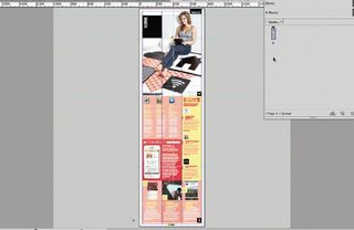
To create a long, scrolling page, extend the page height in the Document Setup panel. Drag the guides to indicate what will appear when the article loads. Here the main image fills the first screen, with an arrow to indicate that you can scroll down. Content running over is fine because the page scrolls smoothly.
Get the Creative Bloq Newsletter
Daily design news, reviews, how-tos and more, as picked by the editors.
04. Point sizes, but not as we know them
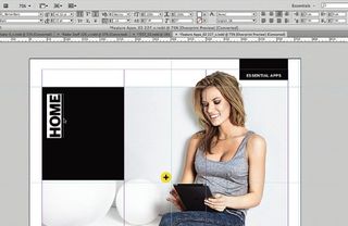
When working to screen sizes you'll find that the point sizes of type that you're used to have changed. For example, body copy that you might normally set to 10-12pt for print could quite easily be 18.20pt for screen. The sub-head highlighted left, for example, is 40.32pt, which would seem huge for a print project.
05. File types and effective PPI
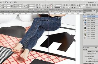
With Adobe DPS, you can use the same file formats as you would for a print project – DPS down-samples large images at export. However, some interactive images must be used at exact size to avoid pixelation. As a rule, make sure all of your images are no less than 108 effective PPI (check this in the Links panel).
06. Getting started with object states
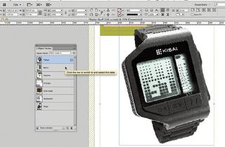
Multi-state objects let you integrate interactive content and work like layers. Select several objects and choose New State in the Object States panel. Only the top one is visible, but you can cycle through them. To make an object a slideshow, open the Folio Overlays panel and use the Slideshow panel options.
07. Using buttons
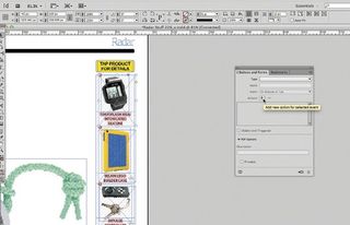
Rather than have images cycle in a slideshow format, you might want to enable the viewer to turn object states on or off. Here, we've repeated the images that are in the object state – but smaller and in a list down the right. Draw a box over the area you'd like the user to tap and bring up the buttons panel.
08. Making an object a button
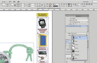
Use the 'cross' icon to add a new event to a butt on and choose Go To state. From the dropdown, select your specific multi-state object and the state within that object that you'd like the butt on to action. This is where being organised and naming up your object states appropriately comes in handy.
09. Adding hyperlinks and video content
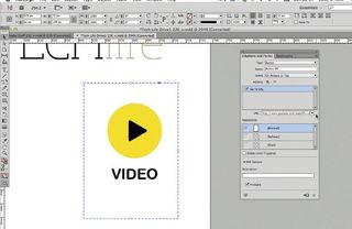
Like images, it's possible to embed video using the Place command, but you may wish to link out to the content to keep the app size down. Simply create a suitable 'play video' icon and draw another box over the top for the button. Rather than link to an object state, choose Go To URL and input the full address.
Words: Luke O'Neill
Currently art editor at T3 magazine, Luke designed the first two volumes of Computer Arts Collection. His illustration work can be found gracing the covers of Computer Arts Presents. This article originally appeared in Computer Arts issue 230.

Thank you for reading 5 articles this month* Join now for unlimited access
Enjoy your first month for just £1 / $1 / €1
*Read 5 free articles per month without a subscription

Join now for unlimited access
Try first month for just £1 / $1 / €1
The Creative Bloq team is made up of a group of design fans, and has changed and evolved since Creative Bloq began back in 2012. The current website team consists of eight full-time members of staff: Editor Georgia Coggan, Deputy Editor Rosie Hilder, Ecommerce Editor Beren Neale, Senior News Editor Daniel Piper, Editor, Digital Art and 3D Ian Dean, Tech Reviews Editor Erlingur Einarsson and Ecommerce Writer Beth Nicholls and Staff Writer Natalie Fear, as well as a roster of freelancers from around the world. The 3D World and ImagineFX magazine teams also pitch in, ensuring that content from 3D World and ImagineFX is represented on Creative Bloq.
Related articles
-
-
-
-

