14 new cover designs for James Bond books
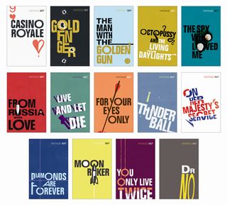
Ian Fleming's enduring spy thrillers are reissued in advance of the first Bond movie's 50th anniversary, and receive a stylish makeover with these Saul Bass-inspired cover designs.
Here's further proof that timeless heritage is one of the foremost graphic design trends in 2012, in the shape of these new James Bond reissues from Vintage Classics released today.
The paperback covers are designed by publisher Random House's in-house team to emphasise the cool sophistication of Ian Fleming's ubiquitous agent 007 and to evoke the heritage and era without appearing dated. For many, Bond’s contemporary image is closely aligned with the movies, yet the novels vividly evoke the setting and atmosphere of the period - and the covers reflect this distancing from the film franchise.
Six designers worked over the 14 titles, which meant that there had to be a clear brief and consistent typography for the designs to cohere.
Creative director Suzanne Dean briefed the designers to be inspired by Saul Bass, perhaps best known for movie art such as posters and title sequences including Psycho, The Man with the Golden Gun, and North by Northwest.
"Bass once described his main goal for his title sequences as being to 'try to reach for a simple, visual phrase that tells you what the picture is all about and evokes the essence of the story'," says Dean. "Our colour palette was referenced from Bass’s posters, and we introduced an authentic retro feel by cutting out our designs."
On typography's secret service
The typography was painstakingly deliberated over too. "Folio was one of the first popular sans-serif fonts and was used in a lot of newspaper and display graphics of the period," continues Dean. "As we were keen to reference the period and content when the books were written, rather than the movies of the '60s and '70s, the font was perfect for the graphic film posters of the '50s and '60s.
"Folio is a realist sans-serif font designed by Konrad Bauer and Walter Baum in 1957, and is more closely related to Akzidenz Grotesk (1896) than similar fonts like Helvetica. It has a strong circular 'O' in its bold version, which formed an important feature within our designs, and had the added attraction of having a very '50s-feeling bold condensed version. Mixing the two gives an immediate retro feel, whilst having fresh take on layout also keeps the covers contemporary."
Here are the new covers, with the designer of each giving an insight into the creation process involved.
01. Casino Royale

"Casino Royale was Ian Fleming’s first James Bond novel," says designer Suzanne Dean, "and he had sketched out a cover design describing it as ‘exquisite symmetry and absolute chastity’.
"It was important to me to nod towards this original design, but to simplify it and introduce an edgier element. The question I had was how far could I pare down the nine of Hearts playing card, while still making it obviously recognisable."
02. Moonraker
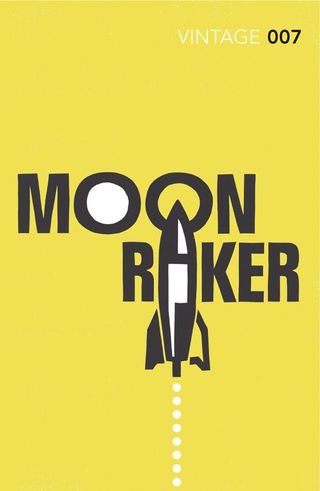
"The Moonraker of the title refers to the name of a missile in the book," says cover designer Stephen Parker, "and so I worked on a design which included a simplified V-2 missile shape within the letterforms.
"Though the moon is absent from the book, written 14 years before the first moon landing, the circular 'Os' in the design do give a faint hint of the later more moon-based movie."
03. Diamonds Are Forever

"The story follows Bond around the world on a mission to track down a diamond-smuggling ring," says Julia Connolly. "By creating sharp angles with the type, the diamond shape can be seen in the negative space, with crosshairs adding a hint of the danger we associate with James Bond."
04. From Russia With Love

"The story centres on a plot by SMERSH to assassinate Bond," says Dean. "This is represented by trapping the bullet within the U, just as Bond traps the bullet with his metal cigarette case. The red and black colour theme emphasizes the communist operations and espionage throughout the novel."
05. Dr No

"Dr No is a reclusive villain living on Crab Key, a mysterious private Caribbean island," says the cover's artist Matt Broughton. "He lives like this because he believes the concept of securing power begins with absolute secrecy.
"The graphic is constructed to suggest this self-enforced isolation, with the elongated shadow of 'No' referring to the looming menace within."
06. For Your Eyes Only

"A key moment in the book, and memorable scene from the film, is when one of Bond's targets is unexpectedly killed by a woman with a crossbow," explains Connolly. "So the arrow is used to dramatically cut through the type. This interaction of title and image, and the use of block colours, was inspired by Saul Bass's classic film posters."
07. The Spy Who Loved Me

"A challenge to work on, The Spy Who Loved Me had many covers along the way," says the book cover's designer James Jones. "Even though the story is told from a female perspective early visuals were too feminine in their approach, and a departure from the rest of the series.
"Having experimented with roses and fire, the idea of scorching the bullet-holed 'Os' seemed to hint at the burnt love represented within the novel."
08. On Her Majesty's Secret Service

"The graphic for On Her Majesty's Secret Service conceals a Union Jack - a reference to Bond's employers," says Broughton. "By splitting the words 'secret' and 'service' we’re encouraged to read an all-too-familiar title without noticing the typographical conflict - the idea that there is more if you look beneath the surface."
09. Octopussy and The Living Daylights

"With the novel being compiled of short stories, both titles needed to be represented on one cover," says Jones. "As the octopus is such a key element, it made sense to use the tentacles to help draw the reader in.
"This allowed for a more subtle sniper element for The Living Daylights, and having two different colours for the titles helped differentiate them further."
10. The Man with the Golden Gun
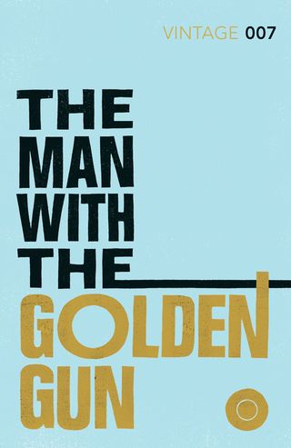
"The Man with the Golden Gun is designed to form the suggestion of a gun shape, and the extending lines speak of sightlines and trajectories," says Parker. The end view of the golden bullet, which has Bond’s name on it, adds a graphic counterbalance to the design and may even be misinterpreted as Scaramanaga’s third nipple."
11. You Only Live Twice
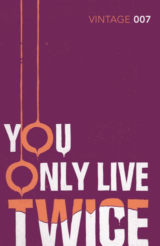
"When reading You Only Live Twice, the image that stuck in my mind was the mysterious ‘Garden of Death’ where people had been flocking to kill themselves," says designer Kris Potter. "The exotic plants with their deadly dripping poisons lent themselves to both the colour and playful treatment of the type."
12. Thunderball
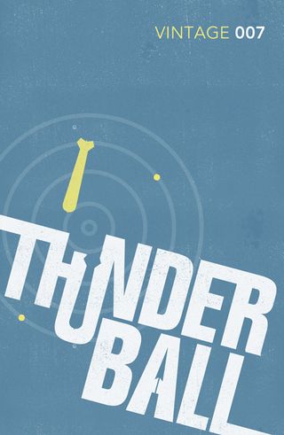
"Thunderball is the operation to recover two atomic bombs threatening to destroy two major cities," says Potter. "This dual threat is suggested by the positive and negative bomb shapes within the design. The action of the book mainly takes place underwater and the colour, speargun and radar lines are suggestive of this."
13. Goldfinger
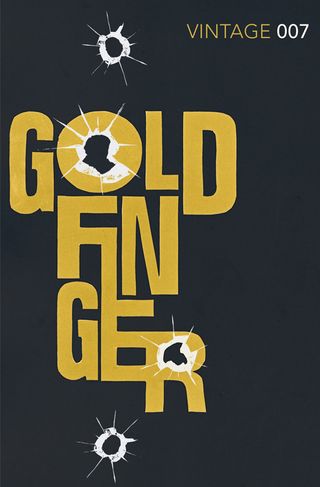
"Bond’s antagonist in the novel is Auric Goldfinger, a man with an unhealthy obsession with gold, hence the title colouring," says Broughton. "The bullet hole/broken glass motif is a nod to the way Goldfinger’s factotum, Oddjob, receives his comeuppance – an ending that is reserved for Goldfinger himself in the film version."
14. Live and Let Die

"Having decided upon a movie poster style, this allowed for the typography of Live and Let Die to have a playful element," says Jones. "The title rising from the grave symbolises the voodoo themes of the novel along with the supernatural colour palette. Then to ‘cap’ it off, Baron Samedi can be seen appearing within the shadows."
The print editions of the Vintage 007 series are on sale now.
Like this? Read these!
Have you seen any book cover designs that have caught your eye? Let us know in the comments box below!

Thank you for reading 5 articles this month* Join now for unlimited access
Enjoy your first month for just £1 / $1 / €1
*Read 5 free articles per month without a subscription

Join now for unlimited access
Try first month for just £1 / $1 / €1
Get the Creative Bloq Newsletter
Daily design news, reviews, how-tos and more, as picked by the editors.
The Creative Bloq team is made up of a group of design fans, and has changed and evolved since Creative Bloq began back in 2012. The current website team consists of eight full-time members of staff: Editor Georgia Coggan, Deputy Editor Rosie Hilder, Ecommerce Editor Beren Neale, Senior News Editor Daniel Piper, Editor, Digital Art and 3D Ian Dean, Tech Reviews Editor Erlingur Einarsson and Ecommerce Writer Beth Nicholls and Staff Writer Natalie Fear, as well as a roster of freelancers from around the world. The 3D World and ImagineFX magazine teams also pitch in, ensuring that content from 3D World and ImagineFX is represented on Creative Bloq.
