You simply won't believe this animation is CG
It's hard to believe but this comedic, stop-motion-style animation was created entirely in 3D. We find out how it was done.
Gracht - which means 'canal' in Dutch - is a quirky and daft comic film. The short, a graduate project from students at the Utrecht School of the Arts in Hilversum, took Nick Groeneveld, Joost de Jong, Michaël Koning and Jeroen Hoolmans six months to produce.
Perhaps the most surprising aspect of the animation, is that although it looks exactly like stop-motion porcelain models and props, the entire thing is in fact CG.
Stylistically, the short’s influences were Dutch TV series New Kids, a Dutch comic called Joop Klepzeiker and Amsterdam itself, according to art director Nick Groeneveld. "We saw Meindbender’s commercial for The Pirate, and we loved the idea of building a miniature CG world," he explains.
"We wanted to explore this further, so we went to an amusement park in The Netherlands called Madurodam, which has miniatures of important cities and structures from around the country. It provided a lot of insight on how to create a miniature canal in Amsterdam."
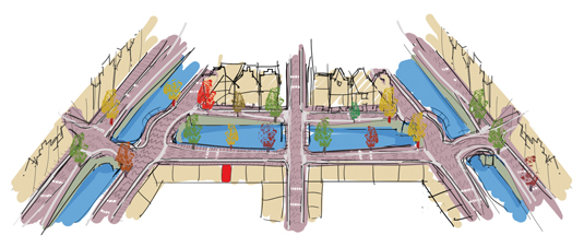
Setting the scene
"My role was to create the style of the film and put it all together, so it would look like it’s a world on its own," says Groeneveld. "I also did the shading and a lot of texturing. Once that was finished I animated a few shots."
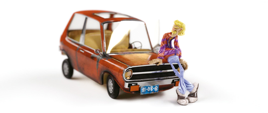
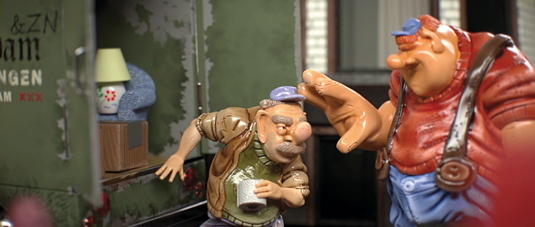
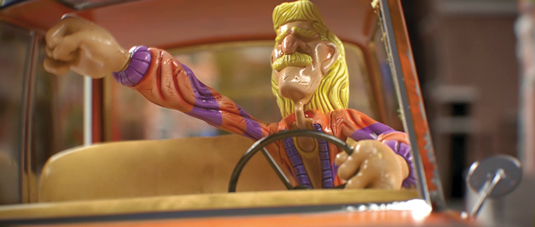
The story, a simple tale of a girl moving apartments, evolved gradually. Lead animator Joost de Jong first came up with a situation of two people sitting in a car, not knowing that they were being robbed. "We loved the Sjonnie character - the blonde guy raving in his car, based on New Kids’ characters - so we decided to give him more screen time,"says Groeneveld.
To achieve the distinctive rendering style for the environments and the characters, the team worked with a range of 3D software. "We started by roughly sculpting our characters in ZBrush and sent them to Blender for retopology," says Groeneveld. "After the retopology was done, we sent the geometry back to ZBrush to add finer detail such as scratches on the surface."
Mari allowed us to actually make the tiny mistakes you’d get if we had created it in the real world
The final model and displacement maps were sent to Maya, where props were created, and then it all went to Photoshop for the creation of textures. "We also imported our geometry into Mari to produce a more hand-painted feel. Mari was a great choice because it allowed us to actually make the tiny mistakes you'd get if we had created it in the real world."
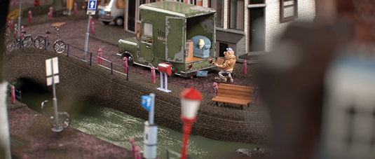
Those mistakes and other visual cues were vital for ensuring that each prop and object felt hand-crafted, which Groeneveld says was probably the biggest challenge throughout the creation process. "The research we did to make our shots feel miniature was essential," he adds. "We spent days looking at these details to understand what makes it feel so small. After a lot of trial and error, we produced our first shot; then, to get the same results over and over again, we refined our workflow to get the best possible result."
Maxwell's house
Along with Mari and ZBrush, Maxwell Render was invaluable on the project. "We rendered with Maxwell because we wanted the ease of the material editor and the realism of the engine," Groeneveld says.
But since this was the first time any of them had worked with Maxwell, it wasn't without its difficulties, not least because of the progressive rendering method that it employs. "There were hardly any render settings and creating shaders was very straightforward; the only downside was our render times," Groeneveld says. "They were over an hour per frame."
Managing render times
It was important to establish early on that final rendering times would be feasible within the production timeframe, as well as devising ways to reduce them where possible.
"We managed to start rendering scenes that were still in production; though some assets were still in development, everything visible was final," says Groeneveld. "We ended up using one big scene as our set, though, which, in my opinion, turned out to be a bad idea. The set was limiting our possibilities for camera angles and positioning of props. If we had created different environments for each shot, or at least multiple smaller scenes, we would have been able to define our angles beforehand."
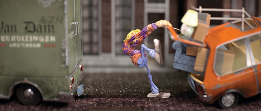
The stop-motion look was created by skipping every other frame of animation, "and sometimes we even chose to animate it on threes or fours to get that choppy feel to it. We used the same technique with our cameras."
Since the team had only six months to complete the film, they were keen to minimise time spent on rendering and production. "Jeroen Hoolmans wrote the production pipeline, which consisted of some scripts that automated a lot of our tasks," says Groeneveld. "You could quickly set up a scene, and then run scripts that would clean up the rough edges. This allowed us to focus on what’s most important – the creative process."
One of the key scripts helped prepare a renderable Maya scene that could quickly export Maxwell scenes, with a particular emphasis on memory management. "Our sets were quite large, with displacements in every shot," Groeneveld explains. "In order to keep things manageable we had to optimise our sets before rendering. We could only use up to about 10GB of RAM during renders, which was a problem for some scenes, especially the close-ups."
By measuring the distance between the camera and scene objects, the script was able to turn displacements on or off by switching shaders before frame export, therefore saving memory and render time. The export itself contained only animation data and linked to everything else that was static.
Their efforts have certainly paid off, with Gracht praised for its distinctive style and the sheer professionalism the whole project displays. So what’s next for Groeneveld and the others? "My main goal is to get a job!" he laughs. "And then to work on awesome, interesting stuff."
This article originally appeared in 3D World issue 175.
Liked this? Read these!
- Create a perfect mood board with these pro tips
- The best 3D movies of 2013
- Download free textures: high resolution and ready to use now

Thank you for reading 5 articles this month* Join now for unlimited access
Enjoy your first month for just £1 / $1 / €1
*Read 5 free articles per month without a subscription

Join now for unlimited access
Try first month for just £1 / $1 / €1
Get the Creative Bloq Newsletter
Daily design news, reviews, how-tos and more, as picked by the editors.

The Creative Bloq team is made up of a group of art and design enthusiasts, and has changed and evolved since Creative Bloq began back in 2012. The current website team consists of eight full-time members of staff: Editor Georgia Coggan, Deputy Editor Rosie Hilder, Ecommerce Editor Beren Neale, Senior News Editor Daniel Piper, Editor, Digital Art and 3D Ian Dean, Tech Reviews Editor Erlingur Einarsson, Ecommerce Writer Beth Nicholls and Staff Writer Natalie Fear, as well as a roster of freelancers from around the world. The ImagineFX magazine team also pitch in, ensuring that content from leading digital art publication ImagineFX is represented on Creative Bloq.
