Create scary 3D art to win animation software
As the annual Halloween 3D render challenge gets underway, we talk to the artist behind the gruesome Pumpkin Eater featured on the event's promotional material.
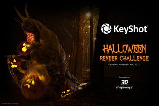
Back by popular demand, the KeyShot Halloween Rendering Challenge is currently in full swing. Sponsored by 3D World, the event calls 3D artists all over the globe to create the scariest shot possible for the chance to win animation and rendering software KeyShot.
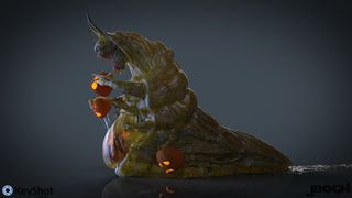
To spread the word about the challenge, 3D artist Jerod Bogh created this foul 'Pumpkin Eater' to feature on all the event's promotional material. Currently working as a character modeller on supernatural TV drama Grimm, Bogh is somewhat of an expert in designing gruesome creatures. Here, he reveals his working process behind the design...
Q: What 3D software did you use for this project?
ZBrush 4r6 and KeyShot 4.2 Pro.
Q: How long did the image take to create?
I spent a day concepting the idea in ZBrush. Two more days finishing out the model. Then finally a two-day render marathon in KeyShot playing with the lighting and composition until I was satisfied with the mood and materials.
Q: Did you use any unusual or notable techniques?
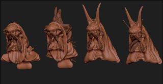
Within ZBrush I took advantage of the IMM brush system. First sculpting an arm I liked, which was then added into an IMM Brush along with spikes and a few other variations of the arm. Building a quick parts library really sped up the initial concepting process.
Within ZBrush I took advantage of the IMM brush system
The GoZ to KeyShot Plugin was used as a single click solution to get all the ZBrush subtools into KeyShot rapidly. Retaining my PolyPaint info from ZBrush let me start working in KeyShot without having to worry about UV Unwrapping the model. I just dove in and started trying different materials. Using one of KeyShot's default Textured Glass materials, I was able to get a really nice ribbed look to the thickness of the creatures stomach by tweaking some of the texture settings.
Q: What did you most enjoy about creating the image?
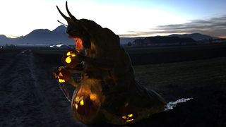
Getting the pumpkins into the scene and lit from within! It added so much to the scene having an already devoured pumpkin light the creature from the inside.
Q: What (other) experience do you have in 3D?
This will be my 3rd season working on the NBC series Grimm. Specializing in sculpting digital doubles of the actors, then morphing them into all kinds of monsters and creatures.
Q: What inspires you as an artist?
I'm constantly inspired by nature. Whether I have a basic idea in mind or am needing a new spark for my imagination, nature does the trick 75% of the time. Other artists whether they be past or present make up that remaining 25%.
I'm always humbled by the level of work being created around the world. But I feel taking too much of it in at a time tends to stop me in my tracks rather than benefit my project. It's always a balance.
Can you talk us through your workflow for the Pumpkin Eater?
Early explorations of this character included some kind of angler fish monster as well as some interesting, but failed, alien attempts. Wanting to have pumpkins as a light source, I tried to build the creature around that idea. I thought it would be kind of creepy to have an already digested pumpkin inside the belly of a beast lighting it from within. Thinking about possible enemies of a pumpkin I realized a slug monster would be a great candidate.
Thinking about possible enemies of a pumpkin I realized a slug monster would be a great candidate
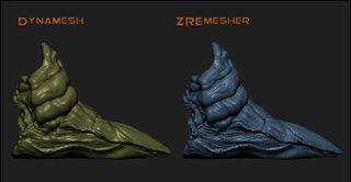
Using Dynamesh (ZBrush's base mesh generation tool) I blocked out a few initial body forms and head types. After I had a direction locked in, I used ZBrush 4r6's ZRemesher feature and retopped the body and head parts with only a few clicks.
Projecting my Dynamesh details onto the new ZRemeshed topology I could now use ZBrush's Subdivisions again. This allowed me to pose a lower resolution version and still have access to high resolution details.
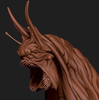
The Pumpkin Eater went through several style changes before I grabbed a set of teeth I made back on the angler fish creature. Creating a pocket for a mouth, I then appended the set of the teeth and moved them into position. Not liking how a typical top and bottom jaw layout looked, I duplicated the bottom set of teeth and began mirroring them together until it looked more alien.
I duplicated the bottom set of teeth and began mirroring them together until it looked more alien
Next I quickly sculpted a few pumpkin variations from a sphere. Cut the tops and face features out using polygroups. Then extracted those planes into a pumpkin with a proper thickness so they look convincing when lit. With the early tests in KeyShot I was able to get back into ZBrush and re-position the pumpkins and their inner light spheres into better placement for the composition.
It was at this point I sent all of the subtools over to KeyShot using the GoZ plugin that will be available soon! Sending over my highest sub divisions means it's necessary to delete the lower levels if the subtools have any.
Getting into Keyshot while I was still in the sculpting and developement stages allowed for some great feedback for the final composition. I lit the scene with an outdoor HDRI, and next a pumpkin. In order to light the pumpkin like a bright candle from the inside I used ZBrush to place a sphere inside each of them. Then used GoZ to send the spheres into KeyShot and set their materials to area lights. Turning off the visibility of the sphere's geometry but keeping the light present.
Staying fearless and saving often is usually my mantra
KeyShot has really impacted the way I work. In the past I never bothered thinking about the lighting until the end. Now it's something I'm considering very early in the process. It's always amazing to me how much an HDRI change can effect the image. So I always do a lot of playing in KeyShot. Staying fearless and saving often is usually my mantra.
You can enter the Keyshot Halloween Render Challenge here. The deadline for entries is Nov 4, 2013.
All images courtesy of Jerod Bogh.
Liked this? Read these!
- Top free 3D models
- Best 3D movies of 2013
- Blender tutorials: ways to create cool effects
Have you seen any inspirational 3D work recently? Let us know in the comments...

Thank you for reading 5 articles this month* Join now for unlimited access
Enjoy your first month for just £1 / $1 / €1
*Read 5 free articles per month without a subscription

Join now for unlimited access
Try first month for just £1 / $1 / €1
Get the Creative Bloq Newsletter
Daily design news, reviews, how-tos and more, as picked by the editors.
The Creative Bloq team is made up of a group of design fans, and has changed and evolved since Creative Bloq began back in 2012. The current website team consists of eight full-time members of staff: Editor Georgia Coggan, Deputy Editor Rosie Hilder, Ecommerce Editor Beren Neale, Senior News Editor Daniel Piper, Editor, Digital Art and 3D Ian Dean, Tech Reviews Editor Erlingur Einarsson and Ecommerce Writer Beth Nicholls and Staff Writer Natalie Fear, as well as a roster of freelancers from around the world. The 3D World and ImagineFX magazine teams also pitch in, ensuring that content from 3D World and ImagineFX is represented on Creative Bloq.
