15 tips for better creature design
Build on the basics of creature design to enhance your creations.
Creating creature designs and art in general is like a sport. You need to practise and train if you want to improve. When you draw every day and have thousands of used sheets of paper and sketchbooks, you learn some tricks to make the process a little easier.
Draw everything: you’ll get faster and your brain will become a database full of references. There are also a few basic tips you already may know, but it’s good to go over them again: things like contrast, shapes, lines of action, movement, perspective. Put all of these techniques together and your creatures will look alive and be full of personality. For more on process, see our post on art techniques, or read on for top 15 tips for creating better creature designs.
And if you want to read more about characters in general, check out our character design tips post.
01. Draw quick thumbnails
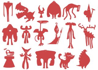
Drawing quick and simple thumbnails is a helpful warm-up exercise. There are a few things to bear in mind, though. I always try to keep the design simple; the silhouette needs to be easy to read. I use a solid colour and sometimes I draw over it with a darker colour tone. In this case I’m concentrating on creatures, which means I’m free to create different shapes, combining object, animal and human elements.
02. Don't forget references
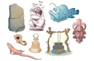
If I don’t feel inspired to draw then I’ll look around for some references. In this case, I’ll search for objects that I can either use as part of a creature, or just act as a launch point to galvanise me into action. My main reference sources are mythology, animals and nature and so I’ll draw some objects (African masks, runes, a cauldron…) and some animals. My sketchbooks are full of such doodles and they can easily end up being part of a figure design.
Need a new sketchbook? Check out our guide to the best sketchbooks.
03. Use basic shapes
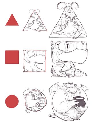
What if I start with basic shapes to create my character? All of them can turn into a creature, right? You might think this is a limitation, but it also forces you to be extra creative. This approach can be a good method for designing a squad of characters that work together, like superheroes. These shapes are just one way to start your designs. Sometimes I break the silhouette by adding elements, or I leave some empty spaces.
Get the Creative Bloq Newsletter
Daily design news, reviews, how-tos and more, as picked by the editors.
04. Combine basic shapes
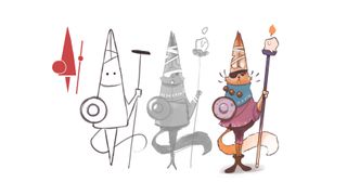
This approach can lead to interesting results. One of my previous thumbnails is a blend of triangles, circles and a rectangle. When I sketch over this basic form I can see immediately that it’s a one-eyed warrior hare carrying a shield and a candle. I start with a very simple doodle in greyscale and then add some details in the colour drawing. This breaks up the symmetry and make this character more visually appealing.
05. Draw without purpose
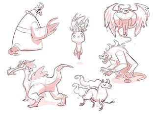
Another useful starting exercise is to simply draw without a specific purpose. And it’s important to me to do this without references. I don’t expect to create my greatest piece of art this way, but this can inspire future projects. Maybe I’ll pay attention to these sketches someday and fresh ideas will come to mind. It’s also a good exercise to banish the dreaded artist’s block.
06. Think about body language
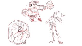
If you want your creatures to be expressive then it’s crucial to understand anatomy and body language. Combine these two key topics and your creation will feel more alive. I believe it’s vital to understand how bodies can express an emotion. You can obtain references from plenty of sources: study films, friends and model sessions; look in the mirror; or take some photos of interesting poses. This step is crucial. As a cartoon character designer, I tend to exaggerate these body expressions with more pronounced curves or shapes.
For more on anatomy and figures, see our guide to figure drawing.
07. Use lines of action
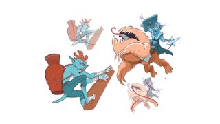
Using simple lines will define the movement of the creature. These are called lines of action. They’ll vary depending on the creature’s mood and activity. Straight lines can make your figure look boring or static, so I often use curved and contrasting lines because they result in more eye-catching body positions. It’s crucial to draw a range of dynamic poses, because they’re a useful way of testing your creature’s proportions and anatomy.
08. Keep experimenting
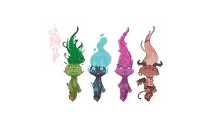
Maintain your creativity by revisiting older designs and producing variants that will work in that universe. Here I’m keeping the same basic shapes and proportions for the different versions. Colours and materials have an important role to play, too. What if, instead of leaves, he has crystal hair? Or maybe there’s a constant flame on the top of his head? These variations can enrich your original concept. Other options include changing the size, age or sex of the character.
09. Add contrast


Contrast is a basic concept that you need to bear in mind when designing a creature. This contrast can be between colours, shapes, objects and more. I make sure that I think about contrast in every stage of my designs.
At the sketching stage, when I draw some basic shapes, any contrast between them will be most obvious during this stage. One creature will be curvy, the other straight. This can be very rough – there’s no need for details.
Next, I work more on the sketch, adding details like the ropes and plants. You can enhance the personality of your creature by adding contrast to the attitude. In this case, a monster is happy carrying a very serious stone head. I’m also using contrasting colours for them, increasing the visual effect and making them complementary characters.
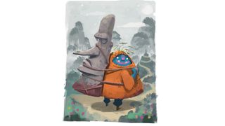
The final step is adding additional details such as texture, shadows and a background. It’s time to paint them all. Texture will enhance personality and give the figures the spirit of adventure. The background is part of the story, so I add a path and some mountains inspired by Chinese art.
10. Add an object
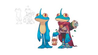
An object can be a good way to further strengthen a creature’s design. These props can boost their personality and charisma, and can also enrich their back story. What are they carrying? And why? Maybe they’re carrying luggage, or they’re holding a lantern to light the path into a mysterious forest. Depending on what they have on their back or in their hands you can define their jobs or roles in your narrative.
11. Try different facial expressions
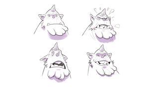
Body poses are of vital importance when showing a creature’s emotion, but so are their facial expressions. Both work together. Try some basic emotions like happiness or anger, then try less-common ones. By placing a small mirror close to your work area, or using your camera phone, you can use yourself as reference. Study how the facial muscles move. Essentially, eyebrows and mouth will do the most amount of work for basic fantasy creatures. Consider adjusting the ears while squashing or stretching the main shape of the head to accentuate these emotions.
12. Use perspective
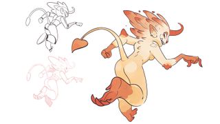
Another way to improve your creature designs is adding some perspective. Symmetry can be very boring, and a simple pose viewed from the front may fail to resonate with the viewer. So it’s important to work with depth and space, to give your creature a strong feeling of movement. Try different angles when you sketch your characters, and look for references if you’re struggling. With this creature, I’ve increased the stroke width in some areas that are close to the viewer to boost the feeling of depth.
13. Create a point of interest
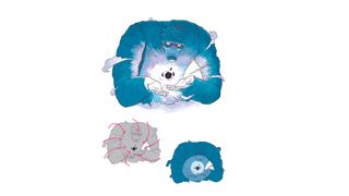
With some simple lines defining a direction, you can create a point of interest in your drawing where you can focus the viewer’s attention. This visual flow leads the viewer’s eyes in the direction you want. You can even create different entry points and there are a lot of ways to achieve this. Faces and hands are very expressive, so concentrate your efforts here. Colour and lighting can also help. Increase the brightness or ramp up the saturation of the area that you want the viewer to focus on.
14. Tell a story
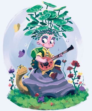
Does this creature have a back story? And how can you tell? The attitude and action of the creature will play an important role, even if they’re standing still or looking at something. The environment plays an important role, too. It helps to explain what’s happening to your creature. Adding some props and details in the background will support the story and give context to the figure’s personality.
15. Create an atmosphere
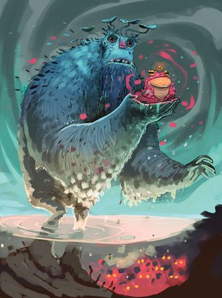
Lighting and colour are key tools to use when painting creature concepts. You must play with lights and shadows to create interesting and atmospheric environments. This will focus the viewer’s eyes to some areas of the drawing. Selecting a source light and applying the correct shades will enable you to highlight key parts of your design. Keep in mind that colour, lighting and shadows are only part of the story. Make the choices that will enhance rather then detract from your narrative. Carry out colour tests to see which ones work best.
This article originally appeared in ImagineFX, the world's leading magazine for digital artists. Subscribe here.
Read more:

Thank you for reading 5 articles this month* Join now for unlimited access
Enjoy your first month for just £1 / $1 / €1
*Read 5 free articles per month without a subscription

Join now for unlimited access
Try first month for just £1 / $1 / €1