How to create impressive 3D graphics in CSS3
Donovan Hutchinson shows you how to use transforms to create a 3D object and animate it with nothing but CSS.
CSS3's 3D transforms are fast becoming a legitimate option for adding depth and interactivity to web projects. In this tutorial we'll walk through how you could approach the process of setting up a 3D stage, building a 3D object, adding shading and animation, and bringing in dynamic content to create something you can use on your own site. We'll also learn some advanced CSS3 features and address some common issues.
Why use CSS?
There are loads of ways to create 3D graphics in HTML. JS-based, Canvas, SVG and even WebGL-based solutions are available, and all have their advantages, but there's also CSS. CSS is bypassing the need for images and being able to hook into the GPU for graphics acceleration. Plug-ins aren't required and CSS can live beyond a walled-in canvas on your page.
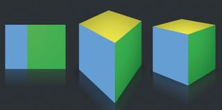
CSS 3D isn't as optimised as WebGL. It's also subject to inconsistent browsers. Still, incorporating 3D objects into your web projects gives you an extra axis to work with, and can be used today.
Not all browsers fully support for the 3D transforms used in this article, so for brevity I'll make use of the -webkit prefix. Take care to include prefixes for Mozilla, Opera, MS as well as the non-prefix version as appropriate. Full versions of the CSS, with prefixes, are in the project files.
Basics: creating a 3D cube
To start we'll build a basic 3D cube, placing and animating it in 3D space. First we set up some HTML that will represent the pieces in the 3D cube.
<div class="stage">
  <div class="cube">
    <figure class="back"></figure>
    <figure class="top"></figure>
    <figure class="bottom"></figure>
    <figure class="left"></figure>
    <figure class="right"></figure>
    <figure class="front"></figure>
  </div>
</div>
I've chosen to use the figure element, but it could be a div, span or whatever type of element you prefer. There are two main parts to this HTML. The stage, in which everything is placed, and a cube to place on the stage.

Setting the stage
The first thing we need when building a 3D scene is to create an element to act as a stage. We give the stage a depth by using the CSS perspective property:
Get the Creative Bloq Newsletter
Daily design news, reviews, how-tos and more, as picked by the editors.
.stage {
  width: 300px; height: 300px;
  -webkit-perspective: 1600px;
  -webkit-perspective-origin: 50% -240px;
}
Setting the perspective value higher creates a more subtle 3D effect; lower makes it more pronounced. A value of 800 pixels or so tends to look good for most small objects, but if you're creating something larger, such as a skyscraper, you may want to use a smaller value to create more extreme angles. When setting perspective, it's also necessary to set a perspective-origin (the position of the virtual camera looking onto the scene), positionable in the X and Y axis.
Making shapes: thinking with planes
Making 3D shapes using HTML and CSS involves thinking about your object as a set of flat planes. Rather than draw vertices and assemble shapes from points and lines as you may be familiar with from other 3D programs, we'll be working with these flat planes and positioning each one at a time. We assemble the cube with six planes that correspond to the sides, top and bottom. To begin with, give the figure elements a shape and style:
figure {
  display: block; position: absolute;
  width: 300px; height: 300px;
  background-color: #60c2ef;
}
The next step is to tell them where to sit in the 3D space.
Transformers are go
We place the figures using the transform property. Transforms in CSS are made up of a sequence of instructions that tell a shape to move, rotate, skew and scale. They read from left to right. For example:
-webkit-transform: rotateY(45deg) translateZ(-100px) rotateX(10deg)We can shift each of the cube's sides into place, starting with front and back:
.cube { -webkit-transform-style: preserve-3d; }
figure { -webkit-transform-origin: 50% 50% 0; }
.front { -webkit-transform: translateZ(150px); }
.back { -webkit-transform: rotateY(180deg) translateZ(150px); }
Note the use of the transform-style property: when this is set to preserve-3d, the cube's sides will carry out transforms in their own 3D space. We also specify the point around which transform is done. The transform-origin property sets a point in the X, Y and Z axes that acts as a centre of rotation. This is the middle of the front of the element, halfway across and halfway down.

The front figure is translated 150px outward; the back flips 180 degrees and moves 150px toward the back of the scene. The ordering matters here - the transform rules are applied from left to right. The second transform on the back figure is a positive number: as it's been rotated, its front face is facing toward the back of the scene. As before, the order of the transform rules matters. If an item is rotated, it's Z axis will be at a different angle and any translation will be affected. Now, place the other sides:
.top { -webkit-transform: rotateX(90deg) translateZ(150px); }
.bottom { -webkit-transform: rotateX(-90deg) translateZ(150px); }
.left { -webkit-transform: rotateY(-90deg) translateZ(150px); }
.right { -webkit-transform: rotateY(90deg) translateZ(150px); }
We now have a complete cube, positioned in a 3D scene.
Move it, move it
Let's have our 3D creation rotate on the stage, using CSS animations:
@-webkit-keyframes rotate {
  0% { -webkit-transform: rotateY(0); }
  100% { -webkit-transform: rotateY(360deg); }
}
CSS animations are achieved by using a series of keyframes. Keyframes are a set of states for an object, set out using percentages. The animation starts with zero rotation and finishes fully rotated around the Y axis. Apply this set of keyframes with the animation property:
.cube { -webkit-animation: rotate 10s infinite linear; }The rotate animation applied here is going to run for 10 seconds, repeat indefinitely and move at a consistent linear pace.
Shading
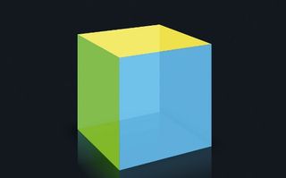
We have a cube rotating on a stage, but it's all very bright. To add shading, without adding more selectors, we'll use pseudo-selectors.
Pseudo-selectors are like extra HTML elements that can be inserted before and after the contents of an element. They give us extra elements to work with and can contain gradients, colours or even text. So we can animate shading on each of the cube's surfaces, we need two gradients - one for when the surface is turning to the left, the other when turning to the right:
figure:before, figure:after {
  content: ""; display: block; position: absolute;
  width: 100%; height: 100%; opacity: 0;
}
figure:before {
  background: -webkit-radial-gradient(top left, rgba(0, 0, 0, 0.5), #000000);
}
figure:after {
  background: -webkit-radial-gradient(top right, rgba(0, 0, 0, 0.5), #000000);
}
The before and after in this example are the pseudo-selectors, which can be styled and animated. It's important to note that this is not yet well supported - Chrome, Firefox and IE10 offer varying levels of support - and hopefully this will improve. We apply an animation to each of the pseudo-selectors to time the showing/hiding of these gradients:
.front:before { -webkit-animation: frontShading1 10s infinite linear; }
...
Each animation is made up of a set of keyframes that show or hide the gradient as they animate. Here are two that apply to the back side:
@-webkit-keyframes frontShading1 {
  2% { opacity: 0; }
  25% { opacity: 0.8; }
  35% { opacity: 0.8; }
  50% { opacity: 0; }
}
...
The full set of animations, along with the prefixes for each browser, is included in the project files.
Top and bottom
Next, the top and bottom. The top needs a gradient that looks like it's not moving. Affix a gradient to the top and rotate it in the opposite direction:
.top:after {
  opacity: 0.5; width: 200%; height: 200%;
  margin-left: -50%; margin-top: -50%;
  background: -webkit-radial-gradient(bottom, rgba(0, 0, 0, 0), #000000);
-webkit-animation: rotateTop 10s infinite linear;
}
@-webkit-keyframes rotateTop {
  0% { -webkit-transform: rotateZ(0); }
  100% { -webkit-transform: rotateZ(360deg); }
}
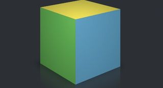
The cube bottom won't be visible but we can use it to add a box-shadow:
.bottom {
  -webkit-box-shadow: 0 10px 100px rgba(0, 0, 0, 0.7);
  background-color: rgba(0, 0, 0, 0);
}
More than flat colours
So far we have created, shaded and animated a cube using nothing but CSS, albeit with flat colours on the sides. Since we're working with HTML elements, we can do so much more with the content.
The faces of the cube could contain images, text - or even other animations. In the example below, I've applied some background images from the game Minecraft:
figure {
  background-image: url(../images/mc_side.png);
  background-size: 100%;
}
.top {
  background-image: url(../images/mc_top.png);
}
The shading we added earlier is still in effect here, adding a better feeling of depth to the sides. It will work on whatever content the figure contains.
Reflections
As if animated shading and a shadow wasn't enough, we can add a little more shine to the scene using some fancy WebKit filters (note this is currently a WebKit-only feature).
figure {
  -webkit-box-reflect: below 0 -webkit-gradient(linear, left top, left bottom, from(transparent), color-stop(50%, transparent), to(RGBA(0, 0, 0, 0.1)));
}
Tweet box
Let's create something more practical. In this example, we'll make the cube a place to show off your most recent tweet and put some secondary info on the side of the cube with an option for people to follow you on Twitter.
Setting up the HTML
Starting with the same HTML as earlier, we'll apply some background images to give it some texture. We apply these two textures to the cube:
figure {
  background-color: #eeeeee;
  background: url(../images/white-noise.jpg);
}
.front {
  background: #e0e0e0 url(../images/net-logo.jpg) no-repeat;
Add some content
Add the content that peeks into view when the cube turns. It'll go on the right side of the cube. Include a bit of JavaScript for calling in the follow button (obtainable from Twitter's button page). The figure with class right should contain something like this:
<figure class="right">
  <p>The world's best selling magazine for web designers and developers since 1994</p>
  <a href="https://twitter.com/netmag" class="twitter-follow-button" datashow-count="false">Follow @netmag</a>
  <script>!function(d,s,id){var js,fjs=d.getElementsByTagName(s)[0],p=/^http:/.test(d.location)?'http':'https';if(!d.getElementById(id)){js=d.createElement(s);js.id=id;js.src=p+'://platform.twitter.com/widgets.js';fjs.parentNode.insertBefore(js,fjs);}}(document, 'script', 'twitter-wjs');</script>
</figure>
The follow button is positioned by adding an iframe rule to the CSS:
.right iframe { padding-left: 90px; margin-top: -30px; }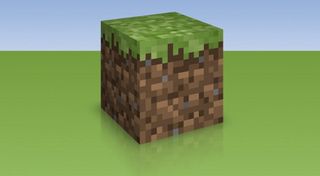
Put a tweet on it
Twitter provides a simple way to get the most recent tweets in the form of widgets. To set one up, log in to Twitter and navigate to the Twitter Widgets page. Select the Create new button, then type the desired Twitter username into the Username box (here we'll be using 'netmag'). Press the Create widget button to generate your embed code.
We can style the widget and add a width, height and some data- values in the code. Replace YOUR_WIDGET_ID with the ID provided in your embed code:
<figure class="front">
  <p style="padding: 0; margin: 85px 25px 0 25px; width: 250px">
  <a class="twitter-timeline" href="https://twitter.com/netmag" width="250" height="200" data-chrome="noheader noborders nofooter transparent" data-tweet-limit="1" data-widget-id="YOUR_WIDGET_ID"></a>
  <script>!function(d,s,id){var js,fjs=d.getElementsByTagName(s) [0],p=/^http:/.test(d.location)?'http':'https';if(!d.getElementById(id)){js=d.createElement(s);js.id=id;js.src=p+"://platform.twitter.com/widgets.js";fjs.parentNode.insertBefore(js,fjs);}}(document,"script","twitter-wjs");</script>
  </p>
</figure>
Transitioning
We won't need the keyframe animations for the shading: it will react to a hover or active event. Instead, add some transitions on the shading pseudo-selectors:
.right:before { opacity: 0.4; -webkit-transition: all 0.4s ease; }
.right:after { display: none; }
.front:before { opacity: 0.1; -webkit-transition: all 0.4s ease; }
.front:after { display: none; }
The pseudo-selector on the right face is set to have an opacity of 0.4. This adds a little shadow and we can animate the opacity to make the face get lighter as it turns toward the front. The right:after pseudo-selector is hidden as we won't be rotating the cube far enough for it to be needed. The front face is given some shading, albeit brighter than the right side, as it's facing forwards.
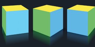
Animation on hover
With the shading effects added, we'll build in an animated 'peek' effect when the user hovers over the cube, achieved by making use of the CSS hover state.
.cube:hover {
  -webkit-transform: rotateY(-50deg);
  -webkit-transition: all 0.4s ease;
}
.cube:hover figure.right:before, .cube:hover figure.front:before {
  opacity: 0.2;
  -webkit-transition: all 0.4s ease;
}
On hover, the cube rotates 50 degrees left. This transform is made into a smooth transition by applying the transition property. Simultaneously, the pseudo-selectors on front and right sides are transitioned to an opacity of 0.2.
The result of these transitions is a nice 3D turning effect, allowing extra content to be tucked out of sight and shown when the user hovers over the cube. The full HTML and CSS can be found in the project files.

Making objects out of flat HTML elements does have limitations: any object you create will need to be made by combining flat shapes to produce the end result. Curved objects such as tubes and spheres are difficult to create without using many elements, so it's best suited to simpler items. But considered use of shading and animation can create impressive results with simpler structures.
Performance and testing
When creating 3D objects, also keep in mind that browser performance and computer speed can vary a lot. CSS isn't really optimised for graphically intense, busy 3D scenes, so discretion is advised for public projects. Test across different platforms: visitors may well be using mobile devices or older, slower computers.
While it's only a matter of time until all browsers support 3D transforms, gradients and all the nice finishing touches we've used here, the reality is that most aren't there yet. We should ensure your visitors using older browsers don't experience a broken page. One approach is to use feature detection and show an alternative version for browsers that don't support these properties.
In this case we'll use Modernizr to detect whether the 3D transforms are supported and, if not, we'll display a static picture. First, include Modernizr's JS in the head of the HTML:
<script src="js/modernizr.js"></script>On load, this will insert a csstransforms3d class into the <head> tag. We then use that information to show or hide a fallback alternative:
.stage { display: none; }
.csstransforms3d .stage { display: block; }
.fallback-stage {
  width: 100%; height: 600px;
  background: url(../images/fallback.png);
}
.csstransforms3d .fallback-stage { display: none; }
For this example, the fallback is a static picture. Use the fallback div as an opportunity to present flat content for the browser or an alternative message.

Next steps
A 3D styled cube probably isn't the first thing most web design clients ask for, but some of these techniques can be used in other ways. You could create a 3D transition hover effect on a logo, a flashy way to show off a new product, or use it to help present and navigate complex sets of data. Introducing the Z-axis to your designs can open the doors to some interesting and fun ideas.
Words: Donovan Hutchinson. Donovan is a front-end designer based in Dublin. He specialises in interaction design and blogs about CSS and other front-end development.
Thanks to Val Head for her peer review of this tutorial. This article originally appeared in net magazine issue 244.
Liked this? Read these!
- Stunning examples of CSS3 animation
- Our favourite web fonts - and they don't cost a penny
- How to make an app: try these great tutorials

Thank you for reading 5 articles this month* Join now for unlimited access
Enjoy your first month for just £1 / $1 / €1
*Read 5 free articles per month without a subscription

Join now for unlimited access
Try first month for just £1 / $1 / €1
The Creative Bloq team is made up of a group of design fans, and has changed and evolved since Creative Bloq began back in 2012. The current website team consists of eight full-time members of staff: Editor Georgia Coggan, Deputy Editor Rosie Hilder, Ecommerce Editor Beren Neale, Senior News Editor Daniel Piper, Editor, Digital Art and 3D Ian Dean, Tech Reviews Editor Erlingur Einarsson and Ecommerce Writer Beth Nicholls and Staff Writer Natalie Fear, as well as a roster of freelancers from around the world. The 3D World and ImagineFX magazine teams also pitch in, ensuring that content from 3D World and ImagineFX is represented on Creative Bloq.
