Give your logo work a 3D edge
2D just doesn't cut it any more. It's time to bolster your Photoshop skills by bringing Cinema 4D into play in your everyday work. Barton Damer reveals how.
- Software: Photoshop CS3 or later, Cinema 4D
- Project time: 12-15 hours
- Skills: Developing 3D elements, modelling in Cinema 4D, Merging texture in Photoshop and Cinema 4D, creating distressed effects in Photoshop
A brand is represented graphically in many ways, not least through its logo. Cinema 4D is an excellent tool to have in your arsenal, and can enable you to create digital illustrations that enhance a brand with one of the most basic - and often overlooked - design principles: depth.
When I first started to explore motion design, I soon realised that the field is yet another extension of how I can express myself as a designer. By getting to grips with 3D software, I've been able to completely change the way I go about developing my print work. In this tutorial we'll use some very basic 3D concepts, combined with a few tricks in Photoshop. Over the following pages we'll recreate a 3D version of a logo, which pays homage to a Star Wars aircraft that has been shot in battle.
You can download a Cinema 4D demo here.
Click here to download the tutorial files (4.83MB)
Step 01
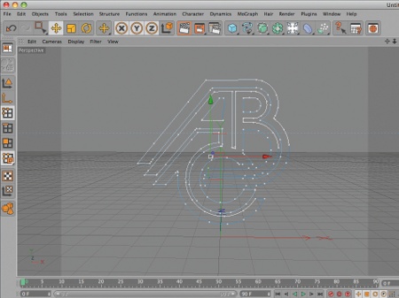
In Cinema 4D, merge a vector version of your logo into a new document (you'll find the merged vector of my logo in the support files). This logo was created using Illustrator, and will serve as a base for extruding the logo and developing 3D elements to fill the contours of the emblem.
Step 02
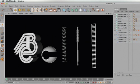
Now model several basic objects to be wrapped around the contours of the logo. I want my logo to feel a little like an old fighter aircraft from Star Wars, so my objects are inspired by that idea - I think about springs, wires, air vents and even a pilot's window, which I've used for the 'C' in 'ABC'.
Step 03
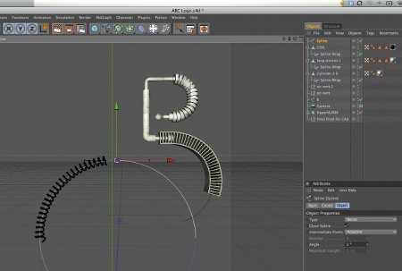
Once the objects are created, use Cinema 4D's Bezier tool to draw specific paths for each to be wrapped around. The key is to keep the elements within the boundaries of the original logo so it maintains its integrity and doesn't become too difficult to identify.
Get the Creative Bloq Newsletter
Daily design news, reviews, how-tos and more, as picked by the editors.
Step 04
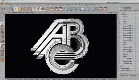
After positioning the objects around the logo, start adding small details to the 3D logo by creating track lights and other various elements. These will fill in some of the areas around the logo without becoming too complex. In this case it's already somewhat complex in its shape, so make sure that you keep your 3D objects a bit larger in scale.
Step 05
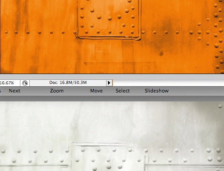
Now to add texture to your logo. I've created a variety of shiny metal textures directly in Cinema 4D using Reflections set to Fresnel with a gradient. Add more in Photoshop by sourcing images of the steel and bolts used to build aircraft, as well as other textures such as glass, and use them to texture most of your 3D models.
Step 06
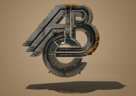
In addition to the use of textures, lighting plays a huge role in the success of your renders. I use the GSG Light Kit Pro (www. greyscalegorilla.com/ lightkitpro) to light the scene on a seamless background. Think about the perspective of your logo. I want to render a straight-on version, so I cast a shadow beneath the logo that shows the window detail I've created for the 'C'.
Step 07
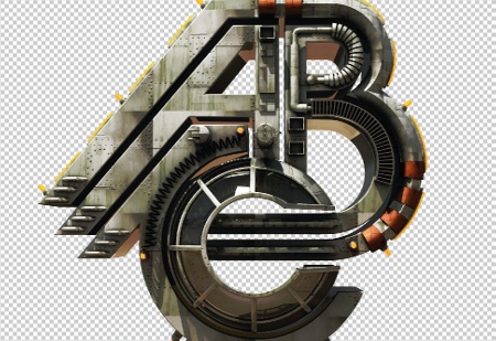
Now open up your Cinema 4D render with an Alpha Channel. This will enable you to adjust the levels of the logo, without affecting the background. Now use the Dodge and Burn tools to pull out some of the highlights and enrich the darks in your image.
Step 08
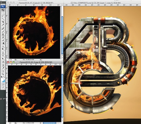
I was able to composite actual photographs of flames with my 3D render to create the look of a fighter aircraft that had been hit in battle. Source some flame images, and in Photoshop position the flames over the logo using a layer mask to hide the areas that you don't want to show. Set the blending mode to Screen.
Step 09

The next step is to add some final details to your logo. Create a custom paint job with the white blocks of colour by making a selection and filling it with white on a new layer set to the blending mode Screen. I then add some of my clients' logos to the fighter craft, as inspired by old B-52 aircraft from the '50s. I'm not so sure that Star Wars fighter crafts had these, but I like the effect!
Step 10
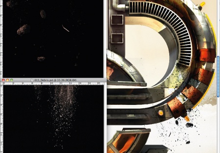
To strengthen to the idea that this fighter aircraft has been shot in battle, I add some debris to show that damage has been done. Source a still image of debris, then inverse and desaturate it. Next, adjust the levels to get some rich darks and bright whites, and set the blending mode to Multiply.
Step 11

Now for the background. I've sourced some photos of mountains and the moon for this. Desaturate your chosen background image, and set the blending mode to Overlay. Duplicate the layer once it's set to Overlay, and you'll start getting some really interesting colours.
Step 12

I now do some custom airbrushing with the Airbrush tool. In particular, I brush some white onto the bottom of the mountains to suggest a haze, and blend the bottom of the mountains to ensure there isn't a hard edge between them and the solid colour background. I also airbrush the edges by hand as well, this time using black and setting the blending mode to Soft Light.
Step 13
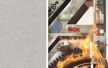
This logo illustration is themed around Star Wars, so I decide to give it a bit of a retro texturing and treatment. Select a piece of paper with a nice grain to it, scan it in, and paste the texture on top of your artwork, with the blending mode set to Soft Light or Overlay. I've ended up having to desaturate the paper image and adjust the Levels to get my desired look.
Step 14
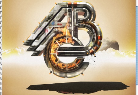
At this point, you're pretty much done with the 3D logo. However, I still want to try some different options with the colour. After showing it to a friend for feedback, we decide to experiment with the contrast of warm and cool colours instead of keeping everything so warm.
Step 15

I use an adjustment layer to change the background to a cooler palette. The warmth of the fire really pops against the cool background.
Liked this? Read these!
- Adobe Photoshop CS6 hands-on review
- Free Photoshop brushes every creative must have
- Free Photoshop actions to create stunning effects
- The best Photoshop plugins

Thank you for reading 5 articles this month* Join now for unlimited access
Enjoy your first month for just £1 / $1 / €1
*Read 5 free articles per month without a subscription

Join now for unlimited access
Try first month for just £1 / $1 / €1

The Creative Bloq team is made up of a group of design fans, and has changed and evolved since Creative Bloq began back in 2012. The current website team consists of eight full-time members of staff: Editor Georgia Coggan, Deputy Editor Rosie Hilder, Ecommerce Editor Beren Neale, Senior News Editor Daniel Piper, Editor, Digital Art and 3D Ian Dean, Tech Reviews Editor Erlingur Einarsson, Ecommerce Writer Beth Nicholls and Staff Writer Natalie Fear, as well as a roster of freelancers from around the world. The ImagineFX magazine team also pitch in, ensuring that content from leading digital art publication ImagineFX is represented on Creative Bloq.
